Interviews are opportunities to demonstrate your expertise, and this guide is here to help you shine. Explore the essential Basic Knowledge of Visual Design interview questions that employers frequently ask, paired with strategies for crafting responses that set you apart from the competition.
Questions Asked in Basic Knowledge of Visual Design Interview
Q 1. Explain the difference between UI and UX design.
UI (User Interface) and UX (User Experience) design are often confused, but they are distinct disciplines. Think of it like this: UI is the what, while UX is the how and why.
UI design focuses on the visual aspects of an interface – the layout, typography, color palettes, and overall aesthetics. It’s about making the interface visually appealing and easy to navigate. It’s concerned with the look and feel of buttons, menus, forms, and other interactive elements. A UI designer might work on the precise placement of a button or the selection of a particular font.
UX design, on the other hand, encompasses the entire user journey. It considers the user’s overall experience with a product or service, from initial interaction to completion of a task. It involves research, user testing, information architecture, interaction design, and usability testing to ensure the product is intuitive, efficient, and enjoyable to use. A UX designer might conduct user interviews to understand user needs or create user flows to optimize the user journey. A well-designed UX makes a product usable and enjoyable, even if the UI is relatively simple.
For example, a beautifully designed mobile banking app (great UI) that crashes frequently and is difficult to use (poor UX) is ultimately a failure. Conversely, a functional but visually unappealing app (good UX, weak UI) might be successful if the user experience is positive.
Q 2. What are the principles of Gestalt design?
Gestalt principles are rules of perception that explain how humans visually organize elements into groups or unified wholes. They’re crucial in design because they help create visually appealing and easily understandable layouts. These principles are based on how our brains naturally process visual information.
- Proximity: Elements placed close together are perceived as a group. Think of bullet points in a list – their proximity makes them a single unit of information.
- Similarity: Similar elements (shape, color, size) are perceived as related. Using similar buttons throughout a website strengthens visual consistency and ease of use.
- Closure: We tend to complete incomplete shapes or figures. A logo with a partially hidden element can be more memorable because our minds fill in the gaps.
- Continuity: The eye follows lines and curves naturally. A continuous line guiding the user’s gaze across a page improves readability and visual flow.
- Figure/Ground: The relationship between an object (figure) and its background (ground). A well-defined figure stands out clearly against its background, enhancing readability.
Applying Gestalt principles ensures your design is coherent and intuitive. For instance, grouping related items together based on proximity makes it easier for users to scan and understand the information.
Q 3. Describe the importance of typography in visual design.
Typography is the art and technique of arranging type to make written language legible, readable, and appealing. It’s a fundamental aspect of visual design, impacting readability, hierarchy, and the overall mood and tone of a design.
The right typography can elevate a design, making it professional, friendly, or sophisticated. Choosing the wrong fonts can be distracting, difficult to read, and damage the credibility of a brand. Consider these aspects:
- Readability: Selecting fonts that are easy to read, especially at smaller sizes, is crucial. Serif fonts (like Times New Roman) are often preferred for body text, while sans-serif fonts (like Arial) are popular for headings.
- Hierarchy: Using different font sizes, weights (bold, light), and styles (italics) helps to create a visual hierarchy, guiding the user’s eye through the information in a logical order.
- Brand Identity: Choosing fonts that align with the brand’s personality and values is essential. A playful brand might use a quirky script font, while a corporate brand might opt for a clean, modern sans-serif.
- Spacing: Proper kerning (space between letters) and tracking (space between words) ensure readability and visual appeal.
For example, a website for a law firm should employ a sophisticated and legible serif font to convey professionalism, unlike a children’s website which might use playful and rounded fonts.
Q 4. What are some common color palettes used in design?
Color palettes are sets of colors used in a design project to maintain consistency and visual harmony. The choice of colors significantly impacts mood, brand identity, and user experience. Some common palettes include:
- Analogous: Colors that sit next to each other on the color wheel (e.g., blue, blue-green, green). They create a harmonious and calming feel.
- Complementary: Colors opposite each other on the color wheel (e.g., blue and orange, red and green). They create high contrast and visual excitement.
- Triadic: Three colors evenly spaced on the color wheel (e.g., red, yellow, blue). They offer a vibrant and balanced palette.
- Monochromatic: Different shades and tints of a single color. They provide a cohesive and elegant look.
- Neutral: Colors like black, white, gray, and beige. They create a versatile base for other colors and are often used for sophistication or minimalism.
The choice of palette depends on the project’s goals and the brand’s identity. For example, a website for a spa might use a calming analogous palette of greens and blues, while a website for a tech company might utilize a bold triadic palette.
Q 5. Explain the concept of visual hierarchy.
Visual hierarchy is the arrangement of elements in a design to guide the user’s eye and indicate importance. It’s about controlling the order in which the viewer sees information, directing attention to key elements. This is achieved through several techniques:
- Size: Larger elements are more prominent than smaller ones.
- Color: Brighter or contrasting colors attract attention.
- Font Weight: Bold text is more noticeable than regular text.
- Position: Elements placed at the top or center tend to be seen first.
- Spacing: White space (negative space) can highlight specific elements.
Effective visual hierarchy ensures users can quickly and easily understand the most important information. Consider a webpage; the headline is usually the largest and most prominent element, guiding users to the core message. Supporting text follows in smaller sizes, and less important information is subtly presented.
Q 6. How do you ensure accessibility in your designs?
Accessibility in design means creating interfaces that are usable by people with disabilities. It’s about ensuring equal access to information and functionality for everyone. Key considerations include:
- Color Contrast: Sufficient contrast between text and background ensures readability for people with low vision.
- Alternative Text for Images: Providing descriptive alt text for images allows screen readers to convey the image’s content to visually impaired users.
- Keyboard Navigation: All interactive elements should be navigable using only a keyboard, benefiting users who cannot use a mouse.
- Captions and Transcripts: Adding captions to videos and transcripts to audio content makes them accessible to deaf or hard-of-hearing users.
- Font Size and Style: Allow users to adjust font sizes and styles, accommodating different visual needs.
Adhering to accessibility guidelines (like WCAG) ensures inclusivity and a wider user base. For example, using sufficient color contrast makes a website usable for people with visual impairments, while providing keyboard navigation enhances usability for those who cannot use a mouse.
Q 7. What file formats are best for web and print design?
The best file formats for web and print design differ based on their respective requirements.
Web Design:
- JPEG (.jpg): Best for photographs and images with continuous tones. It offers good compression but can result in some loss of quality.
- PNG (.png): Ideal for graphics with sharp lines, logos, and images that require transparency. It supports lossless compression, preserving image quality.
- SVG (.svg): Vector-based format, scalable without losing quality. Excellent for logos, icons, and illustrations that need to be resized frequently.
- GIF (.gif): Suitable for simple animations and images with limited colors. Offers lossless compression but is limited in color depth.
Print Design:
- TIFF (.tiff): High-resolution image format, ideal for print production. Supports lossless compression and high color depth.
- PDF (.pdf): Preserves the layout and formatting of documents, perfect for delivering print-ready files to printers.
- EPS (.eps): Vector-based format, suitable for illustrations and logos. Can be imported into many design applications.
Choosing the correct format is essential to maintain image quality and ensure seamless integration into the final product. Using a JPEG for a logo (which should be scalable) would be a mistake, leading to pixelation when enlarged.
Q 8. What is the difference between RGB and CMYK color modes?
RGB and CMYK are two different color models used in visual design, each suited for different applications. RGB (Red, Green, Blue) is an additive color model, meaning colors are created by adding light. It’s used for screens, like monitors and projectors, where light is emitted. CMYK (Cyan, Magenta, Yellow, Key – black) is a subtractive color model, where colors are created by subtracting light from white. It’s used for print media, where ink is applied to a surface.
Think of it like this: If you shine a red, green, and blue light together, you get white. That’s RGB. If you start with a white sheet of paper and apply cyan, magenta, and yellow inks, you’ll get darker colors; adding black (K) helps with achieving true blacks. That’s CMYK.
The key difference lies in their application. A design created in RGB will look vibrant on a screen but may appear dull when printed directly because printers don’t use RGB. Conversely, a design created in CMYK may appear slightly muted on screen but will print accurately.
Therefore, understanding the difference is crucial. You’d use RGB for web design, digital illustrations, and video editing, while CMYK is essential for print projects like brochures, posters, and books.
Q 9. Describe your experience with Adobe Creative Suite (Photoshop, Illustrator, InDesign).
I have extensive experience with Adobe Creative Suite, particularly Photoshop, Illustrator, and InDesign. I’ve utilized these tools for over [Number] years across various projects, from logo design and branding to website mockups and print materials. In Photoshop, my expertise lies in image retouching, manipulation, and compositing. I’m proficient in using layers, masks, and adjustment layers to achieve professional results. Illustrator is my go-to for vector-based graphics, logo creation, and illustration work. I am adept at creating scalable vector graphics and using the pen tool with precision.
InDesign is my choice for page layout and design. I regularly use it for creating brochures, magazines, and books, mastering features such as master pages, styles, and text frames for efficient and consistent design. I’m comfortable with advanced techniques like creating custom brushes, designing complex layouts and using advanced typography settings. I can provide specific examples of projects showcasing my skills in each program if needed.
Q 10. Explain your process for creating a logo.
My logo design process is iterative and client-centric. It begins with a thorough understanding of the client’s brand, target audience, and business objectives. This involves detailed discussions to understand their values, mission, and aspirations. I then conduct market research to analyze competitors and identify unique design opportunities.
- Concept Development: Based on the research, I brainstorm several logo concepts, exploring various styles, typography, and color palettes.
- Sketching and Refinement: I translate the initial concepts into sketches, refining them based on feedback and further exploration.
- Digital Creation: The selected sketches are then developed into high-fidelity digital versions using Illustrator, ensuring scalability and versatility.
- Client Presentation and Feedback: I present the refined logo options to the client, actively seeking their feedback and incorporating their suggestions to ensure alignment with their vision.
- Finalization and Delivery: Once the client approves the design, I finalize the logo and deliver the files in various formats, ensuring flexibility for various applications.
Throughout this process, I maintain open communication, ensuring the client is involved in every step, resulting in a logo that truly represents their brand identity.
Q 11. How do you handle feedback from clients or stakeholders?
Handling client feedback is a crucial aspect of design. I approach it as a collaborative process, valuing constructive criticism. I begin by actively listening to understand the client’s concerns and perspective. I ask clarifying questions to ensure I comprehend their feedback fully.
I then analyze the feedback, considering its validity and feasibility within the project’s scope and timeline. Some feedback may require minor adjustments, while others might need more significant revisions. I present proposed solutions or alternatives, explaining the rationale behind my suggestions, fostering transparency. If changes are substantial, I will often provide revised mockups or sketches for approval before implementing the final changes.
Throughout this process, I strive to maintain a professional and positive attitude, emphasizing collaboration and ensuring the client feels heard and valued. My goal is to deliver a design that not only meets their expectations but also achieves the project’s goals effectively.
Q 12. Describe your experience with user research.
While my primary role is visual design, I understand the importance of user research in informing design decisions. I have experience incorporating user research methods, particularly in projects where understanding user behavior and needs is critical. This often involves conducting user interviews to gain insights into their preferences and pain points. I also utilize surveys and usability testing to assess the effectiveness of design solutions.
For example, in a recent website redesign project, I conducted user interviews to understand users’ navigation patterns and pain points. This information directly influenced the site’s information architecture and interface design, leading to a more intuitive and user-friendly experience. I find incorporating user research significantly enhances the effectiveness and usability of the final design.
Q 13. What are some common design trends you’re aware of?
The design world is constantly evolving. Currently, some prominent trends include:
- Minimalism: A focus on simplicity and clean aesthetics, prioritizing functionality and readability.
- Bold Typography: Using striking fonts to create visual impact and convey brand personality.
- Sustainable Design: Incorporating eco-friendly materials and practices in design solutions.
- Inclusivity and Accessibility: Designing for diverse audiences, considering accessibility needs, and promoting representation.
- 3D elements and animation: Adding depth and dynamism to designs through the strategic use of 3D models and animation.
These trends reflect a shift towards user-centric design, sustainability, and the importance of inclusivity. They are not standalone trends, but rather complement each other to create engaging and effective design solutions.
Q 14. How do you stay updated with the latest design trends and technologies?
Staying updated is vital in the ever-changing design landscape. I utilize several methods:
- Industry Publications and Blogs: I regularly read design publications like [List some relevant publications and blogs] to stay informed about new trends, techniques, and technologies.
- Design Conferences and Workshops: Attending industry events provides opportunities to learn from experts, network with peers, and discover new tools.
- Online Courses and Tutorials: Platforms like [List some relevant platforms] offer valuable courses to enhance skills and stay updated on software advancements.
- Following Design Influencers: Engaging with designers on social media allows for exposure to innovative ideas and current practices.
- Experimentation and Practice: I dedicate time to personal projects to experiment with new techniques and technologies, solidifying my understanding.
This multi-faceted approach ensures that I remain abreast of the latest developments and adapt my skills accordingly.
Q 15. Explain your workflow for a typical design project.
My design workflow is iterative and client-focused. It typically involves these key phases:
- Discovery & Research: I begin by thoroughly understanding the client’s needs, target audience, and project goals. This includes competitor analysis, user research (e.g., surveys, interviews), and defining key performance indicators (KPIs).
- Planning & Ideation: This involves creating mood boards, sketching initial concepts, and brainstorming various design solutions. I often use mind-mapping techniques to explore different creative avenues.
- Wireframing & Prototyping: I create low-fidelity wireframes to outline the basic structure and functionality of the design. These are then refined into interactive prototypes to test usability and gather feedback.
- Visual Design: This phase involves implementing the visual style guide, including typography, color palettes, imagery, and overall aesthetics. I consistently refer back to the established brand guidelines and design principles.
- Testing & Iteration: I rigorously test the design with target users to identify areas for improvement. Feedback is incorporated iteratively, refining the design until it meets the client’s needs and desired KPIs.
- Delivery & Documentation: The final design assets are delivered in the agreed-upon formats (e.g., PSD, Sketch, Figma files). Comprehensive documentation is also provided to ensure ease of implementation and future maintenance.
For example, in a recent e-commerce project, the initial user research revealed a need for improved product filtering and navigation. This directly impacted the wireframing and prototyping stages, leading to a more user-friendly final design.
Career Expert Tips:
- Ace those interviews! Prepare effectively by reviewing the Top 50 Most Common Interview Questions on ResumeGemini.
- Navigate your job search with confidence! Explore a wide range of Career Tips on ResumeGemini. Learn about common challenges and recommendations to overcome them.
- Craft the perfect resume! Master the Art of Resume Writing with ResumeGemini’s guide. Showcase your unique qualifications and achievements effectively.
- Don’t miss out on holiday savings! Build your dream resume with ResumeGemini’s ATS optimized templates.
Q 16. How do you ensure consistency in your designs?
Maintaining design consistency is paramount for a cohesive and professional brand experience. I achieve this through several strategies:
- Style Guides: Creating a comprehensive style guide that outlines typography, color palettes, spacing, imagery guidelines, and component specifications is crucial. This serves as a single source of truth for all design elements.
- Component Libraries: Utilizing component libraries within design software (like Figma or Sketch) ensures consistency across different screens and projects. Reusable components maintain a uniform look and feel.
- Version Control: Using version control systems like Git for design files allows for easy tracking of changes and collaborative work, maintaining a single, consistent version of the design system.
- Regular Audits: Periodically reviewing design assets to ensure adherence to the style guide and identify any inconsistencies prevents drift over time.
For instance, in a recent redesign of a company website, using a component library for buttons ensured that all buttons maintained the same size, style, and spacing, even across different pages.
Q 17. Describe your understanding of responsive design.
Responsive design is the approach of creating websites that adapt seamlessly to various screen sizes and devices (desktops, tablets, smartphones). It focuses on providing an optimal viewing experience across different platforms without compromising functionality or aesthetics.
This is achieved primarily through:
- Fluid Grids: Using percentage-based widths and flexible layouts ensures elements adjust proportionally to the screen size.
- Flexible Images: Images are resized automatically to fit the container, avoiding distortion or overflow.
- Media Queries: CSS media queries allow for applying different styles based on screen size, orientation, and other device characteristics.
@media (max-width: 768px) { /* Styles for tablets and smaller screens */ } - Mobile-First Approach: Designing for the smallest screen first and then scaling up to larger screens ensures a good baseline experience on all devices.
Imagine designing a website for a restaurant. A responsive design would allow customers to easily view the menu, make reservations, and find directions regardless of whether they’re on a desktop, tablet, or their phone.
Q 18. What is your experience with wireframing and prototyping?
Wireframing and prototyping are essential parts of my design process. Wireframing involves creating low-fidelity visual representations of a website or application’s structure and functionality. This helps define the information architecture and user flow before diving into visual design.
Prototyping takes this further by creating interactive mockups, allowing for the testing of user flows and interactions. This can range from simple click-through prototypes to high-fidelity simulations.
I’m proficient in using tools like Figma, Adobe XD, and Balsamiq for both wireframing and prototyping. I believe in creating prototypes early to test key interactions and refine the user experience based on user feedback. For example, in designing a mobile app, creating an interactive prototype allowed me to identify and resolve usability issues before investing significant time in high-fidelity visuals.
Q 19. How do you use visual design to convey a specific message or emotion?
Visual design plays a powerful role in conveying specific messages and emotions. I utilize several techniques:
- Color Psychology: Different colors evoke different feelings. Warm colors (reds, oranges) can convey energy and excitement, while cool colors (blues, greens) often suggest calmness and trust.
- Typography: Font choices significantly influence the mood. A bold, sans-serif font might convey modernity and strength, while a script font could suggest elegance and sophistication.
- Imagery: The imagery used greatly impacts the overall message. High-quality, relevant images can enhance engagement and create a strong emotional connection.
- Layout & Composition: The arrangement of elements on a page influences how users perceive the information. A clean and organized layout promotes clarity, while a more dynamic layout can convey excitement.
For example, in designing a website for a luxury spa, I would use a calming color palette (e.g., soft blues, greens), elegant typography, and serene imagery to create a sense of peace and tranquility.
Q 20. Explain your experience with design systems.
Design systems are crucial for maintaining consistency and efficiency across multiple projects. They are essentially a collection of reusable components, styles, and guidelines that define the visual language of a brand or product.
My experience involves creating and maintaining design systems using tools like Figma and Abstract. This includes defining:
- Component Library: A collection of reusable UI elements (buttons, forms, icons).
- Style Guide: Documentation on typography, color palettes, spacing, and other visual aspects.
- Pattern Library: Examples of how components are used in different contexts.
Using a well-defined design system greatly speeds up the design process and ensures consistency across different projects. It reduces rework, allows for easier collaboration, and enables scalability as the product grows. For instance, in a large-scale project involving multiple applications, a design system helped ensure a unified brand identity while boosting team productivity.
Q 21. What are some common design mistakes to avoid?
Several common design mistakes can negatively impact user experience and brand perception. Here are some key ones to avoid:
- Inconsistent Typography & Branding: Using different fonts and colors throughout a design creates a disjointed and unprofessional look. Adhering to a style guide prevents this.
- Poor Readability: Using low contrast between text and background, small font sizes, or overly complex layouts makes the content difficult to read. Prioritizing readability is crucial.
- Cluttered Design: Overloading a page with too much information creates visual chaos and distracts users. Maintaining a clean and uncluttered layout is essential.
- Ignoring Accessibility: Not considering users with disabilities (visual, auditory, motor impairments) can exclude a significant portion of the audience. Following accessibility guidelines is vital.
- Ignoring User Feedback: Failing to gather and incorporate user feedback can lead to designs that fail to meet user needs. Iterative testing is crucial.
For example, using a low-contrast text on a dark background makes the content nearly impossible to read and frustrates users. Ensuring sufficient contrast is a simple yet impactful solution.
Q 22. How do you prioritize features in a design?
Prioritizing design features is crucial for successful product development. It’s about focusing on the most impactful elements first, maximizing user value and minimizing development time and resources. I use a multi-faceted approach, combining user research, business goals, and technical feasibility.
- User Research: Understanding user needs through surveys, interviews, and usability testing guides feature prioritization. Features directly addressing key user pain points or enhancing crucial user flows rank higher.
- Business Goals: Features that directly contribute to business objectives (e.g., increasing conversion rates, boosting user engagement) are prioritized. For example, a feature improving the checkout process in an e-commerce site would be prioritized over a less impactful aesthetic change.
- Technical Feasibility: Some features, while desirable, might require extensive development time or resources. A prioritization matrix helps balance user value with technical feasibility. A feature that’s easy to implement and delivers high user value would naturally take precedence.
- MoSCoW Method: I frequently use the MoSCoW method (Must have, Should have, Could have, Won’t have) to categorize features based on their importance. This clearly defines priorities and aids in making informed decisions.
For example, when designing a mobile banking app, features like secure login and account balance display are ‘Must haves’, while features like advanced budgeting tools might be ‘Should haves’.
Q 23. Describe your experience working with different design software.
My experience spans several industry-standard design software. I’m proficient in Adobe Creative Suite (Photoshop, Illustrator, InDesign), Figma, and Sketch. Each tool has its strengths, and I choose the best tool depending on the project’s needs.
- Adobe Photoshop: Excellent for image manipulation, photo editing, and creating high-fidelity mockups.
- Adobe Illustrator: Ideal for creating vector graphics, logos, and icons – essential for consistent branding across platforms.
- Adobe InDesign: My go-to for layout design, particularly for print materials and complex documents.
- Figma: A powerful collaborative design tool perfect for web and mobile app design, facilitating real-time feedback and version control. Its prototyping capabilities are excellent.
- Sketch: A strong contender for UI design, especially for Mac users, appreciated for its ease of use and vector-based editing.
For instance, I used Figma for a recent project designing a responsive website because its collaborative features allowed seamless teamwork, and its prototyping capabilities helped us test user flows early in the process.
Q 24. How do you ensure the usability of your designs?
Usability is paramount in any design. It’s about ensuring the design is intuitive, efficient, and enjoyable for users to interact with. I ensure usability through a combination of established design principles and iterative testing.
- Intuitive Navigation: Clear and consistent navigation is crucial. Users should easily find what they need without confusion. Think clearly labeled buttons, logical menu structures, and consistent visual cues.
- Accessibility: Designs should be accessible to users with disabilities, following WCAG (Web Content Accessibility Guidelines) standards. This includes considerations for color contrast, keyboard navigation, and screen reader compatibility.
- Cognitive Load: Minimizing cognitive load is key. Avoid overwhelming users with too much information at once. Use clear and concise language, and prioritize important content.
- Feedback and Confirmation: Provide clear feedback to users’ actions. Confirmations, loading indicators, and error messages should be informative and reassuring.
For example, when designing a mobile app, ensuring large enough tap targets on buttons prevents accidental clicks and frustration. Similarly, providing clear progress indicators during a lengthy process keeps users engaged and informed.
Q 25. What is your process for testing design usability?
Usability testing is an iterative process. I employ a variety of methods depending on the project’s phase and resources.
- Usability Testing with Users: Observing real users interacting with the design is invaluable. This helps identify pain points and areas for improvement. I use both moderated and unmoderated testing methods, depending on the context and resources.
- A/B Testing: Comparing different design iterations through A/B testing allows for data-driven decision-making. This helps identify which design performs better in terms of key metrics like conversion rates or task completion times.
- Heuristic Evaluation: Experts in usability evaluate the design against established usability heuristics (guidelines). This provides a quick and efficient way to identify potential usability issues.
- User Surveys and Feedback Forms: Gathering feedback from users through surveys and forms provides valuable insights into user satisfaction and areas for improvement.
For instance, in a recent project, we conducted usability testing with five participants, observing their interactions and gathering feedback on the navigation and information architecture. This led to significant improvements in the user experience.
Q 26. Describe your experience with design for different screen sizes.
Designing for different screen sizes is crucial for a positive user experience across various devices (desktops, tablets, smartphones). Responsive design principles are central to this process.
- Responsive Design: Using flexible layouts and CSS media queries allows the design to adapt seamlessly to different screen sizes and orientations. This ensures consistent usability across devices.
- Fluid Grids: Employing fluid grids helps to create layouts that scale proportionally to the screen size. This contrasts with fixed-width layouts that often result in horizontal scrollbars on smaller screens.
- Mobile-First Approach: Designing for mobile devices first and then scaling up to larger screens ensures a good foundational user experience on the most constrained device.
- Prioritization of Content: Understanding the importance of content and prioritizing it helps decide what information to present or hide based on the screen size. This minimizes clutter and maintains a clean user interface.
For example, on a smaller screen, you might collapse navigation menus into a hamburger icon, while on a larger screen, you can display it as a full navigation bar. Images and videos may also need to be resized or compressed based on device capabilities to ensure efficient loading times.
Q 27. Explain your approach to solving design challenges.
My approach to solving design challenges involves a structured and iterative process. I begin with a deep understanding of the problem, gather information from multiple sources, and then generate and test multiple solutions.
- Problem Definition: Clearly defining the problem is the first step. This often involves stakeholder interviews, user research, and competitive analysis.
- Information Gathering: Gathering data through user research, market analysis, and technical assessments helps inform the design process.
- Ideation and Brainstorming: Generating multiple design solutions is essential. This involves brainstorming sessions, sketching, and prototyping.
- Prototyping and Testing: Creating prototypes allows for early testing and feedback. This helps identify and address issues early in the process.
- Iteration and Refinement: The design process is iterative. Feedback from testing informs refinements and improvements.
For example, when faced with the challenge of improving website conversion rates, I started by analyzing user behavior through heatmaps and user interviews. This helped to pinpoint friction points in the checkout process, leading to design solutions that streamlined the process and improved conversion rates.
Q 28. How would you explain a complex design concept to a non-designer?
Explaining complex design concepts to non-designers requires clear communication and relatable analogies. I avoid technical jargon and focus on the user experience and business outcomes.
For example, if explaining the concept of ‘information architecture,’ I might say: “Imagine a library. Good information architecture is like organizing the library’s books so people can easily find the ones they need. It’s about structuring the website’s content in a logical and intuitive way to make it easy for users to navigate and find what they’re looking for.”
Similarly, when explaining ‘user flows,’ I’d say: “Think of a recipe. A user flow is like the steps in a recipe. It shows how a user moves through the website or app to achieve a goal, like completing a purchase or creating an account. A good user flow is clear, easy to follow, and leads the user smoothly to their destination.”
Using visual aids like diagrams and flowcharts can greatly enhance understanding, especially when dealing with complex concepts.
Key Topics to Learn for Basic Knowledge of Visual Design Interview
- Color Theory: Understanding color harmonies (complementary, analogous, etc.), color psychology, and their impact on visual communication. Practical application: Explaining your choices in a design project regarding color palettes and their intended effect.
- Typography: Knowledge of different font types, hierarchy, readability, and kerning. Practical application: Justifying your selection of specific fonts for different design elements and explaining how you ensure legibility.
- Layout and Composition: Principles of visual balance (symmetrical, asymmetrical), the rule of thirds, and creating visual hierarchy through design elements. Practical application: Analyzing existing designs and identifying effective (or ineffective) compositional choices.
- Image and Graphic Manipulation: Basic understanding of image formats (JPEG, PNG, GIF), resizing, cropping, and simple image editing techniques. Practical application: Demonstrating proficiency in using basic image editing software to improve visual appeal.
- Visual Hierarchy and Emphasis: Techniques for guiding the viewer’s eye and highlighting key information within a design. Practical application: Describing how you would use size, color, and placement to create a clear visual hierarchy in a webpage or brochure.
- Design Principles (Proximity, Alignment, Repetition, Contrast): Understanding and applying these core principles to create visually appealing and effective designs. Practical application: Analyzing a design and evaluating how effectively these principles are implemented.
- User Interface (UI) and User Experience (UX) Basics: A foundational understanding of UI/UX principles, such as usability and accessibility, is beneficial. Practical application: Explaining how design choices impact user experience in a specific context.
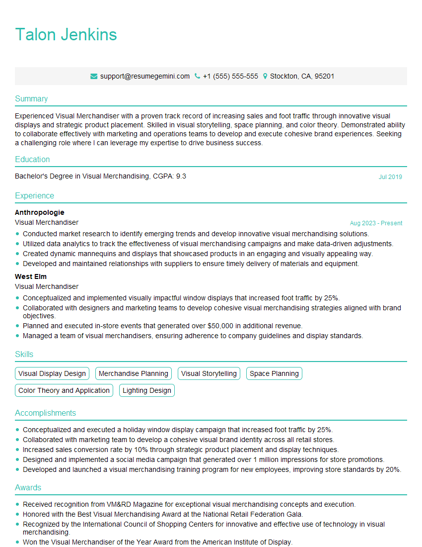
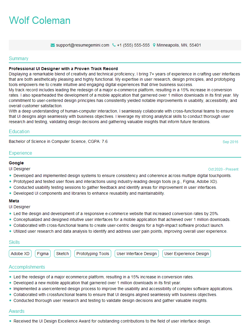
Next Steps
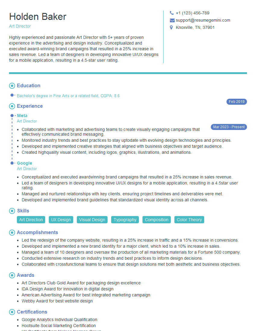
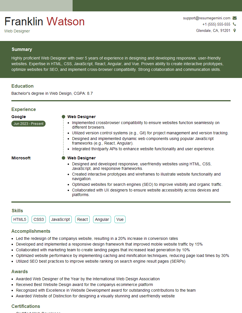
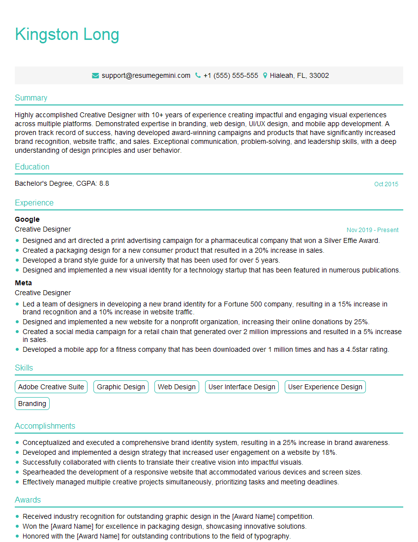
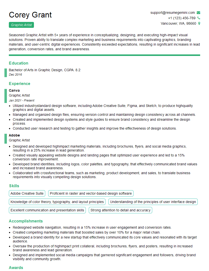
Mastering basic visual design principles is crucial for career advancement in numerous fields, opening doors to exciting opportunities and demonstrating your ability to communicate effectively through visuals. To significantly increase your job prospects, create an ATS-friendly resume that highlights your skills and experience clearly. ResumeGemini is a trusted resource to help you build a professional and impactful resume, ensuring your qualifications stand out. Examples of resumes tailored to showcasing Basic Knowledge of Visual Design are available – leverage these resources to present yourself effectively to potential employers.
Explore more articles
Users Rating of Our Blogs
Share Your Experience
We value your feedback! Please rate our content and share your thoughts (optional).
What Readers Say About Our Blog
Hi, I’m Jay, we have a few potential clients that are interested in your services, thought you might be a good fit. I’d love to talk about the details, when do you have time to talk?
Best,
Jay
Founder | CEO
