Preparation is the key to success in any interview. In this post, we’ll explore crucial Desktop Publishing and Formatting interview questions and equip you with strategies to craft impactful answers. Whether you’re a beginner or a pro, these tips will elevate your preparation.
Questions Asked in Desktop Publishing and Formatting Interview
Q 1. What are the key differences between InDesign, QuarkXPress, and FrameMaker?
InDesign, QuarkXPress, and FrameMaker are all professional desktop publishing (DTP) applications, but they cater to different needs and have distinct strengths. Think of them as specialized tools in a carpenter’s toolbox – each best suited for a particular job.
- InDesign: Adobe InDesign is the industry standard, especially for page layouts requiring complex typography, image integration, and long-form documents like books, magazines, and brochures. Its strengths lie in its robust features for handling text frames, master pages, and its excellent integration with other Adobe Creative Cloud applications like Photoshop and Illustrator.
- QuarkXPress: QuarkXPress was once the dominant player but has lost some ground to InDesign. It still holds a strong position in specific niche markets and is known for its stability and powerful features, particularly for print production workflows. It’s a strong contender for users who value a consistent, reliable platform.
- FrameMaker: FrameMaker shines when dealing with highly technical documents, such as manuals, specifications, and long documents requiring structured content and single-sourcing. Its strengths are in its robust XML support, its ability to handle complex tables, and its features for creating structured documents that are easily updated and repurposed.
In short: InDesign is versatile and widely used; QuarkXPress offers a reliable alternative; and FrameMaker excels in technical documentation.
Q 2. Explain the importance of color profiles and color management in desktop publishing.
Color profiles and color management are crucial for ensuring that colors look consistent across different devices and throughout the printing process. Imagine trying to paint a picture using paints from different manufacturers – the colors might not blend correctly, or look different in different lighting conditions. That’s the problem color management solves.
A color profile is a set of data that describes how a particular device (monitor, printer, scanner) represents color. Each device has its own unique color gamut (the range of colors it can reproduce).
Color management is the process of using color profiles to ensure that colors appear consistently across different devices. It involves converting colors from one color space to another (e.g., from your monitor’s RGB color space to your printer’s CMYK color space) in a controlled manner, minimizing color shifts. Without proper color management, the colors in your final printed piece may look drastically different from what you see on screen.
For example, a vibrant green that looks perfect on your screen might appear dull or muddy when printed if color management isn’t implemented correctly. Using a consistent color profile throughout your workflow (from image editing to printing) is key to achieving accurate and consistent color reproduction.
Q 3. Describe your experience with image editing software (e.g., Photoshop) in a DTP workflow.
My experience with Photoshop within a DTP workflow is extensive. I routinely use it for image retouching, color correction, image resizing, and preparing images for optimal use in InDesign or other DTP software. I’m adept at working with various image formats (TIFF, JPEG, PNG) and understanding their limitations in terms of resolution and compression.
A typical workflow might involve:
- Image retouching: Removing blemishes, adjusting contrast and brightness, sharpening images.
- Color correction: Ensuring color consistency between images and adjusting color balance to match the overall document design.
- Resolution adjustment: Upscaling or downscaling images to appropriate resolutions for print or screen. This involves a keen understanding of DPI (dots per inch) and PPI (pixels per inch) and the impact on image quality.
- File preparation: Saving images in appropriate formats (e.g., high-resolution TIFFs for print, compressed JPEGs for online use) with correct color profiles embedded.
Understanding how Photoshop’s color spaces interact with InDesign’s is critical to avoid color discrepancies. For instance, I ensure my Photoshop images use the same color profile as my InDesign document (often Adobe RGB or sRGB for screen and CMYK for print) to maintain color accuracy.
Q 4. How do you handle large and complex documents efficiently?
Handling large and complex documents efficiently requires a strategic approach. Think of it like building a skyscraper – you wouldn’t start constructing it without a blueprint!
- Modular Design: Breaking down the document into smaller, manageable sections (chapters, modules) allows for easier editing and collaboration. Each section can be worked on independently, reducing the risk of file corruption and improving efficiency.
- Templates and Styles: Consistent use of master pages, paragraph styles, and character styles ensures uniformity and simplifies formatting updates. Changes to a style automatically update all instances throughout the document.
- Version Control: Using version control systems (like Git, though less common in pure DTP workflows) or simply maintaining regular backups prevents data loss and allows for easy reversion to previous versions.
- Package and Links: Properly packaging all linked images and fonts ensures that the document can be opened and used by others without missing elements. Using package or export functions in InDesign are crucial here.
- Optimized File Structure: Keeping the file structure of the project organized allows for quick location of assets and reduces clutter.
By employing these methods, I can significantly reduce the time and effort required to manage and work with extensive documents, avoiding common issues like slow performance and file corruption.
Q 5. What are your preferred methods for creating and managing styles and templates?
Creating and managing styles and templates is fundamental to efficient and consistent DTP work. It’s like having a well-stocked toolbox – each tool perfectly designed for a specific task.
My preferred methods involve:
- Creating master pages: For consistent page numbering, headers, footers, and other recurring elements. This reduces repetitive tasks.
- Defining paragraph and character styles: For consistent font sizes, styles (bold, italic), spacing, and indents. This ensures uniformity across the entire document and makes it easy to make global changes.
- Building templates: Combining master pages and styles into reusable templates for different document types (e.g., newsletters, brochures, reports). This speeds up the creation of new documents by providing a pre-defined structure and style.
- Regularly auditing styles: Checking for redundancy and inconsistencies in styles to maintain organization and efficiency.
- Using InDesign’s style management features: Leverage InDesign’s built-in style management tools for organizing, updating, and modifying styles efficiently.
These practices ensure a streamlined workflow and simplify maintenance of large documents.
Q 6. How do you ensure consistency in fonts, styles, and formatting across a large document?
Consistency in fonts, styles, and formatting across a large document is paramount for a professional look. Inconsistency is distracting and unprofessional. My approach emphasizes proactive measures:
- Style Guides: Developing a clear style guide defining all aspects of formatting (fonts, font sizes, spacing, headings, etc.) ensures everyone involved works from the same set of rules. This is essential for collaborative projects.
- Centralized Style Management: Using InDesign’s built-in style management capabilities or a dedicated style sheet ensures that all style updates are automatically applied throughout the document.
- Regular Style Audits: Periodically reviewing and updating styles ensures that they remain consistent and efficient.
- Pre-flight checks: Utilizing InDesign’s pre-flight feature to detect and correct inconsistencies before final output.
- Templates and Master Pages: Enforcing the use of templates and master pages prevents accidental deviations from the established style guide.
By using these strategies, I ensure a polished and professional final product that adheres to a consistent visual identity.
Q 7. Explain your understanding of bleed, margins, and gutter in page layout.
Understanding bleed, margins, and gutter is essential for professional page layout. They determine the printable area and how elements are positioned on the page. Imagine designing a postcard – you need to account for the edges being trimmed!
- Bleed: The area extending beyond the final trim size of the page. This ensures that images or colors extend to the edge of the page after trimming, preventing unsightly white borders. Typically, a bleed of 3mm is used.
- Margins: The space between the edge of the page and the content. Margins provide white space, improving readability and visual appeal. They should be consistent throughout the document and carefully chosen based on page size and content.
- Gutter: The space between facing pages (e.g., in a book or magazine). The gutter is crucial for ensuring that text and images near the binding aren’t lost or obscured when the pages are bound. The gutter size depends on the type of binding.
Properly setting bleed, margins, and gutter is essential to avoid costly printing errors. For example, neglecting bleed can lead to unsightly white edges on the printed piece; insufficient gutter can lead to text being hidden by the spine.
Q 8. How do you troubleshoot common DTP problems, such as font issues or image corruption?
Troubleshooting font and image issues in DTP is crucial for a successful project. Let’s tackle fonts first. Font issues often stem from missing fonts, font substitution, or font conflicts. If a font is missing, the document will display a placeholder font. The solution is simple: install the correct font on your system and ensure it’s embedded in the document (if creating a PDF for print). Font substitution occurs when the program uses a different font than the one specified; checking the font mapping in your DTP software helps identify and rectify this. Font conflicts happen when multiple versions of the same font are present, leading to inconsistencies. This is solved by removing conflicting fonts or using a font management system.
Image corruption manifests as pixelation, artifacts, or missing parts of an image. The first step is to check the image file itself for corruption. Try opening it in a dedicated image editor. If corrupt, you’ll need the original image. If the original is unavailable, you may need to find a replacement or recreate the image. If the problem lies in how the image is placed in the document, checking its resolution and color mode (CMYK for print) is essential. Low-resolution images will appear blurry, requiring a replacement with a higher-resolution version. Incorrect color modes can lead to color shifts; ensuring CMYK is used for print materials avoids this problem. Lastly, if the image is too large for the software to handle, you might need to reduce its size or optimize it to a smaller file size without losing too much quality.
Q 9. Describe your experience with preflighting and trapping.
Preflighting and trapping are essential pre-press processes that help ensure print quality. Preflighting is a quality control check that analyses your document for potential problems before sending it to print. Think of it as a pre-flight checklist for airplanes – crucial for safety (in this case, for print quality). It checks for missing fonts, links, images with low resolution, color profile issues, and other potential problems. This catches errors early, saving time and costs later. Most DTP software includes preflighting tools. I use them religiously before any significant job.
Trapping, on the other hand, is the process of creating overlaps between colors to prevent tiny gaps or white lines from appearing between them. Imagine two adjacent color blocks: trapping ensures a slight overlap, preventing a thin white line where the colors meet. This is particularly important in offset printing because of the slight inaccuracy in the printing process. This subtle overlap helps to hide these inconsistencies. The goal is to eliminate undesirable white spaces which can appear when printing two close colors, and the trapping method chosen depends on the printing press being used, often automated by the print service provider.
Q 10. What file formats are you proficient in for print production (e.g., PDF, EPS, TIFF)?
My proficiency in file formats for print production is extensive. I’m highly experienced with PDF (Portable Document Format), the industry standard for print submissions because of its excellent cross-platform compatibility and ability to embed fonts and images. EPS (Encapsulated PostScript) is another one I regularly utilize, especially for vector graphics, preserving their quality at any size. TIFF (Tagged Image File Format) is my go-to for high-resolution raster images, often used for photographs. I also have experience with other formats like JPEG (for web images but not ideal for print unless carefully optimized) and PNG (primarily for images with transparent backgrounds).
Choosing the right format is crucial. PDFs are versatile, but for maximum control, EPS is often preferred for vector elements. TIFFs are usually best for raster images, providing the highest print quality. Understanding the strengths and weaknesses of each format allows me to choose the best option for each project and maintain consistency throughout the process.
Q 11. How do you manage revisions and feedback effectively in a DTP project?
Managing revisions and feedback efficiently is key to a smooth DTP workflow. I typically use a version control system, like keeping track of various file versions with clearly labeled file names (e.g., filename_v1.pdf, filename_v2_revisions.pdf). This way, I can always revert to previous versions if needed. For client feedback, I prefer using a collaborative platform that allows for direct annotation on the document itself, such as Adobe Acrobat’s comment and markup tools. This makes it clear what changes are required and where. I ensure that feedback is incorporated into the document systematically, always checking back with the client before finalizing the changes. Clear communication is essential; I maintain detailed records of all revisions and feedback, creating a transparent and accountable workflow.
I’ve found that clearly defined communication channels and regular check-ins with the client minimize misunderstandings. Providing regular updates on progress and addressing queries promptly helps to keep the project on track. This collaborative approach ensures the final product accurately reflects the client’s vision.
Q 12. Explain your process for creating a table of contents and index.
Generating tables of contents (TOCs) and indexes is a common task, but automating it saves considerable time. Most DTP software offers tools to automatically generate TOCs based on the heading styles applied throughout the document. It’s crucial to maintain a consistent heading structure. For example, using ‘Heading 1’, ‘Heading 2’, and ‘Heading 3’ styles for different levels of headings ensures the TOC reflects the document’s hierarchy.
For indexes, while some software can partially automate index creation, a manual review is usually required. I generally use the software’s index functionality to create a preliminary index, but I usually refine it manually to ensure accuracy and completeness. This often involves reviewing the entire document to add missing entries or correct inaccuracies. This two-step approach – automated generation followed by manual refinement – provides a high degree of accuracy and ensures a professional, polished final product.
Q 13. How familiar are you with different types of printing processes (e.g., offset, digital)?
I’m familiar with several printing processes. Offset printing is a high-volume, cost-effective method ideal for large print runs. It involves transferring ink from plates to a rubber blanket and then to the paper. Offset printing produces high-quality results with sharp details and vibrant colors, but it’s less suitable for small runs due to setup costs.
Digital printing, on the other hand, is suitable for both small and large runs, particularly advantageous for short runs or personalized documents. It uses digital imaging technologies to print directly onto the paper. While offering speed and flexibility, the quality can sometimes be slightly lower than offset printing, especially concerning finer details. Other processes like screen printing and large format printing are also part of my knowledge base, but my experience centers around offset and digital printing, given their prevalence in publishing.
Q 14. How do you work with clients to understand their design and formatting requirements?
Understanding client requirements is paramount. I begin by having a detailed initial consultation with the client to fully grasp their vision. I ask about their target audience, brand guidelines, message, and the overall purpose of the document. Visual references, such as examples of designs they like, are incredibly helpful. I ask detailed questions to ensure a thorough understanding of their specifications, such as preferred fonts, color palettes, layout preferences, image requirements, and desired print quality. Throughout the project, I maintain open communication, providing regular updates and actively seeking client feedback to ensure alignment and satisfaction. This collaborative approach allows me to translate their vision into a professional and impactful document.
A successful project relies on effective communication. I create detailed briefs with the client to confirm expectations, outlining timelines, deliverables, and revision processes. These briefs serve as a shared understanding of the project scope, mitigating the risk of misunderstandings.
Q 15. Describe your experience using version control systems for collaborative DTP projects.
Version control systems (VCS) are crucial for collaborative Desktop Publishing (DTP) projects, preventing conflicts and ensuring everyone works with the most up-to-date files. Think of it like Google Docs for design – multiple people can edit simultaneously without overwriting each other’s work. My experience primarily involves using Git, often integrated with platforms like GitHub or Bitbucket. In a typical project, we’d create a repository for all design assets (InDesign files, images, fonts, etc.). Each team member would then clone the repository to their local machine, making their changes and committing them regularly. This creates a history of changes, allowing us to revert to previous versions if necessary and track who made specific edits. Before merging changes into the main branch (the central, shared version), we’d conduct thorough reviews to ensure consistency and quality. For example, one team member might focus on text layout while another handles image placement; Git ensures seamless integration of these independent tasks.
Using branches in Git allows us to work on different features or design iterations simultaneously without impacting the main project. Imagine we’re working on a brochure with three different design concepts. Each concept can reside in its own branch, and once approved, it can be merged into the main branch.
Career Expert Tips:
- Ace those interviews! Prepare effectively by reviewing the Top 50 Most Common Interview Questions on ResumeGemini.
- Navigate your job search with confidence! Explore a wide range of Career Tips on ResumeGemini. Learn about common challenges and recommendations to overcome them.
- Craft the perfect resume! Master the Art of Resume Writing with ResumeGemini’s guide. Showcase your unique qualifications and achievements effectively.
- Don’t miss out on holiday savings! Build your dream resume with ResumeGemini’s ATS optimized templates.
Q 16. How do you ensure accessibility in your DTP work (e.g., for visually impaired users)?
Accessibility is paramount in DTP. For visually impaired users, this means ensuring content is perceivable, operable, understandable, and robust (POUR). In practice, this involves using sufficient color contrast between text and background (checked with tools like WebAIM’s contrast checker), providing alternative text descriptions for images (alt text), using structured headings for improved navigation, creating logical reading order, and using appropriate font sizes and styles to enhance readability. We also need to consider users with cognitive disabilities; this means using clear and concise language, avoiding complex layouts, and providing clear visual cues.
For example, if I’m designing a magazine, I would ensure that all headings are tagged properly in InDesign using the styles panel. This not only makes the document visually organized but also allows screen readers to identify and structure the information effectively. I would use sufficient contrast between text and backgrounds, making text easy to read, especially for those with low vision. I’d also avoid using color alone to convey information, ensuring that meaning is also conveyed through text or other visual elements.
Q 17. What is your experience with imposition and finishing techniques?
Imposition refers to the arrangement of pages in a document to prepare it for printing on larger sheets. Finishing encompasses all post-press processes, like cutting, folding, binding, and lamination. My experience includes using imposition software like Impose and imposition features within Adobe InDesign to create efficient print layouts, minimizing waste and optimizing printing speed. For example, when preparing a booklet, I would use imposition software to arrange pages in a way that they print correctly and fold seamlessly. I’m familiar with various finishing techniques like saddle-stitch binding (for brochures), perfect binding (for books), and wire-o binding (for notebooks), considering the project’s needs and budget. Understanding these techniques is essential to creating a final product that is not only visually appealing but also practical and durable.
In one project, we were creating a large-format calendar. Careful imposition was essential to ensure that the twelve months printed correctly on the large sheet, and then cut and folded to the right dimensions. Understanding the capabilities of the printing press (e.g., sheet size, folding options) significantly impacted the imposition strategy.
Q 18. Explain your understanding of CMYK and RGB color models.
CMYK and RGB are two different color models. RGB (Red, Green, Blue) is an additive color model, used for screens. It combines these three colors of light to create a vast range of colors. Imagine shining a red, green, and blue light on a white wall; by adjusting the intensity of each light, you can create various colors. CMYK (Cyan, Magenta, Yellow, Key – black) is a subtractive color model used for print. It works by subtracting colors from white. Think of it like mixing paints; each color absorbs certain wavelengths of light, leaving others to be reflected. The black (K) component is added to improve contrast and richness.
Understanding the difference is crucial in DTP because an image that looks vibrant on screen (RGB) may appear dull or off-color when printed (CMYK). Therefore, converting images to CMYK before printing is essential, and often involves color management and profile adjustments to ensure accurate color reproduction.
Q 19. How do you optimize images for print to ensure high quality and small file sizes?
Optimizing images for print involves balancing quality and file size. Large image files can slow down processing and increase printing costs. My process starts with choosing the right image format: JPEG is generally suitable for photographic images, while PNG is better for images with sharp lines and text. I use software like Adobe Photoshop or Lightroom to adjust the resolution to the required print resolution (typically 300 DPI). I also compress the images, carefully balancing quality and file size. Over-compression can lead to noticeable artifacts, while under-compression can result in unnecessarily large files. I often use a lossy compression (like JPEG) for photos and lossless compression (like PNG) for graphics containing text or logos.
For example, if I am working with a high-resolution camera image destined for a magazine cover, I would adjust it to 300 DPI at the correct dimensions and save it as a high-quality JPEG, carefully adjusting the compression level to minimize file size without significant quality loss.
Q 20. Describe your experience with creating interactive PDFs.
Creating interactive PDFs involves using features in Adobe Acrobat Pro or similar software. This can include adding hyperlinks (linking to web pages or other sections within the document), bookmarks for easy navigation, interactive form fields for data collection (e.g., surveys, questionnaires), embedded videos or audio, and animations. The specific techniques used depend on the project’s requirements and desired user experience. For example, I might create an interactive e-book with hyperlinked chapters, embedded videos showcasing products, and clickable annotations to enhance engagement.
In a recent project, we produced an interactive company brochure. Using Acrobat Pro, we embedded a 360° product viewer, allowing the user to explore the product from all angles. We also added hyperlinks to the company website and social media pages.
Q 21. What is your process for preparing files for print production?
Preparing files for print production is a critical step. It ensures a smooth printing process and avoids costly mistakes. My process begins with verifying the document’s settings, making sure it uses the correct CMYK color profile, ensuring fonts are embedded or outlined, and checking the resolution of all images. I then create a print-ready PDF, often using the ‘PDF/X-1a’ standard, which ensures compatibility with most printers. This PDF includes all necessary fonts and images, and is optimized for high-quality printing. Finally, I conduct a thorough preflight check, using tools within Adobe Acrobat or dedicated preflight software to identify any potential issues (like missing fonts, low-resolution images, or color profile mismatches) before sending the files to the printer.
Thorough preflighting saves time and money. In the past, a missing font led to a costly reprint, emphasizing the importance of this step. A preflight checklist ensures all elements are in place before the final submission.
Q 22. What software are you proficient in for creating and editing vector graphics?
For creating and editing vector graphics, I’m highly proficient in Adobe Illustrator and Affinity Designer. Both offer robust tools for precise illustration, logo design, and creating scalable artwork. Illustrator, being the industry standard, provides a wider range of features and plugins, while Affinity Designer offers a more streamlined and often more affordable alternative. My experience encompasses everything from creating simple icons to complex multi-layered illustrations. For example, I recently used Illustrator to design a complex corporate logo that required intricate details and precise scaling for various applications, from business cards to billboards. In another project, I leveraged Affinity Designer’s speed and ease of use to create a series of infographics for a client with a tight deadline.
I also have experience with Inkscape, a free and open-source vector graphics editor, useful for projects where cost is a primary concern. Understanding the strengths and weaknesses of each program allows me to choose the optimal tool for any given project.
Q 23. How do you manage deadlines and prioritize tasks in a high-pressure environment?
Managing deadlines and prioritizing tasks in high-pressure environments requires a structured approach. I typically utilize project management techniques like creating detailed Gantt charts or using project management software such as Asana or Trello to visualize tasks, dependencies, and deadlines. This allows me to break down large projects into smaller, manageable chunks. I prioritize tasks based on urgency and importance using methods like the Eisenhower Matrix (urgent/important), ensuring that critical tasks are addressed first.
Effective communication is also key; I proactively communicate with clients and stakeholders to manage expectations, highlight potential roadblocks, and adjust timelines as needed. My ability to remain calm and focused under pressure helps me efficiently navigate unexpected challenges and deliver high-quality work on time.
Q 24. Describe your experience with creating and managing templates for different document types.
My experience with creating and managing templates is extensive. I’ve developed templates for various document types, including brochures, business cards, newsletters, reports, and presentations, utilizing both Adobe InDesign and Microsoft Publisher. The process involves understanding the client’s branding guidelines, identifying consistent design elements, and creating master pages with pre-defined styles, text boxes, and image placeholders. This ensures consistency and efficiency across multiple documents. For instance, I created a master template for a company newsletter which allowed me to quickly populate it with new content each month, maintaining a consistent look and feel.
I also consider accessibility when designing templates. Ensuring appropriate font sizes, color contrasts, and alt text for images are crucial for inclusivity. Properly structured templates, with the use of styles and paragraph styles, makes future editing and updates far simpler and less error-prone.
Q 25. How familiar are you with different types of paper and their properties?
My understanding of paper types and their properties is crucial to successful print production. I’m familiar with various paper weights (measured in gsm – grams per square meter), finishes (coated, uncoated, matte, gloss), textures (smooth, textured), and colors. Knowing the differences between these properties is vital for selecting the appropriate paper for a specific print job. For example, a glossy paper might be suitable for high-impact images in a brochure, while a heavier uncoated stock might be better for a business card that needs to be durable. I consider factors such as the intended use of the printed material, the desired aesthetic, and the printing method when making these selections.
I’m also aware of the environmental implications of different paper choices and can advise clients on sustainable options, such as recycled or FSC-certified papers.
Q 26. Explain your understanding of the printing process from design to finished product.
The printing process, from design to finished product, involves several key stages. It starts with the design phase, where I create the document using DTP software like InDesign. This involves careful consideration of color profiles (CMYK for print), image resolution, and bleed (extra space beyond the trim). Next, I prepare the files for output, ensuring they are in the correct format (usually PDF/X-1a) and resolution for the printing method.
The pre-press stage involves sending the files to a commercial printer or print service. They will check for errors, perform color separations (if necessary), and create printing plates. The printing process itself varies based on the method (offset printing, digital printing, etc.). Finally, finishing processes such as cutting, binding, and folding complete the product. Throughout this process, communication with the printer is essential to ensure that the final product meets the client’s expectations.
Q 27. How do you adapt to new software or technologies in the field of desktop publishing?
Adapting to new software and technologies is a continuous process in the DTP field. I actively seek out opportunities for professional development, such as attending workshops, online courses, and industry conferences. I also stay updated on the latest industry news and software releases through publications and online resources. When encountering new software, I typically start by exploring the tutorials and documentation provided by the software vendor. Then, I engage in hands-on practice, experimenting with different features and functionalities. I find that working on small, personal projects is an effective way to learn and consolidate new skills.
For example, when Adobe introduced new features in InDesign, I proactively explored the updates through online tutorials and practiced using them in my personal projects before integrating them into client work. This proactive approach ensures I remain at the forefront of industry best practices.
Q 28. Describe a challenging DTP project you worked on and how you overcame the challenges.
One challenging project involved designing a multi-lingual, 200-page coffee table book with numerous high-resolution images and complex layouts. The challenge stemmed from managing the different language versions, ensuring consistent formatting and typography across all languages, and optimizing the image quality for print without significantly increasing the file size.
To overcome these challenges, I used InDesign’s master pages and styles extensively to maintain consistency across all pages and languages. I employed a structured folder system to manage the diverse assets, and utilized image optimization techniques to balance quality and file size. Regular communication with the client throughout the process ensured that potential issues were identified and addressed early on. Successful completion of this project demonstrated my ability to manage complex projects efficiently and deliver high-quality results under pressure.
Key Topics to Learn for Desktop Publishing and Formatting Interview
- Typography and Font Selection: Understanding kerning, leading, tracking, and choosing appropriate fonts for different projects and audiences. Practical application: Demonstrate your ability to select fonts that enhance readability and project the desired tone for various documents (brochures, reports, etc.).
- Layout and Design Principles: Mastering grids, whitespace utilization, visual hierarchy, and balance in page composition. Practical application: Explain how you would design a multi-page document ensuring visual appeal and easy navigation.
- Image Editing and Manipulation: Familiarize yourself with image resolution, compression techniques, and effective image placement within layouts. Practical application: Describe your workflow for optimizing images for print or digital publishing without sacrificing quality.
- Software Proficiency: Demonstrate in-depth knowledge of industry-standard software such as Adobe InDesign, QuarkXPress, or other relevant tools. Practical application: Be prepared to discuss your experience with specific features and workflows within your preferred software.
- Pre-press and Print Production: Understanding color profiles (CMYK, RGB), bleed, margins, and the print production process. Practical application: Explain how you would prepare a document for optimal print quality and avoid common pre-press issues.
- Accessibility and Inclusivity: Understanding and implementing accessibility best practices for visually impaired users. Practical application: Describe your approach to creating accessible documents using appropriate techniques.
- Workflow and Project Management: Explain your approach to managing projects, deadlines, and client communication. Practical application: Describe a past project and highlight your role in ensuring timely completion and client satisfaction.
Next Steps
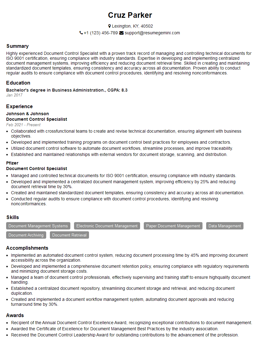
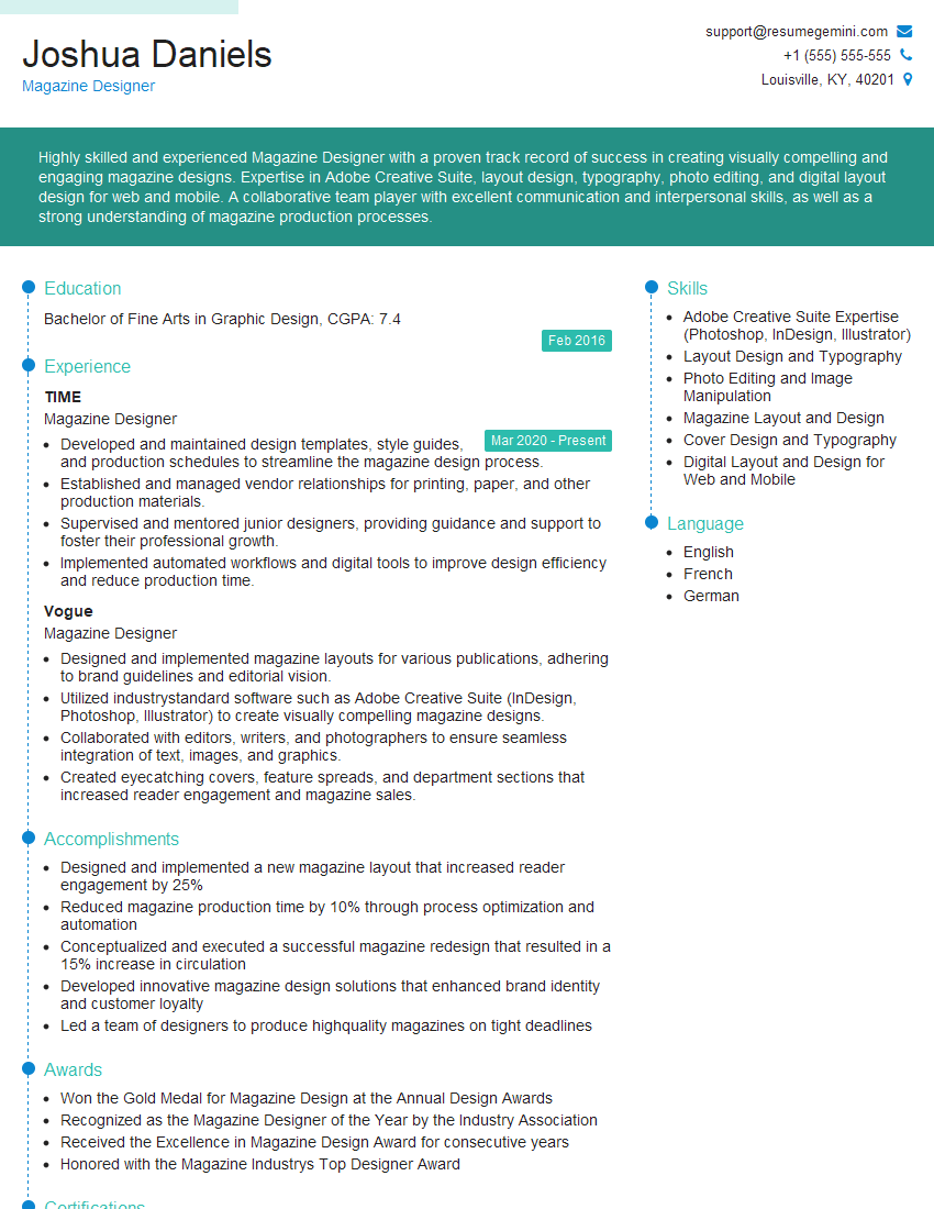
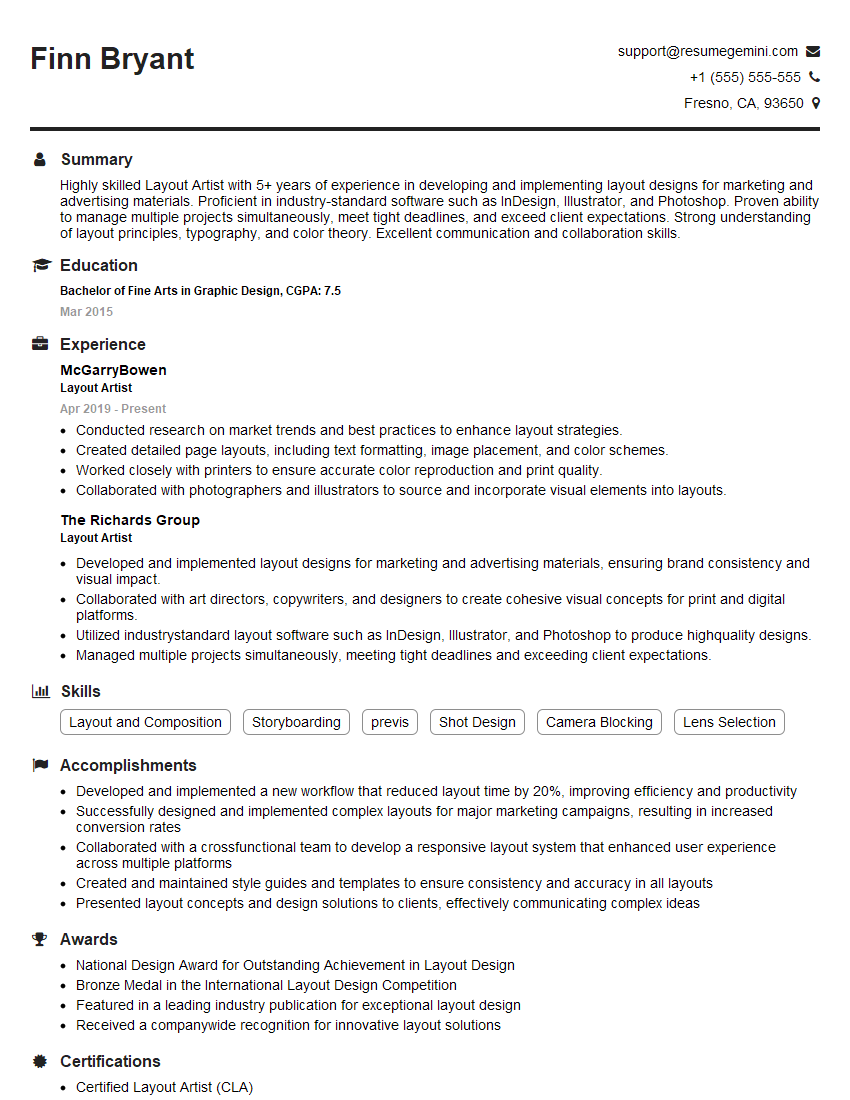
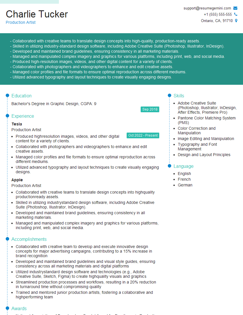
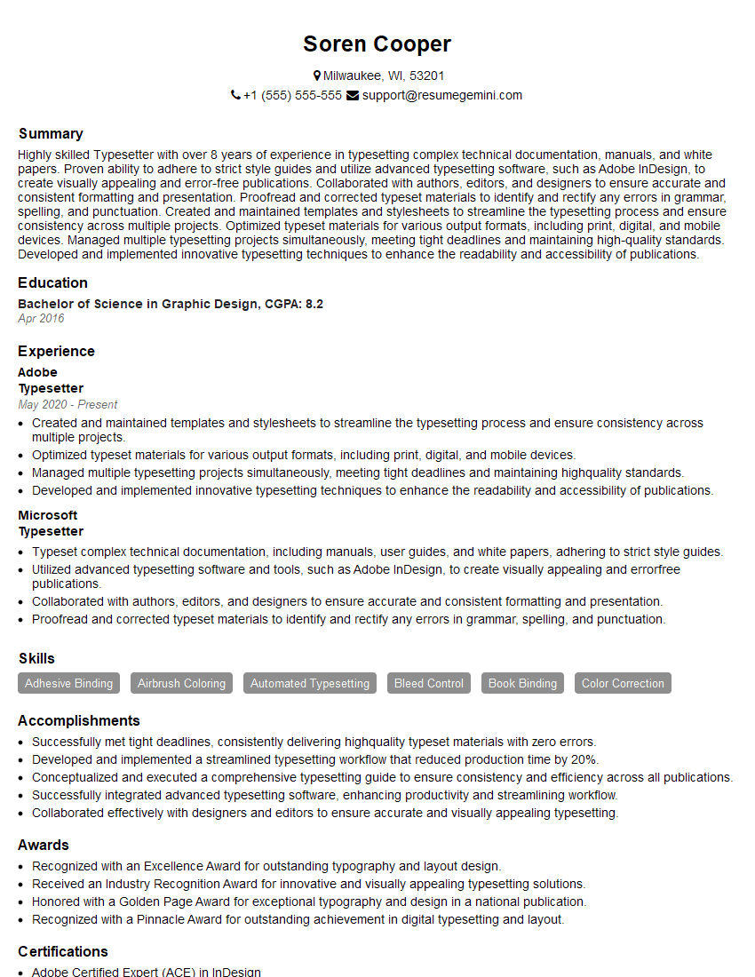
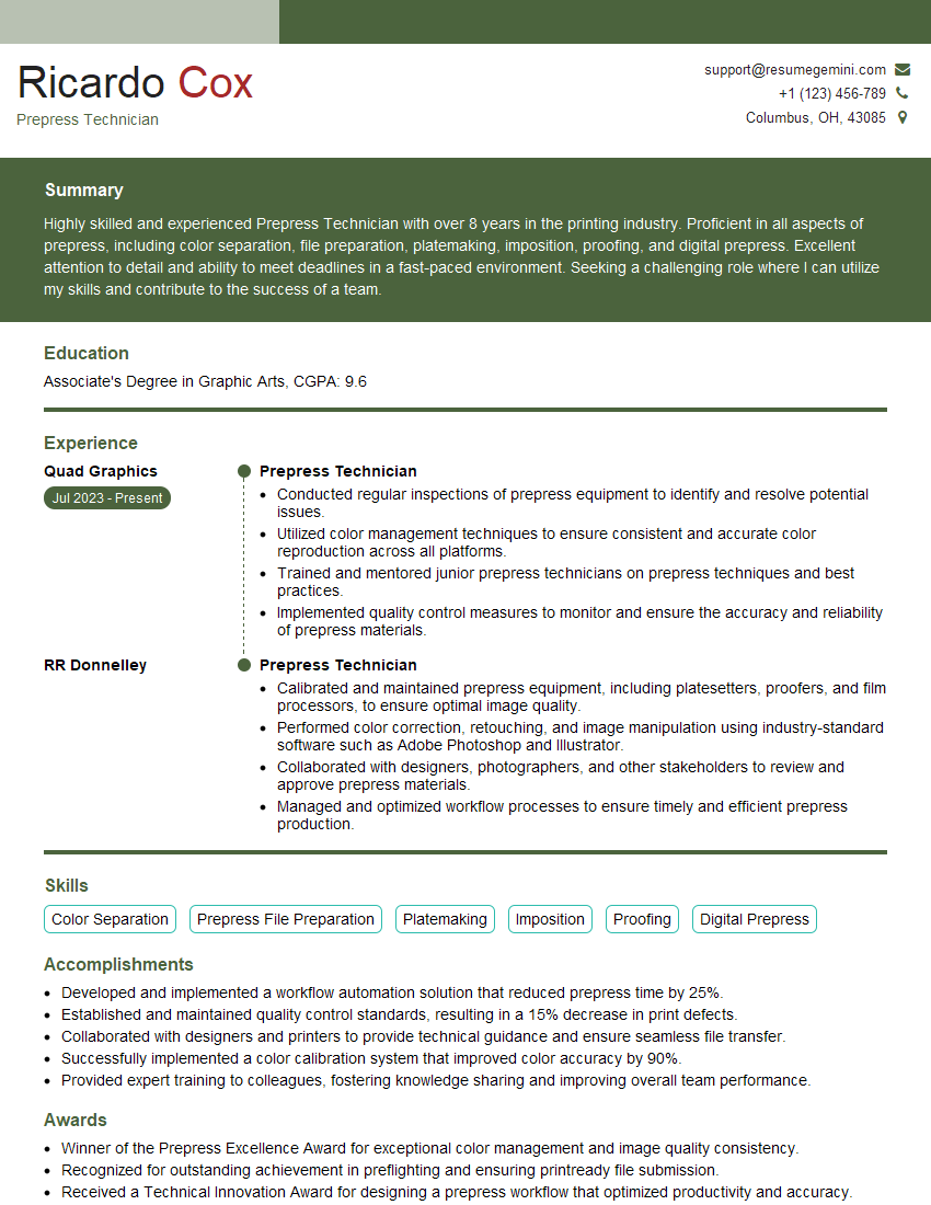
Mastering Desktop Publishing and Formatting opens doors to exciting careers in design, publishing, and marketing. A strong understanding of these skills is highly valued by employers. To significantly increase your job prospects, create an ATS-friendly resume that showcases your expertise effectively. ResumeGemini is a trusted resource to help you build a professional resume that highlights your accomplishments. Examples of resumes tailored to Desktop Publishing and Formatting are available to help guide you.
Explore more articles
Users Rating of Our Blogs
Share Your Experience
We value your feedback! Please rate our content and share your thoughts (optional).
What Readers Say About Our Blog
I Redesigned Spongebob Squarepants and his main characters of my artwork.
https://www.deviantart.com/reimaginesponge/art/Redesigned-Spongebob-characters-1223583608
IT gave me an insight and words to use and be able to think of examples
Hi, I’m Jay, we have a few potential clients that are interested in your services, thought you might be a good fit. I’d love to talk about the details, when do you have time to talk?
Best,
Jay
Founder | CEO
