Interviews are opportunities to demonstrate your expertise, and this guide is here to help you shine. Explore the essential InDesign and Photoshop Proficiency interview questions that employers frequently ask, paired with strategies for crafting responses that set you apart from the competition.
Questions Asked in InDesign and Photoshop Proficiency Interview
Q 1. Explain the difference between InDesign’s Master Pages and regular pages.
Think of InDesign’s Master Pages as templates for your document. They’re like the foundation upon which all your other pages are built. Any elements placed on a Master Page, such as page numbers, headers, footers, or running text, will automatically appear on all pages linked to that Master Page. Regular pages, on the other hand, are the individual pages where you place your main content. Changes to the Master Page will automatically update across all linked pages, making it incredibly efficient to maintain consistency across a large document like a brochure or book. For example, if you need to change the font of your header, you only need to edit it once on the Master Page, and it’s updated everywhere. Conversely, content added to a regular page is specific to that page only and won’t affect the Master Page or other pages.
Q 2. How do you create and manage styles in InDesign?
Creating and managing styles in InDesign is crucial for maintaining consistency and efficiency. Paragraph styles control the formatting of text blocks (font, size, spacing, etc.), while character styles control the formatting of individual characters or selections within a text block (e.g., bold, italic, color). To create a style, you go to the Styles panel (Window > Styles). You can then click the ‘New Style’ button, define its attributes, and give it a descriptive name. You can nest styles (a character style within a paragraph style), making it easy to reuse and update stylistic elements across your document. For instance, if you establish a ‘Body Text’ paragraph style and a ‘Heading 1’ paragraph style, changing the font in either will automatically propagate the change to all instances of that style. Managing styles efficiently makes large-scale edits very easy. For instance, say you need to change the font of all headings across 100 pages – you do it once in the style definition, and it updates everywhere!
Q 3. Describe your experience with InDesign’s text wrap features.
InDesign’s text wrap features allow you to precisely control how text flows around images or other objects. There are several options: you can wrap text tightly around an object, have it wrap only on one side (like a caption), or create a custom wrap by drawing a path for the text to follow. Imagine you’re designing a magazine layout. You’ve got a stunning photograph, and you want the text to gracefully flow around it. You’d select the image, then choose the text wrap option in the Properties panel or the contextual menu, setting the desired wrap style. Mastering text wrap is essential for creating visually appealing and balanced layouts. I often find myself using the ‘Jump Object’ feature when dealing with complex text flow situations, allowing me to control how text avoids specific areas.
Q 4. How do you handle color management in InDesign?
Color management in InDesign is essential for ensuring consistent color reproduction across different devices and output methods. I always begin by setting the correct color profile in the document setup (Edit > Color Settings). This ensures accurate color representation throughout the design process. Working with CMYK is often essential for print, while RGB is more suitable for screens. Using ‘Proof Colors’ (View > Proof Setup) allows me to preview how the colors will appear in the final output, helping to avoid unexpected surprises during printing. Properly defining your color spaces and using color swatches consistently significantly minimizes discrepancies in the final printed product and prevents costly reprint scenarios.
Q 5. What are your preferred methods for creating and exporting PDFs in InDesign?
My preferred method for creating and exporting PDFs in InDesign involves using the ‘Export as Adobe PDF (Interactive)’ option. This allows me to control settings like compression, image resolution, and PDF security. For example, when preparing a print-ready PDF, I typically select a high-quality preset, ensuring high-resolution images, minimal compression, and embedding all necessary fonts. For online distribution, I might use a smaller PDF size to speed up downloads, choosing a different export preset with optimized compression. The ‘Export’ dialog provides options for creating accessible PDFs (including tagging and metadata), and I always make sure to include these elements for wider usability. Before final export, I always do a thorough preflight check to ensure that the PDF is print-ready and that there are no missing fonts or images.
Q 6. Explain the difference between raster and vector graphics.
Raster graphics are made up of pixels, like a digital photograph. They lose quality if you enlarge them too much, often resulting in pixilation. Vector graphics, on the other hand, are made up of mathematical paths. They are resolution-independent, meaning you can scale them up or down without loss of quality. Think of a logo: it should look sharp at any size, which is a great use case for a vector graphic format such as SVG or AI. In contrast, a detailed photographic image would be better as a raster graphic like a JPG or TIFF. Knowing which format is appropriate for your design element is key for achieving desired results and optimizing file sizes.
Q 7. How do you adjust image resolution in Photoshop without losing quality?
You can’t actually increase the resolution of an image without losing *some* quality; you can only decrease it without loss. However, you can *re-sample* an image to a lower resolution while maintaining acceptable visual quality using Photoshop’s image resizing feature. Go to Image > Image Size. Here, you can change the resolution (ppi) and dimensions (pixels). When downsampling, Photoshop uses algorithms that try to intelligently reduce the number of pixels while minimizing detail loss. There is always some information lost, but Photoshop’s algorithms attempt to preserve as much quality as possible. Always work with the highest resolution you reasonably can throughout your workflow, only downsampling at the final stages and only to the size and resolution needed for the intended output. Upsampling will always result in some image artifacts, so that should be avoided if possible. Using the ‘Bicubic Sharper’ or ‘Bicubic Smoother’ resampling methods usually provides the best results for downsampling, depending on the image.
Q 8. Describe your experience with Photoshop’s layer styles.
Photoshop’s layer styles are a powerful non-destructive way to add effects to layers without permanently altering the original image data. Think of them as customizable presets for common effects. They’re incredibly versatile and time-saving. You can apply a range of styles, from simple shadows and glows to complex bevels and embossing, all within a single click.
- Drop Shadow: Creates a realistic shadow effect behind the layer, making it appear to stand out from the background. I often use this for text or logo designs to give them depth.
- Inner Shadow: Adds a shadow *inside* the layer, useful for creating an inset effect or giving the impression of depth within a shape.
- Outer Glow: Adds a soft glow around the layer’s edges. Great for creating highlights or emphasizing elements.
- Inner Glow: Similar to Outer Glow, but the glow appears inside the layer’s edges, often giving a more subtle highlight.
- Bevel and Emboss: Simulates a three-dimensional effect by adding highlights and shadows to the layer, ideal for creating realistic button designs or textured effects.
- Satin: Adds a smooth, satiny highlight or shadow to a layer.
- Color Overlay: Adds a solid color to the layer. Useful for changing the overall color of an object without affecting underlying layers.
- Gradient Overlay: Similar to Color Overlay but uses a gradient instead of a solid color, offering a smoother transition of colors. I use this to create more realistic lighting effects on objects.
For example, if I’m designing a website banner, I might use a drop shadow on the headline text to make it pop, and a gradient overlay on a button to add a subtle, professional touch.
Q 9. Explain the use of adjustment layers in Photoshop.
Adjustment layers are non-destructive editing tools in Photoshop that allow you to modify the color and tone of an image without directly affecting the pixel data of the underlying layers. This is crucial for maintaining flexibility and the ability to easily make changes later. They act like filters, but instead of permanently altering the image, they sit above the image layers, allowing you to adjust the effect at any point in time. Think of it as putting a colored cellophane sheet on top of your artwork; you can change the sheet’s color or remove it entirely without affecting the artwork beneath.
- Brightness/Contrast: Adjusts the overall brightness and contrast of the image.
- Levels: Provides precise control over the tonal range of an image, enhancing highlights, shadows, and midtones.
- Curves: Offers a more advanced way to adjust the tonal range, giving you more flexibility to fine-tune the image’s look.
- Hue/Saturation: Modifies the hue, saturation, and lightness of the image or specific color ranges.
- Color Balance: Adjusts the balance of colors in the image.
A practical example: I once had to adjust the color temperature of a product photograph to maintain consistency across a series of images. Using a color balance adjustment layer allowed me to quickly and non-destructively correct the color without affecting the original image, making future edits much easier.
Q 10. How do you effectively use masks in Photoshop?
Masks in Photoshop are incredibly powerful tools that allow you to selectively reveal or conceal portions of a layer. Think of them as stencils, where you can paint to show parts of the layer and erase to hide parts. They’re non-destructive, meaning you can always go back and make changes without ruining your original image.
- Layer Masks: These allow you to selectively hide portions of a layer without deleting pixels. You paint with black to hide and with white to reveal.
- Vector Masks: These masks use vector shapes to precisely hide and reveal parts of a layer. They’re perfect for sharp, clean selections. I frequently use them when working with logos or text.
- Clipping Masks: These masks clip a layer to the shape of the layer below it. This is useful for easily adding effects to specific areas of an image, such as adding a texture to a specific object.
Example: If I needed to remove a person from a background, I’d use a layer mask to carefully paint over the background, leaving the person visible. If I needed to add a shadow only under a specific object, I’d use a clipping mask. This ensures a precise and clean edit.
Q 11. What are your preferred methods for retouching images in Photoshop?
My retouching workflow often involves a combination of techniques depending on the image and desired outcome. I prioritize non-destructive editing whenever possible.
- Spot Healing Brush Tool: For removing small blemishes or imperfections.
- Clone Stamp Tool: For replacing damaged areas with similar textures from another part of the image.
- Patch Tool: For removing larger imperfections by sampling a source area and blending it seamlessly into the target area.
- Frequency Separation: For separating the texture and color information of an image, allowing for independent adjustment and detailed retouching. This is especially useful for advanced skin retouching.
- Dodge and Burn Tools: For subtly adjusting the brightness and darkness of specific areas to enhance details or create a more artistic look.
For instance, while retouching a portrait, I might use the spot healing brush for minor blemishes, the clone stamp tool for more extensive areas, and frequency separation for a refined, natural look to the skin. The approach is always tailored to the specific image.
Q 12. How do you work with different color modes (RGB, CMYK) in Photoshop?
Understanding and managing color modes (RGB and CMYK) is critical for effective image editing. RGB (Red, Green, Blue) is used for images displayed on screens, while CMYK (Cyan, Magenta, Yellow, Key/Black) is the color model used for printing. The key is knowing when to use which.
- RGB: Best for web graphics, digital displays, and any work intended for screen viewing. It offers a wider color gamut than CMYK.
- CMYK: Essential for print projects. Converting an RGB image to CMYK before printing helps predict how the colors will reproduce on press, although some color shifting is inevitable.
I usually work in RGB for most of my projects, converting to CMYK only when preparing the final files for print. This prevents losing color information during the conversion process. I also carefully proof my CMYK images to check for any significant color shifts and make adjustments as necessary.
Q 13. How do you optimize images for web use in Photoshop?
Optimizing images for web use involves reducing file size without sacrificing too much quality. This improves page load times and provides a better user experience.
- Save for Web (Legacy): This feature in Photoshop allows you to choose various file formats (JPEG, PNG, GIF) and compression settings to balance image quality and file size. I usually select JPEG for photographs and PNG for images with sharp lines and text. I’ll often experiment with different compression levels to find the optimal balance. The higher the compression, the smaller the file size, but also the more likely you will have noticeable artifacts.
- File Size Reduction: Reducing the resolution of images for the web is crucial. Images intended for web use rarely need high resolutions like those used for print.
- Compression Settings: Understanding the tradeoff between image quality and file size is crucial. The right compression level depends on the detail in your image. A photograph will usually allow for more compression than an image with sharp edges.
For instance, when preparing images for a website, I always reduce the resolution to web-friendly dimensions (around 72 DPI) and use ‘Save for Web’ to optimize the file size and format. I’ll closely monitor the file size and image quality to ensure the best results.
Q 14. Describe your process for creating a print-ready design in InDesign.
Creating a print-ready design in InDesign involves a meticulous process to ensure accurate color reproduction and optimal printing results.
- Setting Up the Document: I begin by creating a document with the correct dimensions, bleeds (extra space beyond the trim line), and resolution (typically 300 DPI) specified by the printer.
- Color Mode: I use CMYK throughout the design process to prevent color shifts during printing. I will always make sure any images or vector art brought into the project are already in CMYK mode.
- Fonts: I always outline or embed fonts to ensure consistency across different systems.
- Images: I ensure all images are high-resolution (300 DPI), properly sized, and color-managed to avoid any issues during printing.
- Bleeds: I extend design elements beyond the trim area to compensate for potential shifts during trimming.
- Proofing: Before exporting, I thoroughly check for any errors, such as incorrect font sizes, misplaced elements, and inconsistencies in color or layout.
- Exporting: I export the file as a PDF/X-1a or PDF/X-4 compliant file, which is the industry standard for print-ready files. This ensures proper color profile management and prevents complications at the print shop.
An example: When designing a brochure, I would meticulously check for bleed marks, ensuring that background images extended beyond the trim lines to prevent white margins after printing. Using PDF/X-1a ensures that the print shop has all the information it needs to correctly print the job without any issues.
Q 15. How do you troubleshoot common InDesign issues, such as font problems or slow performance?
Troubleshooting InDesign issues like font problems or slow performance requires a systematic approach. Let’s start with font issues. Often, a missing font is the culprit. InDesign will display a placeholder if it can’t find the font specified. To fix this, you need to locate the correct font file on your system and ensure it’s properly installed. Sometimes, font conflicts arise – two fonts with the same name but different file paths. InDesign’s Font Book (or your system’s font manager) helps identify and resolve these conflicts.
For slow performance, the first step is to check your InDesign preferences. Excessive memory usage, particularly with large, high-resolution images, can significantly slow things down. Reducing image resolution or converting images to a smaller file format (like JPEG instead of TIFF) can dramatically improve speed. You should also check your history states (Edit > Undo), clearing unnecessary steps, and consider turning off features like automatic spell check or hyphenation if you don’t need them. A restart often helps clear out cached data as well. In extreme cases, reinstalling InDesign might be necessary, but always back up your files first! If the problem persists after these steps, consider checking the health of your hard drive and increasing available RAM.
Career Expert Tips:
- Ace those interviews! Prepare effectively by reviewing the Top 50 Most Common Interview Questions on ResumeGemini.
- Navigate your job search with confidence! Explore a wide range of Career Tips on ResumeGemini. Learn about common challenges and recommendations to overcome them.
- Craft the perfect resume! Master the Art of Resume Writing with ResumeGemini’s guide. Showcase your unique qualifications and achievements effectively.
- Don’t miss out on holiday savings! Build your dream resume with ResumeGemini’s ATS optimized templates.
Q 16. How do you handle image placement and linking in InDesign?
Image placement and linking in InDesign are crucial for efficient workflow and file management. Linking is always preferred over embedding. Embedding images increases the file size significantly, making the InDesign file unwieldy and slower to load. Linking creates a connection between your InDesign document and the original image file. InDesign only stores a reference to the image, keeping the file size smaller. When you place an image, InDesign prompts you to either embed it or link it. Linking is done by selecting ‘Place’ (File > Place) and navigating to your image file. Once placed, you can easily resize and reposition it within your document.
Managing linked images is key. If you move or rename a linked image outside of InDesign, you’ll get a missing link error. InDesign provides a way to relink to find the image again, this should be done via the ‘Links’ panel (Window > Links). Regularly checking this panel is good practice, ensuring all images are accurately linked. Using a consistent file naming convention and storing linked images in a well-organized folder structure greatly simplifies the linking process and minimizes risk. Think of it like creating a well-organized library for your project – easy to find and manage!
Q 17. Explain your understanding of bleeds and margins in print design.
Bleeds and margins are essential aspects of print design that ensure your design looks exactly as intended when printed. Bleeds are the extra area of your design that extends beyond the trim line. It’s important for preventing unsightly white borders around the edges of your printed piece, particularly when dealing with images or colors that extend to the very edge. Typically, bleeds should extend 1/8 inch (3mm) beyond the final trim size.
Margins, on the other hand, are the safe area within the bleed where your crucial design elements should reside. These ensure important text and graphics don’t get accidentally trimmed off. Establishing appropriate margins is critical for readability and visual appeal. Margins are often dictated by the printing specifications but typically range from 0.25 inches to 0.5 inches. When preparing a document for print, both bleeds and margins should be meticulously considered and set correctly within InDesign’s page setup options (File > Document Setup). Imagine it like framing a photograph – the bleed is the matting, and the margin is where the actual photograph sits inside that mat.
Q 18. Describe your experience with creating and using templates in InDesign.
Templates are the backbone of efficient InDesign workflow, particularly when creating multiple documents with similar layouts. They allow for consistent branding and efficient design. Creating a template involves setting up master pages with your desired styles, colors, and placeholders for text and images. Once created, you can save it as an InDesign template (.indt) file. Subsequent documents created from this template will inherit the pre-defined styles and layouts, saving valuable time and effort. For example, a marketing team might create a template for a monthly newsletter, ensuring consistent design across all issues.
Using templates saves time, which is beneficial when working on multiple projects with similar needs, and also guarantees a consistent brand identity. You can create various templates for different purposes – brochures, posters, business cards, etc. – creating a central library of templates streamlines your production. Think of it as a pre-built house framework: you only need to add the unique features within a consistent structure.
Q 19. How familiar are you with InDesign’s scripting capabilities?
I have intermediate experience with InDesign’s scripting capabilities, primarily using Javascript. I understand that scripting allows for automation of repetitive tasks and customization of functionalities. I’ve used scripts to automate tasks like generating page numbers, inserting images based on a file list, and creating customized reports. While I haven’t developed extensive custom scripts from scratch, I am comfortable adapting and modifying existing scripts to meet specific project needs. The ability to script helps to optimize efficiency significantly in projects with high volumes and repetitive work. It’s a powerful tool for streamlining processes and avoiding manual interventions.
For example, I once used a script to automate the creation of hundreds of product brochures, each needing a different product image and text, instead of manually placing them one by one. My knowledge here is continually growing; I am always looking to learn more advanced scripting techniques to improve my efficiency further.
Q 20. How do you use Photoshop’s healing tools?
Photoshop’s healing tools are invaluable for retouching images, removing blemishes, or seamlessly blending elements. The Spot Healing Brush Tool is excellent for quickly removing small imperfections like dust spots or blemishes. It automatically samples surrounding pixels to seamlessly fill in the selected area. The Healing Brush Tool offers more control, allowing you to select a source point to sample pixels from, which is useful for blending textures or larger imperfections. The Patch Tool lets you select an area to be healed and then drag it to a source area to use as a replacement.
Choosing the right tool depends on the complexity of the imperfection. For small, isolated flaws, the Spot Healing Brush is quick and efficient. For more significant or complex retouching, the Healing Brush or Patch Tool provides the necessary control for natural-looking results. The key is to use these tools with a light touch and blend seamlessly with the surrounding areas. It’s like using a digital airbrush to subtly correct imperfections without making it obvious.
Q 21. What is your experience with Photoshop actions and automation?
I have considerable experience with Photoshop actions and automation. Actions are recorded sequences of steps that can be replayed, automating repetitive editing tasks. This is extremely valuable for batch processing or applying consistent edits across multiple images. I’ve created actions for tasks like resizing and sharpening images, applying color corrections, and adding watermarks. This is especially beneficial for streamlining tasks like bulk image preparation for websites or print.
Beyond basic actions, I also understand the potential for more advanced automation using scripts or plugins. Although I haven’t developed complex custom plugins, I’m familiar with their functionality and appreciate the potential for creating highly customized workflows. For example, I have an action that automatically resizes a batch of images for web usage, ensuring consistent dimensions and file sizes. It saves me a substantial amount of time, particularly when working with a large number of photographs.
Q 22. Describe your workflow for creating a complex multi-page layout in InDesign.
Creating a complex multi-page layout in InDesign involves a structured workflow prioritizing planning and efficiency. I begin with meticulous planning, outlining the document’s structure, page numbers, and content hierarchy. This often involves creating a style guide detailing fonts, colors, and spacing for consistency.
Next, I create master pages to establish consistent elements like headers, footers, and page numbers across all pages. This saves significant time and ensures uniformity. Then, I import high-resolution images and graphics, carefully placed and sized to maintain visual balance. I use InDesign’s powerful text and object styling capabilities to maintain consistency throughout. For example, I define paragraph styles for body text, headings, and captions, ensuring readability and a professional look.
Throughout the process, I frequently utilize InDesign’s features like the Pages panel for easy navigation and management, and the Layers panel to organize elements and avoid visual clutter. For complex layouts, I often break down the project into smaller, manageable sections, focusing on completing one section before moving on. Regular saves and version control are critical, especially in collaborative projects. Finally, a thorough proofread and quality check are essential before finalizing the document.
For instance, while designing a multi-page brochure for a client, I first created a comprehensive style guide to maintain consistency in branding elements such as logo placement, font usage, and color palettes. Then, I meticulously designed master pages to ensure uniformity across all pages, only making necessary alterations on individual pages as needed. This saved a lot of time and effort, enabling me to efficiently complete the project within the stipulated deadline.
Q 23. How familiar are you with the different file formats used in graphic design (e.g., AI, PSD, EPS, TIFF)?
I’m very familiar with various file formats commonly used in graphic design. Each format has its strengths and weaknesses, making them suitable for different tasks.
- AI (Adobe Illustrator): Vector-based format, ideal for logos, illustrations, and scalable graphics that maintain their quality at any size.
- PSD (Adobe Photoshop): Raster-based format, excellent for photo editing and manipulation, offering layer support for non-destructive editing.
- EPS (Encapsulated PostScript): Vector-based, often used for high-quality illustrations and printing, ensuring compatibility across different applications.
- TIFF (Tagged Image File Format): Raster-based format, suitable for high-resolution images, often used in print production because of its lossless compression options and color space management capabilities.
Understanding the nuances of these formats is vital for maintaining image quality and ensuring compatibility throughout the design process. For example, I’d use AI files for logos, PSD for image editing, and TIFF for high-resolution print-ready images.
Q 24. How do you ensure design consistency across multiple documents?
Maintaining design consistency across multiple documents requires a structured approach. The most effective method is to establish a comprehensive style guide early in the process. This guide acts as a central repository for all design elements, including fonts, colors, spacing, and logo usage.
I utilize InDesign’s Styles and Master Pages extensively to ensure consistent application of these defined elements across all documents. For instance, creating a single paragraph style for body text means any changes made to that style will automatically update across all pages and documents using it. Using pre-defined swatches ensures consistent colors. Similarly, using Master Pages helps maintain consistent headers, footers, and page numbering.
For collaborative projects, I use cloud storage for sharing the style guide and ensuring everyone follows the same guidelines. This consistent methodology prevents visual inconsistencies and ensures brand continuity across all design materials. As a practical example, I successfully maintained brand consistency across a company’s website, marketing brochures, and social media posts by creating and enforcing a robust style guide.
Q 25. Describe your experience with working with Pantone colors.
I have extensive experience working with Pantone colors, understanding their importance in ensuring accurate color reproduction, especially in print. Pantone Matching System (PMS) provides a standardized color language for designers and printers, guaranteeing consistent colors across different printing processes.
In InDesign, I utilize Pantone libraries directly, ensuring accurate color representation in my designs. I ensure that the correct color profiles are assigned to the documents to prevent color shifts during printing. I know that specifying PMS colors avoids the variability inherent in CMYK or RGB color models, crucial for projects demanding precise color matching, such as corporate branding or packaging.
For example, when designing a corporate identity package that needs exact color matching across business cards, letterheads and brochures, using Pantone colors is essential to maintaining consistency across all materials. The Pantone color specifications are provided to the printer to ensure the final product precisely matches the design.
Q 26. How do you use Photoshop to create composite images?
Creating composite images in Photoshop involves skillfully combining multiple images to create a single, cohesive image. The process often starts with selecting and preparing individual images – ensuring they are high-resolution and well-lit.
I use tools like the Lasso, Marquee, and Pen tools for precise selections, and the Clone Stamp and Healing Brush tools for seamless blending and retouching. Layers are extensively used to manage individual elements, allowing adjustments to be made non-destructively. Masks are employed to control the visibility and opacity of layers, allowing for precise control over blending and compositing. Color correction and adjustments are made to ensure the final image has a consistent look and feel.
For example, while creating a product advertisement featuring a product on a background, I’d carefully select the product image and the background image using the Pen tool for precise cuts. Then I would composite them in Photoshop, using masks and adjustments to blend them seamlessly. The final image would be carefully color corrected and saved in a high-resolution format suitable for print.
Q 27. Explain your experience with using vector graphics in Adobe Illustrator and incorporating them into InDesign.
I’m highly proficient in using vector graphics in Adobe Illustrator and integrating them into InDesign. Vector graphics, unlike raster images, are resolution-independent, making them ideal for logos, illustrations, and scalable graphics.
In Illustrator, I create vector graphics using tools like the Pen tool, Shape tools, and Type tools. I carefully construct and edit these vectors, ensuring they are clean, precise, and optimized for clarity. Once the vector graphics are finalized, I export them in formats like AI or EPS, ensuring compatibility with InDesign.
In InDesign, I import the vector graphics and utilize InDesign’s features for placement and manipulation. Because vector graphics maintain their quality at any size, I can easily scale them up or down without loss of quality. They are perfectly suited for print design where high resolution is crucial.
For instance, I designed a logo in Illustrator using vector shapes and then exported it as an AI file. I then imported it into InDesign to create business cards and letterheads. Since it’s a vector graphic, it looked crisp and clear at any size, ensuring consistent brand identity across all materials.
Q 28. How do you ensure your designs are accessible to people with disabilities?
Designing for accessibility is paramount; I ensure my designs are usable by people with disabilities by adhering to accessibility guidelines like WCAG (Web Content Accessibility Guidelines). This involves considering aspects like color contrast, font size, alt text for images, and keyboard navigation.
In InDesign, I use sufficient color contrast between text and background to ensure readability for people with low vision. I use sufficiently large font sizes and choose fonts that are easily readable. I also ensure that any images have alternative text descriptions so that screen readers can convey the image’s meaning to visually impaired users.
For example, I always check the color contrast ratio using tools and ensure it meets WCAG guidelines. I provide alt text for all images so they are accessible to people using screen readers. I ensure sufficient white space around elements to improve readability and avoid visual clutter. These practices ensure my designs are inclusive and accessible to a broader audience, enhancing usability for everyone.
Key Topics to Learn for InDesign and Photoshop Proficiency Interview
- InDesign: Master Page Setup and Management: Understanding how to create and utilize master pages for efficient document creation and consistent branding across multiple pages. Practical application: Demonstrate your ability to create a multi-page brochure with consistent headers, footers, and page numbering.
- InDesign: Text and Image Manipulation: Proficiency in working with text frames, image placement, and advanced typographic controls (kerning, tracking, leading). Practical application: Showcase your skill in creating a visually appealing layout with perfect alignment and consistent typography.
- InDesign: Working with Styles and Templates: Efficiently using paragraph and character styles for consistency and ease of editing. Creating and utilizing templates for streamlining workflow. Practical application: Explain how using styles improves editing efficiency and ensures brand consistency in large projects.
- Photoshop: Image Retouching and Enhancement: Mastering techniques for improving image quality, color correction, and removing blemishes. Practical application: Describe your workflow for retouching a product image for online use, highlighting your approach to color correction and sharpening.
- Photoshop: Layer Management and Masking: Understanding the importance of non-destructive editing and using layers and masks to achieve complex effects. Practical application: Explain your strategy for creating a composite image with multiple layers, demonstrating your proficiency in masking and layer blending modes.
- Photoshop & InDesign: File Preparation & Export: Understanding resolution, color modes (CMYK vs. RGB), and appropriate file formats for print and web. Practical application: Discuss the considerations for preparing files for both print and web, explaining your process for optimizing image size and quality.
- Problem-Solving & Workflow Optimization: Demonstrate your ability to troubleshoot common design issues, optimize your workflow, and meet deadlines efficiently. Practical application: Describe a challenging design project and how you overcame obstacles to achieve a successful outcome.
Next Steps
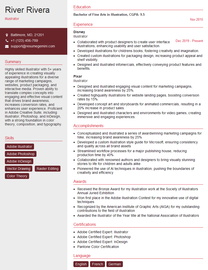
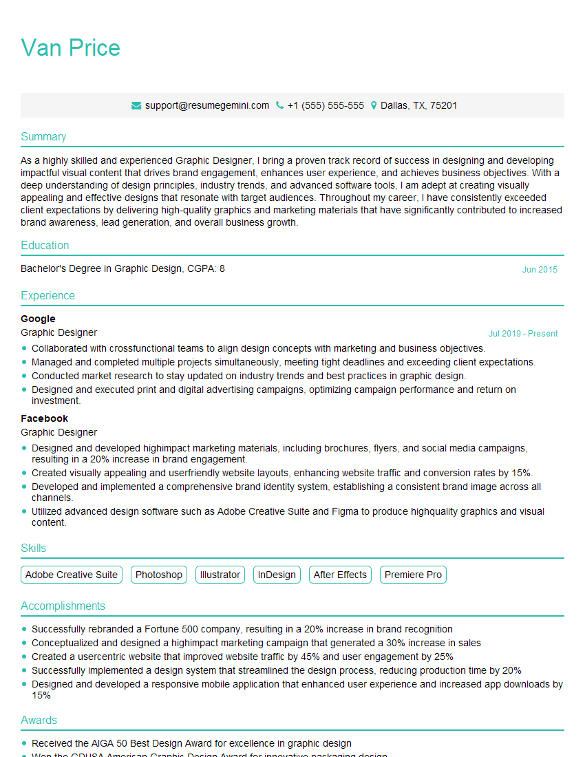
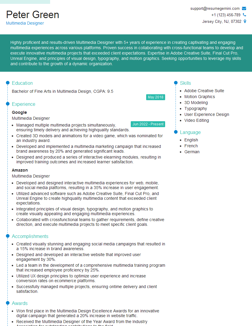
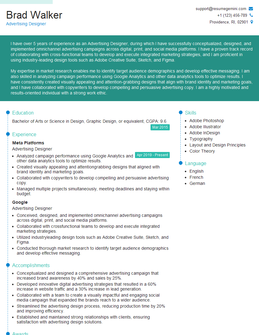
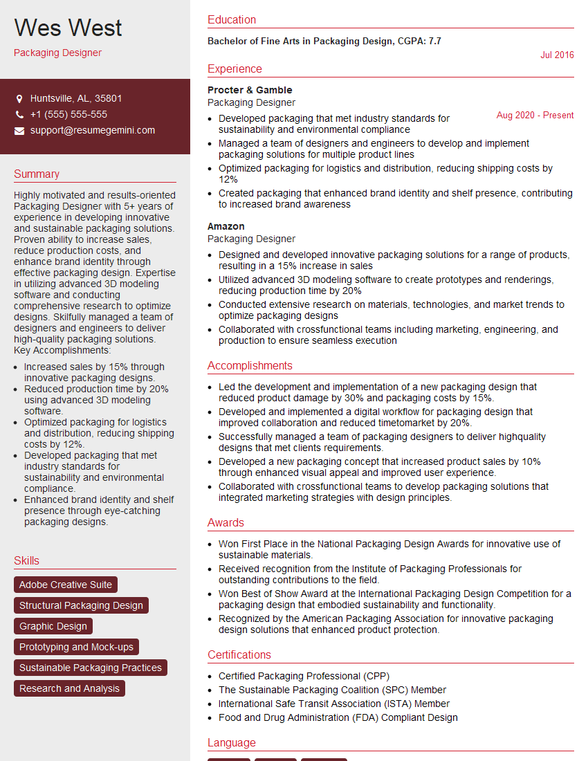
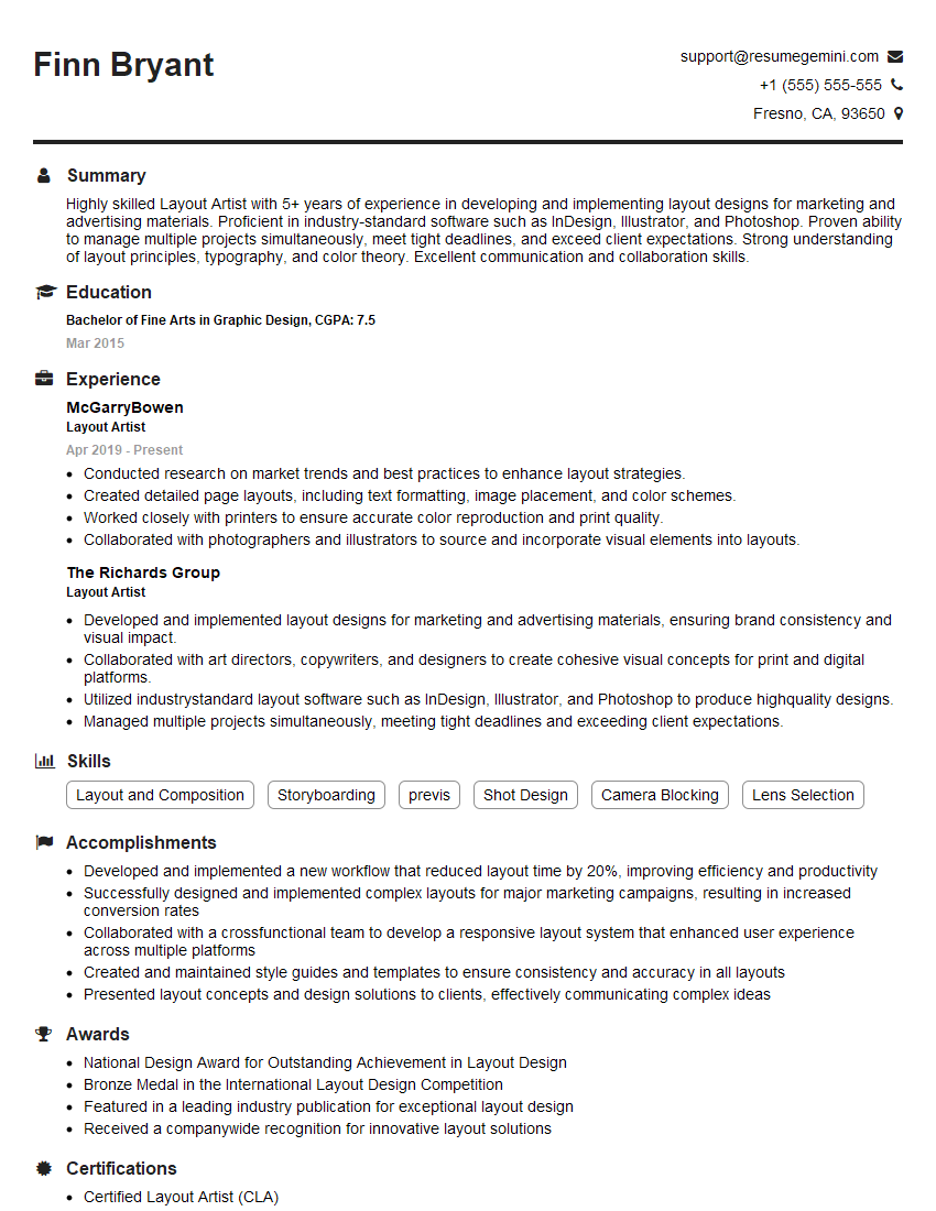
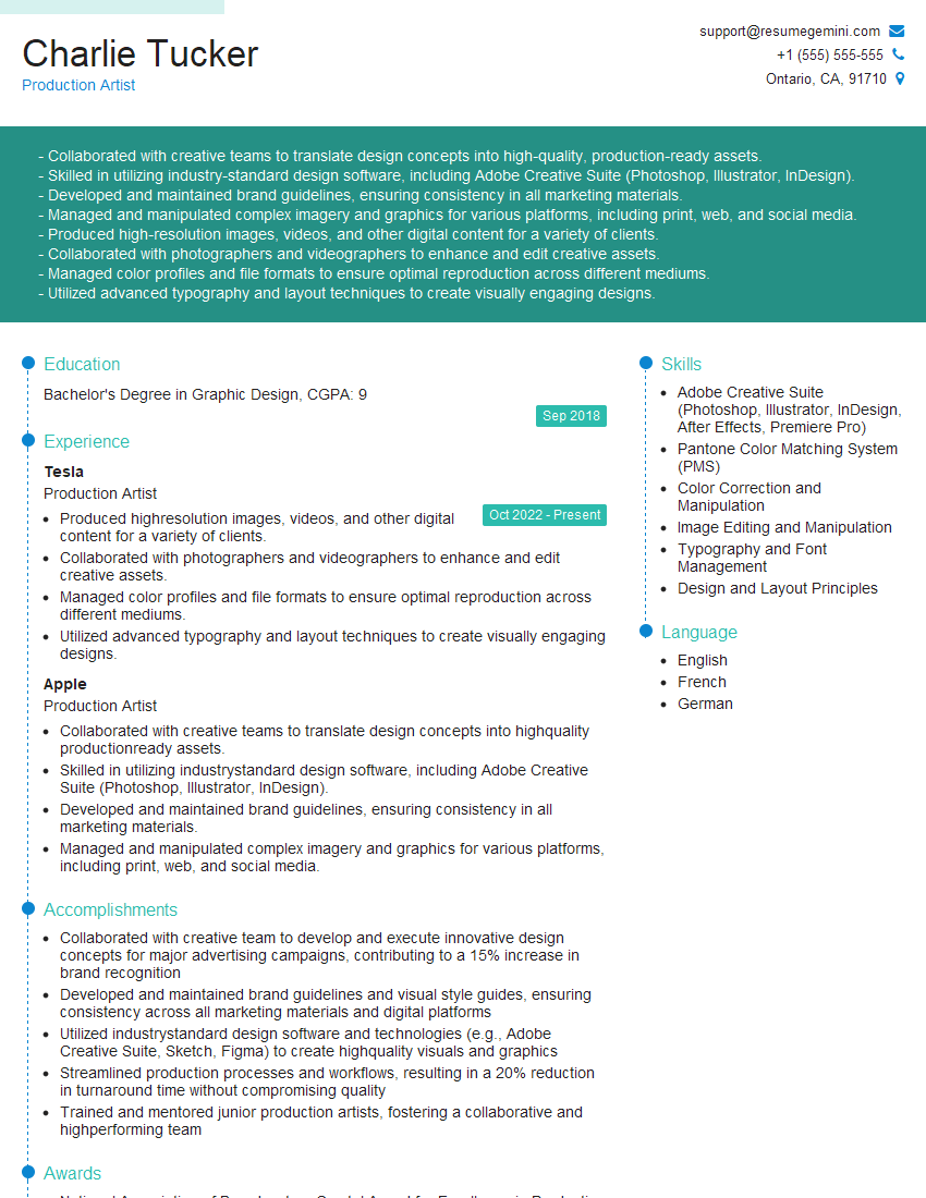
Mastering InDesign and Photoshop proficiency opens doors to exciting career opportunities in graphic design, publishing, marketing, and more! To significantly boost your job prospects, crafting a strong, ATS-friendly resume is crucial. ResumeGemini is a trusted resource to help you build a professional resume that highlights your skills effectively. Examples of resumes tailored to InDesign and Photoshop proficiency are available, showcasing how to present your expertise in the best possible light.
Explore more articles
Users Rating of Our Blogs
Share Your Experience
We value your feedback! Please rate our content and share your thoughts (optional).
What Readers Say About Our Blog
Hi, I’m Jay, we have a few potential clients that are interested in your services, thought you might be a good fit. I’d love to talk about the details, when do you have time to talk?
Best,
Jay
Founder | CEO
