Every successful interview starts with knowing what to expect. In this blog, we’ll take you through the top Data Analytics (SQL, Tableau) interview questions, breaking them down with expert tips to help you deliver impactful answers. Step into your next interview fully prepared and ready to succeed.
Questions Asked in Data Analytics (SQL, Tableau) Interview
Q 1. Explain the difference between INNER JOIN and LEFT JOIN in SQL.
Both INNER JOIN and LEFT JOIN are used to combine rows from two or more tables based on a related column between them. Think of it like matching puzzle pieces – the related column is what lets you connect the pieces.
The key difference lies in how they handle unmatched rows. An INNER JOIN only returns rows where there is a match in both tables. If a row in one table doesn’t have a corresponding match in the other, it’s excluded from the result. It’s like only keeping the perfectly assembled puzzle sections.
A LEFT JOIN, on the other hand, returns all rows from the left table (the table specified before LEFT JOIN), even if there’s no matching row in the right table. For rows in the left table without a match, the columns from the right table will have NULL values. It’s like keeping all the pieces from one puzzle, even if some don’t have a match from the second.
Example: Let’s say we have a Customers table and an Orders table. An INNER JOIN would only show customers who have placed orders. A LEFT JOIN would show all customers, including those who haven’t placed any orders (their order details would show as NULL).
SELECT * FROM Customers INNER JOIN Orders ON Customers.CustomerID = Orders.CustomerID;SELECT * FROM Customers LEFT JOIN Orders ON Customers.CustomerID = Orders.CustomerID;Q 2. Write a SQL query to find the top 5 customers with the highest total purchase amount.
To find the top 5 customers with the highest total purchase amount, we need to aggregate order data by customer and then sort the results. Here’s how you can do it using SQL, assuming you have tables named Customers and Orders with appropriate columns:
SELECT c.CustomerID, c.CustomerName, SUM(o.OrderAmount) AS TotalPurchaseAmount
FROM Customers c
JOIN Orders o ON c.CustomerID = o.CustomerID
GROUP BY c.CustomerID, c.CustomerName
ORDER BY TotalPurchaseAmount DESC
LIMIT 5;
This query first joins the Customers and Orders tables to link customers to their orders. Then, it uses SUM() to calculate the total purchase amount for each customer, grouping the results by CustomerID. Finally, it orders the results in descending order of TotalPurchaseAmount and uses LIMIT to retrieve only the top 5 customers.
Q 3. How would you handle missing data in a dataset?
Handling missing data, often represented as NULL values, is crucial for data analysis. Ignoring it can lead to biased or inaccurate results. The best approach depends on the context and the nature of the missing data.
- Deletion: If the missing data is minimal and random, you can remove rows or columns with missing values. However, this can lead to information loss if a significant portion of the data is affected.
- Imputation: This involves filling in missing values with estimated values. Common methods include:
- Mean/Median/Mode Imputation: Replace missing values with the mean, median, or mode of the non-missing values in that column. Simple, but can distort the distribution if many values are missing.
- Regression Imputation: Use a regression model to predict missing values based on other variables. More sophisticated, but requires careful model selection.
- K-Nearest Neighbors Imputation: Find the ‘k’ nearest data points (based on similarity) and use their average to impute the missing value. Good for handling non-linear relationships.
- Flag Missing Values: Instead of imputation, you can create a new variable indicating whether a value was missing. This preserves the original data and allows you to analyze the impact of missingness.
Choosing the right method requires understanding why the data is missing (e.g., random, systematic, or due to a specific reason) and the potential impact of each method on your analysis. Often, a combination of techniques is used.
Q 4. Describe your experience with data cleaning and preprocessing.
Data cleaning and preprocessing is a cornerstone of any successful data analysis project. I’ve had extensive experience in this area, handling various challenges like inconsistent data formats, missing values, and outliers.
My process typically involves:
- Data profiling: I start by understanding the data’s structure, identifying data types, checking for inconsistencies, and assessing data quality. I often use tools like SQL queries and Python libraries (pandas) for this.
- Data cleaning: This includes handling missing values (as described above), removing duplicates, correcting inconsistencies (e.g., standardizing date formats), and addressing outliers using techniques like capping, winsorizing, or removal depending on the context.
- Data transformation: This step might involve converting data types, creating new variables, scaling or normalizing data (e.g., using standardization or min-max scaling), and encoding categorical variables (e.g., one-hot encoding).
- Data validation: After cleaning and transformation, I thoroughly validate the data to ensure accuracy and consistency before further analysis.
For instance, in a recent project involving customer transaction data, I had to clean up inconsistent date formats, handle missing transaction amounts, and identify and deal with fraudulent transactions. This involved writing SQL queries for data extraction and manipulation, and utilizing Python scripts for more complex cleaning tasks.
Q 5. What are some common data visualization techniques you’ve used with Tableau?
Tableau offers a wide array of data visualization techniques. I’ve extensively used many, tailoring my choice to the specific data and analytical goals. Some common ones include:
- Bar charts and column charts: Excellent for comparing categorical data.
- Line charts: Ideal for showing trends over time.
- Scatter plots: Useful for exploring relationships between two continuous variables.
- Heatmaps: Effective for visualizing large matrices of data.
- Pie charts: Suitable for showing proportions of a whole (though I use them sparingly as they can be less effective with many categories).
- Maps: Particularly useful for geographical data.
- Treemaps: Good for hierarchical data, showing proportions of sub-groups within larger groups.
I often combine these techniques to create comprehensive dashboards that provide a holistic view of the data. For example, I might use a map to show sales performance across different regions, combined with bar charts to compare sales figures for different product categories within each region. The selection of charts depends heavily on the nature of the data and the insights we are trying to convey.
Q 6. Explain the difference between a dashboard and a story in Tableau.
In Tableau, dashboards and stories serve different purposes, although they can often complement each other.
A dashboard acts as a central hub for displaying multiple visualizations related to a specific topic or question. Think of it as a control panel – it provides a snapshot of key metrics and insights. It’s designed for quick, at-a-glance understanding of complex data. Dashboards usually comprise multiple charts, tables, and other elements arranged for optimal information access.
A story, on the other hand, is a sequential narrative using dashboards, individual visualizations, and text annotations to guide the viewer through a specific analysis or argument. Stories add context, explain findings, and help tell a compelling data-driven narrative. Imagine a story as presenting a series of data-backed arguments to support a particular conclusion.
For example, you might create a dashboard summarizing key sales metrics, and then use a story to elaborate on the trends and patterns revealed in the dashboard. The story might include multiple dashboards at various stages of the analysis, leading to a comprehensive understanding of the business situation.
Q 7. How do you optimize SQL queries for performance?
Optimizing SQL queries for performance is crucial, especially when dealing with large datasets. Here are several strategies:
- Indexing: Creating indexes on frequently queried columns significantly speeds up data retrieval. Indexes are like a table of contents for your data, allowing the database to quickly locate specific rows.
- Query Optimization Tools: Many database systems offer built-in query analyzers (e.g., SQL Server’s execution plans, MySQL’s EXPLAIN). These tools help identify bottlenecks in your queries.
- Writing Efficient Queries: Avoid using
SELECT *; select only the columns you need. Use appropriate joins (avoiding unnecessary joins), and optimizeWHEREclauses using appropriate filters and operators. - Avoid using functions on indexed columns in the WHERE clause: Using functions on an indexed column might prevent the database from utilizing the index effectively.
- Proper Use of Aggregations: Efficiently group and aggregate data using
GROUP BYand aggregate functions to reduce the number of rows processed. - Database Tuning: Ensure your database server has sufficient resources (memory, CPU, disk I/O) and that the database configuration is optimized for your workload.
- Data Partitioning: For massive tables, partitioning can improve query performance by dividing the data into smaller, more manageable segments.
For example, if you’re frequently querying data based on a specific date column, creating an index on that column could drastically reduce query execution time. Similarly, using EXISTS instead of COUNT(*) in subqueries can sometimes yield significant performance improvements.
Q 8. How do you create calculated fields in Tableau?
Creating calculated fields in Tableau is a fundamental aspect of data analysis, allowing you to derive new metrics from existing data. Think of it as creating new columns in a spreadsheet, but with much more flexibility and power. You access this functionality through the ‘Analysis’ menu, selecting ‘Create Calculated Field’. A dialog box then opens where you write the calculation using Tableau’s built-in functions and operators.
For instance, if you have ‘Sales’ and ‘Quantity’ fields, you could create a ‘Unit Price’ field with the calculation: SUM([Sales]) / SUM([Quantity]). This would compute the average unit price across all your data. You can use various functions like AVG(), SUM(), COUNT(), IF statements, and date functions to create incredibly complex and useful calculated fields tailored to your analysis needs.
Another example: Imagine you need to categorize sales into ‘High’, ‘Medium’, and ‘Low’ based on sales value. You could use an IF statement: IF [Sales] > 1000 THEN 'High' ELSEIF [Sales] > 500 THEN 'Medium' ELSE 'Low' END. This creates a new categorical field for easier analysis and visualization.
Q 9. What are some best practices for designing effective dashboards?
Designing effective dashboards is an art and a science. It’s about clearly communicating insights in a way that’s easy to understand and act upon. Several key best practices are crucial:
- Focus on a clear narrative: Each dashboard should tell a story, guiding the user through key findings. Don’t overload it with information; prioritize the most important metrics.
- Less is more: Avoid visual clutter. Use a clean and consistent design with appropriate whitespace.
- Choose the right chart type: Different charts are suited for different types of data and analyses. Bar charts for comparisons, line charts for trends, maps for geographical data, etc.
- Use color strategically: Color should enhance understanding, not distract. Use a consistent color palette and avoid overuse of bright, jarring colors.
- Interactive elements: Allow users to drill down into the data, filter, and explore different aspects of the visualization.
- Annotations and labels: Clearly label axes, legends, and data points. Add annotations to highlight important trends or insights.
- Consider your audience: Design the dashboard with the user’s knowledge and needs in mind. A dashboard for executives will be different from one for operational staff.
For example, a sales dashboard might start with a summary of total sales, followed by breakdowns by region, product category, and sales representative, allowing users to progressively explore the data.
Q 10. Describe your experience with different data types in SQL (e.g., INT, VARCHAR, DATE).
SQL data types are crucial for defining the kind of data that can be stored in a database column. Selecting the appropriate data type is essential for data integrity and efficient query processing. Here are some common examples:
INT(Integer): Stores whole numbers, like customer IDs or order quantities. For example,CREATE TABLE Customers (CustomerID INT);VARCHAR(n)(Variable-length string): Stores text, such as customer names or product descriptions. The ‘n’ specifies the maximum length. Example:CREATE TABLE Products (ProductName VARCHAR(255));DATE: Stores dates, crucial for time-series analysis or tracking events. Example:CREATE TABLE Orders (OrderDate DATE);FLOATorDOUBLE: Stores decimal numbers, like prices or weights.BOOLEAN: Stores true/false values.
Choosing the right data type impacts storage space, query performance, and data validity. Using VARCHAR(255) for a field that only needs to store a few characters is inefficient. Similarly, trying to store a date in a VARCHAR field makes date-based calculations and filtering much more complex.
Q 11. Explain how you would use SQL to identify trends in sales data.
Identifying sales trends in SQL involves using aggregate functions and possibly window functions, depending on the complexity of the trend analysis. Let’s assume a table named ‘Sales’ with columns like ‘OrderDate’, ‘ProductID’, and ‘SalesAmount’.
For a simple trend analysis of total sales over time, we can use the SUM() function and GROUP BY clause:
SELECT OrderDate, SUM(SalesAmount) AS TotalSales FROM Sales GROUP BY OrderDate ORDER BY OrderDate;This query aggregates sales by date, showing the total sales for each day. To visualize trends over a longer period (e.g., monthly or yearly), you would GROUP BY the appropriate date part (e.g., strftime('%Y-%m', OrderDate) for monthly sales). For more sophisticated trend analysis (like moving averages or year-over-year growth), window functions become invaluable.
For instance, a 7-day moving average can be calculated with a window function (the specific syntax might vary slightly depending on your SQL dialect):
SELECT OrderDate, SalesAmount, AVG(SalesAmount) OVER (ORDER BY OrderDate ASC ROWS BETWEEN 6 PRECEDING AND CURRENT ROW) AS MovingAverage FROM Sales ORDER BY OrderDate;This provides a more smoothed trend line, reducing the impact of daily fluctuations.
Q 12. How would you use Tableau to create a map visualization?
Creating map visualizations in Tableau leverages geographical data connected to your data source. First, ensure your data has a geographical component, such as latitude/longitude coordinates, zip codes, city names, or state names. Tableau automatically recognizes many geographical fields.
Once you’ve connected your data, drag a geographical field (e.g., ‘State’, ‘City’, ‘Latitude’, ‘Longitude’) to the ‘Details’ card on the Marks shelf. Tableau automatically recognizes this as a geographical dimension. Then, drag a measure (e.g., ‘Sales’, ‘Number of Customers’) to the ‘Size’ or ‘Color’ card to represent the data on the map. The size or color of the geographical markers (e.g., points, polygons) will reflect the values of your measure.
You can customize the map by selecting different map types (e.g., filled maps, symbol maps), adjusting colors, adding labels, and customizing tooltips to provide more context. You can further enhance the map with interactive features like filters, allowing users to explore different aspects of your geographical data.
For example, you might visualize sales performance across different states by dragging the ‘State’ field to the ‘Details’ mark, and ‘Sales’ to the ‘Size’ mark. Larger circles on the map would represent states with higher sales.
Q 13. What are some common challenges you’ve faced in data analysis and how did you overcome them?
Data analysis is rarely straightforward. I’ve encountered several challenges, including:
- Data quality issues: Inconsistent data formats, missing values, and inaccuracies are common. I’ve tackled this using data profiling techniques, developing custom data cleaning scripts in SQL, and implementing data validation rules.
- Performance bottlenecks: Working with massive datasets can lead to slow query execution. I’ve addressed this by optimizing SQL queries (using indexes, appropriate data types, and avoiding unnecessary joins), and by employing data warehousing or other data optimization techniques.
- Ambiguous requirements: Sometimes, the business questions are not clearly defined. I address this by actively engaging with stakeholders to understand their needs thoroughly, refining the questions through iterative discussions.
- Interpreting results: Identifying causal relationships versus correlations can be challenging. I address this by employing statistical methods, applying domain expertise, and carefully considering potential confounding factors.
For instance, in one project, I encountered inconsistent date formats in a sales database. I wrote a SQL script to standardize the formats, using CASE statements and date functions. This improved data quality and enabled accurate trend analysis.
Q 14. Explain your experience with data modeling.
Data modeling is the process of designing a structured representation of your data. It’s like creating a blueprint for a database. A well-designed data model ensures data integrity, efficiency, and scalability. My experience encompasses various modeling techniques, including:
- Relational modeling: Using relational databases and SQL, defining tables, relationships (one-to-one, one-to-many, many-to-many), and primary and foreign keys. This is crucial for managing structured data effectively.
- Dimensional modeling: Designing star schemas or snowflake schemas for business intelligence and data warehousing. This focuses on creating fact tables (containing measures) and dimension tables (containing attributes), facilitating efficient data analysis and reporting.
- Data warehousing and ETL (Extract, Transform, Load): Designing and implementing data warehouses, extracting data from various sources, transforming it to a consistent format, and loading it into the warehouse. This is vital for consolidating data from diverse origins for comprehensive analysis.
In a recent project, I designed a dimensional model for a retail company’s sales data. This involved creating a fact table with sales transactions and linking it to dimension tables for products, customers, time, and stores. This structure significantly improved query performance and enabled insightful analysis of sales trends and patterns.
Q 15. How familiar are you with different database systems (e.g., MySQL, PostgreSQL, SQL Server)?
I have extensive experience working with various database systems, including MySQL, PostgreSQL, and SQL Server. My familiarity extends beyond basic querying to encompass database design, optimization, and administration. For instance, I’ve used MySQL extensively for agile development projects where speed and scalability were paramount. Its open-source nature and readily available community support made it ideal for rapid prototyping and iterative development. In contrast, I’ve leveraged PostgreSQL for projects demanding robust data integrity and complex data modeling, particularly when dealing with large datasets and sophisticated relationships. Its advanced features, like support for JSONB, proved invaluable. Finally, SQL Server, with its robust enterprise features and tight integration with the Microsoft ecosystem, has been my go-to for projects needing enterprise-grade security and scalability.
My experience isn’t simply limited to using these systems individually; I’m comfortable migrating data between them and understanding their strengths and weaknesses for various use cases. Choosing the right database system is crucial for project success, and I consider factors like data volume, transaction rate, required security, and the existing infrastructure before making a decision.
Career Expert Tips:
- Ace those interviews! Prepare effectively by reviewing the Top 50 Most Common Interview Questions on ResumeGemini.
- Navigate your job search with confidence! Explore a wide range of Career Tips on ResumeGemini. Learn about common challenges and recommendations to overcome them.
- Craft the perfect resume! Master the Art of Resume Writing with ResumeGemini’s guide. Showcase your unique qualifications and achievements effectively.
- Don’t miss out on holiday savings! Build your dream resume with ResumeGemini’s ATS optimized templates.
Q 16. Describe your experience with data aggregation and summarization.
Data aggregation and summarization are core to my analytical process. I frequently use SQL’s aggregate functions (SUM(), AVG(), COUNT(), MIN(), MAX()) to condense large datasets into meaningful summaries. For example, I might use SELECT SUM(sales), AVG(sales) FROM sales_data GROUP BY region; to get total and average sales for each region.
Beyond SQL, I leverage Tableau’s powerful aggregation capabilities to visualize these summaries. Tableau allows for flexible aggregation at different levels of granularity, easily switching between showing regional totals and drilling down to individual store performance. This interactive exploration is vital for identifying trends and patterns that might be missed in static reports. In a recent project, I aggregated website traffic data to identify peak usage times, informing server resource allocation strategies.
Q 17. How do you ensure data accuracy and integrity?
Data accuracy and integrity are paramount. I employ a multi-faceted approach, starting with data validation at the source. This involves checking for data type consistency, identifying and handling missing values (using imputation techniques or flagging them for review), and detecting and correcting inconsistencies. I often use constraints (e.g., NOT NULL, UNIQUE, CHECK) within the database schema to enforce data integrity rules at the database level.
Regular data profiling and quality checks are also crucial. This could involve running SQL queries to identify outliers, inconsistencies, or duplicate entries. In Tableau, I utilize data validation tools to check for inconsistencies before visualization and analysis. Finally, clear documentation of data sources, transformation processes, and assumptions is key to maintaining transparency and trust in the data.
Q 18. What are your preferred methods for data validation?
My preferred methods for data validation are a combination of automated checks and manual reviews. Automated checks involve using SQL queries to identify inconsistencies like null values, duplicates, or values outside expected ranges. For example, a query like SELECT * FROM orders WHERE order_date > CURRENT_DATE; would flag orders with future dates. I also use regular expressions to validate data formats, such as email addresses or phone numbers.
Beyond automated checks, manual reviews are essential, especially when dealing with sensitive data or complex relationships. This involves visually inspecting data samples in Tableau or using spreadsheet software to identify potential issues that automated checks might miss. For example, a manual review might catch a typo in a field that an automated check wouldn’t recognize as an error.
Q 19. Explain your experience with different chart types and when to use them.
I’m proficient with a wide range of chart types and understand their strengths and weaknesses. My choices depend heavily on the data and the insights I want to convey. For instance:
- Bar charts: Ideal for comparing categorical data, such as sales across different product categories.
- Line charts: Excellent for showing trends over time, such as website traffic or stock prices.
- Scatter plots: Useful for identifying correlations between two numerical variables, such as income and spending.
- Pie charts: Suitable for showing proportions of a whole, such as market share.
- Maps: Effective for visualizing geographically distributed data, such as sales by region.
In a recent project, I used a combination of bar charts and line charts to illustrate website traffic trends across different demographics over time. This gave a clear picture of both overall trends and variations across different user segments.
Q 20. How do you handle outliers in your data?
Handling outliers requires careful consideration. Simply removing them can bias the analysis, so I first investigate the reason for their existence. Are they errors in data entry, genuine extreme values, or indicative of a separate population?
My approach often involves a combination of methods. Visual inspection using box plots or scatter plots in Tableau helps to identify outliers. Then I use statistical methods like the Interquartile Range (IQR) to identify potential outliers quantitatively. Depending on the context and the reason for the outlier, I might:
- Correct errors: If they are due to data entry errors, I correct them.
- Transform the data: Techniques like log transformation can reduce the influence of extreme values.
- Use robust statistical methods: Methods less sensitive to outliers, such as median instead of mean, are used.
- Analyze separately: If outliers represent a distinct group, I analyze them separately.
The key is to document the approach taken to handle outliers and justify the chosen method.
Q 21. Explain your understanding of relational database concepts.
Relational database concepts form the foundation of my data analysis work. I understand the importance of entities, attributes, relationships, and keys in designing efficient and scalable databases. Entities represent real-world objects (e.g., customers, products, orders), attributes are their characteristics (e.g., customer name, product price, order date), and relationships define how entities relate to each other (e.g., a customer can place many orders).
I’m proficient in using primary keys to uniquely identify records within a table and foreign keys to establish relationships between tables. Understanding normalization principles (reducing data redundancy and improving data integrity) is crucial, and I use them to design well-structured databases. For example, I understand the difference between 1NF, 2NF, and 3NF and how to apply them to avoid data anomalies. My understanding extends to using SQL to create, query, and manage relational databases, including complex joins and subqueries.
Q 22. Describe your experience with data warehousing concepts.
Data warehousing is the process of collecting, storing, and managing large amounts of data from various sources to provide a centralized, consistent, and readily accessible view of business information. Think of it as a massive, organized library for your company’s data. It’s crucial for making informed business decisions.
- Data sources: These can include operational databases (like transaction systems), external data (market research, social media), and even log files.
- Data integration: The process of combining data from diverse sources, addressing inconsistencies in data formats and structures, and ensuring data quality.
- Data modeling: Creating a logical and physical design for the warehouse. This usually involves star schemas or snowflake schemas, which optimize querying and reporting.
- ETL (Extract, Transform, Load): The process of extracting data from various sources, transforming it into a consistent format, and loading it into the data warehouse.
- Data storage: This could involve various technologies like cloud-based data warehouses (e.g., Snowflake, Google BigQuery, Amazon Redshift), or on-premise solutions.
In my experience, I’ve worked with both cloud-based and on-premise data warehouses, designing schemas, implementing ETL processes using tools like Informatica PowerCenter and Apache Airflow, and optimizing query performance. For example, I once redesigned a data warehouse schema for a retail client, moving from a denormalized design to a star schema, which reduced query times by over 70%.
Q 23. How do you perform data analysis using both SQL and Tableau together?
SQL and Tableau work synergistically in data analysis. SQL is excellent for data extraction, manipulation, and aggregation, while Tableau excels at visualization and interactive exploration. I typically use them together in a sequential workflow.
- Data Extraction with SQL: I use SQL to extract relevant data from the source database(s). This often involves creating complex queries to filter, join, aggregate, and clean the data. For example,
SELECT order_id, customer_id, SUM(order_total) AS total_spent FROM orders GROUP BY customer_id ORDER BY total_spent DESC;retrieves customer spending data. - Data Loading into Tableau: The data extracted using SQL is then imported or connected to Tableau. Tableau supports various data connection types, allowing flexible integration with different databases.
- Data Visualization and Analysis in Tableau: Within Tableau, I use the extracted data to build dashboards and visualizations like charts, graphs, maps, and tables. I can further analyze the data using Tableau’s built-in analytical capabilities, such as filtering, trend analysis, and forecasting.
This approach allows for powerful and efficient data analysis. The SQL part ensures data accuracy and efficiency in extraction, and Tableau provides a user-friendly environment for exploration and insightful visualization.
Q 24. How would you troubleshoot a slow-performing SQL query?
Troubleshooting slow SQL queries requires a systematic approach. I typically follow these steps:
- Identify the slow query: Use query monitoring tools to identify the queries consuming the most resources.
- Examine the execution plan: Analyze the query execution plan (using tools like
EXPLAIN PLANin Oracle or similar tools in other database systems) to see where the bottlenecks are (e.g., full table scans instead of index scans, inefficient joins). - Optimize the query: Based on the execution plan, make appropriate adjustments to the query. This might involve adding indexes, rewriting the query to use more efficient joins, or optimizing subqueries.
- Check for data volume: Large datasets can inherently impact query speed. Consider partitioning tables or using data warehousing techniques to improve performance.
- Review database configuration: Ensure sufficient resources (CPU, memory, storage I/O) are allocated to the database server. Check for any performance issues in the server itself.
- Consider caching: Implementing appropriate caching mechanisms (query caching, data caching) can significantly reduce query time.
For instance, if a query shows a full table scan on a large table, adding an index on the relevant columns would dramatically improve its performance. If there are inefficient joins, optimizing them by using appropriate join techniques (e.g., using indexed columns, hash joins) can speed things up.
Q 25. What are some best practices for data security and privacy?
Data security and privacy are paramount in data analytics. Best practices include:
- Data encryption: Encrypting data both at rest (in storage) and in transit (during transmission) is crucial to protect sensitive information.
- Access control: Implementing robust access control mechanisms (role-based access control, least privilege principle) to ensure only authorized personnel can access specific data.
- Data masking and anonymization: Techniques like data masking (replacing sensitive data with dummy values) and anonymization (removing personally identifiable information) help protect sensitive data while still allowing for analysis.
- Regular security audits: Performing regular security audits and penetration testing to identify and address vulnerabilities.
- Compliance with regulations: Adhering to relevant data privacy regulations (GDPR, CCPA, HIPAA, etc.) is crucial.
- Data loss prevention (DLP): Implementing DLP measures to prevent sensitive data from leaving the organization’s control.
- Secure data storage: Using secure cloud storage solutions with robust security features, and regularly backing up data.
For example, in a healthcare setting, adhering to HIPAA regulations requires strict control over patient data, including encryption, access controls, and audit trails. These measures help protect patient privacy and ensure compliance with legal obligations.
Q 26. How do you stay up-to-date with the latest trends in data analytics?
Staying up-to-date in data analytics is an ongoing process. I employ several strategies:
- Following industry publications and blogs: Regularly reading reputable sources like Towards Data Science, Analytics Vidhya, and official blogs from database vendors and analytics software companies.
- Attending conferences and webinars: Participating in conferences like Strata Data Conference or attending webinars offered by companies like Tableau and Databricks.
- Taking online courses: Utilizing platforms like Coursera, edX, and Udacity to expand my knowledge on new tools and techniques.
- Networking with peers: Engaging in online communities and attending local meetups to learn from and share knowledge with other data professionals.
- Experimenting with new tools and technologies: Actively trying out new tools and libraries to gain practical experience and stay ahead of the curve.
For example, I recently completed a course on advanced SQL techniques and am currently experimenting with Apache Spark for large-scale data processing.
Q 27. Describe a time you had to analyze a large dataset and extract meaningful insights.
I once worked on a project analyzing a large dataset of customer interactions for a telecommunications company. The dataset contained millions of records with details about customer calls, internet usage, and billing information. The goal was to identify customer segments with high churn risk.
I used SQL to extract and preprocess the data, creating features such as average call duration, data usage patterns, and payment history. I then used Tableau to visualize the data and identify patterns. I discovered that customers with high call volumes and inconsistent payment history had significantly higher churn rates. I also found a strong correlation between low data usage and churn in a specific age group. These insights helped the company design targeted retention campaigns, leading to a substantial decrease in churn.
The analysis involved cleaning the data to handle missing values and outliers, using statistical techniques to assess the significance of correlations, and building predictive models to segment customers based on churn probability. The combination of SQL’s data manipulation capabilities and Tableau’s powerful visualization tools was key to efficiently handling and interpreting the vast volume of data.
Q 28. How would you explain complex data analysis results to a non-technical audience?
Explaining complex data analysis results to a non-technical audience requires clear communication and a focus on the story. I typically follow these guidelines:
- Use simple language: Avoid jargon and technical terms whenever possible. Instead of saying “multivariate regression,” I might say “we analyzed the relationship between multiple factors.”
- Focus on the key findings: Highlight the most important insights and present them concisely. Use visual aids like charts and graphs to enhance understanding.
- Tell a story: Frame the analysis within a compelling narrative that explains the problem, the approach, and the key findings. Use analogies and real-world examples to make the results relatable.
- Avoid overwhelming with details: Focus on the overall message and avoid getting bogged down in technical details unless absolutely necessary.
- Encourage questions: Create an interactive environment where the audience feels comfortable asking questions and clarifying any uncertainties.
For example, instead of saying “The p-value is less than 0.05, indicating statistical significance,” I might say “Our analysis shows a strong relationship between these two factors; the results are unlikely to be due to chance.” By focusing on the implications of the findings and using plain language, I can effectively communicate complex data analysis results to a non-technical audience.
Key Topics to Learn for Data Analytics (SQL, Tableau) Interview
- SQL Fundamentals: Understanding database structures (tables, relationships), writing efficient SELECT, JOIN, WHERE, GROUP BY, and HAVING clauses, handling subqueries and common table expressions (CTEs).
- SQL for Data Analysis: Practical application in data cleaning, transformation, and aggregation. Analyzing trends and patterns within large datasets using SQL queries. Experience with window functions and analytical functions is a plus.
- Data Visualization with Tableau: Creating effective dashboards and visualizations to communicate insights from data. Mastering different chart types (bar charts, line charts, scatter plots, etc.) and their appropriate use cases.
- Data Wrangling & Cleaning in Tableau: Preparing messy data for analysis within Tableau, including handling missing values, outliers, and data inconsistencies.
- Tableau Calculated Fields & Data Blending: Creating calculated fields for advanced data analysis and blending data from multiple sources to gain a comprehensive perspective.
- Data Storytelling & Communication: Understanding how to effectively present your findings through clear visualizations and concise narratives. Practice conveying complex data insights to a non-technical audience.
- Performance Optimization (SQL & Tableau): Strategies for writing efficient SQL queries to minimize processing time. Understanding performance considerations in Tableau dashboards, such as optimizing visualizations and data connections.
- Database Design Principles: Understanding normalization and different database models (relational, NoSQL) to design efficient and scalable data solutions.
Next Steps
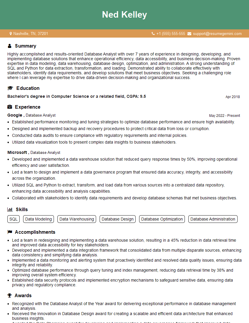
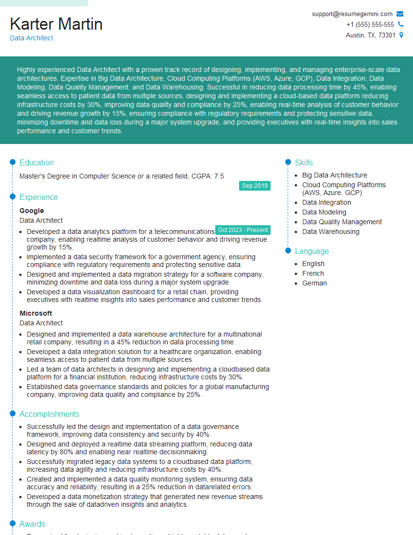
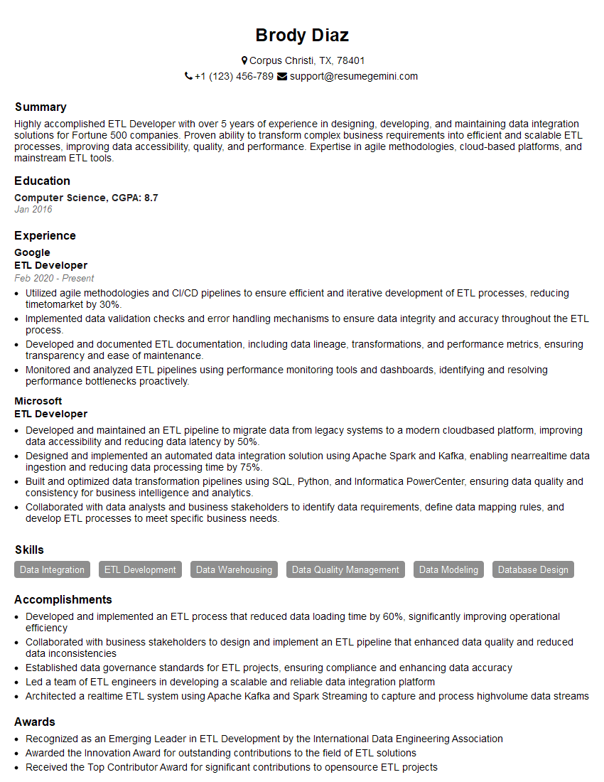
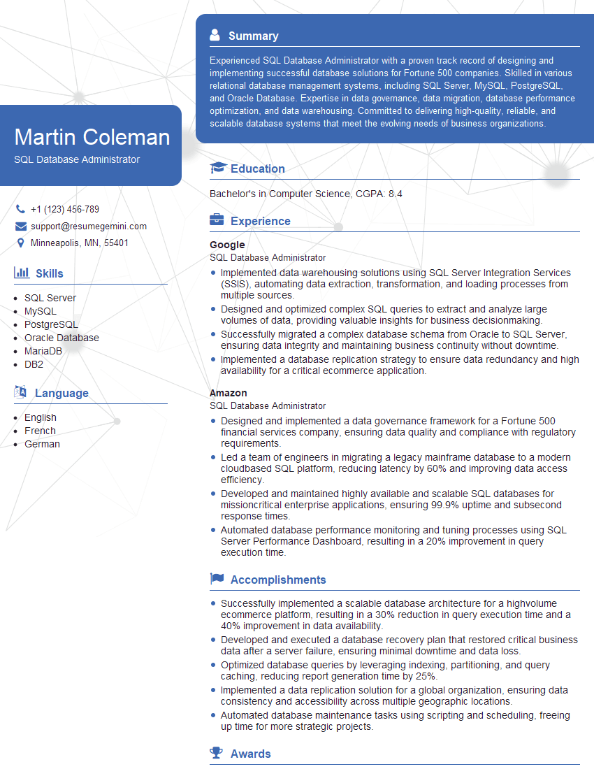
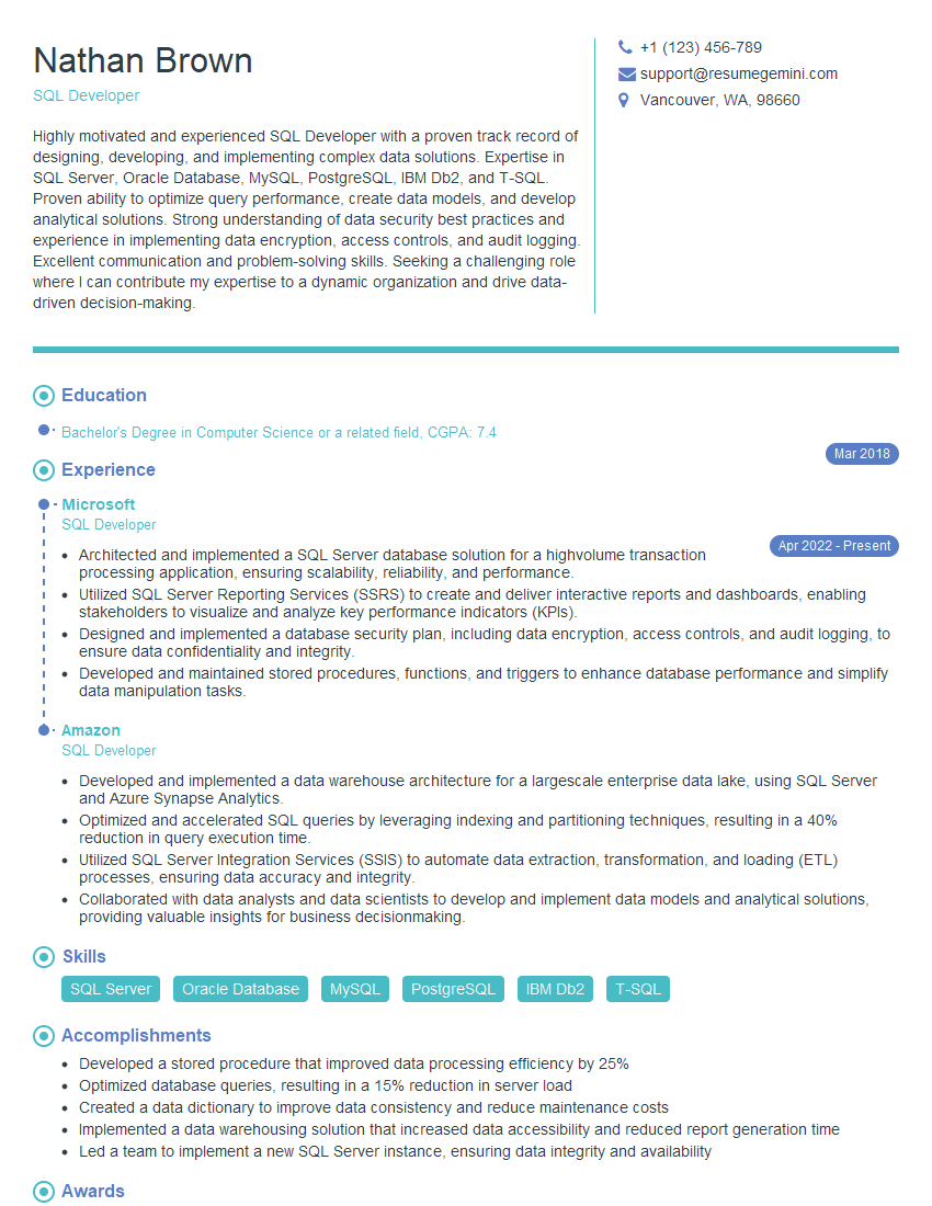
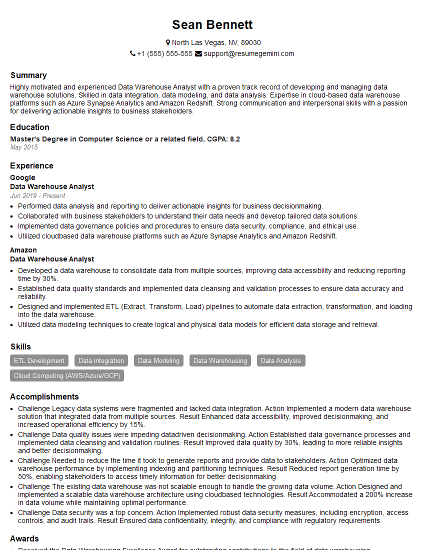
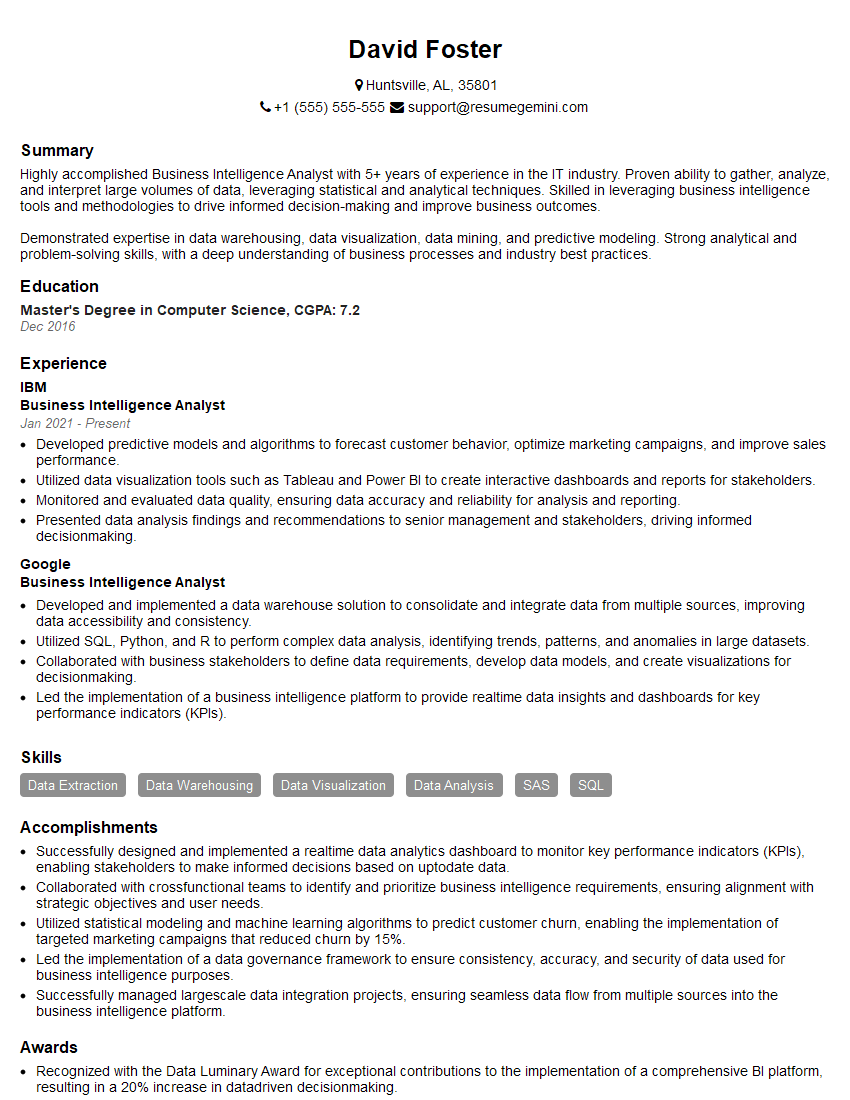
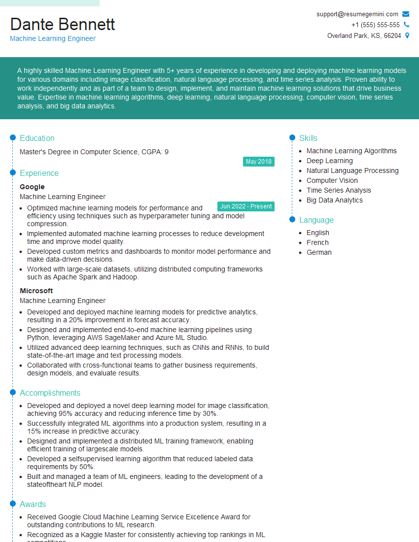
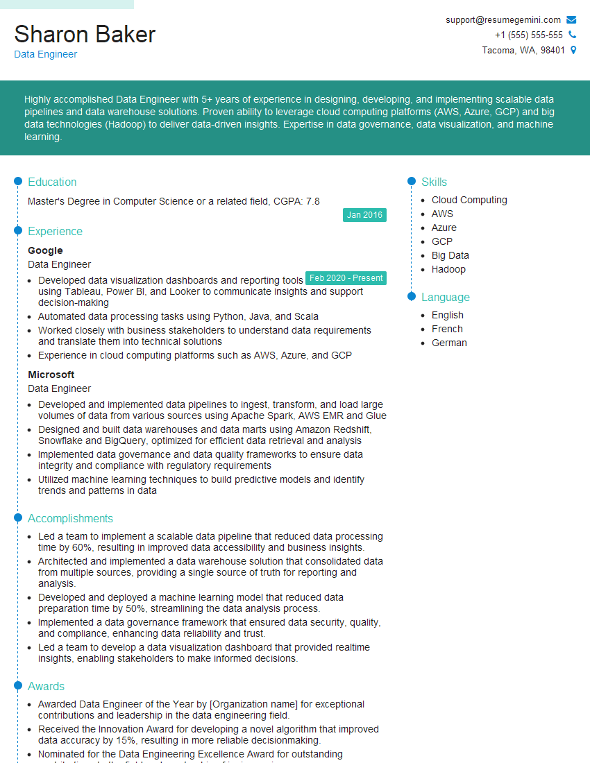
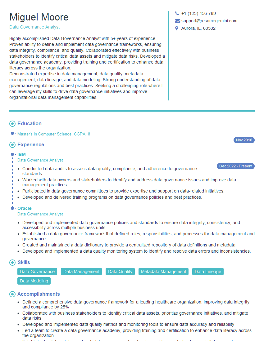
Mastering SQL and Tableau is crucial for a successful career in data analytics, opening doors to exciting roles with high earning potential and significant impact. To maximize your job prospects, invest time in crafting an ATS-friendly resume that showcases your skills effectively. ResumeGemini is a trusted resource that can help you build a professional and impactful resume tailored to the data analytics field. Examples of resumes specifically designed for Data Analytics roles utilizing SQL and Tableau are available to help you get started. Take the next step towards your dream career today!
Explore more articles
Users Rating of Our Blogs
Share Your Experience
We value your feedback! Please rate our content and share your thoughts (optional).
What Readers Say About Our Blog
I Redesigned Spongebob Squarepants and his main characters of my artwork.
https://www.deviantart.com/reimaginesponge/art/Redesigned-Spongebob-characters-1223583608
IT gave me an insight and words to use and be able to think of examples
Hi, I’m Jay, we have a few potential clients that are interested in your services, thought you might be a good fit. I’d love to talk about the details, when do you have time to talk?
Best,
Jay
Founder | CEO
