The right preparation can turn an interview into an opportunity to showcase your expertise. This guide to Formatting and Layout interview questions is your ultimate resource, providing key insights and tips to help you ace your responses and stand out as a top candidate.
Questions Asked in Formatting and Layout Interview
Q 1. Explain your experience with different page layout software (InDesign, QuarkXPress, etc.).
My experience spans several years working with industry-standard page layout software. I’m highly proficient in Adobe InDesign, which I consider my primary tool, leveraging its robust features for complex layouts, typography control, and advanced publishing workflows. I’ve also worked extensively with QuarkXPress, particularly on legacy projects requiring its specific functionalities or client preference. The key difference I see between the two lies in InDesign’s superior flexibility and integration within the Adobe Creative Cloud ecosystem, making collaboration smoother and asset management more efficient. For example, InDesign’s ability to directly link and update content from other Adobe applications like Photoshop and Illustrator simplifies the design process significantly. QuarkXPress, while still capable, often requires more manual intervention for similar tasks. My experience extends to using both software for diverse projects, including brochures, magazines, books, and interactive PDFs. I’m comfortable adapting my workflow to suit the specific needs of each project and the software’s strengths.
Q 2. Describe your process for creating a consistent brand identity across multiple documents.
Maintaining a consistent brand identity across multiple documents involves a meticulous approach that begins with establishing a comprehensive brand style guide. This guide acts as a central repository, clearly defining all aspects of the brand, including logo usage, color palettes (with specific Pantone or CMYK values for print and hex codes for web), typography (font families, sizes, weights, and spacing), and image styles. Then, for each document, I create a template based on the style guide. This ensures all new pages inherit the correct settings. For example, master pages in InDesign allow consistent header, footer, and margin application. This template becomes the foundation for the document’s structure, ensuring consistent elements across all pages. Regularly reviewing the style guide and applying it consistently throughout the design process is essential. I also find it helpful to provide clients with a copy of the style guide, enabling them to quickly identify brand inconsistencies and providing a central point of reference for feedback. In practice, I might create a series of InDesign templates with preset styles and master pages for various document types, ensuring consistent application across brochures, presentations, or social media posts.
Q 3. How do you ensure accessibility in your layouts (e.g., for visually impaired users)?
Accessibility is a crucial consideration in my layout designs. For visually impaired users, I adhere to WCAG (Web Content Accessibility Guidelines) principles and best practices. This includes: using sufficient color contrast between text and background (I use tools to check contrast ratios), employing alternative text (alt text) for all images to describe their content, providing clear and concise headings that use logical hierarchy (H1, H2, etc.), ensuring sufficient spacing between text and elements to enhance readability, and using semantic HTML for web-based layouts. For print documents, larger font sizes, sans-serif fonts for better readability, and clear visual separation of elements are employed. For example, using a sufficiently large font size (at least 12pt) and high color contrast makes printed materials more accessible to those with low vision. Additionally, I consider providing braille or large-print versions of crucial documents where appropriate. I frequently utilize accessibility checkers integrated within design software and browser extensions to validate that the layout adheres to established accessibility standards.
Q 4. What are your preferred methods for image optimization for print and web?
My image optimization strategies differ depending on the output medium. For print, I focus on high-resolution images with appropriate color profiles (CMYK for most print processes). I ensure images are at the correct resolution for the printing process, avoiding unnecessary scaling which could reduce image quality. For web, I compress images using lossy compression techniques (like JPEG for photographs or PNG for graphics with transparency) to reduce file size without significant visual loss, striking a balance between image quality and load times. I often use tools like Adobe Photoshop’s ‘Save for Web’ feature, or online tools, to fine-tune the compression settings. I also utilize modern web formats such as WebP where appropriate to achieve even better compression. For instance, for a high-resolution magazine spread, I would use high-quality CMYK images, whereas for a web banner, a carefully optimized JPEG or WebP would be preferred to ensure fast loading. I always ensure the image dimensions are appropriate for their intended use. Overly large images unnecessarily slow down websites and increase the file size for printed materials.
Q 5. Explain your workflow for managing large-scale document projects.
Managing large-scale document projects requires a structured workflow. I begin by meticulously defining the project scope, outlining tasks, and establishing a clear timeline. I utilize project management software (like Asana or Trello) to track progress, assign tasks, and manage deadlines. For complex projects, I break down the tasks into smaller, manageable units, ensuring a clear hierarchy and dependencies. Version control is critical. I use cloud-based storage services with version history to track changes and facilitate collaboration. Regular team meetings and check-in points help address potential challenges early on. I often use a phased approach: designing templates, creating content, building the layouts, and finally reviewing and proofing. I always maintain a well-organized file structure, clearly labeling assets and documents. For example, a large-scale book project would be broken down into chapters, then sections, with individual files for each. This structured approach ensures accountability, simplifies revisions, and maintains quality throughout the entire project lifecycle.
Q 6. How do you handle revisions and feedback efficiently?
Handling revisions and feedback efficiently involves a combination of clear communication, structured processes, and appropriate tools. Before starting, I make sure to understand the client’s expectations regarding the revision process. I use tracked changes in InDesign (or similar functionalities in other software) to easily view revisions. I annotate directly on the design or provide detailed written feedback. I prefer to receive feedback in a structured format, perhaps using a designated feedback form or online review tool. This approach reduces confusion and ensures all feedback points are clearly addressed. After incorporating revisions, I send a summary of changes made, allowing for efficient review. Maintaining open and clear communication is crucial to ensuring that all revisions are addressed correctly and that the client is satisfied with the end result. I aim to make the feedback process as transparent and simple as possible.
Q 7. Describe your experience with color management and profiles.
Color management is critical for ensuring consistent color reproduction across different devices and output methods. I have a solid understanding of color spaces (RGB, CMYK), color profiles (ICC profiles), and their application in print and web design. I ensure that images are properly profiled (usually in a CMYK profile for print and RGB for web) to minimize color discrepancies. I carefully manage color profiles throughout the design process, from image acquisition to final output. Using a calibrated monitor is essential, and I regularly calibrate mine using a colorimeter. I frequently work with color management systems (CMS) within my design software to maintain consistency and accuracy in color reproduction. For instance, when preparing files for print, I utilize a proof to preview how the final output will look, ensuring colors are accurately represented before sending to the printer. Mismatched color profiles can lead to significant discrepancies between what’s seen on screen and the final printed output. Proper color management is crucial in preventing such problems.
Q 8. What are some common pitfalls to avoid when designing for print?
Designing for print requires meticulous attention to detail, as unlike digital media, there’s no easy ‘undo’ button. Common pitfalls include:
- Ignoring bleed and margins: Always account for bleed (the extra area printed that gets trimmed) to prevent white edges on your final product. Similarly, sufficient margins ensure important content isn’t too close to the edge.
- Low-resolution images: Using low-resolution images leads to blurry, pixelated prints. Ensure your images have a high enough resolution (at least 300 DPI for print) to maintain sharpness.
- Incorrect color profiles: Mismatched color profiles between your design software and the printer can result in significant color shifts. Using a consistent color profile (like CMYK for print) is crucial.
- Overlooking the paper type: The choice of paper (coated, uncoated, etc.) significantly impacts how ink sits and the overall appearance. Design choices should complement the paper.
- Font issues: Using fonts not embedded in the PDF or relying on system fonts can cause font substitution, leading to a different typeface in the final print. Always embed necessary fonts.
For example, I once worked on a brochure where the designer forgot to include bleed. The final product had unsightly white borders, requiring a costly reprint. Learning from this, I now meticulously check for bleed and margins before sending any file to print.
Q 9. How do you ensure your layouts are responsive across different screen sizes?
Responsive design for different screen sizes involves adapting layouts to fit various devices without sacrificing usability. This is achieved through techniques like:
- Fluid grids: Using percentages instead of fixed widths for columns and elements allows content to reflow gracefully across different screen sizes.
- Flexible images: Employing
max-width: 100%;on images ensures they scale proportionally to their container, preventing overflow. - Media queries: These CSS rules allow applying different styles based on screen size (e.g., hiding elements on smaller screens).
@media (max-width: 768px) { /* Styles for smaller screens */ } - Responsive images: Using the
srcsetattribute lets you specify different image sizes for different screen resolutions, optimizing performance and visual quality.
For instance, I recently redesigned a website using a 12-column fluid grid. This allowed me to create a visually appealing layout on desktops while ensuring content remained readable and accessible on tablets and smartphones without any jarring rearrangements.
Q 10. How familiar are you with typography and its impact on readability?
Typography is more than just choosing fonts; it’s about enhancing readability and conveying a specific mood or message. I’m very familiar with its nuances, understanding the impact of:
- Font choice: Serif fonts (like Times New Roman) are generally considered more readable for large blocks of text, while sans-serif fonts (like Arial) are often preferred for headings and shorter texts.
- Font size and leading (line spacing): Sufficient font size and appropriate leading ensure comfortable reading. Too small a font or tight leading can strain the eyes.
- Kerning and tracking: Kerning adjusts the space between individual characters, while tracking adjusts the spacing between words. Proper adjustments enhance readability and visual appeal.
- Hierarchy: Using different font sizes, weights, and styles creates a clear visual hierarchy, guiding the reader’s eye through the content.
I often use tools like Google Fonts to access a wide variety of high-quality, web-safe fonts. In a recent project, I carefully selected a serif font for the body text and a matching sans-serif font for headings, ensuring a cohesive and easily readable design.
Q 11. Explain your understanding of different file formats (PDF, EPS, TIFF, etc.).
Understanding different file formats is vital for efficient workflow and print quality. Here’s a breakdown:
- PDF (Portable Document Format): Excellent for preserving layout and fonts across different platforms. Ideal for final print files and sharing documents.
- EPS (Encapsulated PostScript): Vector-based format commonly used for illustrations and logos. Maintains scalability without loss of quality. Often used in print design for sharp, crisp images.
- TIFF (Tagged Image File Format): Raster-based format that supports high resolution and lossless compression. Excellent for images intended for print, but can be large file sizes.
- JPEG (Joint Photographic Experts Group): Raster-based format ideal for photographs, offering good compression but with some loss of quality.
- PNG (Portable Network Graphics): Raster-based format supporting lossless compression and transparency. Best for images with sharp lines and text, especially for web use.
Choosing the right format depends on the intended use. For print, I typically use PDFs, TIFFs, or EPS files to ensure optimal quality and maintain the design’s integrity.
Q 12. How do you ensure consistency in fonts, styles, and branding across a project?
Maintaining consistency is crucial for professional branding. I achieve this by:
- Style guides: Creating a detailed style guide outlining fonts, colors, spacing, and other design elements ensures uniformity across the project.
- Master templates: Designing master templates for documents (e.g., InDesign templates) ensures consistency in layout and styling across multiple pages.
- Centralized asset libraries: Storing all brand assets (logos, fonts, images) in a centralized location ensures everyone uses the correct versions.
- Color palettes: Utilizing predefined color palettes prevents inconsistencies in color usage across different elements.
For example, in a recent branding project, I created a comprehensive style guide that defined the client’s brand colors, fonts, and logo usage guidelines. This guide served as a reference for all team members, ensuring visual consistency across the entire marketing campaign.
Q 13. Describe your experience with creating interactive documents.
I have experience creating interactive documents using various tools, including:
- Adobe Acrobat Pro: Allows adding interactive elements like buttons, forms, and hyperlinks to PDFs, creating engaging documents for online or print distribution.
- InDesign with interactive features: InDesign allows creating interactive PDFs with animation and multimedia components, though it requires more technical expertise.
- HTML5 and Javascript: This combination allows for complex interactivity, including animations, data visualizations, and user input, within a web-based interactive document format.
For example, I developed an interactive product catalog using Adobe Acrobat, embedding clickable links to product pages and allowing users to fill out inquiry forms directly within the document.
Q 14. How do you handle complex layouts with multiple columns and tables?
Handling complex layouts requires a structured approach. My strategies include:
- Grid systems: Using a well-defined grid system provides a framework for organizing columns and tables, ensuring consistent spacing and alignment.
- Master pages (InDesign): Employing master pages facilitates consistent header/footer management across multiple pages, simplifying the creation of complex multi-page layouts.
- Tables with nested tables: For complex table structures, I create nested tables to organize data efficiently. This allows for precise column widths and alignment.
- Style sheets: Creating style sheets for table styles and cell formatting helps enforce consistency and makes adjustments easier.
- Software features: Leveraging software features such as InDesign’s text wrap and object placement tools facilitates intricate layouts.
In a recent annual report, I used a 3-column grid and master pages to create a professional layout with multiple tables and charts. The structured approach ensured readability and a consistent aesthetic throughout the lengthy document.
Q 15. What are your strategies for optimizing files for different output methods (e.g., print, web, email)?
Optimizing files for different output methods hinges on understanding the unique requirements of each platform. Print, web, and email all have distinct resolutions, color spaces, and file size limitations. My strategy involves a multi-step process:
Resolution: For print, high-resolution images (300 DPI or higher) are crucial for sharp details. Web outputs benefit from lower resolutions (72-150 DPI) to reduce file sizes and loading times. Email generally falls somewhere in between, aiming for a balance between quality and deliverability.
Color Space: Print typically uses CMYK, while web uses RGB. Converting between color spaces is essential to prevent color shifts. For email, RGB is generally preferred for broader compatibility. I carefully manage color profiles throughout the workflow to ensure color accuracy across platforms.
File Format: PDFs are ideal for print, offering excellent preservation of layout and fonts. Web outputs often leverage JPEGs for images and optimized SVGs for graphics. For email, I favor lightweight formats like PNG for images and consider using HTML for richer email layouts.
File Size Optimization: Large file sizes can negatively impact web loading speeds and email deliverability. I use compression techniques (lossy for images where appropriate, lossless where quality is paramount) and optimize file sizes according to the platform’s limitations. For example, I might use progressive JPEGs for faster web loading.
Testing: Before final output, rigorous testing is paramount. I’ll check the layout on different browsers for web, and proofread carefully for print and email to identify any issues before distribution.
For example, I recently worked on a marketing campaign with print brochures and accompanying email announcements. For the brochures, I used high-resolution CMYK images and a PDF output. The email version used optimized RGB images and a well-structured HTML template to ensure responsiveness and avoid rendering issues across various email clients.
Career Expert Tips:
- Ace those interviews! Prepare effectively by reviewing the Top 50 Most Common Interview Questions on ResumeGemini.
- Navigate your job search with confidence! Explore a wide range of Career Tips on ResumeGemini. Learn about common challenges and recommendations to overcome them.
- Craft the perfect resume! Master the Art of Resume Writing with ResumeGemini’s guide. Showcase your unique qualifications and achievements effectively.
- Don’t miss out on holiday savings! Build your dream resume with ResumeGemini’s ATS optimized templates.
Q 16. Explain your experience with preflighting and quality control checks.
Preflighting and quality control are integral to my workflow. Preflighting involves automated checks to identify potential problems *before* the file goes to print or is published. This includes verifying fonts, color spaces, image resolution, and bleed settings. I utilize preflighting tools (such as those integrated into Adobe Acrobat or InDesign) to ensure consistency and avoid costly errors. My quality control process goes beyond preflighting; it includes:
Manual Review: A thorough visual inspection of the layout to check for typos, alignment issues, and inconsistencies in style.
Client Review: Ensuring the final product meets the client’s expectations and specifications.
Proofing: Generating hard copy proofs for print projects to examine color accuracy and overall quality.
A recent project involved a complex multi-page booklet. Preflighting revealed a missing font, which was quickly rectified before printing. The manual review highlighted a slight misalignment that wouldn’t have been caught by the software alone. By combining automated checks with manual review, I guarantee a polished final product.
Q 17. How do you prioritize tasks in a fast-paced environment?
In a fast-paced environment, effective prioritization is crucial. I use a combination of techniques:
Prioritization Matrix: I categorize tasks based on urgency and importance (Eisenhower Matrix). This helps me focus on high-impact tasks first.
Time Blocking: Allocating specific time slots for different tasks improves focus and efficiency.
Task Breakdown: Breaking down large projects into smaller, manageable tasks makes them less daunting and easier to track progress.
Communication: Open communication with team members is key to managing expectations and adjusting priorities as needed. This prevents unforeseen delays.
For example, I recently had to manage several projects with overlapping deadlines. By using the Eisenhower Matrix, I identified crucial tasks for each project and focused my efforts accordingly. This enabled me to meet all deadlines without sacrificing quality.
Q 18. Describe a time you had to solve a complex layout problem.
I encountered a complex layout challenge during the design of a multi-lingual website. The design required accommodating varying text lengths across multiple languages without compromising the overall visual balance. Simply translating the content and letting the text reflow resulted in inconsistent column widths and an awkward layout.
My solution involved a combination of strategies:
Flexible Grid System: Implementing a flexible grid system allowed the layout to adapt dynamically to different text lengths. This ensured consistent spacing and visual appeal.
Responsive Design Principles: Employing responsive design ensured that the layout adjusted gracefully across different screen sizes and devices.
Content Prioritization: I prioritized key content and designed the layout to showcase this information prominently, regardless of the language.
Through careful planning and the use of appropriate tools and techniques, I successfully addressed the layout complexities, resulting in a consistent and user-friendly website across all languages.
Q 19. What are your strategies for collaborating with other team members?
Collaboration is key in design. My strategies include:
Clear Communication: Open and frequent communication through regular meetings, email updates, and project management tools ensures everyone is on the same page.
Shared Resources: Utilizing cloud-based platforms for file sharing and version control enables easy collaboration and avoids version conflicts.
Constructive Feedback: Giving and receiving feedback in a constructive manner fosters a positive and productive team environment.
Roles and Responsibilities: Defining clear roles and responsibilities ensures everyone understands their contributions and prevents overlaps.
For example, during a recent project, I used a project management tool to track progress, share feedback, and facilitate communication among team members (writers, developers, and other designers). This significantly improved our efficiency and ensured a seamless workflow.
Q 20. How do you stay up-to-date with the latest trends in formatting and layout?
Staying current in formatting and layout requires continuous learning. My strategies include:
Industry Publications: Regularly reading design magazines and blogs keeps me informed about the latest trends and best practices.
Online Courses and Webinars: I actively participate in online courses and webinars to stay updated on new software features and design techniques.
Design Communities: Engaging with online design communities and attending industry conferences allows me to learn from experts and share knowledge.
Experimentation: I actively experiment with new software, tools and techniques to expand my skill set and improve my design workflow.
For instance, I recently completed a course on web accessibility, improving my understanding of designing inclusive layouts. Attending industry conferences allows me to see real-world applications of new techniques and connect with peers.
Q 21. Explain your understanding of bleeds, margins, and gutter spaces.
Bleeds, margins, and gutter spaces are fundamental elements of page layout. Understanding them is crucial for creating professional-looking documents.
Bleed: The bleed is the area of the design that extends beyond the final trim size of the printed piece. It ensures that no white space appears along the edges after trimming. Typically, a ⅛-inch bleed is standard.
<img src="bleed_example.jpg" alt="Bleed Example">(replace with actual image for illustration)Margins: Margins define the blank space between the edges of the page and the content. They create visual breathing room and prevent the content from feeling cramped. Margins are typically larger on the outside edges (e.g., for binding) compared to the inside.
Gutter Space: The gutter is the space between columns of text or images. It improves readability and visual separation. Insufficient gutter space can lead to cramped, unreadable layouts. The gutter space often increases with the number of columns.
For example, in designing a book, a generous gutter space is necessary to accommodate the binding, ensuring that text isn’t obscured. Appropriate bleeds, margins, and gutters contribute significantly to the overall aesthetics and usability of a document.
Q 22. How do you handle images with different resolutions and aspect ratios?
Handling images with varying resolutions and aspect ratios requires a strategic approach that balances visual appeal with technical feasibility. The key is understanding the constraints and leveraging tools to adapt images effectively.
Resolution: High-resolution images are ideal for print or large displays, but they increase file sizes. Low-resolution images might look pixelated when enlarged. I address this by using appropriate image sizes for their intended purpose – a small thumbnail might only need 72dpi, whereas a print-ready image might require 300dpi. I often work with vector graphics (like SVGs) whenever possible, as they scale without loss of quality.
Aspect Ratio: Different aspect ratios (the ratio of width to height) can cause images to be cropped or distorted if not handled carefully. I use several techniques: cropping to maintain the desired aspect ratio while preserving the most important parts of the image, using responsive image techniques (
<img srcset="image-small.jpg 300w, image-medium.jpg 600w, image-large.jpg 1200w" sizes="(max-width: 600px) 300px, 600px" >), or adding letterboxing or pillarboxing (adding black bars to maintain the aspect ratio) depending on the overall design.Software: Image editing software like Adobe Photoshop and Illustrator are essential for image resizing, cropping, and format conversion. I leverage their capabilities for non-destructive editing to preserve image quality and allow for easy adjustments.
For example, I recently worked on a project where a client provided images with vastly different resolutions. I used Photoshop to intelligently resize images for web use (72 dpi) and created separate, high-resolution versions (300 dpi) for print materials. This ensured optimal quality across all platforms without unnecessary file bloat.
Q 23. Describe your experience with creating templates and style guides.
Creating templates and style guides is fundamental to ensuring design consistency and efficiency, especially in collaborative projects. I have extensive experience developing both, ensuring they are user-friendly and comprehensive.
Templates: I construct templates that define the basic structure and layout of a document, including page sizes, margins, fonts, and styles. This ensures a consistent look and feel across various documents. I use software like Adobe InDesign and Microsoft Word to create and manage these templates, using master pages and styles to streamline the design process.
Style Guides: These documents specify design rules and best practices, providing clear guidelines on everything from typography and color palettes to image usage and spacing. A well-structured style guide serves as a single source of truth for the entire team, preventing design inconsistencies. I create style guides using various software, often incorporating visual examples for clarity.
In a recent project, I developed a style guide and accompanying InDesign templates for a company’s marketing materials. The style guide detailed the brand’s logo usage, font families, color palettes, and image guidelines. These templates and the style guide ensured the marketing materials were consistent in their branding and design, contributing significantly to a professional image.
Q 24. How do you manage version control in your layout projects?
Version control is crucial for managing layout projects, particularly those involving multiple collaborators or iterative design processes. I use Git and associated platforms like GitHub or Bitbucket for this purpose.
Workflow: I regularly commit changes with descriptive messages, ensuring each version is clearly identifiable. Branching allows me to work on different features or revisions simultaneously without affecting the main project. I utilize pull requests for code reviews and collaboration, ensuring changes are thoroughly checked before merging into the main branch.
File Management: While Git primarily manages code, I use it to track design files by storing them in a version-controlled repository. This allows for the retrieval of previous versions if needed and facilitates collaboration on design assets.
For example, in a recent website redesign, I used Git to track all design file changes, allowing me to revert to earlier versions if necessary and collaborate seamlessly with developers. The ability to track changes also helps identify potential conflicts and resolve issues quickly.
Q 25. What is your experience with using different printing techniques?
My experience with various printing techniques is extensive, ranging from offset printing to digital printing and large-format printing. Understanding the capabilities and limitations of each technique is critical for achieving optimal print results.
Offset Printing: Ideal for large-scale projects, offset printing offers high-quality results and consistent color accuracy. I understand the importance of preparing files correctly for this process, including color profiles (CMYK) and bleed considerations.
Digital Printing: This technique is faster and more cost-effective for smaller projects or short runs. I am familiar with different digital printing methods and know how to adjust settings to achieve optimal results on various media.
Large-Format Printing: This includes techniques like inkjet printing for banners, posters, and other large-scale displays. I am adept at preparing files for large-format printing, considering resolution, color spaces, and file formats.
Recently, I worked on a project requiring both offset and digital printing. I prepared the files accordingly, understanding the color profile needs (CMYK for offset and often RGB for digital) and ensuring the resolution was appropriate for each method. This attention to detail ensured high-quality results for both print runs.
Q 26. Explain your experience with creating graphics from scratch or modifying existing images.
I possess a strong skill set in both creating graphics from scratch and modifying existing images to meet specific design requirements. This involves a combination of technical skills and creative problem-solving.
Creating Graphics: I utilize software like Adobe Illustrator and Photoshop to design vector and raster graphics. I am proficient in creating logos, illustrations, icons, and other visual elements from concept to final execution.
Modifying Existing Images: I can retouch photographs, remove unwanted elements, adjust color and contrast, and enhance images to meet specific design objectives. I understand the importance of maintaining image quality during editing.
For example, I recently created a series of custom illustrations for a client’s website. In another project, I enhanced existing product photos to improve their visual appeal for an online store. This involved color correction, background removal, and minor retouching.
Q 27. What are some common challenges you have encountered in formatting and layout?
Throughout my career, I’ve encountered several common challenges in formatting and layout. Successfully navigating these challenges requires a combination of technical skill, creative problem-solving, and effective communication.
Conflicting Design Requirements: Balancing different stakeholders’ needs and design preferences can be challenging. I address this through clear communication, iterative design processes, and finding creative compromises that meet the majority of requirements.
Complex Layouts: Managing intricate layouts with numerous elements requires careful planning and organization. I use tools like style sheets and master pages to maintain consistency and control complexity.
Technical Limitations: Software limitations or browser compatibility issues can impact the final output. I proactively identify and address these challenges by testing across different platforms and devices.
For example, one project involved balancing a client’s desire for a highly visual design with the technical constraints of a website’s loading speed. Through careful image optimization and efficient coding, I successfully achieved a balance between visual appeal and performance.
Q 28. How do you prioritize visual hierarchy in your designs?
Visual hierarchy is crucial for guiding the viewer’s eye and conveying information effectively. I employ several techniques to prioritize elements and create a clear visual hierarchy.
Size and Scale: Larger elements naturally command more attention. I use varying font sizes, image sizes, and element dimensions to establish a clear hierarchy.
Contrast: Color contrast, both in hue and brightness, is critical. I use contrasting colors to highlight important elements, drawing the viewer’s attention.
Whitespace: Strategic use of whitespace creates visual separation between elements and helps guide the eye. I use whitespace to organize content and establish visual breathing room.
Positioning: Placement plays a significant role. I strategically place key elements, such as headings and calls to action, to ensure they are easily noticeable.
Think of it like a good story; you start with the main point, then delve into supporting details. In design, this is achieved through visual hierarchy. I carefully consider the order in which the viewer’s eye will process information, leading them smoothly through the design.
Key Topics to Learn for Formatting and Layout Interview
- Typography & Readability: Understanding font choices, hierarchy, spacing, and line length to create visually appealing and easily digestible content. Practical application: Analyzing existing layouts for readability and suggesting improvements.
- Grid Systems & Responsive Design: Mastering the principles of grid-based layouts and adapting designs for various screen sizes (desktop, tablet, mobile). Practical application: Creating a responsive layout using CSS frameworks like Bootstrap or Flexbox.
- Color Theory & Branding: Applying color palettes effectively to convey a brand’s message and create a cohesive visual identity. Practical application: Developing a color scheme that aligns with a company’s branding guidelines.
- Image Optimization & Accessibility: Understanding image formats, compression techniques, and alt text for accessibility. Practical application: Optimizing images for web performance and ensuring inclusivity for visually impaired users.
- White Space & Visual Hierarchy: Effectively using white space to guide the reader’s eye and create visual hierarchy. Practical application: Improving the visual flow and emphasis within an existing layout.
- Layout Software & Tools: Familiarity with industry-standard software (e.g., Adobe InDesign, Figma, Sketch) and their functionalities. Practical application: Demonstrating proficiency in using chosen software to create professional layouts.
- Print vs. Digital Layouts: Understanding the key differences in designing for print and digital media. Practical application: Adapting a design for both print and web, considering resolution and file formats.
Next Steps
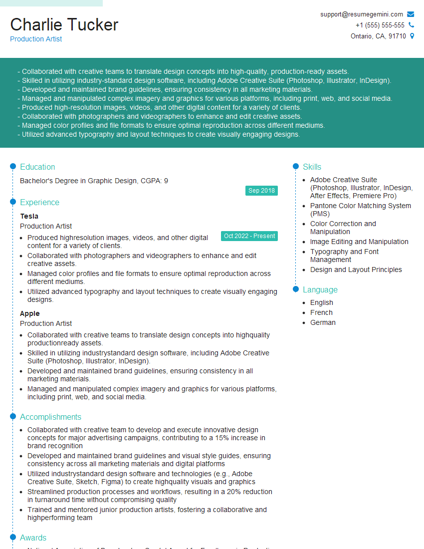
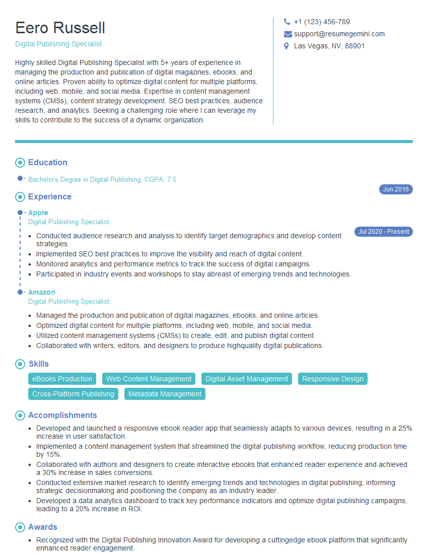
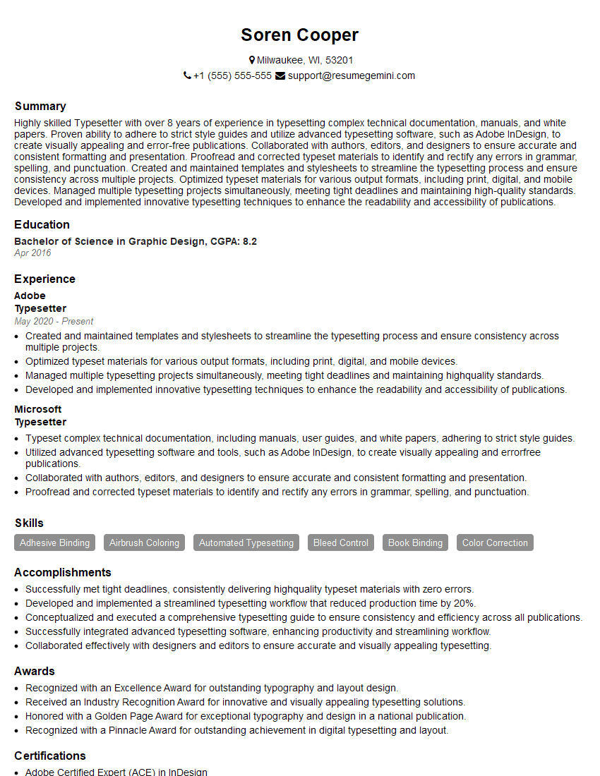
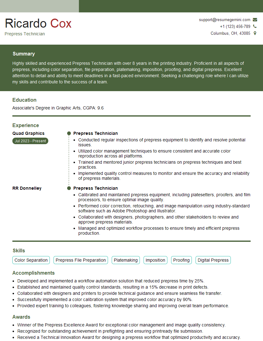
Mastering Formatting and Layout is crucial for career advancement in design and publishing. A strong understanding of these principles directly translates to creating impactful and user-friendly designs, leading to greater job opportunities. To enhance your job prospects, it’s vital to create a resume that is both visually appealing and easily parsed by Applicant Tracking Systems (ATS). ResumeGemini can help you build a professional, ATS-friendly resume tailored to highlight your formatting and layout skills. Examples of resumes tailored to Formatting and Layout positions are available to help you further refine your application materials.
Explore more articles
Users Rating of Our Blogs
Share Your Experience
We value your feedback! Please rate our content and share your thoughts (optional).
What Readers Say About Our Blog
Hi, I’m Jay, we have a few potential clients that are interested in your services, thought you might be a good fit. I’d love to talk about the details, when do you have time to talk?
Best,
Jay
Founder | CEO

