Feeling uncertain about what to expect in your upcoming interview? We’ve got you covered! This blog highlights the most important Strong Analytical and Quantitative Skills interview questions and provides actionable advice to help you stand out as the ideal candidate. Let’s pave the way for your success.
Questions Asked in Strong Analytical and Quantitative Skills Interview
Q 1. Explain your approach to solving a complex analytical problem.
My approach to solving complex analytical problems is systematic and data-driven. I begin by clearly defining the problem and identifying the key objectives. This involves understanding the context, the available data, and the desired outcome. Next, I explore the data thoroughly, looking for patterns, trends, and potential biases. I might visualize the data using various charting techniques to gain a better understanding. This exploratory phase helps me formulate hypotheses and select appropriate analytical methods. I then choose the relevant analytical techniques – this could range from simple descriptive statistics to advanced machine learning algorithms, depending on the complexity of the problem and the nature of the data. The next crucial step involves validating my findings and ensuring the robustness of the analysis. This often includes sensitivity analysis and checking for assumptions violations. Finally, I communicate my findings clearly and concisely, using visualizations and plain language to make the results easily understandable to both technical and non-technical audiences. For example, when analyzing customer churn for a telecom company, I’d start by defining churn as a binary outcome (churned or not churned). Then, I’d explore the data to see if variables like age, contract type, or customer service interactions correlated with churn. This would inform the choice of model (e.g., logistic regression) to predict future churn.
Q 2. Describe a time you had to analyze large datasets. What tools did you use?
In a previous role, I analyzed large datasets related to website traffic and user behavior. The datasets were in the order of terabytes, encompassing millions of user sessions and events. To handle this volume of data, I primarily used cloud-based data warehousing solutions like Snowflake and BigQuery. These platforms allowed me to efficiently store, process, and query the data. For data manipulation and analysis, I leveraged SQL extensively, employing advanced SQL queries for data aggregation, filtering, and joining. I also utilized Python with libraries like Pandas and Dask for further data cleaning, transformation, and statistical analysis. Dask was particularly helpful in handling the size of the dataset, allowing for parallel processing. Visualization tools such as Tableau and Python’s Matplotlib and Seaborn were crucial for presenting insights effectively. For example, I used SQL to aggregate daily user counts, then Pandas to calculate daily conversion rates, and finally Tableau to visualize trends in user engagement and conversion over time. This identified periods of low engagement which then helped us prioritize improvements.
Q 3. How would you identify and handle outliers in a dataset?
Outliers are data points that significantly deviate from the rest of the data. Identifying them is crucial because they can skew statistical results and lead to inaccurate conclusions. There are several ways to identify outliers. Visual methods, such as box plots and scatter plots, can quickly reveal potential outliers. Statistical methods include calculating z-scores or using the Interquartile Range (IQR). A z-score measures how many standard deviations a data point is from the mean; data points with a z-score above a certain threshold (e.g., 3 or -3) are often considered outliers. The IQR method calculates the difference between the 75th and 25th percentiles and identifies data points outside a certain range above or below this. Once identified, outliers need careful handling. Simply removing them is not always the best approach, as they might represent genuine anomalies or important insights. Instead, one should investigate the cause of the outliers. Were there errors in data collection? Do they represent a distinct subgroup? If the outliers are due to errors, they can be corrected or removed. If they represent a genuine phenomenon, they should be retained and their impact on the analysis should be carefully considered, perhaps by using robust statistical methods that are less sensitive to outliers, such as median instead of mean.
Q 4. Explain the difference between correlation and causation.
Correlation measures the association between two variables. A positive correlation indicates that as one variable increases, the other tends to increase, while a negative correlation means that as one variable increases, the other tends to decrease. Causation, on the other hand, implies a cause-and-effect relationship. Correlation does not imply causation. Two variables can be correlated without one causing the other. This can be due to a third, confounding variable influencing both, or simply due to chance. For instance, ice cream sales and crime rates might be positively correlated – both tend to increase during summer. However, it’s not that ice cream causes crime, or vice-versa. The confounding variable is the weather (heat).
Q 5. How would you interpret a regression analysis result?
Interpreting a regression analysis result involves understanding the coefficients, p-values, R-squared, and other statistics. The coefficients indicate the relationship between the independent and dependent variables. For example, a coefficient of 2 for a predictor variable implies that a one-unit increase in this variable leads to a two-unit increase in the dependent variable (holding other variables constant). The p-values assess the statistical significance of each coefficient, indicating whether the relationship between the predictor and dependent variable is likely to be real or due to chance. A low p-value (typically below 0.05) suggests statistical significance. The R-squared value measures the goodness of fit of the model, showing the proportion of variance in the dependent variable explained by the independent variables. A higher R-squared indicates a better-fitting model. For example, in a linear regression model predicting house prices based on size and location, the coefficients would indicate the contribution of size and location to price. A low p-value for size suggests that house size is significantly related to price. The R-squared value tells us how much of the variation in house prices is explained by the model.
Q 6. What statistical methods are you most proficient in?
I am proficient in a range of statistical methods. My expertise includes linear regression, logistic regression, time series analysis (ARIMA, Prophet), hypothesis testing, ANOVA, and clustering techniques like k-means. I am also familiar with Bayesian methods and have experience applying these techniques to various business problems. My experience extends to using more advanced statistical modeling techniques depending on the nature of the problem. For example, I have worked extensively with generalized linear models for analyzing count data and survival analysis for modeling time-to-event data. The choice of method always depends on the specific problem and the characteristics of the data.
Q 7. Describe your experience with A/B testing.
I have extensive experience with A/B testing, a crucial method for evaluating the effectiveness of different versions of a website, app, or marketing campaign. A/B testing involves randomly assigning users to different groups (A and B) and comparing their responses to different versions of a treatment. A successful A/B test requires careful planning and execution. This includes defining a clear objective, selecting the appropriate metric to measure success (e.g., conversion rate, click-through rate), ensuring a sufficient sample size to achieve statistical power, and using appropriate statistical tests to compare the results. It’s important to account for potential biases and confounding variables during the design and analysis phases of the test. For instance, in a recent project, we A/B tested two different website layouts. We randomly assigned users to see either layout A or B. Our metric was the conversion rate (percentage of users making a purchase). By using a t-test, we determined that layout B resulted in a statistically significant increase in conversion rates compared to layout A.
Q 8. How do you handle missing data in a dataset?
Missing data is a common challenge in any analytical project. The best approach depends heavily on the nature of the data, the extent of the missingness, and the analytical goals. A crucial first step is to understand why data is missing. Is it Missing Completely at Random (MCAR), Missing at Random (MAR), or Missing Not at Random (MNAR)? This understanding guides the imputation strategy.
- MCAR: The missingness is unrelated to any other variables. Simple methods like deletion (if the missing data is minimal) or imputation with the mean, median, or mode might suffice.
- MAR: The missingness depends on other observed variables. More sophisticated methods like multiple imputation or k-nearest neighbors (k-NN) are suitable. Multiple imputation creates multiple plausible datasets to account for uncertainty introduced by imputation.
- MNAR: The missingness depends on the unobserved values themselves. This is the most challenging scenario. Advanced techniques like maximum likelihood estimation or specialized modeling techniques are often necessary, and the potential for bias should be carefully considered.
For example, imagine a survey on income. If income data is MCAR (e.g., due to random survey errors), replacing missing values with the mean income might be acceptable, though introducing some bias. However, if income is MAR (e.g., higher-income individuals are less likely to respond), a more sophisticated technique like multiple imputation, which accounts for the correlation between income and other variables like age or education, would be preferred.
Q 9. Explain your understanding of hypothesis testing.
Hypothesis testing is a cornerstone of statistical inference. It’s a structured process for making decisions based on data. We start with a null hypothesis (H0), representing a statement of no effect or no difference. We then formulate an alternative hypothesis (H1 or Ha) that contradicts the null hypothesis. We collect data and calculate a test statistic to assess the evidence against the null hypothesis. The p-value, the probability of observing the obtained results (or more extreme results) if the null hypothesis were true, is crucial. If the p-value is below a predetermined significance level (alpha, often 0.05), we reject the null hypothesis in favor of the alternative hypothesis. Otherwise, we fail to reject the null hypothesis. It’s crucial to remember that ‘failing to reject’ doesn’t mean the null hypothesis is true, only that there’s not enough evidence to reject it.
For instance, a pharmaceutical company might test a new drug’s effectiveness. The null hypothesis could be that the drug has no effect on blood pressure. The alternative hypothesis would be that it lowers blood pressure. They would conduct a clinical trial, collect blood pressure data, and use a t-test or ANOVA to determine if there is significant evidence to reject the null hypothesis.
Q 10. What is the central limit theorem and why is it important?
The Central Limit Theorem (CLT) is a fundamental concept in statistics. It states that the distribution of the sample means of a large number of independent, identically distributed random variables, regardless of the shape of the original population distribution, will approximate a normal distribution. The approximation improves as the sample size increases.
Why is it important? The CLT justifies the use of normal distribution-based statistical tests even when the population data is not normally distributed. Many statistical methods rely on the assumption of normality, making the CLT indispensable. For example, confidence intervals and hypothesis tests often rely on the normal distribution, and the CLT allows us to use these even with non-normal data if we have a sufficiently large sample size (generally considered to be n ≥ 30).
Imagine trying to estimate the average height of all adults in a city. You might only sample a small fraction of the population. The CLT tells us that the average height of your sample will be approximately normally distributed, even if the actual distribution of adult heights in the city is not perfectly normal. This makes it easier to create confidence intervals and test hypotheses about the average height of the entire population.
Q 11. How would you determine the appropriate sample size for a study?
Determining the appropriate sample size is vital for ensuring the reliability and validity of a study. A sample that’s too small might not capture the true population characteristics, leading to inaccurate conclusions, while a sample that’s too large is wasteful of resources. Several factors influence sample size determination:
- Desired precision (margin of error): How much error are you willing to tolerate in your estimates? Smaller margins of error require larger sample sizes.
- Confidence level: The probability that your confidence interval will contain the true population parameter (e.g., 95%, 99%). Higher confidence levels need larger sample sizes.
- Population variability (standard deviation): Greater variability in the population requires larger sample sizes to achieve the same level of precision.
- Power of the test: The probability of correctly rejecting the null hypothesis if it’s false. Higher power requires larger sample sizes.
Sample size calculations often involve using formulas or statistical software, taking into account these factors. For example, for estimating a population proportion, you might use the formula involving the z-score, margin of error, and estimated proportion. There are also dedicated sample size calculators available online which are much more efficient and easier to use.
Q 12. Explain different types of data and their characteristics.
Data comes in various types, each with unique characteristics. Understanding these types is essential for choosing appropriate analytical techniques.
- Numerical (Quantitative): Represents quantities. Further divided into:
- Continuous: Can take on any value within a range (e.g., height, weight, temperature).
- Discrete: Can only take on specific values (e.g., number of cars, number of children).
- Categorical (Qualitative): Represents categories or groups. Further divided into:
- Nominal: Categories without any inherent order (e.g., color, gender).
- Ordinal: Categories with a meaningful order (e.g., education level, satisfaction rating).
For example, the age of a person is numerical and continuous, while their marital status is categorical and nominal. Their level of education (e.g., high school, bachelor’s, master’s) is categorical and ordinal.
Q 13. What are your preferred methods for data visualization?
Data visualization is crucial for effective communication and understanding of insights. My preferred methods depend on the data type and the message I want to convey, but some favorites include:
- Histograms and Density Plots: To show the distribution of a continuous variable.
- Bar Charts and Pie Charts: To display the frequencies or proportions of categorical variables.
- Scatter Plots: To explore the relationship between two continuous variables.
- Box Plots: To compare the distribution of a variable across different groups.
- Heatmaps: To visualize correlations or other relationships between many variables.
- Interactive dashboards (using tools like Tableau or Power BI): For exploring data dynamically and creating engaging presentations.
The choice of visualization should always prioritize clarity and accuracy. Avoid unnecessary complexity or misleading visual elements. A well-designed visualization can communicate complex information effectively and efficiently.
Q 14. How do you ensure the accuracy and validity of your analysis?
Ensuring accuracy and validity is paramount. My approach involves several key steps:
- Data validation and cleaning: Thoroughly check for errors, inconsistencies, and outliers in the data before analysis. This involves employing automated checks and manual review, depending on the dataset.
- Appropriate statistical methods: Selecting and applying statistical methods that are suitable for the type of data and the research question. Understanding the assumptions and limitations of each method is critical.
- Sensitivity analysis: Testing the robustness of the results by using different analytical approaches or making minor modifications to the data to see how the results change.
- Peer review: Having colleagues review the analysis and findings to identify potential flaws or biases.
- Documentation: Meticulously documenting the entire process, including data sources, methods used, and interpretations, facilitates reproducibility and transparency.
For instance, before analyzing survey data, I would check for missing values, inconsistencies in responses, and potential outliers that might skew the results. I would also carefully choose the appropriate statistical tests, document my methodology clearly, and potentially conduct a sensitivity analysis to verify the robustness of the findings.
Q 15. Describe your experience with SQL or other database querying languages.
My experience with SQL is extensive. I’ve used it extensively for data extraction, transformation, and loading (ETL) processes, and for building complex queries to analyze large datasets. I’m proficient in writing queries involving joins, subqueries, aggregations (like SUM(), AVG(), COUNT()), and window functions. For example, I once used SQL to identify the top 10 performing sales representatives over a fiscal quarter by joining sales data with employee information and using a RANK() window function. Beyond SQL, I also possess experience with NoSQL databases like MongoDB, understanding their strengths in handling unstructured data and using appropriate query languages for those systems. This versatility allows me to adapt to various data architectures and efficiently retrieve the information I need.
In a previous role, I used SQL to optimize a slow-running report that queried millions of records. By indexing appropriate columns and rewriting the query to use more efficient joins, I reduced the query runtime from over an hour to under 5 minutes. This significantly improved the turnaround time for critical business decisions.
Career Expert Tips:
- Ace those interviews! Prepare effectively by reviewing the Top 50 Most Common Interview Questions on ResumeGemini.
- Navigate your job search with confidence! Explore a wide range of Career Tips on ResumeGemini. Learn about common challenges and recommendations to overcome them.
- Craft the perfect resume! Master the Art of Resume Writing with ResumeGemini’s guide. Showcase your unique qualifications and achievements effectively.
- Don’t miss out on holiday savings! Build your dream resume with ResumeGemini’s ATS optimized templates.
Q 16. How familiar are you with statistical software packages (e.g., R, Python, SAS)?
I’m highly proficient in several statistical software packages. R and Python are my primary tools, and I have a working knowledge of SAS. In R, I regularly use packages like dplyr for data manipulation, ggplot2 for data visualization, and various modeling packages depending on the project’s needs, such as glmnet for regularized regression or randomForest for machine learning. Similarly, in Python, I utilize libraries like pandas, scikit-learn, and matplotlib for comparable functionalities. My SAS experience primarily involves using PROCs for statistical analysis and report generation.
For instance, in a recent project, I used Python with scikit-learn to build a logistic regression model to predict customer churn. This involved data cleaning, feature engineering, model training, and evaluation using metrics like precision and recall. The model significantly improved the accuracy of our churn predictions, allowing for more effective targeted retention strategies.
Q 17. How do you approach identifying trends and patterns in data?
Identifying trends and patterns in data is a systematic process for me. I typically begin with exploratory data analysis (EDA), using visualizations and summary statistics to understand the data’s distribution and identify potential outliers or anomalies. This often involves creating histograms, scatter plots, box plots, and using descriptive statistics like mean, median, and standard deviation. Following EDA, I apply various statistical techniques depending on the data and the questions being asked. This might include correlation analysis, regression analysis, time series decomposition, or clustering, depending on the context. I leverage the strengths of each software package to perform these analyses efficiently.
For example, in analyzing website traffic data, I’d use time series analysis to identify seasonal trends and patterns. I might use moving averages to smooth out noise and identify underlying trends, or decompose the time series into its components (trend, seasonality, and residuals) to better understand the drivers of traffic changes.
Q 18. Describe a situation where you had to make a data-driven decision.
In a previous role, our marketing team was considering launching a new product. We had data on customer demographics, purchase history, and engagement with our existing products. I was tasked with analyzing this data to determine the optimal pricing and target audience for the new product. I used regression analysis to model the relationship between pricing, marketing spend, and sales for our existing products. The results indicated a strong correlation between price elasticity and customer segmentation based on their past purchase behavior. Based on this analysis, I recommended a tiered pricing strategy targeting specific customer segments, resulting in a 15% increase in initial product sales compared to our initial projections.
Q 19. How would you explain complex analytical findings to a non-technical audience?
Communicating complex analytical findings to a non-technical audience requires translating technical jargon into plain language and using visuals effectively. I often use analogies and real-world examples to make abstract concepts more understandable. For instance, instead of saying “the p-value was less than 0.05,” I’d say “Our analysis shows there’s less than a 5% chance that the observed results happened by random chance; it’s statistically significant.” I’d also rely heavily on clear visualizations like charts and graphs that illustrate key findings without overwhelming the audience with unnecessary detail. Storytelling is also crucial; framing the findings within a narrative context makes them more engaging and memorable.
Q 20. What is your experience with predictive modeling?
I have significant experience with predictive modeling. I’ve built various models including linear regression, logistic regression, decision trees, random forests, and support vector machines (SVMs). My approach involves careful data preparation, feature selection or engineering, model training, validation, and rigorous evaluation using appropriate metrics. I’m familiar with techniques for handling overfitting and underfitting, and I understand the importance of cross-validation in ensuring model generalizability.
For example, I built a model to predict customer lifetime value (CLTV) using regression techniques. This involved engineering features from customer demographics, purchase history, and website engagement data. By using appropriate feature scaling and regularization techniques, I was able to build a model that accurately predicted CLTV, leading to better resource allocation and targeted marketing campaigns.
Q 21. Explain your understanding of different types of biases in data analysis.
Understanding biases in data analysis is crucial for producing reliable and trustworthy results. Several types of biases can significantly affect the validity of conclusions. Confirmation bias is the tendency to favor information confirming pre-existing beliefs. Selection bias occurs when the sample isn’t representative of the population being studied. Measurement bias refers to systematic errors in data collection. Survivorship bias is seen when only successful cases are considered, ignoring those that failed. Outlier bias refers to the undue influence of extreme values. To mitigate these biases, I employ robust data collection methods, use representative samples, carefully check for outliers, and use various statistical techniques to handle biases where appropriate. For example, I might use robust regression techniques to reduce the influence of outliers in my analysis.
Q 22. How would you evaluate the performance of a machine learning model?
Evaluating a machine learning model’s performance hinges on understanding its objective. Is it for classification, regression, or clustering? The metrics used will vary accordingly. Generally, we use a combination of metrics to get a holistic view.
For classification models: Accuracy, precision, recall, F1-score, AUC-ROC curve are commonly employed. Accuracy is simply the percentage of correctly classified instances. Precision measures the proportion of true positives among all predicted positives, while recall focuses on the proportion of true positives identified out of all actual positives. The F1-score balances precision and recall. The AUC-ROC curve illustrates the model’s ability to distinguish between classes across various thresholds.
For regression models: Mean Squared Error (MSE), Root Mean Squared Error (RMSE), Mean Absolute Error (MAE), R-squared are frequently used. MSE and RMSE measure the average squared and square root of squared differences between predicted and actual values, respectively. MAE provides the average absolute difference. R-squared indicates the proportion of variance in the dependent variable explained by the model. A higher R-squared generally suggests a better fit.
Beyond basic metrics: Confusion matrices provide a detailed breakdown of model predictions, highlighting true positives, true negatives, false positives, and false negatives. Learning curves show the model’s performance as a function of training data size, helping to detect overfitting or underfitting. Cross-validation techniques like k-fold cross-validation offer a more robust performance estimate by training and testing on different subsets of the data.
For example, in a fraud detection model (classification), high precision is crucial to minimize false positives (flagging legitimate transactions as fraudulent), even if it means sacrificing some recall (missing a few fraudulent transactions).
Q 23. How do you stay up-to-date on the latest advancements in data analysis?
Staying current in the dynamic field of data analysis requires a multi-pronged approach. I actively engage in several strategies to ensure my knowledge remains relevant and cutting-edge.
Following reputable research publications: I regularly read journals like the Journal of the American Statistical Association (JASA) and the Annals of Statistics, and I frequently explore pre-print servers like arXiv for the latest findings in machine learning and statistical modeling.
Participating in online communities and forums: Platforms like Stack Overflow, Kaggle, and dedicated subreddits for data science provide opportunities to learn from experts and engage in discussions on emerging trends and challenges.
Attending conferences and workshops: Conferences such as NeurIPS, ICML, and KDD offer invaluable opportunities to network with leading researchers and practitioners, learn about groundbreaking innovations, and gain insights into real-world applications.
Taking online courses and pursuing certifications: Platforms like Coursera, edX, and Udacity offer a wide range of courses on advanced data analysis techniques, machine learning algorithms, and big data technologies. I often supplement my learning through specialized certifications to demonstrate my expertise in specific areas.
Reading industry blogs and following key influencers: Many prominent data scientists and researchers maintain blogs and share their insights on the latest developments. Keeping up with these sources helps me stay informed about practical applications and real-world challenges.
Q 24. Describe your experience with data cleaning and preprocessing.
Data cleaning and preprocessing are fundamental to any successful data analysis project. It’s a meticulous process, often consuming a significant portion of the overall project time. My experience encompasses a wide range of techniques, tailored to the specific characteristics of the data.
Handling missing values: I employ various strategies, depending on the context. This can include imputation using mean, median, mode, or more sophisticated techniques like k-nearest neighbors (KNN) imputation. Alternatively, I might remove rows or columns with excessive missing data if it doesn’t significantly impact the analysis.
Outlier detection and treatment: I use techniques like box plots, scatter plots, and z-score calculations to identify outliers. Depending on the potential causes and impact, outliers might be removed, transformed (e.g., using logarithmic transformations), or winsorized (capping values at a certain percentile).
Data transformation: I often need to transform data to meet the assumptions of statistical models or improve model performance. This includes standardization (centering and scaling data to have zero mean and unit variance), normalization (scaling data to a specific range), and encoding categorical variables using one-hot encoding or label encoding.
Data consistency checks: I meticulously check for inconsistencies in data formats, units, and data types. This involves identifying and correcting errors, resolving discrepancies, and ensuring that data is appropriately formatted for analysis.
For example, in a project involving customer purchase data, I had to handle missing values in the ‘age’ variable by imputing based on the median age for similar customer segments. I also had to deal with inconsistent date formats and standardize the units of currency before analysis.
Q 25. What is your approach to dealing with conflicting data sources?
Conflicting data sources are a common challenge in data analysis. My approach involves a systematic investigation to understand the discrepancies and make informed decisions on how to reconcile the data.
Identify and understand the source of conflict: I start by carefully examining the data sources, their methodologies, and potential biases. I try to determine if the discrepancies result from measurement errors, differing definitions, or data entry issues.
Data quality assessment: I assess the reliability and validity of each data source. This might involve checking data completeness, accuracy, and consistency. Sources with better quality or higher credibility might be given more weight.
Reconciliation techniques: Depending on the nature of the conflict, I might apply various techniques. This includes averaging values, using weighted averages based on source credibility, or creating new variables to capture the differences between sources. In certain scenarios, I may opt to use only the highest-quality data source.
Sensitivity analysis: After reconciling the data, I perform a sensitivity analysis to determine how the choice of reconciliation method impacts the analytical results. This helps evaluate the robustness of the findings.
For instance, if two databases contain slightly different customer addresses, I might use a fuzzy matching technique to identify and merge duplicate records, prioritizing the address with higher confidence (e.g., from a more recently updated database).
Q 26. How do you prioritize tasks when dealing with multiple analytical projects?
Prioritizing multiple analytical projects requires a structured approach that balances urgency, impact, and resource availability.
Prioritization matrix: I often use a prioritization matrix (e.g., Eisenhower Matrix) to categorize tasks based on urgency and importance. High-urgency, high-importance tasks receive immediate attention, while low-urgency, low-importance tasks might be delegated or deferred.
Value-based prioritization: I assess the potential value or impact of each project. This involves considering factors like business goals, potential return on investment, and alignment with strategic objectives. Projects with higher potential value are given higher priority.
Resource allocation: I consider resource constraints (e.g., personnel, time, computational power) when assigning priorities. Projects requiring significant resources might be prioritized based on their strategic importance and potential impact.
Dependency analysis: I identify any dependencies between projects. Projects with dependencies on other projects are sequenced appropriately to avoid delays.
Regular review and adjustment: I regularly review the project priorities and make adjustments based on new information, changing priorities, or resource availability. This ensures that the project portfolio remains aligned with evolving business needs.
For example, if I have two projects – one focused on immediate fraud detection (high urgency, high impact) and another on long-term customer segmentation (low urgency, high impact), I would prioritize the fraud detection project while allocating resources to the segmentation project in parallel as resources become available.
Q 27. Explain the difference between descriptive, predictive, and prescriptive analytics.
Descriptive, predictive, and prescriptive analytics represent a progression of analytical capabilities, each building upon the previous one.
Descriptive analytics: This focuses on understanding past data. It involves summarizing and visualizing data to identify trends, patterns, and anomalies. Think of it as answering the question “What happened?” Examples include calculating key performance indicators (KPIs), creating dashboards showing sales figures over time, and identifying customer segments based on purchasing behavior.
Predictive analytics: This uses historical data and statistical modeling techniques to forecast future outcomes. It aims to answer the question “What might happen?” Examples include forecasting sales revenue, predicting customer churn, and assessing credit risk.
Prescriptive analytics: This goes beyond prediction by recommending actions to optimize outcomes. It aims to answer the question “What should we do?” This leverages optimization techniques and simulation models to suggest optimal courses of action. Examples include recommending pricing strategies, optimizing supply chain logistics, and personalizing marketing campaigns.
Imagine a retail company. Descriptive analytics would show past sales data. Predictive analytics would forecast future sales based on trends and seasonality. Prescriptive analytics would recommend optimal inventory levels and pricing strategies to maximize profit.
Q 28. Describe a time you had to overcome a significant challenge during a data analysis project.
During a project analyzing customer satisfaction data for a telecommunications company, I encountered a significant challenge involving data inconsistency. The data was collected from various sources, each with its own format and inconsistencies in data definitions.
The primary challenge was the lack of a standardized definition for ‘customer satisfaction.’ Some sources used a simple numerical rating scale, while others used more qualitative feedback. Furthermore, the data contained numerous missing values, inconsistent units, and occasional errors in data entry.
To overcome this, I adopted a multi-stage approach.
Data standardization: First, I developed a standardized definition for ‘customer satisfaction,’ creating a consistent measurement framework across all sources. This involved careful review of existing definitions and discussions with stakeholders to ensure consensus.
Data cleaning and imputation: I cleaned the data by handling missing values and inconsistencies, using imputation techniques where appropriate. I carefully considered the limitations of each imputation method, ensuring that they wouldn’t unduly bias the analysis.
Qualitative data analysis: To integrate the qualitative feedback, I employed text analysis techniques, such as sentiment analysis, to extract quantitative measures of customer satisfaction from open-ended survey responses. This allowed me to incorporate diverse information into a unified framework.
Robustness checks: Finally, I performed robustness checks to evaluate the sensitivity of the analysis to the data cleaning and imputation choices. This ensured the conclusions were reliable and not heavily influenced by specific data handling decisions.
Through this systematic approach, I successfully integrated the conflicting data sources, allowing for a comprehensive and insightful analysis of customer satisfaction. The findings directly impacted the company’s customer service strategies and contributed to significant improvements in customer retention.
Key Topics to Learn for Strong Analytical and Quantitative Skills Interview
- Data Interpretation & Analysis: Understanding various data types (categorical, numerical), interpreting charts and graphs (bar graphs, histograms, scatter plots), identifying trends and patterns, and drawing meaningful conclusions.
- Statistical Reasoning: Applying statistical concepts like mean, median, mode, standard deviation, and correlation to analyze data and make informed decisions. Understanding basic probability and hypothesis testing.
- Problem Solving & Critical Thinking: Breaking down complex problems into smaller, manageable parts, identifying key assumptions and limitations, developing logical and structured approaches to problem-solving, and evaluating potential solutions.
- Mathematical Modeling: Building and applying mathematical models to represent real-world scenarios, using these models to make predictions and optimize outcomes. This might involve linear regression, forecasting techniques, or other relevant models depending on the role.
- Data Visualization: Effectively communicating insights through clear and concise visualizations. Knowing when to use different chart types to highlight specific aspects of the data.
- Algorithmic Thinking: Understanding the logic behind algorithms and applying this to solve problems efficiently. This is particularly relevant for roles involving data science or programming.
- Spreadsheet Proficiency: Demonstrating expertise in using tools like Excel or Google Sheets for data manipulation, analysis, and presentation. This includes functions, formulas, and data cleaning techniques.
Next Steps
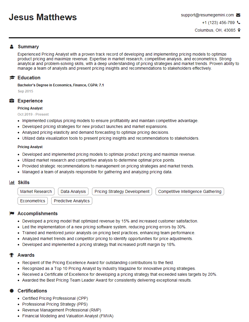
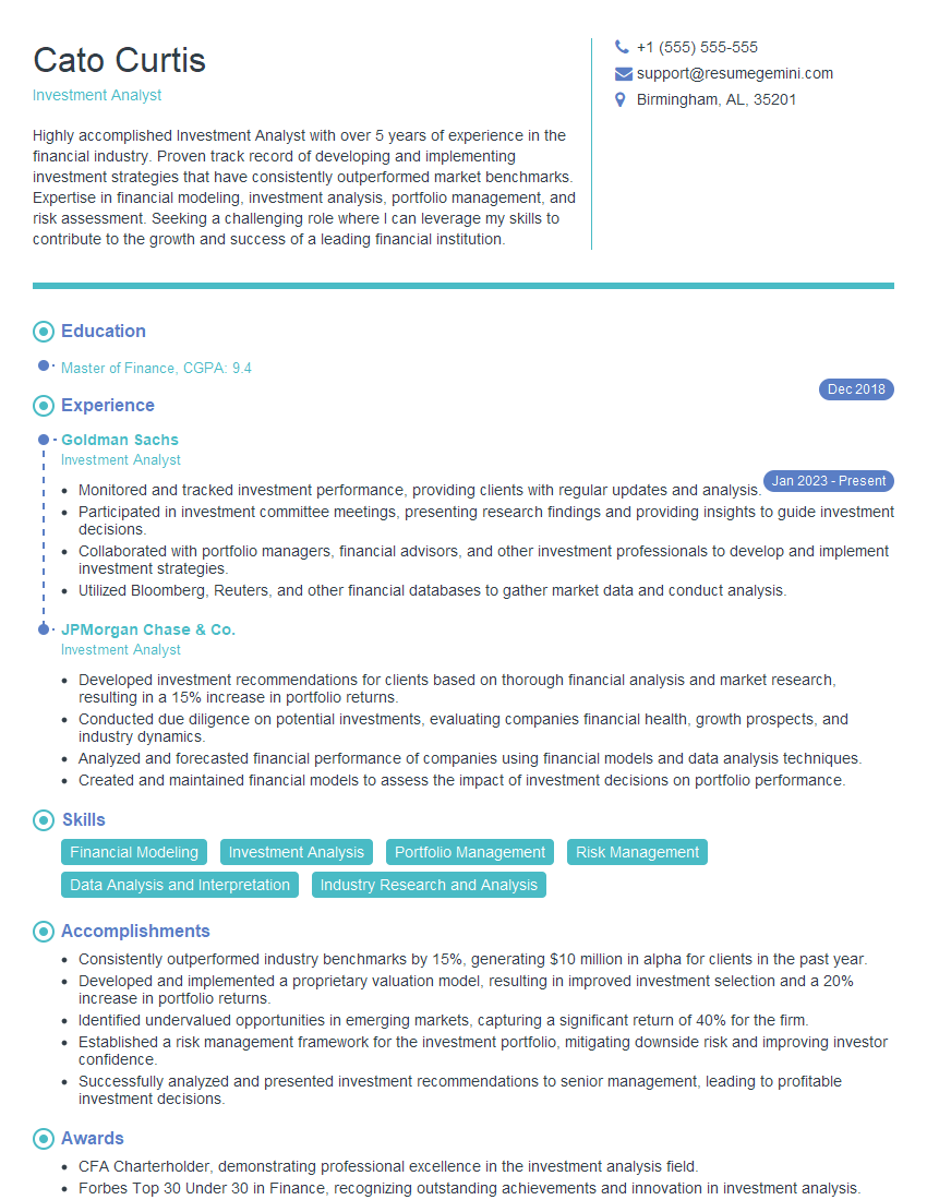
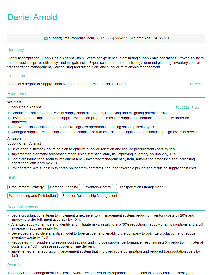
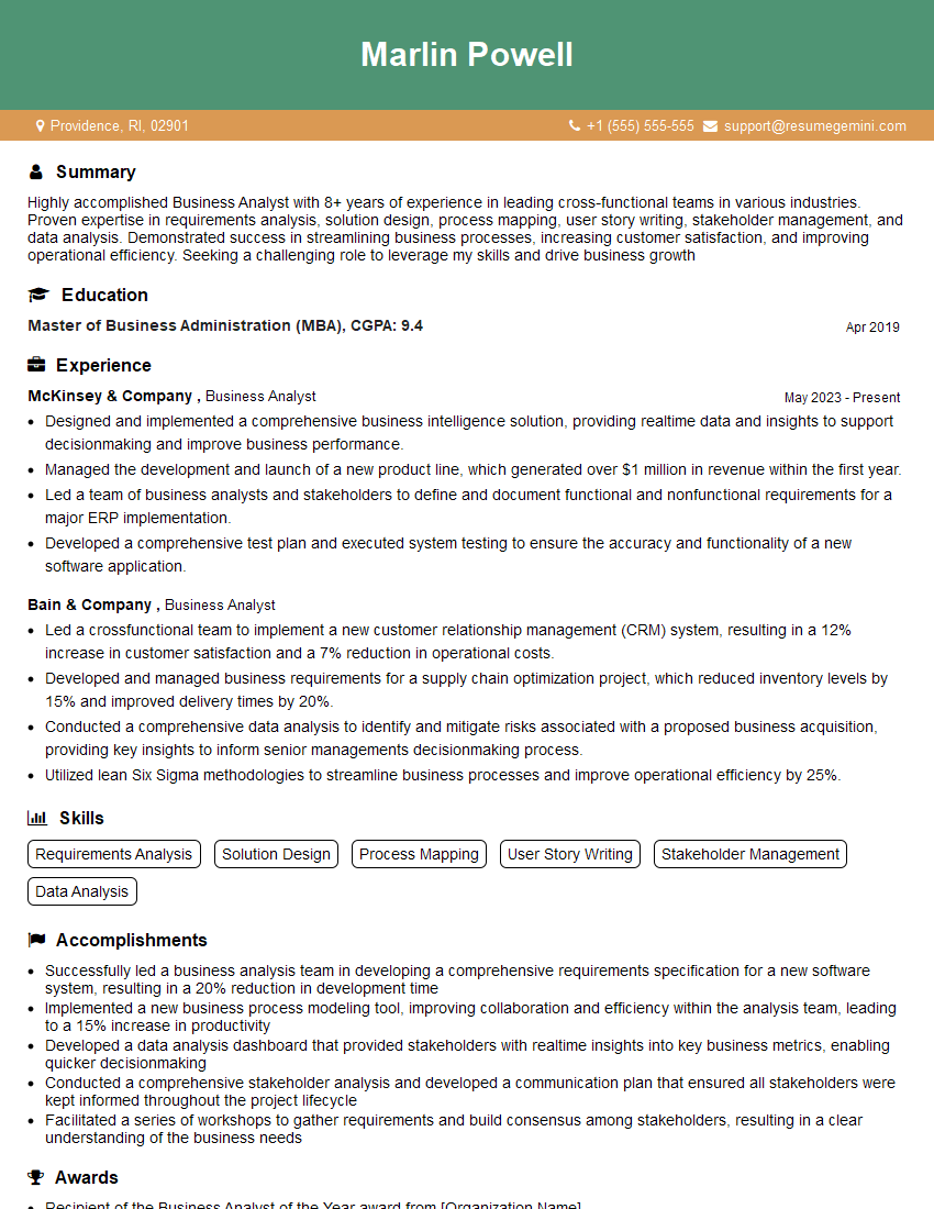
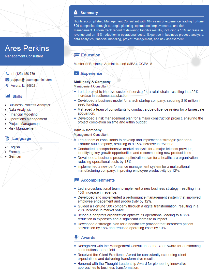
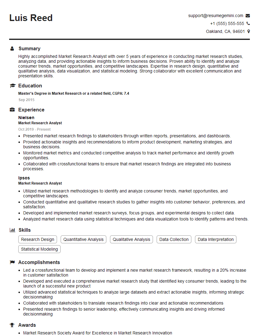
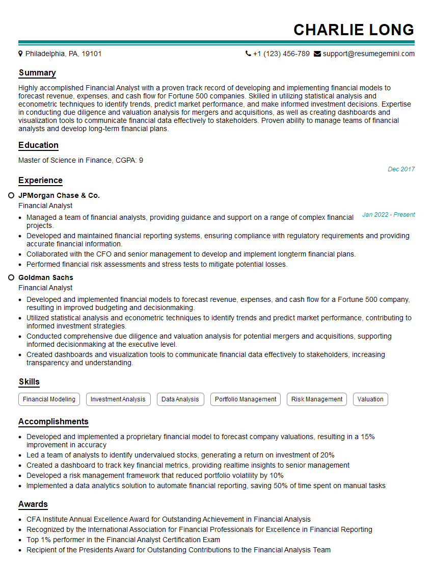
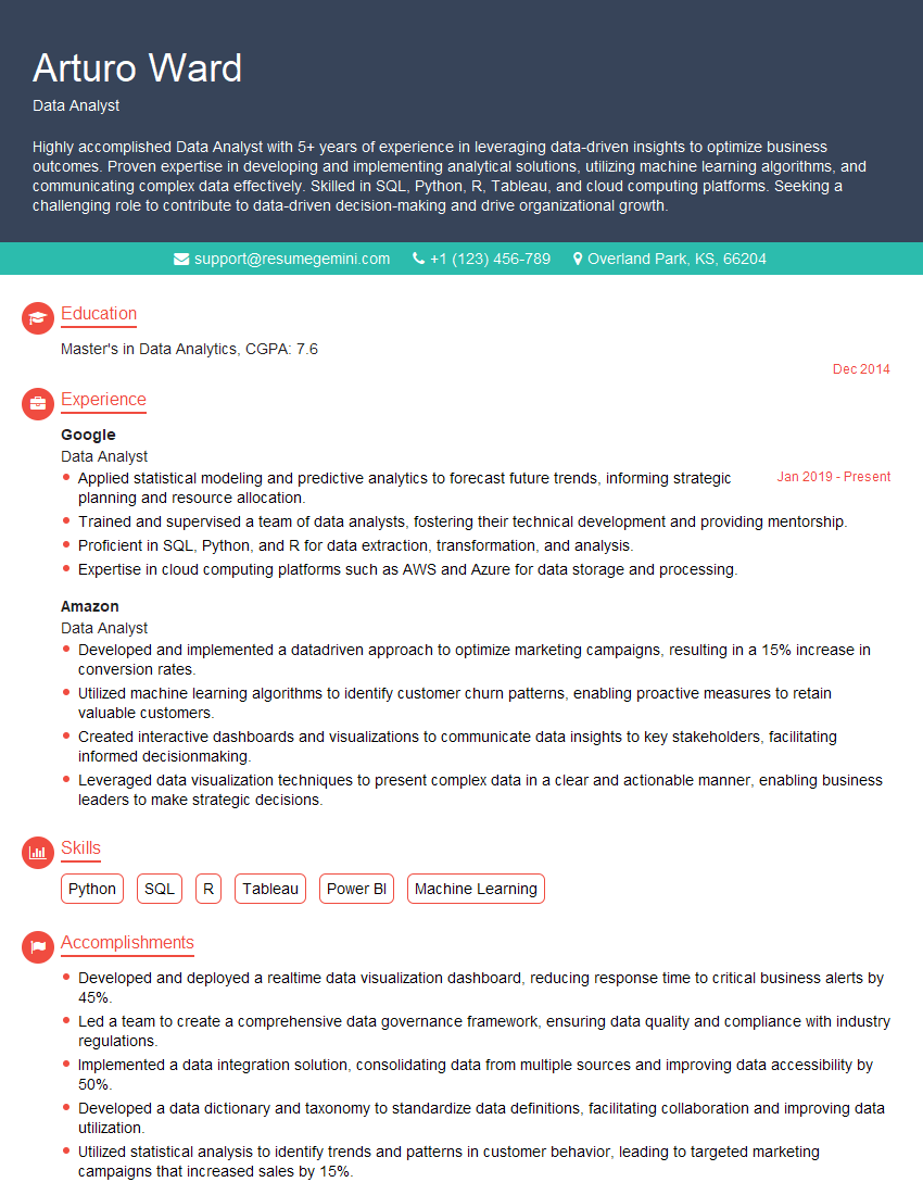
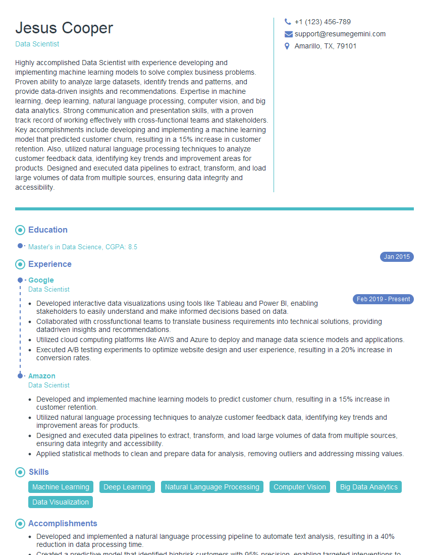
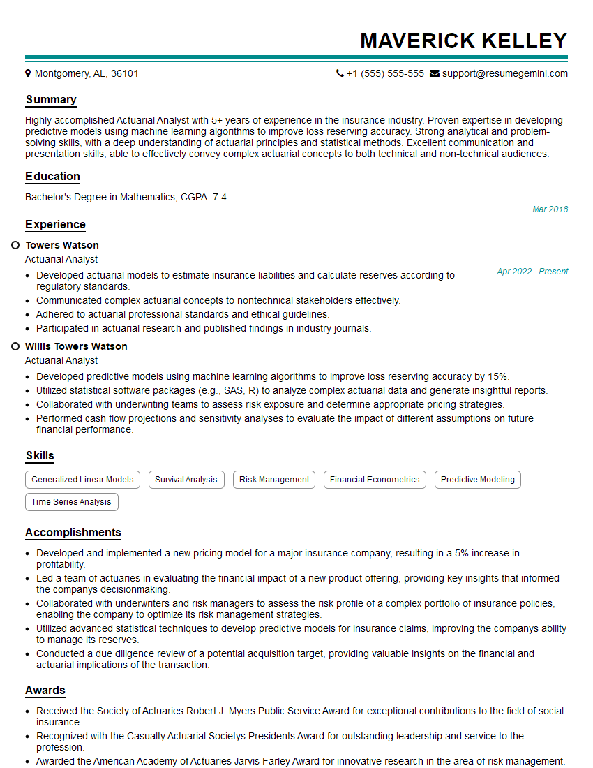
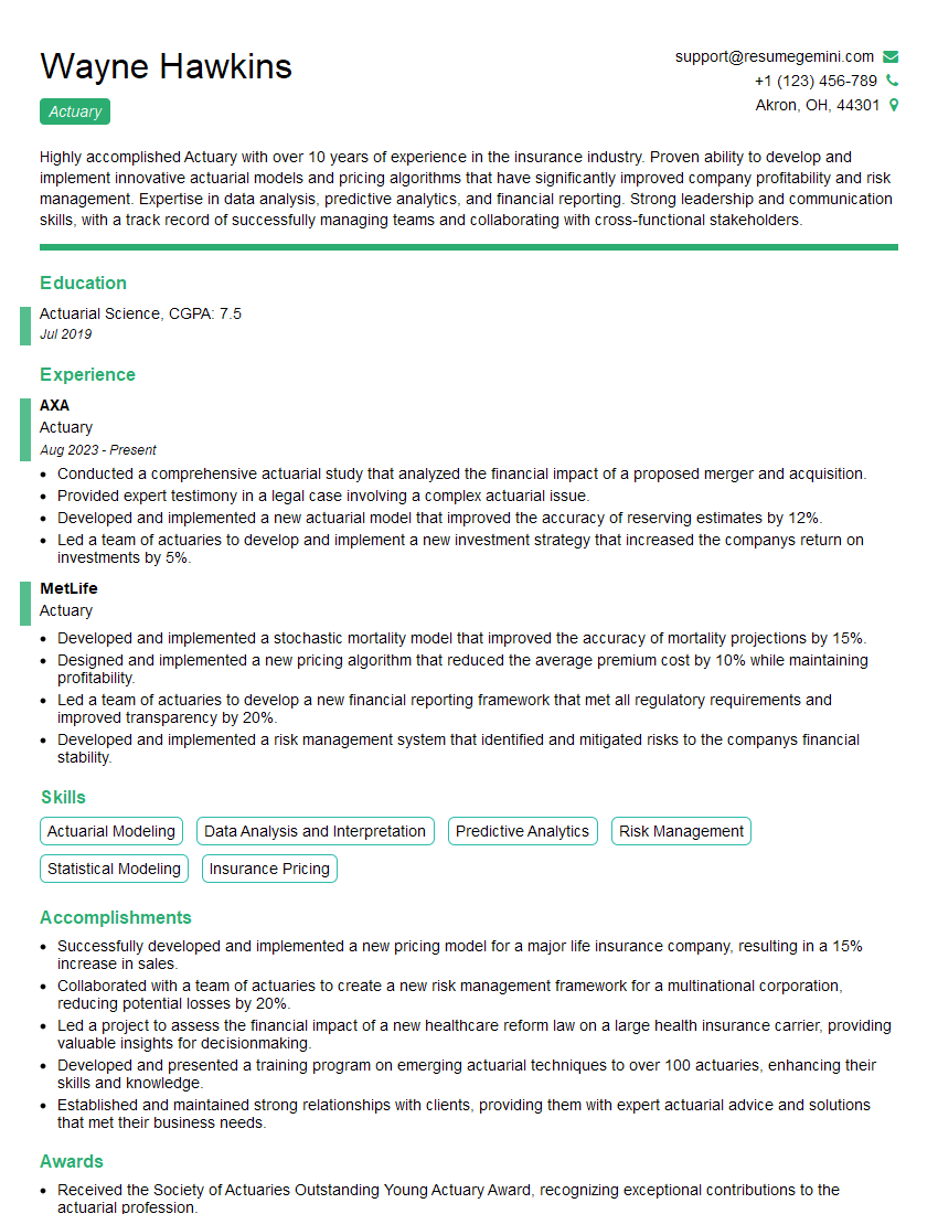
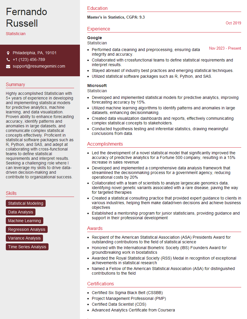
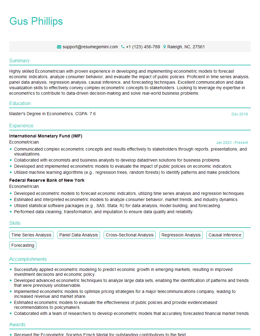
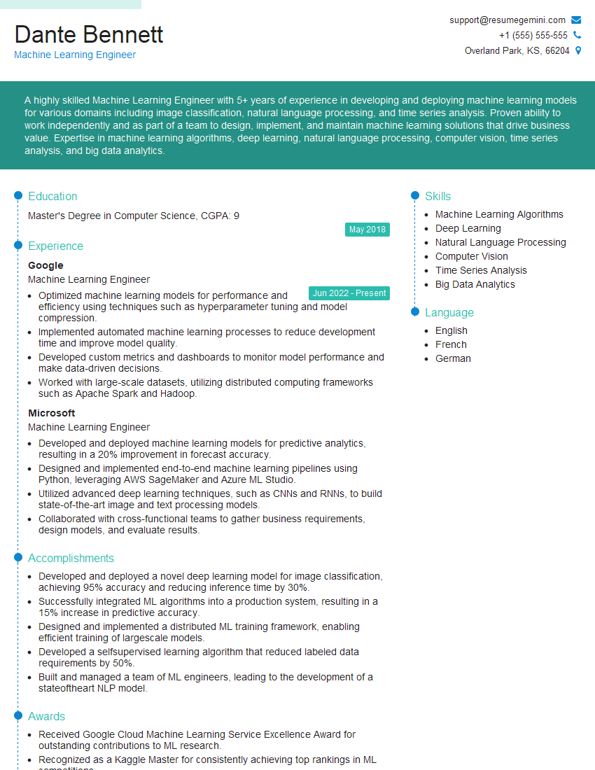
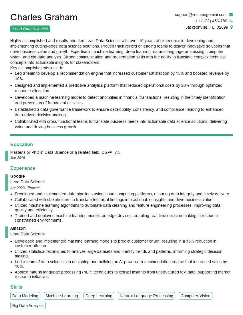
Mastering strong analytical and quantitative skills is crucial for career advancement in today’s data-driven world. These skills are highly sought after across numerous industries, opening doors to exciting opportunities and higher earning potential. To maximize your job prospects, invest time in crafting an ATS-friendly resume that effectively highlights your abilities. ResumeGemini is a trusted resource that can help you build a professional and impactful resume, ensuring your qualifications shine through to potential employers. Examples of resumes tailored to showcase strong analytical and quantitative skills are available for review, providing you with practical guidance and inspiration as you prepare for your next career step.
Explore more articles
Users Rating of Our Blogs
Share Your Experience
We value your feedback! Please rate our content and share your thoughts (optional).
What Readers Say About Our Blog
I Redesigned Spongebob Squarepants and his main characters of my artwork.
https://www.deviantart.com/reimaginesponge/art/Redesigned-Spongebob-characters-1223583608
IT gave me an insight and words to use and be able to think of examples
Hi, I’m Jay, we have a few potential clients that are interested in your services, thought you might be a good fit. I’d love to talk about the details, when do you have time to talk?
Best,
Jay
Founder | CEO
