Are you ready to stand out in your next interview? Understanding and preparing for Proficient in Microsoft Office Suite, including Excel, Word, and PowerPoint interview questions is a game-changer. In this blog, we’ve compiled key questions and expert advice to help you showcase your skills with confidence and precision. Let’s get started on your journey to acing the interview.
Questions Asked in Proficient in Microsoft Office Suite, including Excel, Word, and PowerPoint Interview
Q 1. Explain your experience using different versions of Microsoft Word.
My experience with Microsoft Word spans several versions, from Word 2007 to the current version, Microsoft 365. Each iteration has brought refinements to features I use daily. Early versions were useful for basic document creation and formatting, but more recent versions have significantly improved collaboration tools and features like real-time co-authoring. For example, the transition from the ribbon interface in Word 2007 to the more intuitive and customizable ribbon in later versions improved my workflow considerably. I’ve adapted quickly to each new version, leveraging new features to enhance productivity. In particular, the improved version control and track changes in the newer versions have made collaborative projects much smoother.
Q 2. Describe your proficiency in creating and formatting professional documents in Word.
Creating and formatting professional documents is a core skill I’ve honed over many years. I’m proficient in using styles to ensure consistency in headings, body text, and other elements, making document updates and revisions much easier. I leverage features like tables for organizing data, creating visually appealing layouts with columns and images, and advanced formatting options like page numbering, headers, and footers. My focus is always on clarity, readability, and a professional aesthetic. For instance, when creating reports, I consistently use professional templates, ensuring uniformity and a polished appearance. This extends to mastering techniques like controlling line spacing, using different font sizes effectively to emphasize key points and creating consistent margins across the document.
Q 3. How would you use mail merge in Word to send personalized letters?
Mail merge in Word is a powerful tool for creating personalized documents. It allows you to combine a main document (the letter template) with a data source (like an Excel spreadsheet containing recipient information) to generate multiple individualized letters. Imagine sending personalized thank-you notes to hundreds of clients. First, I would create a letter template in Word, inserting merge fields (e.g., <, <, <>) where personalized information should go. Then, I’d create or import an Excel spreadsheet containing the recipient data, ensuring the column headers match the merge field names. Finally, I’d initiate the mail merge process within Word, selecting my data source and previewing the results before printing or emailing the personalized letters. This significantly reduces time and effort compared to manually creating each letter.
Q 4. How familiar are you with Word’s track changes and commenting features?
I’m highly familiar with Word’s track changes and commenting features. These collaborative tools are essential for any professional writing environment. Track changes allow multiple authors to edit a document simultaneously, highlighting additions and deletions for clear review. Commenting enables authors to leave feedback and suggestions directly within the document, facilitating discussions and revisions. I frequently use these features to improve the clarity and accuracy of documents by identifying areas for improvement and streamlining the feedback process. For example, during a large project, I use track changes to manage edits from various team members and comments to provide constructive feedback. This makes the collaborative editing process significantly more transparent and organized.
Q 5. What are your preferred methods for creating visually appealing presentations in PowerPoint?
Creating visually appealing PowerPoint presentations involves a blend of design principles and technical skills. I focus on creating a clear narrative, using high-quality images and minimal text on each slide. I often use consistent themes and color palettes throughout the presentation to maintain a professional and cohesive look. I believe in leveraging PowerPoint’s design templates as a starting point, customizing them to suit the specific content. White space is my ally—it improves readability. I also ensure that my charts and graphs are clear, labeled correctly, and visually distinct to emphasize key data. For example, instead of overwhelming a slide with text, I utilize visual aids like infographics to communicate complex information effectively.
Q 6. Describe your experience with PowerPoint animations and transitions.
My experience with PowerPoint animations and transitions is extensive. I use them judiciously, focusing on enhancing the presentation’s flow and impact rather than overwhelming the audience with unnecessary effects. Subtle animations, such as appearing text or objects, can highlight key points. Transitions should be smooth and consistent; avoiding overly flashy or distracting effects. For instance, I might use a simple fade transition between slides, and a subtle animation like a ‘fly-in’ effect for bullet points to guide the audience’s eye. The goal is always to support the message, not distract from it. Overuse of these features can easily detract from the message.
Q 7. How would you create a professional-looking chart in PowerPoint using data from an Excel spreadsheet?
Creating professional charts in PowerPoint from Excel data is straightforward. First, I’d select the relevant data in my Excel spreadsheet. Then, I’d copy this data. In PowerPoint, I’d choose the ‘Insert’ tab and select the appropriate chart type (bar chart, line graph, pie chart, etc.) depending on the nature of the data and the message I want to communicate. After pasting the data, PowerPoint automatically generates the chart. I’d then customize the chart’s title, axis labels, legend, and colors to ensure clarity and visual appeal. I might adjust the chart style using pre-designed templates or manually altering elements to match the overall presentation’s design. Finally, I ensure that the chart is easy to understand and that the data is clearly presented to the audience. For example, I’d avoid using too many data points or overly complex chart types that would hinder comprehension.
Q 8. How do you handle large datasets in Excel?
Handling large datasets in Excel efficiently requires a multifaceted approach. Simply opening a massive dataset can lead to slow performance and crashes. My strategy focuses on several key areas:
- Data Reduction: Before importing, I assess the dataset’s size and relevance. Unnecessary columns are removed, and if possible, I’ll work with a sample subset for initial analysis. This drastically reduces processing time and memory usage.
- Power Query (Get & Transform Data): I leverage Power Query extensively. This powerful tool allows me to clean, transform, and filter data *before* it even enters the Excel worksheet. I can handle data from various sources (databases, CSV files, web pages), apply complex transformations, and even create custom functions to automate data preparation. For instance, I might use Power Query to remove duplicates, filter out irrelevant entries, or pivot data for easier analysis.
- Data Models and Pivot Tables: Once the data is cleaned and imported, I utilize Excel’s Data Model to create efficient relationships between different tables. This enables faster performance when using PivotTables and PivotCharts for analysis. These tools allow me to summarize and analyze large datasets very quickly.
- Working with External Data Sources: For exceptionally large datasets, I’d consider connecting directly to the source data (e.g., a database) using Excel’s connection capabilities. This eliminates the need to import the entire dataset into Excel, improving performance significantly.
For example, I once worked with a client who had a customer database with over 100,000 rows. Using Power Query, I streamlined their data, reducing it by 30% before analysis. This allowed me to build interactive reports using PivotTables that would have been impossible to create with the original dataset size.
Q 9. Explain your experience with Excel formulas and functions (e.g., VLOOKUP, SUMIF, PivotTables).
My experience with Excel formulas and functions is extensive, covering a wide range of applications. I’m highly proficient with core functions like SUM, AVERAGE, COUNT, MAX, and MIN. Beyond these basics, I frequently utilize more advanced functions for data manipulation and analysis:
- VLOOKUP and HLOOKUP: These are essential for looking up values in tables.
VLOOKUPsearches vertically, whileHLOOKUPsearches horizontally. I regularly use these to match data from different sources and automate data entry. - SUMIF, COUNTIF, AVERAGEIF: These conditional functions are invaluable for summarizing data based on specific criteria. For instance,
SUMIFcan add up sales figures only for a particular product category. - PivotTables: I consider PivotTables the cornerstone of data analysis in Excel. They allow for dynamic summarization, aggregation, and filtering of data, making it easy to explore different perspectives and identify trends. I often combine PivotTables with slicers and filters to create interactive dashboards.
- INDEX and MATCH: These functions provide a more flexible and powerful alternative to VLOOKUP, especially when dealing with multiple lookup criteria or non-sequential data.
For example, I recently used INDEX and MATCH to create a dynamic pricing calculator that looked up prices based on product ID and customer segment. This avoided the limitations of VLOOKUP and allowed for more efficient data handling.
Q 10. Describe your experience using Excel to create charts and graphs.
Creating effective charts and graphs in Excel is crucial for visualizing data and communicating insights. I’m comfortable with a wide range of chart types, selecting the most appropriate one based on the data and the message I want to convey. My experience includes:
- Column, Bar, and Pie Charts: These are fundamental for showing comparisons and proportions.
- Line Charts: Excellent for displaying trends over time.
- Scatter Plots: Ideal for showing correlations between two variables.
- Area Charts: Useful for highlighting the cumulative effect of data over time.
- Customization: I go beyond basic charts, adding custom titles, legends, axis labels, and data labels to ensure clarity and professional presentation. I use formatting options to enhance visual appeal and highlight key findings.
For example, I once created a series of interactive dashboards for a marketing team using a combination of charts and graphs to showcase campaign performance metrics. These visuals allowed them to track key indicators and make data-driven decisions effectively.
Q 11. How would you use conditional formatting in Excel to highlight important data?
Conditional formatting is a powerful tool for highlighting important data and making it easy to spot trends or outliers. It allows you to automatically format cells based on specific rules. My approach involves:
- Highlighting Cells Based on Value: I regularly use this to highlight cells that exceed a certain threshold, fall below a target, or are outside a defined range. For example, I might highlight sales figures above $10,000 in red to quickly identify top performers.
- Data Bars: These visually represent the magnitude of data within a cell, making comparisons easier. A longer data bar indicates a higher value.
- Color Scales: I use color scales to visually represent a range of values, with colors changing gradually based on the data.
- Icon Sets: These use icons (e.g., traffic lights) to represent different ranges of values.
For instance, in a financial report, I would use color scales to show the variance between budgeted and actual expenses, making it instantly clear where overspending or underspending occurred.
Q 12. Explain your experience with data validation in Excel.
Data validation in Excel is crucial for ensuring data accuracy and consistency. It prevents users from entering incorrect or inappropriate data. My approach to data validation includes:
- Defining Data Types: I enforce specific data types (e.g., numbers, dates, text) to ensure data integrity. For example, I’d prevent users from entering text in a column designed for numerical data.
- Setting Data Ranges: I limit data entry to specific ranges, ensuring that values fall within acceptable boundaries. For example, percentages should be within 0% and 100%.
- Using Custom Validation Rules: I can create complex rules to validate data based on specific conditions. For instance, I might ensure that a date is in the past or that a specific code conforms to a defined format.
- Dropdown Lists: I use dropdown lists to restrict input to pre-defined options, preventing typos and inconsistencies. This is very effective for fields with a limited number of options (e.g., country, status).
In a project tracking spreadsheet, I’d use data validation to prevent users from entering non-existent project codes, incorrect status updates, or dates in the future.
Q 13. How would you use Excel to analyze trends in a dataset?
Analyzing trends in Excel involves a combination of techniques, leveraging the power of Excel’s analytical capabilities. My approach usually involves these steps:
- Data Cleaning and Preparation: Ensure the data is accurate, complete, and consistent. This might involve removing outliers, handling missing values, and transforming data into the appropriate format.
- Data Visualization: Creating appropriate charts and graphs is crucial. Line charts are ideal for visualizing trends over time, while scatter plots can reveal correlations between variables. I might use multiple charts to show different aspects of the trend.
- Trendline Analysis: Excel’s trendline feature can fit various models (linear, exponential, polynomial) to the data, allowing for trend prediction and extrapolation. I use this to forecast future values or identify potential turning points.
- Moving Averages: I often calculate moving averages to smooth out fluctuations in the data and highlight underlying trends. This is particularly useful when dealing with noisy data.
- Statistical Functions: Excel provides statistical functions (e.g.,
FORECAST.LINEAR,TREND) that can be used for more sophisticated trend analysis.
For example, I used trendline analysis to predict future sales for a retail company based on historical sales data. This allowed them to make informed decisions about inventory and resource allocation.
Q 14. What are your strategies for troubleshooting errors in Excel?
Troubleshooting Excel errors requires a systematic approach. My strategy involves these steps:
- Error Messages: Pay close attention to the specific error message. These often provide valuable clues about the source of the problem.
- Check Formulas: Carefully review all formulas involved, paying particular attention to cell references, function arguments, and operator precedence. Incorrect references are a common source of errors. Excel’s formula auditing tools (Evaluate Formula, Trace Precedents, Trace Dependents) can help here.
- Data Validation: Ensure that the data being used is accurate and consistent. Errors in the source data can propagate throughout the spreadsheet.
- Simplify Formulas: Break down complex formulas into smaller, more manageable parts. This makes it easier to identify the source of errors.
- Test Data: Use a small, easily verifiable dataset to test formulas and ensure they produce the expected results.
- Online Resources: Utilize online resources like Microsoft’s support website or Excel forums to find solutions to specific error messages or issues.
For instance, a common error I encounter is a #REF! error, which usually indicates a broken cell reference. I would carefully examine the formula to trace the source of the broken link and correct the reference.
Q 15. How proficient are you in using macros in Excel?
My proficiency in Excel macros is extensive. I’ve used them extensively to automate repetitive tasks, saving significant time and improving accuracy. I’m comfortable with VBA (Visual Basic for Applications), the programming language used for Excel macros. This allows me to create customized solutions for complex data manipulation, report generation, and even user interface enhancements. For example, I once developed a macro that automatically pulled data from multiple spreadsheets, cleaned it, performed calculations, and generated a formatted report, all with a single button click. This eliminated hours of manual work each week.
I understand the importance of error handling and debugging within macros, ensuring robust and reliable automation. I’m also experienced in integrating macros with other applications through automation techniques.
Beyond simple automation, I’ve worked on macros involving looping, conditional statements, and working with external data sources, demonstrating a solid grasp of programming logic within the Excel environment.
Career Expert Tips:
- Ace those interviews! Prepare effectively by reviewing the Top 50 Most Common Interview Questions on ResumeGemini.
- Navigate your job search with confidence! Explore a wide range of Career Tips on ResumeGemini. Learn about common challenges and recommendations to overcome them.
- Craft the perfect resume! Master the Art of Resume Writing with ResumeGemini’s guide. Showcase your unique qualifications and achievements effectively.
- Don’t miss out on holiday savings! Build your dream resume with ResumeGemini’s ATS optimized templates.
Q 16. Describe your experience with data analysis in Excel.
Data analysis in Excel is a core competency of mine. I’m proficient in using various functions and tools for data cleaning, transformation, and analysis. This includes tasks such as:
- Data Cleaning: Removing duplicates, handling missing values, and correcting inconsistencies using functions like
IFERROR,TRIM, andCLEAN. - Data Transformation: Reshaping and restructuring data using pivot tables, power query, and text functions like
LEFT,RIGHT, andMID. - Statistical Analysis: Applying functions such as
AVERAGE,STDEV,COUNTIF, andSUMIFfor descriptive statistics and conditional calculations. I also leverage charting tools to visually represent the findings. - Data Visualization: Creating charts and graphs to effectively communicate data insights. I choose the appropriate chart type depending on the data and the message I want to convey.
For instance, I recently analyzed sales data for a client, identifying seasonal trends and key performance indicators (KPIs) to help them optimize their marketing strategies. My analysis involved data cleaning, calculations using various formulas, and creating dynamic charts for a compelling presentation.
Q 17. How familiar are you with different Excel chart types (bar charts, pie charts, scatter plots)?
I’m very familiar with various Excel chart types and understand their strengths and weaknesses in conveying different kinds of data.
- Bar Charts: Ideal for comparing categorical data, showing differences between groups or categories over time.
- Pie Charts: Best for showing proportions or percentages of a whole; useful for illustrating market share or composition.
- Scatter Plots: Excellent for showing relationships between two numerical variables; revealing correlations or trends between data points.
- Line Charts: Show trends over time, demonstrating changes in a variable over a continuous period.
My selection of a chart type always depends on the data and the insights I want to highlight. I avoid using inappropriate chart types that could misrepresent the data. For example, I wouldn’t use a pie chart with too many slices, as it can become difficult to interpret.
Q 18. How would you use Excel to create a budget?
Creating a budget in Excel is straightforward using its powerful features. I typically start by creating a worksheet with clear categories for income and expenses. I then use formulas to calculate totals, subtotals, and differences.
Step-by-step process:
- Categorize Income: List all sources of income (salary, investments, etc.) in separate rows.
- Categorize Expenses: Create rows for each expense category (housing, transportation, food, etc.).
- Input Data: Enter the expected income and expense amounts for each category.
- Use Formulas: Employ
SUMformulas to calculate the total income and total expenses. Use a formula to calculate the difference between total income and total expenses (Net Income). - Formatting: Format the worksheet using bolding, borders, and color-coding for better readability. Consider creating charts to visually represent income vs. expenses.
Advanced techniques, such as using named ranges and data validation, can significantly enhance the budget’s functionality and accuracy. I might even add conditional formatting to highlight areas where spending exceeds a pre-defined limit, allowing for proactive financial management.
Q 19. How familiar are you with PowerPoint’s presentation design tools?
I’m highly proficient with PowerPoint’s presentation design tools. My expertise extends beyond basic formatting; I understand the principles of visual communication and apply them to create engaging and impactful presentations. I’m skilled in using various features, including:
- Master Slides: Establishing consistent branding and formatting throughout the presentation.
- Animations and Transitions: Enhancing visual appeal and guiding the audience’s attention, but always with restraint, avoiding excessive animations that can distract.
- Image Editing: Cropping, resizing, and adjusting images to fit the presentation’s aesthetic and maintain visual consistency.
- SmartArt: Creating visually appealing diagrams and charts to illustrate complex information clearly and concisely.
- Text Formatting: Employing various font styles, sizes, and colors to emphasize key points and improve readability.
I prioritize creating presentations that are both visually appealing and easy to understand. I ensure clarity and consistency in font choices, color palettes, and visual elements to create a professional and impactful presentation.
Q 20. Describe your experience using PowerPoint templates.
PowerPoint templates are invaluable for saving time and creating professional-looking presentations. I have extensive experience using a wide range of pre-designed templates, customizing them to meet specific project needs. I understand how to effectively leverage the template’s existing structure while incorporating my own unique content and branding. This includes modifying color schemes, fonts, and layouts to align with the presentation’s objectives and the client’s branding guidelines.
I also know when a template is the wrong choice and prefer to start from scratch when the project’s requirements demand a highly customized design.
Q 21. How would you create an effective slide for a business presentation?
Creating an effective slide for a business presentation requires a strategic approach. I focus on the following key elements:
- Clear and Concise Message: Each slide should convey a single, focused message. Avoid overwhelming the audience with too much text or information.
- Visually Appealing Design: Utilize high-quality images, charts, or graphs to illustrate key points effectively. Maintain a consistent visual style throughout the presentation.
- Strong Headline: Create a compelling headline that captures the essence of the slide’s content. This immediately grabs the audience’s attention.
- Limited Text: Use bullet points or short phrases rather than lengthy paragraphs. The presentation should support, not replace, the speaker.
- Appropriate Visuals: The visuals should complement the text, enhancing understanding and creating visual interest.
Think of each slide as a visual aid that supports your spoken message. The goal isn’t to have the audience read the slides, but to have them understand and remember your key takeaways. A well-designed slide is memorable, easy to understand, and leaves a lasting impression on the audience.
Q 22. How proficient are you at creating professional-looking tables in Word?
Creating professional-looking tables in Word involves more than just inserting a table; it’s about ensuring readability, consistency, and visual appeal. I begin by choosing the appropriate table style from the pre-defined options, often selecting one with subtle borders and appropriate shading for better readability. Then, I meticulously adjust column widths to optimally display the data, avoiding excessively wide or narrow columns. I pay close attention to font selection, ensuring consistent font sizes and styles throughout the table. For complex tables, I might use banded rows to improve visual organization and make it easier to scan information. Finally, I always check the table’s alignment, ensuring the text is properly aligned within each cell and the table itself is centrally positioned within the document if necessary.
For example, if I were creating a comparison table for different software packages, I would use a style with alternating row shading to highlight each option clearly. I would also ensure that column headers are bold and perhaps use a slightly larger font size for better emphasis. The final product would be a clean, easy-to-read table that helps the reader quickly compare the various software features.
Q 23. How would you create a table of contents in Word?
Generating a table of contents in Word is a straightforward process that saves significant time and effort. First, I ensure all the headings in my document are correctly formatted using Word’s built-in heading styles (Heading 1, Heading 2, etc.). These styles are crucial because Word uses them to automatically generate the table of contents. Once my headings are correctly styled, I place the cursor where I want the table of contents to appear and navigate to the ‘References’ tab. From there, I select ‘Table of Contents’ and choose a style that suits my document’s design. Word then automatically creates the table of contents, listing all the headings with their corresponding page numbers. It’s important to update the table of contents after making significant changes to the document’s structure to ensure accuracy.
Think of it like creating an index for a book – the headings act as the entries and the page numbers are their locations. Word does all the tedious work of finding and listing them for you.
Q 24. Explain your experience with using Word’s citation and bibliography features.
Word’s citation and bibliography features are invaluable for academic and professional writing, helping maintain accuracy and consistency in referencing sources. My experience involves using these features extensively to manage citations within research papers, reports, and proposals. I typically use the ‘Manage Sources’ function to add sources in various formats (e.g., books, journals, websites). This involves inputting relevant details like author, title, publication date, and URL. Once sources are added, I can easily insert citations into the text using the ‘Insert Citation’ option. Word automatically numbers these and generates a correctly formatted bibliography at the end of my document, following a chosen citation style (MLA, APA, Chicago, etc.). Regularly updating the bibliography is crucial to ensure that all citations are accurate and that the bibliography reflects all cited sources.
For instance, when writing a research paper, I meticulously document every source to avoid plagiarism and ensure academic integrity. This function not only simplifies the process but also ensures consistency in citation formatting across the entire document.
Q 25. How would you create a complex formula in Excel involving nested functions?
Creating complex formulas in Excel involving nested functions requires a systematic approach and a thorough understanding of Excel’s function hierarchy. Nested functions involve placing one function inside another. For example, consider a scenario where I need to calculate the total cost of items, including a 10% discount if the quantity exceeds 100 and a 5% sales tax. The formula might look like this:
=IF(A1>100, (A1*B1)*(1-0.1), A1*B1)*(1+0.05)In this formula, ‘A1’ represents the quantity, ‘B1’ represents the unit price, and the nested ‘IF’ function checks the quantity. If it exceeds 100, a 10% discount is applied; otherwise, the full price is used. This result is then multiplied by (1+0.05) to add the 5% sales tax. When constructing nested functions, it’s critical to pay attention to parenthesis to ensure the correct order of operations. I typically use Excel’s formula bar to visually check the structure and correct any errors before applying it to the entire dataset.
Q 26. Describe a situation where you had to use Excel to solve a problem. What was the problem, and how did you solve it?
In a previous role, our sales team needed a system to quickly analyze sales data and identify top-performing products and regions. The existing reporting method was manual and time-consuming. To solve this, I created an Excel spreadsheet that imported sales data from our database. I used pivot tables to summarize sales by product, region, and salesperson. This allowed for quick filtering and sorting, enabling the identification of top performers and areas needing attention. Furthermore, I added conditional formatting to highlight high-performing sales figures visually. This streamlined the process, providing the sales team with actionable insights quickly and efficiently. Before, the report generation took hours; with my solution, it was reduced to just minutes.
This demonstrates my ability to transform raw data into actionable information using Excel’s powerful analytical features.
Q 27. How do you ensure data accuracy in your Excel work?
Data accuracy is paramount in my Excel work. I employ several strategies to ensure this. Firstly, I always verify the data source’s reliability. Is it from a trusted source? Are the data definitions clear? Secondly, I use data validation features to restrict data entry to specific formats or ranges, preventing erroneous inputs. Thirdly, I meticulously cross-check my calculations using multiple methods or formulas whenever possible. For large datasets, I might use summary statistics (like sums and averages) to validate the overall data integrity. Finally, I always thoroughly review my spreadsheets before sharing them or using them for decision-making. Think of it like proofreading an important document; it’s crucial to ensure the accuracy of the final output.
Data validation is like setting guardrails to prevent incorrect entries; it’s a proactive approach to maintaining accuracy.
Q 28. Describe your experience working with large spreadsheets and managing data integrity.
Working with large spreadsheets and maintaining data integrity requires a structured and organized approach. For starters, I always begin by understanding the data structure and relationships between different data points. This helps me identify potential issues early on. Then, I often break down the large spreadsheet into smaller, more manageable sections for easier analysis and manipulation. Regularly saving the spreadsheet in different versions helps to prevent data loss. Data cleaning is essential; I use Excel’s built-in functions to identify and correct inconsistencies, errors, or missing values. Using named ranges improves clarity and makes formulas more manageable. For very large datasets, I might consider utilizing Power Query to import, clean, and transform data more efficiently before bringing it into Excel.
Imagine a library – organizing it properly ensures you can quickly find any book. Similarly, structuring a large spreadsheet properly allows for effective management and prevents data corruption.
Key Topics to Learn for Proficient in Microsoft Office Suite, including Excel, Word, and PowerPoint Interview
- Microsoft Word: Mastering document formatting (styles, headings, tables), advanced features like mail merge and track changes, creating professional-looking reports and letters.
- Microsoft Excel: Understanding data manipulation (sorting, filtering, pivot tables), creating formulas and functions (basic to advanced), data visualization using charts and graphs, effectively presenting data insights.
- Microsoft PowerPoint: Designing engaging presentations, utilizing animations and transitions effectively, incorporating charts and data visualizations, delivering clear and concise presentations.
- Data Analysis (Excel): Practical application of Excel for analyzing datasets, identifying trends, and drawing conclusions. Think about examples from your own experience.
- Advanced Excel Functions: Explore functions like VLOOKUP, INDEX/MATCH, and conditional formatting to demonstrate a deeper understanding of Excel’s capabilities.
- Word Document Collaboration: Discuss your experience with collaborative editing features in Word, like track changes and commenting.
- PowerPoint Storytelling: Focus on how you structure presentations to tell a compelling story with data and visuals.
- Problem-Solving with Office Suite: Prepare examples of how you’ve used the Office Suite to solve problems in previous roles. Highlight your analytical and problem-solving skills.
Next Steps
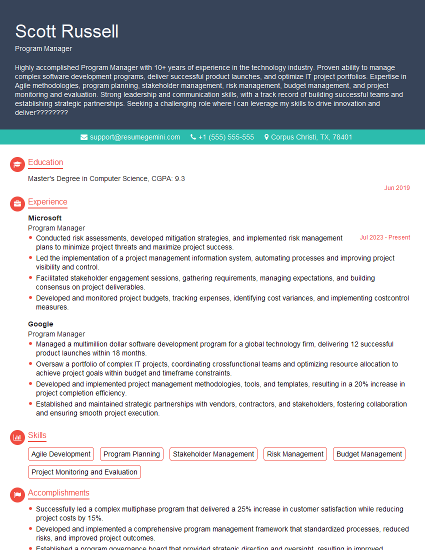
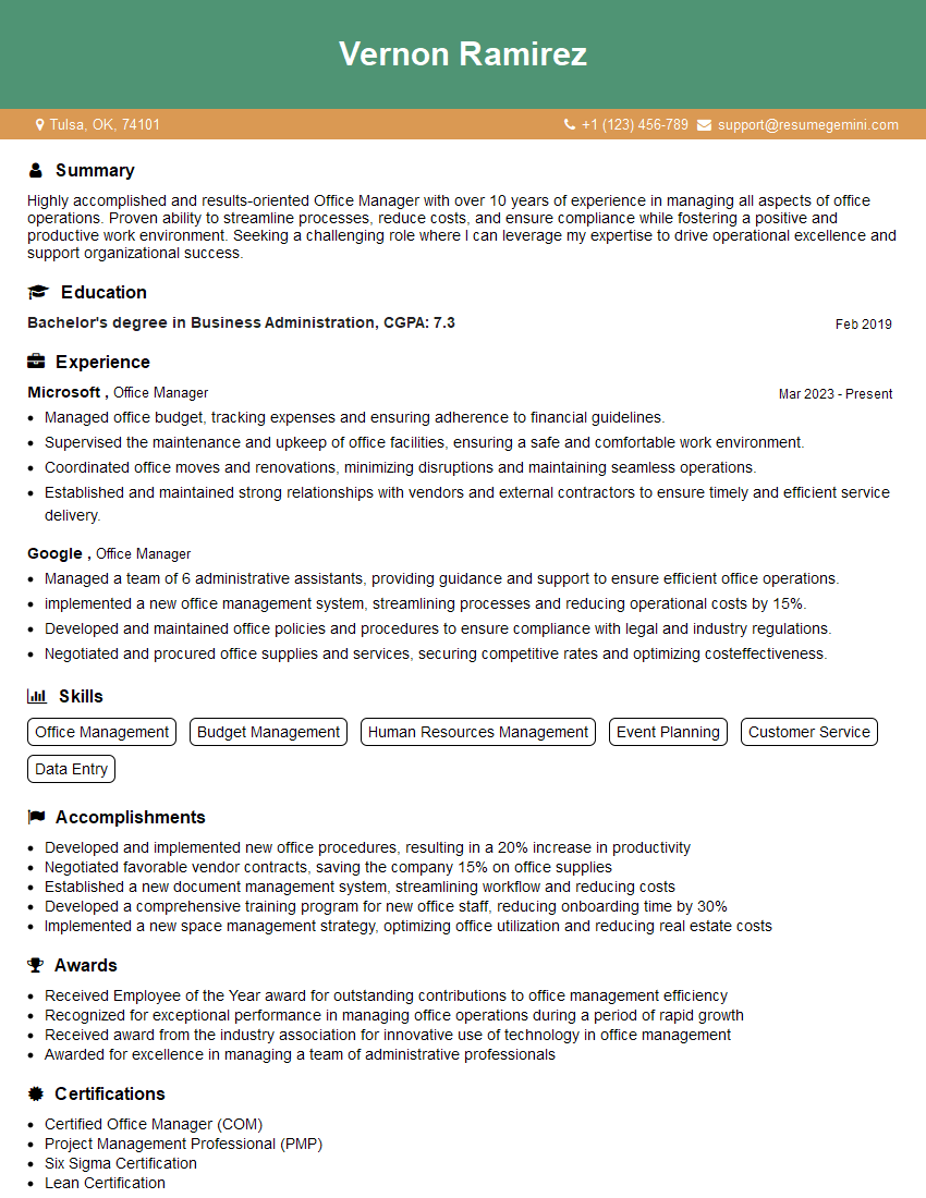
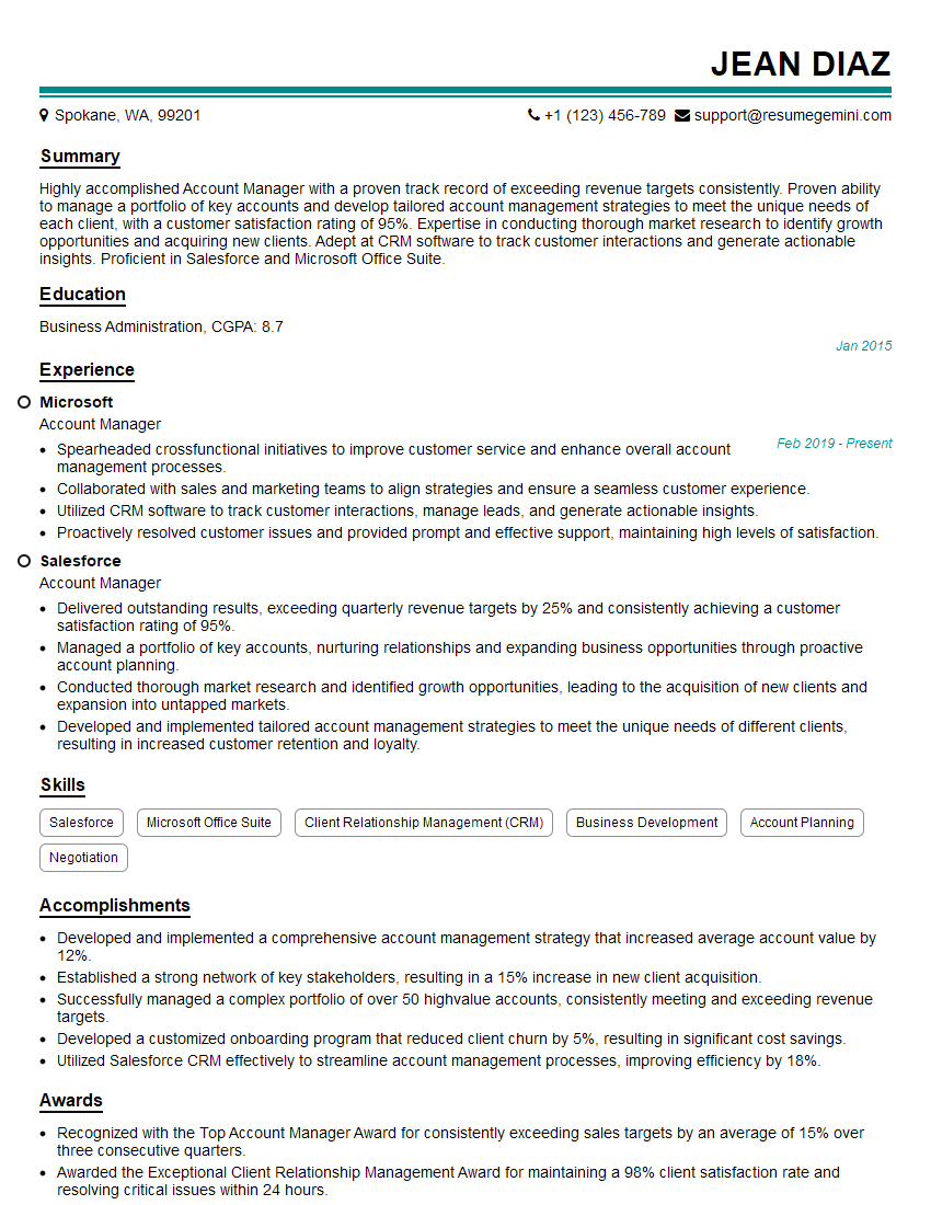
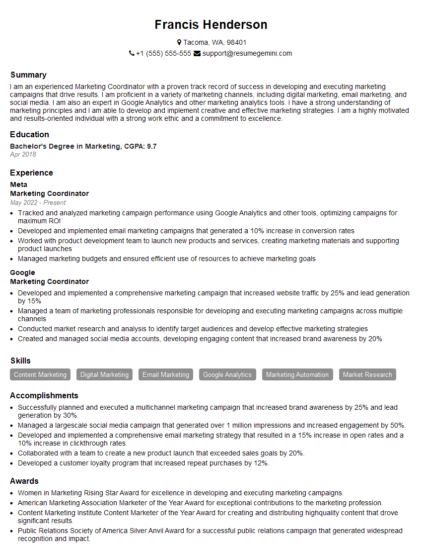
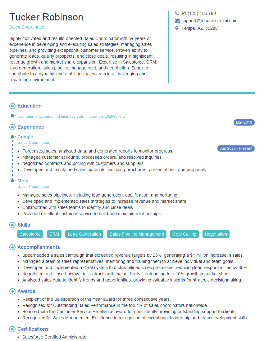
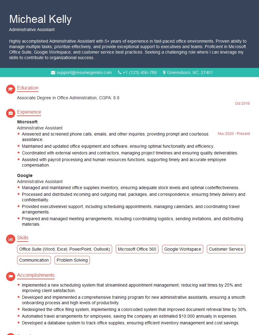
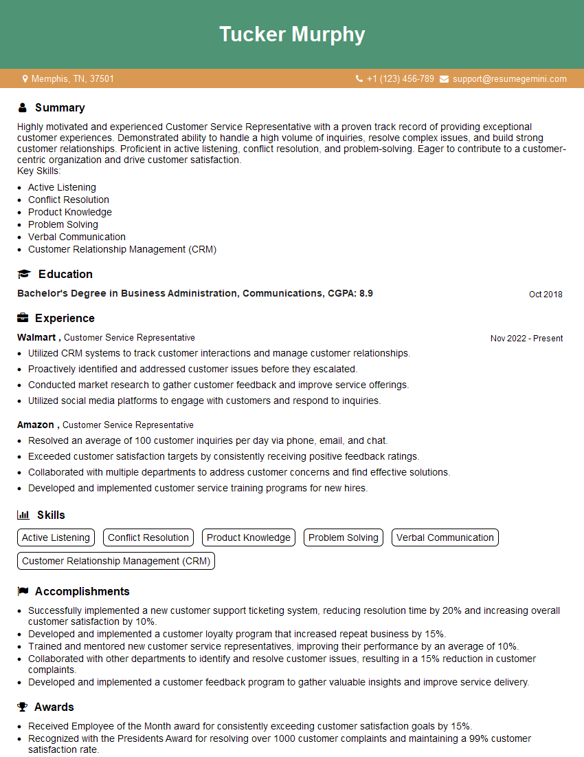
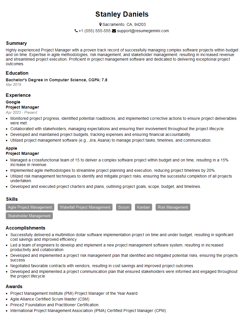
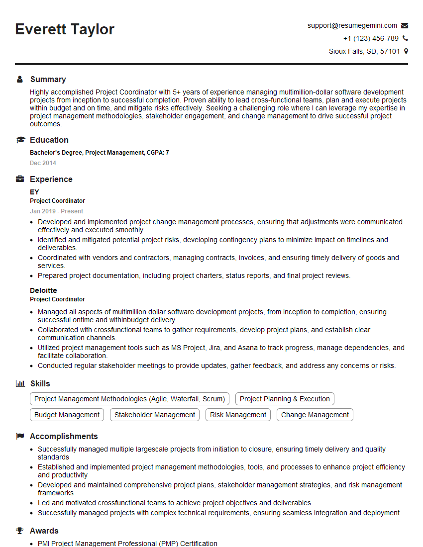
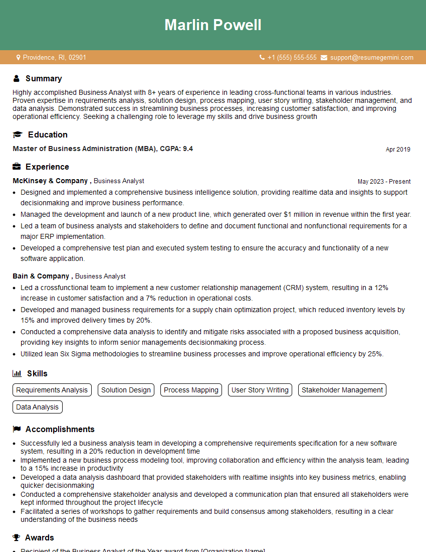
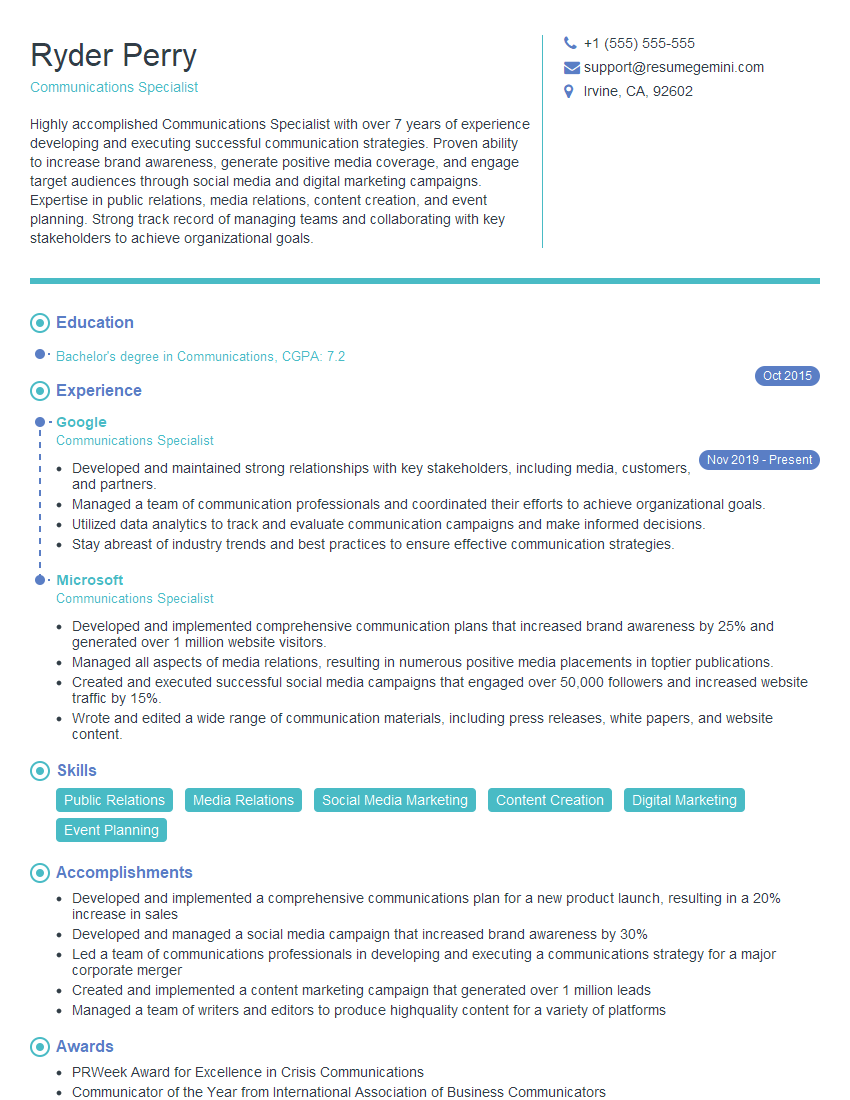
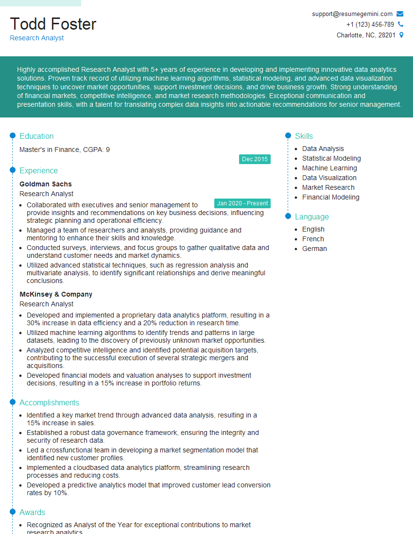
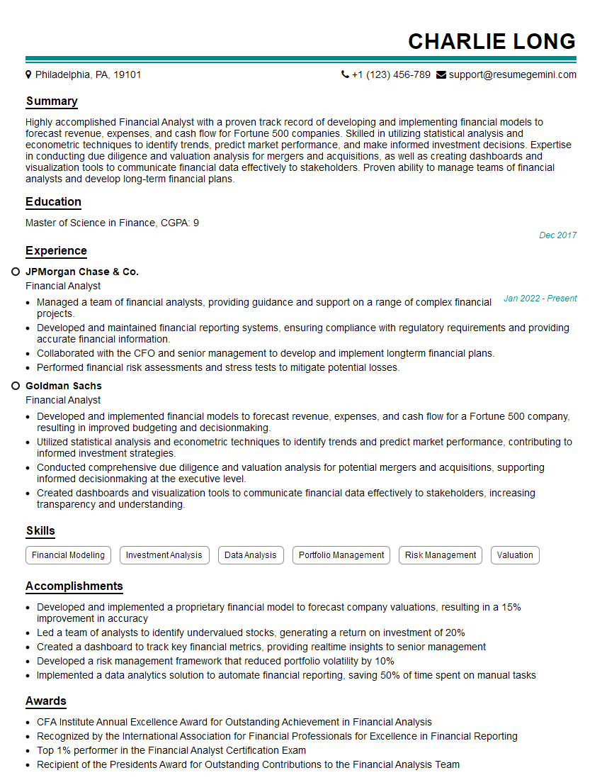
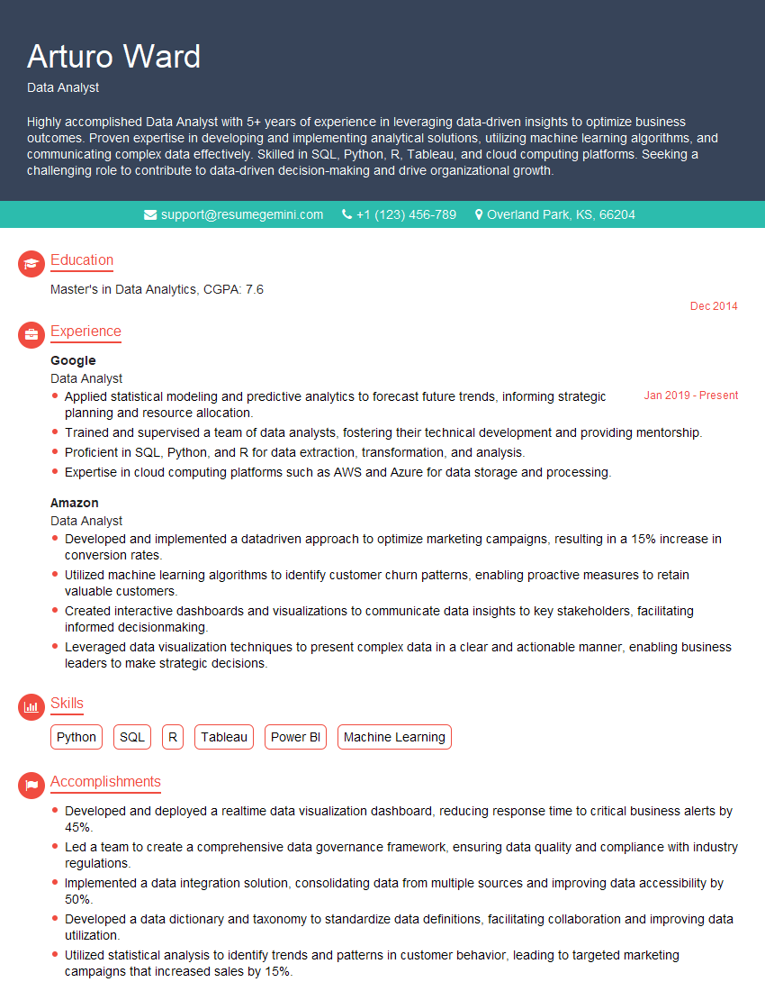
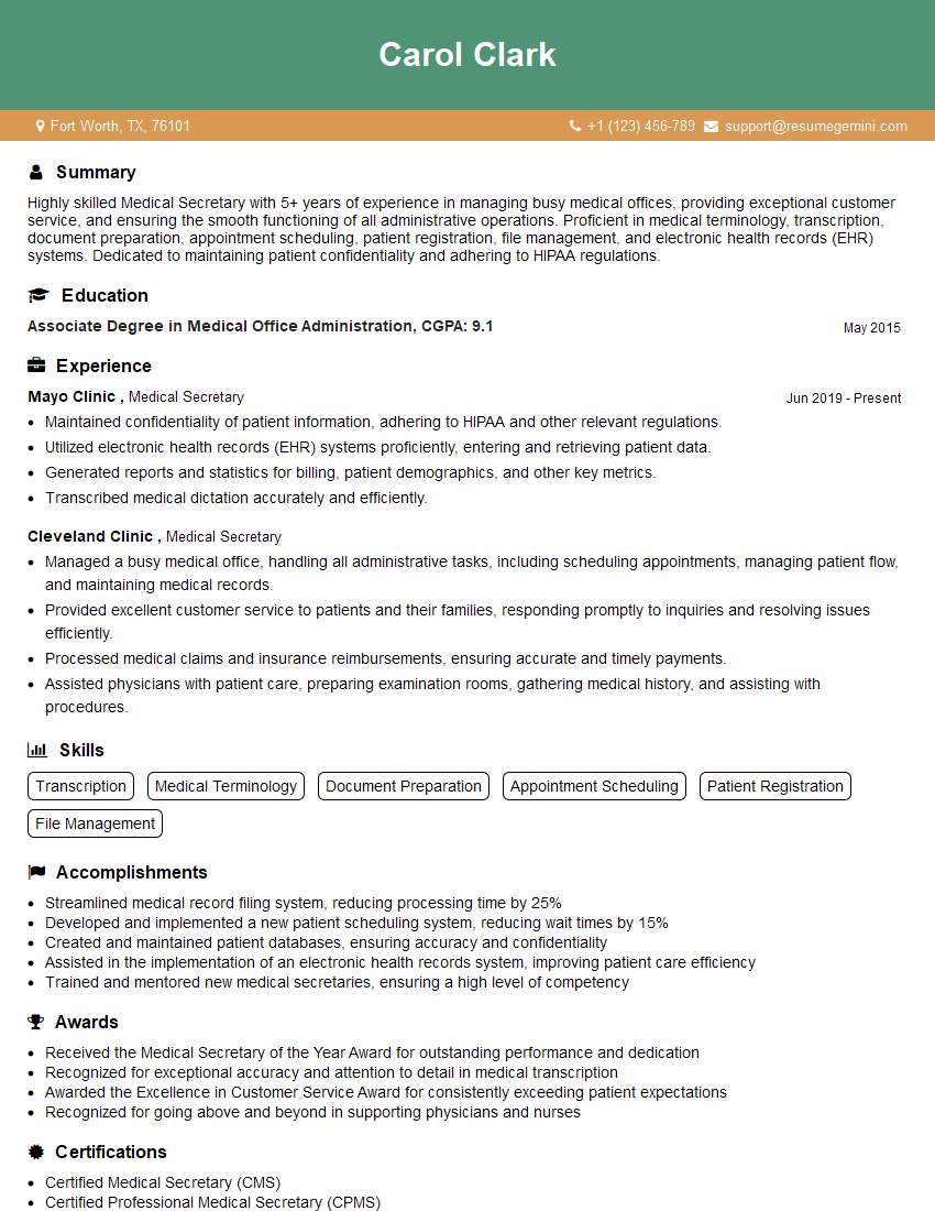
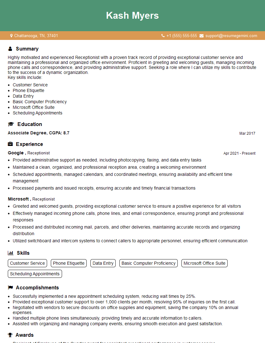
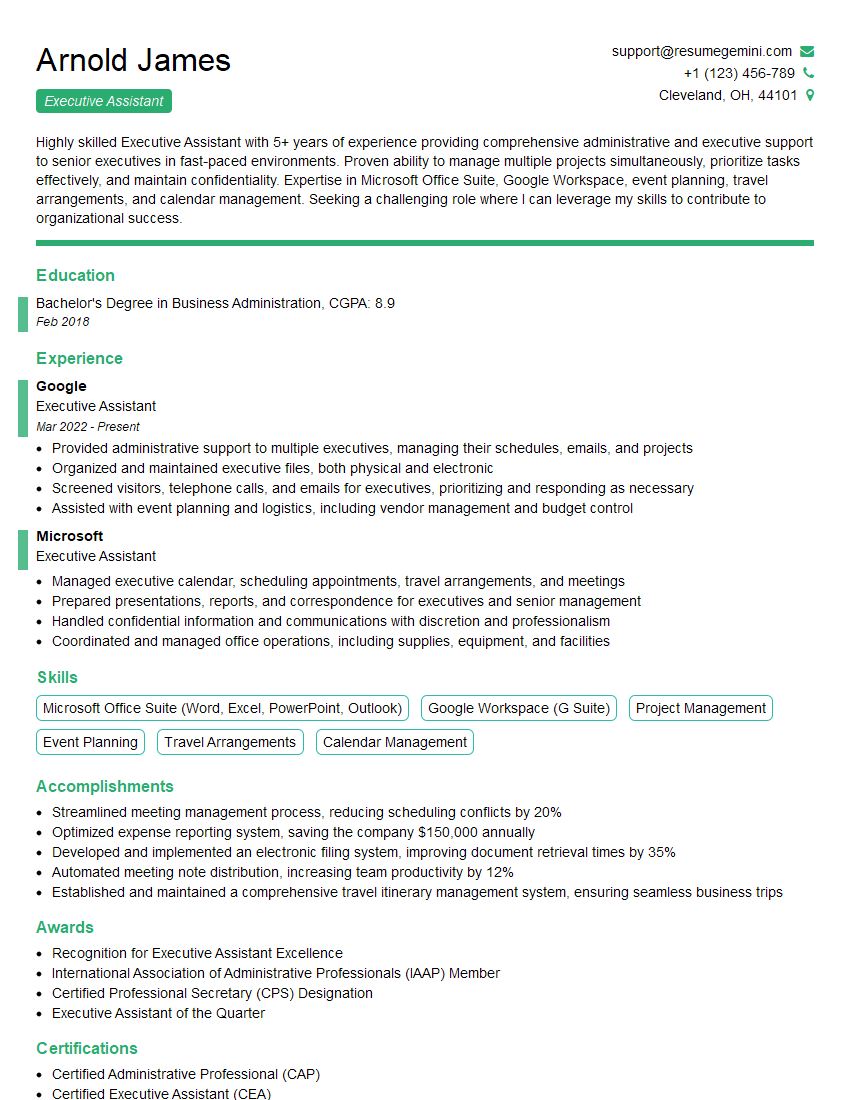
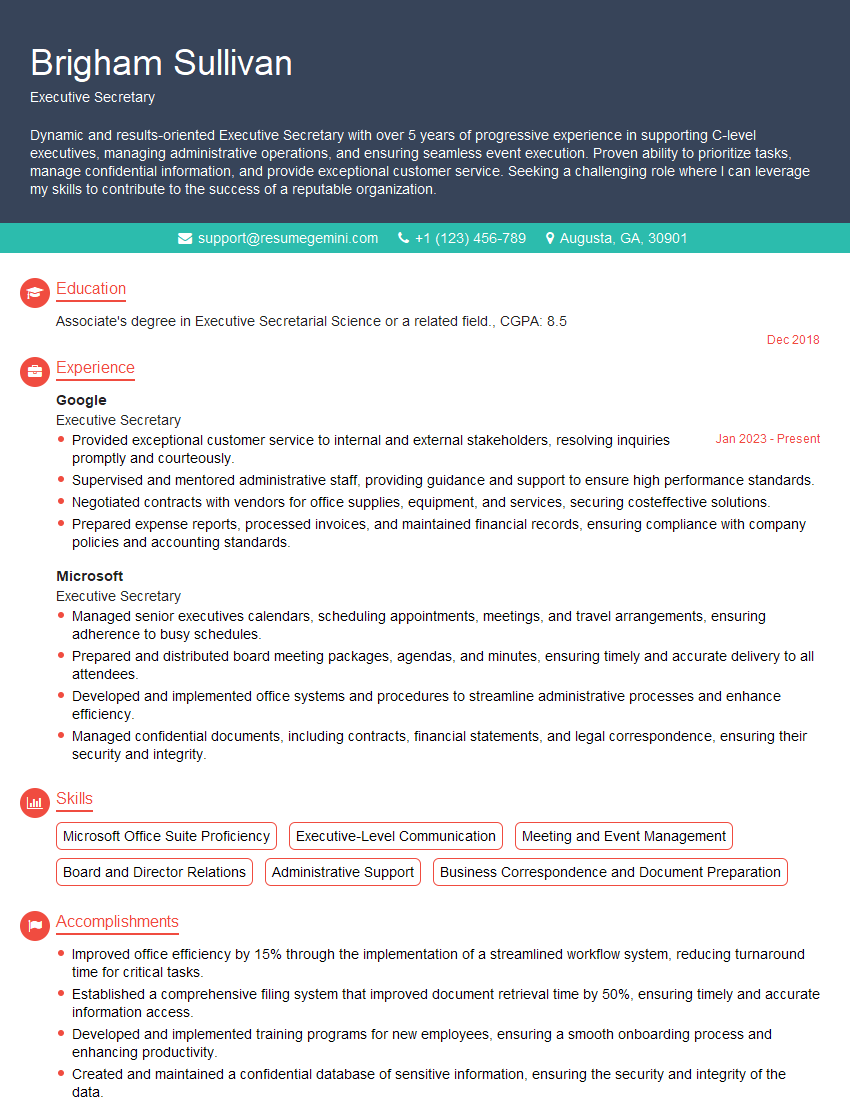
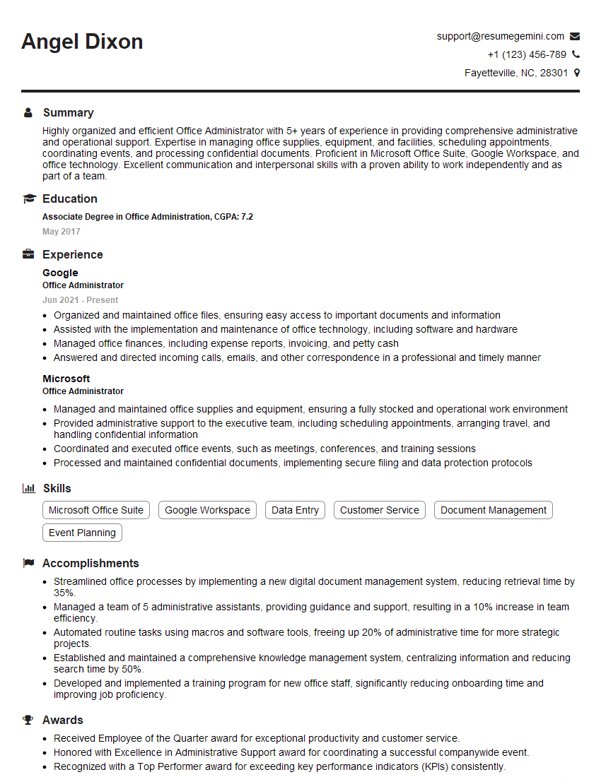
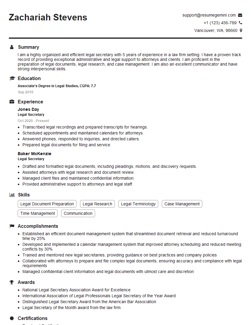
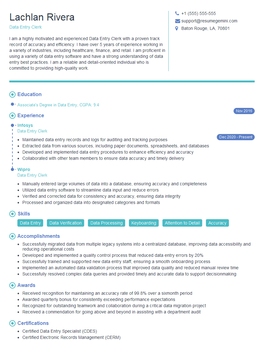
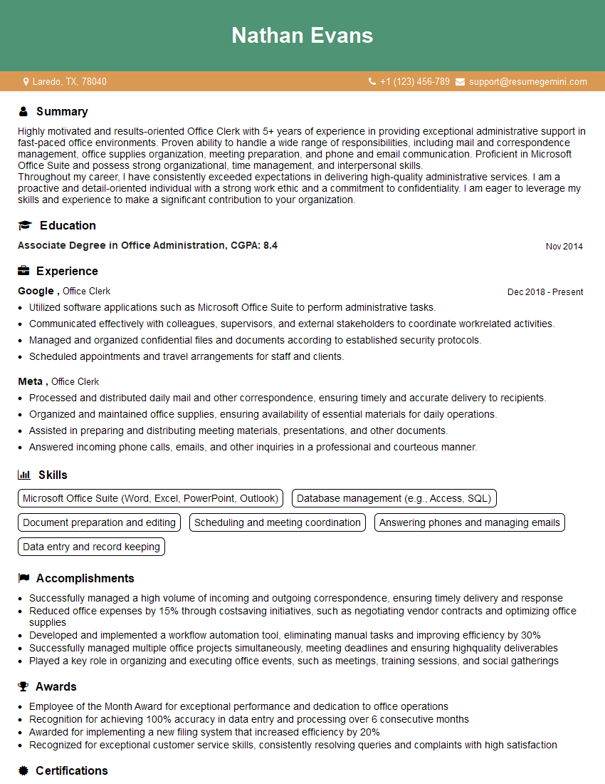
Mastering the Microsoft Office Suite is crucial for success in almost any professional field. It demonstrates essential skills in organization, data analysis, communication, and presentation. To maximize your job prospects, it’s vital to showcase these skills effectively on your resume. Creating an ATS-friendly resume is key to getting your application noticed by recruiters. We strongly encourage you to utilize ResumeGemini, a trusted resource, to build a professional and impactful resume that highlights your proficiency in the Microsoft Office Suite. Examples of resumes tailored to showcasing expertise in Excel, Word, and PowerPoint are available to guide you. Invest time in crafting a compelling resume; it’s your first impression with potential employers.
Explore more articles
Users Rating of Our Blogs
Share Your Experience
We value your feedback! Please rate our content and share your thoughts (optional).
What Readers Say About Our Blog
Hi, I’m Jay, we have a few potential clients that are interested in your services, thought you might be a good fit. I’d love to talk about the details, when do you have time to talk?
Best,
Jay
Founder | CEO
