The right preparation can turn an interview into an opportunity to showcase your expertise. This guide to Artistic Eye interview questions is your ultimate resource, providing key insights and tips to help you ace your responses and stand out as a top candidate.
Questions Asked in Artistic Eye Interview
Q 1. Describe your process for evaluating the visual appeal of a design.
Evaluating a design’s visual appeal involves a multi-faceted approach that goes beyond simply liking something. I use a structured process combining objective and subjective assessments. Firstly, I analyze the design’s composition: Is the layout balanced? Do elements have visual hierarchy? Do lines, shapes, and forms create a pleasing arrangement? I then assess the use of visual elements – color palette, typography, imagery – considering if they are cohesive and effectively convey the intended message. Finally, I consider the overall impact; does the design evoke the desired emotion or reaction? Is it memorable and engaging? I often use tools like mood boards to visualize the desired aesthetic and compare it to the actual design, highlighting any discrepancies. For example, if a design aims for a feeling of serenity, I would check if the color palette, typography, and imagery all contribute to that feeling, or if any elements are clashing.
This process is iterative. I often create several versions, testing them with target users for feedback to refine the design further. It’s like sculpting – you start with a rough form and gradually refine it until it meets your vision and user needs.
Q 2. How do you identify and correct visual inconsistencies in a design?
Identifying and correcting visual inconsistencies is crucial for a polished design. I begin by systematically reviewing the design using checklists. I focus on consistent use of:
- Typography: Font families, sizes, weights, and styles should be consistent across the design.
- Color palette: Variations in shades or hues can undermine cohesiveness. I use color palettes and style guides.
- Spacing and padding: Inconsistent spacing creates a jarring visual effect. I use grid systems and design tools to maintain consistent spacing.
- Imagery: Style, resolution, and aspect ratios must be consistent.
Tools like design software with grid systems and style guides immensely help maintain consistency. Let’s say, I find inconsistent button styles throughout a website. I’d create a master button style in the design system, then apply it throughout. This approach simplifies future updates and maintains uniformity across the project.
Q 3. Explain your understanding of color theory and its application in design.
Color theory is fundamental to design. It’s the understanding of how colors mix, interact, and create visual effects. My knowledge encompasses the color wheel, including primary, secondary, and tertiary colors; color harmonies (e.g., complementary, analogous, triadic); and the impact of color temperature (warm vs. cool).
In design, I use color to evoke emotions, create hierarchy, and guide the user’s eye. For example, a vibrant red can be used to draw attention to a call-to-action, while calming blues might be used for a relaxing website. Understanding color contrast is vital for accessibility; sufficient contrast between text and background ensures readability for all users. I often use accessibility checkers to ensure sufficient contrast ratios.
I also consider cultural connotations of colors – what might be positive in one culture might be negative in another. A thoughtful, context-aware application of color is crucial.
Q 4. How do you incorporate user experience principles into your design decisions?
User experience (UX) principles are at the heart of my design decisions. I believe aesthetically pleasing design is only half the equation; usability is equally important. I incorporate UX principles through:
- User research: Understanding user needs, behaviours, and pain points is crucial. This informs the design’s structure, navigation, and overall flow.
- Information architecture: Organizing content logically and intuitively helps users find what they need quickly.
- Interaction design: Designing intuitive interactions and clear feedback mechanisms ensures a smooth user journey. For instance, clear buttons with descriptive labels, helpful tooltips, and appropriate animations provide visual feedback.
- Accessibility: Designing for inclusivity means considering users with disabilities, focusing on elements such as color contrast, keyboard navigation, and screen reader compatibility.
For instance, if I’m designing an e-commerce site, I ensure the checkout process is intuitive and minimizes friction, leading to higher conversion rates. This involves clear instructions, progress indicators, and easy navigation.
Q 5. Discuss your approach to creating a visually cohesive design across different platforms.
Creating visual consistency across multiple platforms (web, mobile, tablet) requires a well-defined design system. This system includes a style guide outlining the brand’s visual identity (logo, typography, colors) and a component library with reusable design elements.
Responsive design principles are critical; the layout adapts seamlessly to different screen sizes. I employ techniques like flexible grids, media queries, and fluid images to ensure the design remains consistent and aesthetically pleasing across all platforms. For example, I might use a responsive grid system which adjusts column widths depending on the device’s screen size, thereby maintaining a consistent layout regardless of whether the user is on a desktop or mobile phone. Furthermore, I use a design system that stores reusable components, such as buttons and text fields that automatically adjust size and spacing based on the device, improving efficiency and ensuring consistency.
Q 6. How do you balance aesthetics and functionality in your designs?
Balancing aesthetics and functionality is a continuous iterative process. It’s not a compromise, but rather a synergy. A beautiful design that is unusable is ultimately a failure. Similarly, a functional design that is unpleasant to interact with will likely be abandoned.
My approach involves prioritizing user needs while striving for aesthetic excellence. I use user research to understand functional requirements and then explore design solutions that meet both needs. Sometimes I have to make difficult choices, such as simplifying a visually complex design element to improve usability. The key is to constantly evaluate both aspects throughout the design process. I’ll frequently test different design approaches with users to gauge the balance between the two, iterating until both functionality and aesthetic appeal are optimized.
Q 7. Describe a time you had to revise a design based on feedback. What changes did you make?
Recently, I designed a landing page for a new software product. The initial design was visually striking, using bold colors and complex animations. However, user testing revealed that the animations were distracting and the call-to-action was not easily found.
Based on this feedback, I made several revisions:
- Simplified animations: I replaced the complex animations with more subtle micro-interactions to maintain visual interest without being distracting.
- Improved call-to-action: I redesigned the call-to-action button, making it visually prominent with clear and concise language. A/B testing showed this significantly increased click-through rates.
- Improved visual hierarchy: I adjusted the layout and typography to improve the visual hierarchy, making crucial information easier to find.
The revised design retained the initial aesthetic appeal while significantly enhancing usability. The changes resulted in a better user experience and higher conversion rates. This experience taught me the value of iterating based on user feedback and prioritizing usability.
Q 8. How do you stay updated on current design trends and technologies?
Staying current in the ever-evolving world of design requires a multifaceted approach. I actively engage with several key resources. Firstly, I subscribe to and regularly read industry publications like AIGA Eye on Design and Communication Arts. These provide insightful articles and showcases of cutting-edge work. Secondly, I follow influential designers and design studios on platforms like Behance and Dribbble, observing their creative processes and exploring new trends. I also attend online webinars and workshops, often offered by platforms like Skillshare and Udemy, to learn about new software features and design techniques. Finally, I participate in online design communities and forums where I can discuss ideas, get feedback, and learn from the experiences of other designers. This multi-pronged approach ensures I’m constantly expanding my knowledge and skillset.
Q 9. What software or tools are you proficient in using for visual design?
My proficiency spans a wide range of design software. I’m highly skilled in Adobe Creative Suite, specifically Photoshop, Illustrator, and InDesign. Photoshop is my go-to for image manipulation, retouching, and creating digital artwork. Illustrator is essential for vector graphics, logo design, and creating scalable assets. InDesign is my powerhouse for layout, typography, and creating professional documents. Beyond Adobe products, I also have experience with Figma, a collaborative design platform ideal for web design and prototyping, and After Effects for motion graphics and animation. Proficiency with these tools allows me to approach projects with flexibility and choose the best tool for the specific task.
Q 10. Describe your understanding of typography and its role in visual communication.
Typography is far more than just choosing fonts; it’s the art and technique of arranging type to make written language legible, readable, and appealing. It’s a fundamental aspect of visual communication, impacting the overall tone, mood, and message of a design. Understanding typography includes knowledge of various font classifications (serif, sans-serif, script, etc.), their weights (light, regular, bold), and their styles (italic, condensed). Consider the difference between using a playful script font for a children’s book versus a clean sans-serif font for a corporate report—the choice directly affects the audience’s perception. Effective typography involves considerations of kerning (space between individual letters), tracking (space between words), leading (space between lines), and hierarchy (using size and weight to emphasize important information). I strive to ensure readability and visual harmony, carefully selecting and arranging fonts to create a cohesive and impactful visual experience.
Q 11. How do you use visual hierarchy to guide the user’s eye through a design?
Visual hierarchy guides the viewer’s eye through a design, directing attention to key elements in a logical and intuitive sequence. I achieve this using several techniques. Size is a powerful tool—larger elements naturally draw more attention. Contrast, both in color and brightness, makes elements stand out. Placement is crucial; elements at the top and left of the page are generally seen first. Color is another key player; using a vibrant color against a muted background will draw the eye. Finally, whitespace is often overlooked but extremely effective. Using ample white space provides visual breathing room and emphasizes key components. For example, in a website design, I might use a large, bold headline at the top, followed by a clear call to action button, supported by high-quality images and concise text, all carefully spaced to guide the user’s journey.
Q 12. Explain your approach to designing for different target audiences.
My approach to designing for different target audiences is highly contextual. I begin by deeply researching the target demographic—their age, lifestyle, interests, and cultural background. For example, designing for children would involve using bright colors, playful fonts, and simple imagery, while a design for a corporate client would necessitate a more sophisticated, minimalist, and professional aesthetic. Understanding the audience’s needs and preferences is paramount to create designs that resonate and are effective. User research, including surveys, focus groups, and usability testing, is integral to ensure my designs meet their expectations and are easily understood. I always keep accessibility in mind, ensuring designs are inclusive and usable by people of all abilities.
Q 13. How do you handle criticism of your work?
I embrace constructive criticism as an opportunity for growth. I believe that every feedback, whether positive or negative, provides valuable insights that help refine my work. I actively listen to the feedback, seeking to understand the perspective of the critic. I analyze the criticism objectively, separating personal opinions from actionable suggestions. If the feedback is valid and constructive, I incorporate it into my design process, revising and improving my work accordingly. However, I also retain the ability to discern between subjective opinions and objective flaws. Ultimately, my goal is to create the best possible design, and constructive feedback is an integral part of this process.
Q 14. How do you measure the success of your designs?
Measuring design success depends heavily on the project’s objectives. For a website, success could be measured by increased user engagement (time spent on site, bounce rate, conversion rates), improved brand awareness (social media engagement, website traffic), or higher sales. For a print advertisement, success might be quantified by response rates, brand recall, or sales uplift. For a logo design, success could be judged by its memorability, versatility, and suitability for the brand. Key performance indicators (KPIs) are established at the beginning of a project. I use analytics tools to track relevant metrics and evaluate whether the design achieves its intended goals. Beyond numerical data, I also consider user feedback and qualitative assessments to get a comprehensive understanding of the design’s effectiveness.
Q 15. Describe your experience with branding and logo design.
Branding and logo design are the cornerstones of establishing a strong visual identity for any entity. My experience spans over [Number] years, encompassing a wide range of projects from startups to established corporations. I approach each project by deeply understanding the client’s brand values, target audience, and competitive landscape. This involves extensive research and collaborative discussions to define the brand’s personality and essence. Then, I translate these insights into compelling visual elements, starting with conceptual sketches and mood boards, before refining the logo and extending its application across various brand touchpoints, such as websites, packaging, and social media.
For example, I recently worked with a sustainable coffee company. Their core values were ethical sourcing, environmental responsibility, and community engagement. This led to a logo design that incorporated natural elements and earthy tones, reflecting their commitment to sustainability. The logo’s versatility also allowed for seamless integration across all their marketing materials, creating a consistent and recognizable brand identity.
Career Expert Tips:
- Ace those interviews! Prepare effectively by reviewing the Top 50 Most Common Interview Questions on ResumeGemini.
- Navigate your job search with confidence! Explore a wide range of Career Tips on ResumeGemini. Learn about common challenges and recommendations to overcome them.
- Craft the perfect resume! Master the Art of Resume Writing with ResumeGemini’s guide. Showcase your unique qualifications and achievements effectively.
- Don’t miss out on holiday savings! Build your dream resume with ResumeGemini’s ATS optimized templates.
Q 16. How do you incorporate visual storytelling into your work?
Visual storytelling is crucial for creating impactful and memorable designs. I believe in weaving narratives through visual elements, moving beyond mere aesthetics. This involves carefully selecting imagery, color palettes, typography, and layout to communicate a specific message or emotion. Think of it like crafting a silent movie – each visual element plays a crucial role in conveying the story.
In a recent project for a non-profit organization focused on animal welfare, I used powerful imagery of rescued animals paired with a muted color palette to evoke empathy and create a sense of urgency. The overall design communicated the organization’s mission effectively and emotionally resonated with the audience.
Q 17. Explain your approach to solving design problems using visual solutions.
My approach to solving design problems is iterative and user-centric. I begin by thoroughly understanding the problem’s context, defining clear objectives, and identifying the target audience. Then, I explore various visual solutions through sketching, mood boards, and prototyping. This process allows me to quickly iterate and refine ideas based on feedback and testing. I utilize a combination of creative problem-solving and analytical thinking to ensure the final design is not only aesthetically pleasing but also effective in achieving its intended purpose.
For example, when designing a website for a complex financial product, I used user flows and wireframes to ensure the navigation was intuitive and user-friendly. The visual design then complemented the functionality, making the complex information accessible and engaging.
Q 18. Describe your understanding of composition and its impact on visual appeal.
Composition is the art of arranging elements within a design to create visual harmony and balance. It significantly impacts a design’s visual appeal, guiding the viewer’s eye and establishing a hierarchy of information. Understanding principles like the rule of thirds, leading lines, and negative space is crucial for creating visually engaging compositions.
For instance, using the rule of thirds can create a more dynamic and less static image. By placing key elements off-center, you create visual interest and draw the viewer’s attention to specific areas. Similarly, effective use of negative space can enhance readability and reduce visual clutter, making the design feel more clean and sophisticated.
Q 19. How do you handle conflicting design requests from multiple stakeholders?
Handling conflicting design requests from multiple stakeholders requires effective communication, collaboration, and a diplomatic approach. I start by actively listening to each stakeholder’s needs and concerns, documenting them clearly. Then, I facilitate a discussion to identify common ground and prioritize conflicting requirements. This might involve creating multiple design options, each addressing different priorities, and allowing stakeholders to provide feedback and select the preferred solution. Transparency and clear communication throughout the process are crucial for successful conflict resolution.
I often use a collaborative design platform to share work-in-progress, collect feedback, and maintain a clear record of decisions. This approach ensures everyone is informed and involved, leading to a more satisfying outcome for all stakeholders.
Q 20. Explain your process for creating mood boards and concept sketches.
Mood boards and concept sketches are essential tools in my design process. Mood boards visually represent the overall aesthetic and feeling of a project, encompassing images, textures, color palettes, and typography samples. They serve as a starting point for establishing a design direction. Concept sketches are quick, rough drawings that explore different design layouts and compositions. They allow me to quickly test ideas and refine the design before moving into digital execution.
I typically begin by creating a mood board based on research and discussions with the client. This visual representation helps define the overall tone and style of the design. Then, I develop several concept sketches, experimenting with different layouts and arrangements, before choosing the most promising direction for further development.
Q 21. How do you incorporate whitespace effectively into your designs?
Whitespace, or negative space, is often underestimated, but it’s a powerful design element. It’s the empty space around and between design elements. Used effectively, whitespace improves readability, enhances visual hierarchy, and creates a sense of breathing room, preventing the design from feeling cluttered or overwhelming. It’s about strategic placement, not just empty space.
For example, a website with generous whitespace around text and images feels more modern and sophisticated, increasing readability. Conversely, a website crammed with content appears messy and unprofessional, making it difficult for the user to focus on key information.
Q 22. Describe your experience with different design styles (e.g., minimalist, modern, retro).
My experience spans a wide range of design styles, each demanding a unique approach. Minimalist design, for example, emphasizes simplicity and functionality, using a limited color palette and clean lines. I’ve worked on projects where reducing visual clutter to highlight key elements was paramount – think a website for a high-end watchmaker, where elegance and sophistication are key. Conversely, modern design often incorporates bolder colors, geometric shapes, and a sense of dynamism. I recently designed a logo for a tech startup that perfectly captured their innovative spirit using a vibrant color scheme and a contemporary font. Finally, retro design draws inspiration from past eras, often invoking nostalgia through vintage color schemes, fonts, and imagery. A personal project of mine involved redesigning a classic game’s interface using a retro aesthetic, carefully selecting assets to capture the original game’s feel while improving usability.
Q 23. How do you use visual metaphors effectively in your work?
Visual metaphors are crucial for conveying complex ideas concisely and memorably. I use them by identifying the core message and then searching for a visual representation that resonates with the target audience. For example, if I’m designing a campaign about environmental conservation, I might use an image of a wilting flower to symbolize the impact of pollution or a strong, growing tree to represent sustainability. The key is to choose a metaphor that is both visually striking and easily understood, avoiding ambiguity. I always test my metaphors on focus groups to ensure they land effectively.
Q 24. How do you ensure accessibility in your design choices?
Accessibility is paramount in my design process. I ensure designs are usable by people with disabilities by following established guidelines like WCAG (Web Content Accessibility Guidelines). This includes using sufficient color contrast, providing alternative text for images (alt text), ensuring proper keyboard navigation, and using clear and concise language. For example, I carefully choose font sizes and styles to be easily readable and utilize sufficient spacing to make navigation intuitive. Testing with assistive technologies like screen readers is crucial to confirm accessibility at every stage.
Q 25. Describe your experience with image editing and manipulation.
I’m proficient in various image editing and manipulation software, including Adobe Photoshop, Illustrator, and GIMP. My skills encompass tasks like retouching, color correction, compositing, and creating digital assets from scratch. For instance, I recently used Photoshop to restore an old, faded family photograph, bringing back its original colors and sharpness. The ability to manipulate images effectively is essential for creating visually engaging and polished designs across diverse media.
Q 26. Explain your understanding of visual balance and its importance in design.
Visual balance is the distribution of visual weight in a design, creating a sense of harmony and stability. Think of it like a seesaw – if one side is heavier, the seesaw tilts. In design, imbalance can create visual unease. There are three main types: symmetrical (mirrored elements), asymmetrical (balanced but not mirrored), and radial (elements radiate from a central point). Understanding and applying these principles is crucial; an unbalanced design feels chaotic and unprofessional. For example, in a website layout, I might use symmetrical balance for a formal look or asymmetrical for a more modern, dynamic feel. The choice depends entirely on the overall message and brand identity.
Q 27. How do you use contrast and texture to create visual interest?
Contrast and texture are powerful tools for grabbing attention and creating visual interest. Contrast involves juxtaposing elements that differ significantly – light and dark colors, rough and smooth textures, large and small shapes. For example, a vibrant red button on a neutral gray background immediately catches the eye. Texture adds depth and tactility to a design, even on a screen. I might use a rough texture to convey a sense of rusticity or a smooth texture for elegance. In a recent project designing a packaging for artisanal chocolates, I used a combination of smooth, glossy imagery alongside a subtly textured background to highlight the product’s premium quality.
Q 28. Describe your experience with creating interactive design elements.
My experience with interactive design elements includes creating animations, micro-interactions, and responsive interfaces. I use tools like After Effects and Figma to design engaging user experiences. For instance, I recently designed a website navigation menu with subtle animations to enhance user engagement and intuitive navigation. Understanding user behavior and designing intuitive interactions is crucial to building positive user experiences. Each interaction should be purposeful and contribute to a smooth user flow. Careful consideration of timing, transitions, and feedback mechanisms ensures a positive experience.
Key Topics to Learn for Artistic Eye Interview
- Visual Perception & Analysis: Understanding principles of design, color theory, composition, and visual hierarchy. Consider how these principles apply to different mediums and styles.
- Creative Problem-Solving: Developing innovative solutions to design challenges, demonstrating adaptability and resourcefulness in finding effective visual communication strategies.
- Technical Proficiency: Showcase your skills in relevant software (mention specific software if applicable, e.g., Adobe Creative Suite, etc.) and your ability to translate creative concepts into tangible outputs.
- Communication & Collaboration: Articulate your design choices effectively, demonstrating your ability to work collaboratively with clients or team members to achieve shared creative goals.
- Design Trends & History: Demonstrate awareness of current design trends and a foundational understanding of design history to contextualize your work and creative decisions.
- Portfolio & Self-Promotion: Prepare to discuss your portfolio, highlighting key projects and demonstrating your ability to present your work professionally and persuasively.
- Client Understanding & Needs: Show your ability to interpret client briefs accurately and create designs that meet their needs and objectives, effectively translating their vision into compelling visuals.
- Project Management & Time Management: Discuss your experience managing design projects, meeting deadlines, and prioritizing tasks efficiently to deliver high-quality results within constraints.
Next Steps
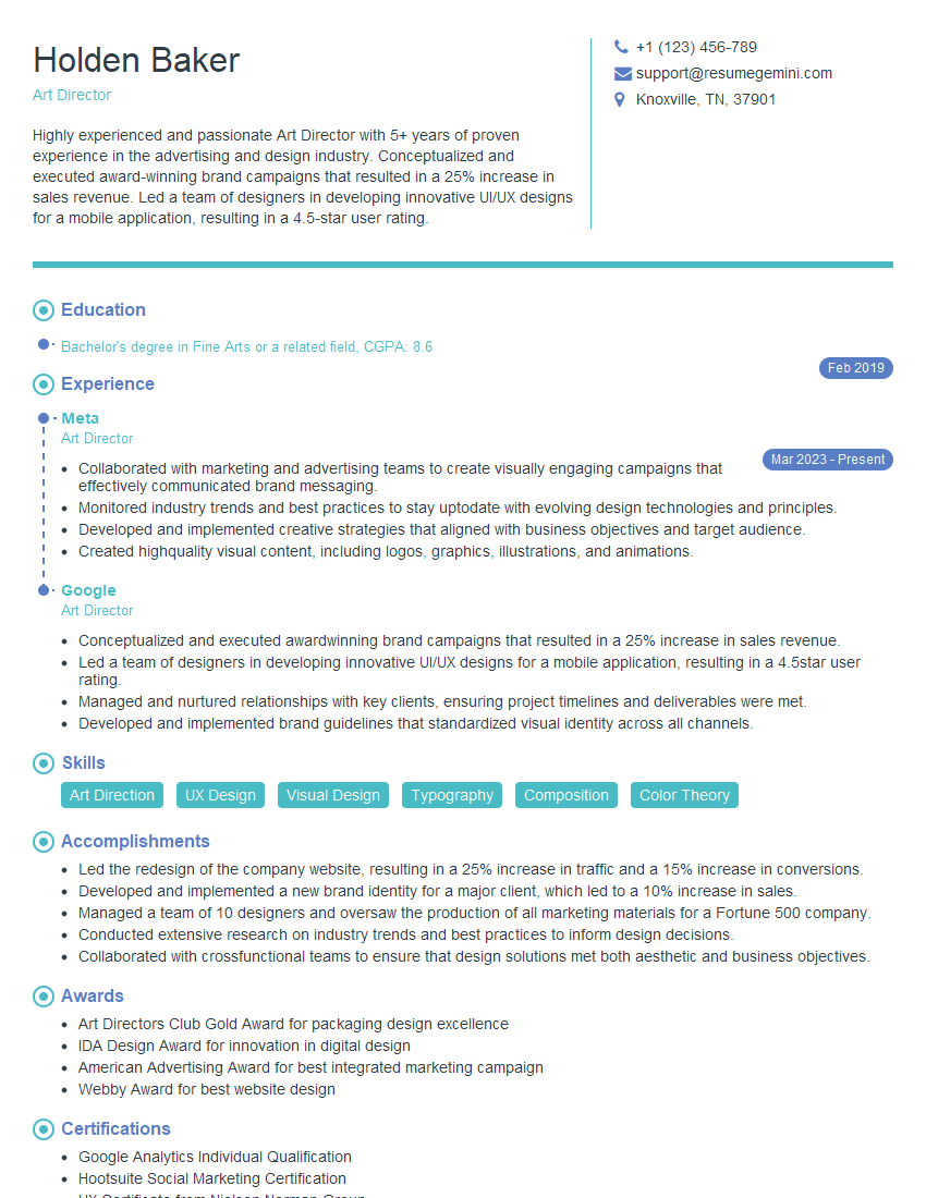
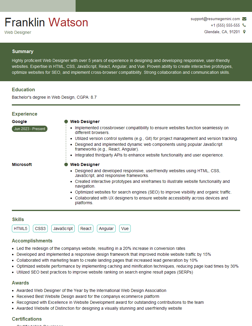
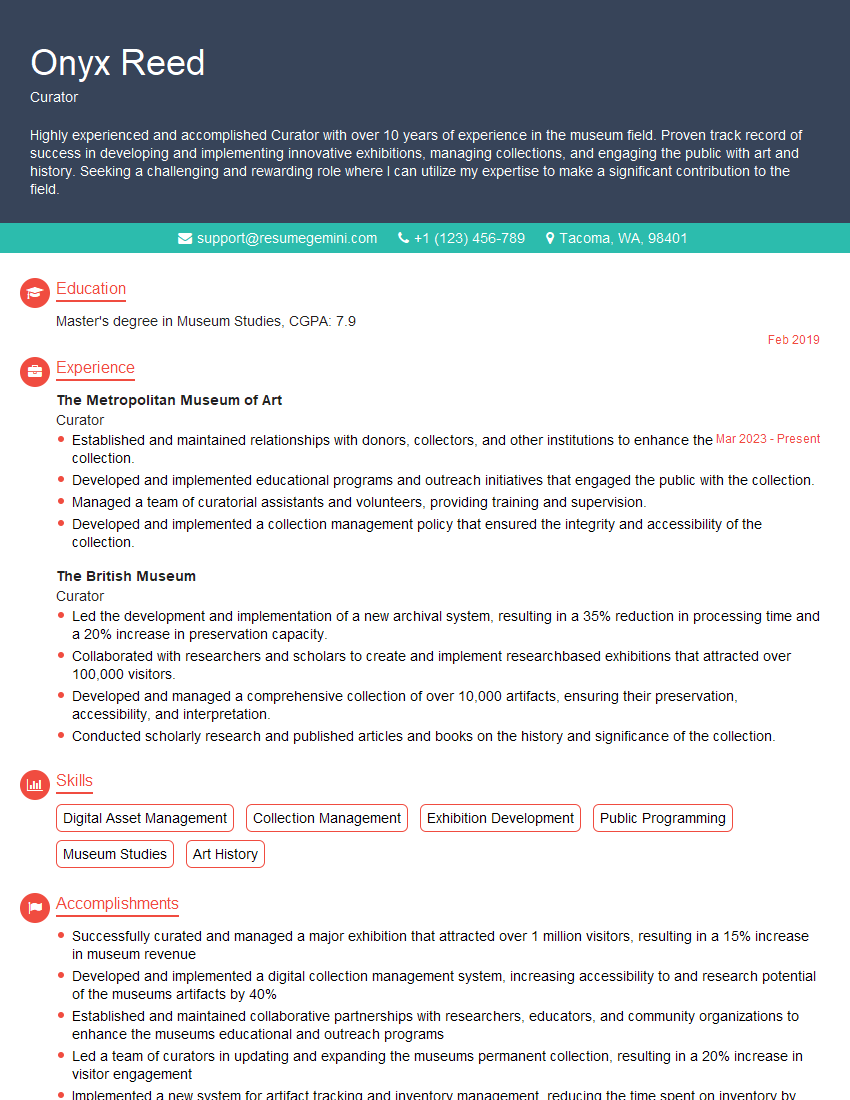
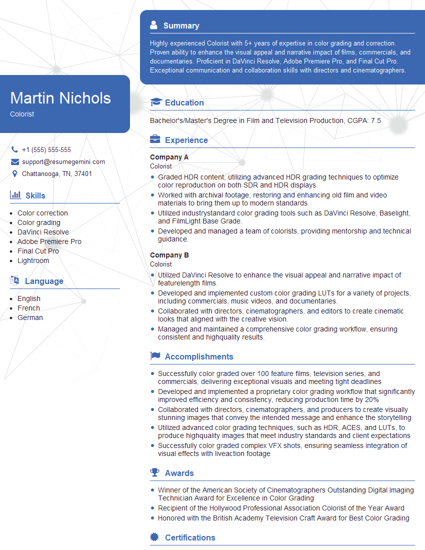
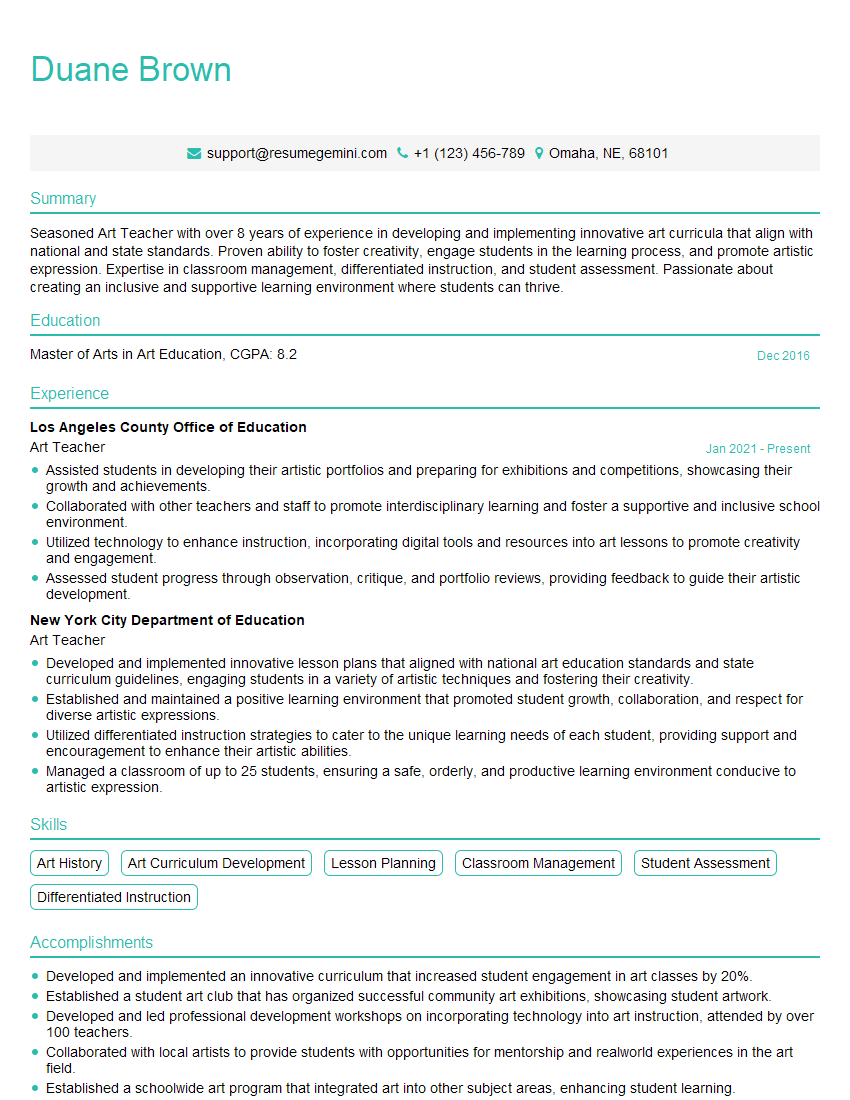
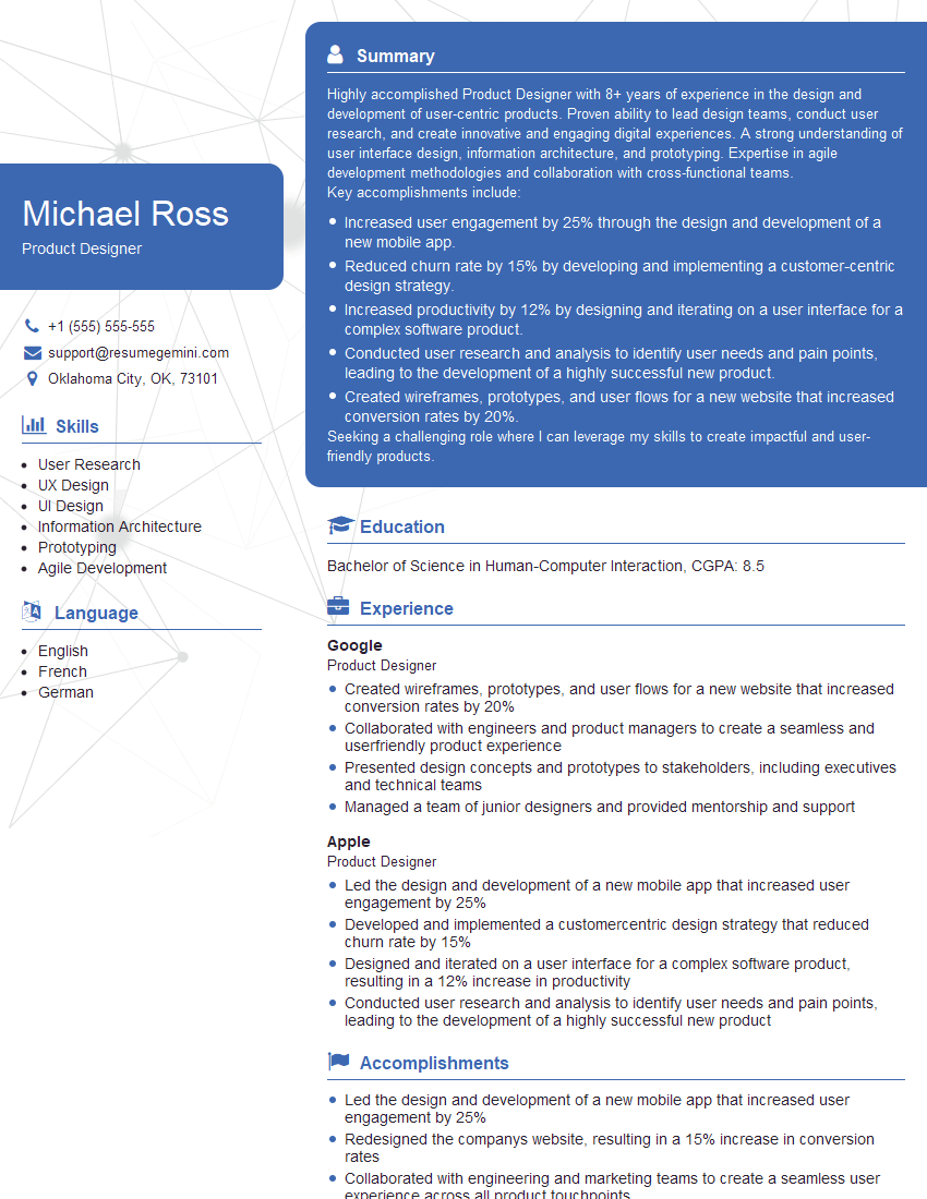
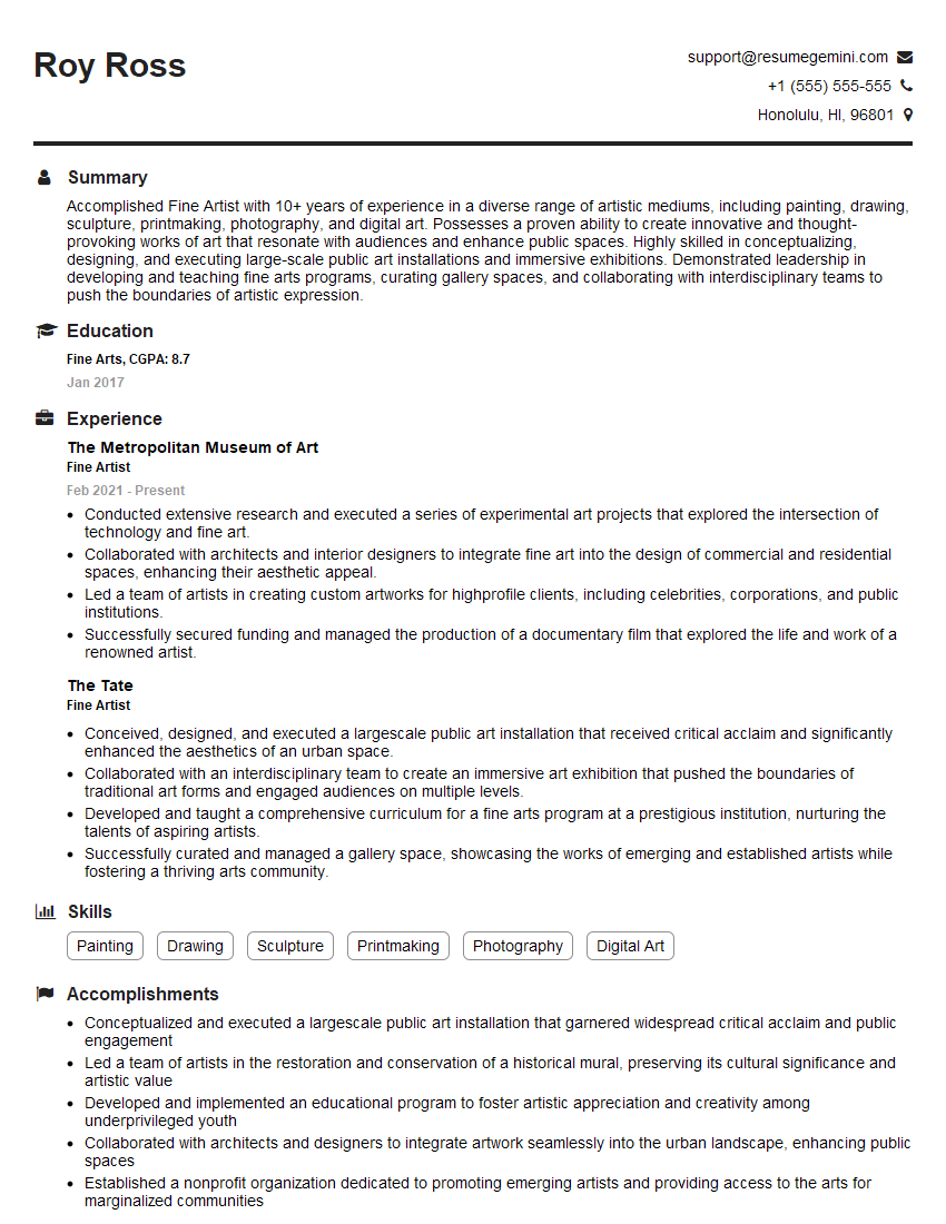
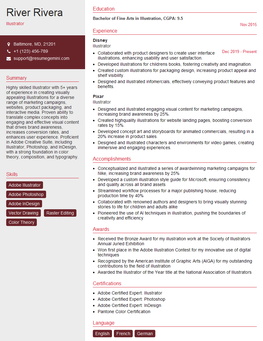
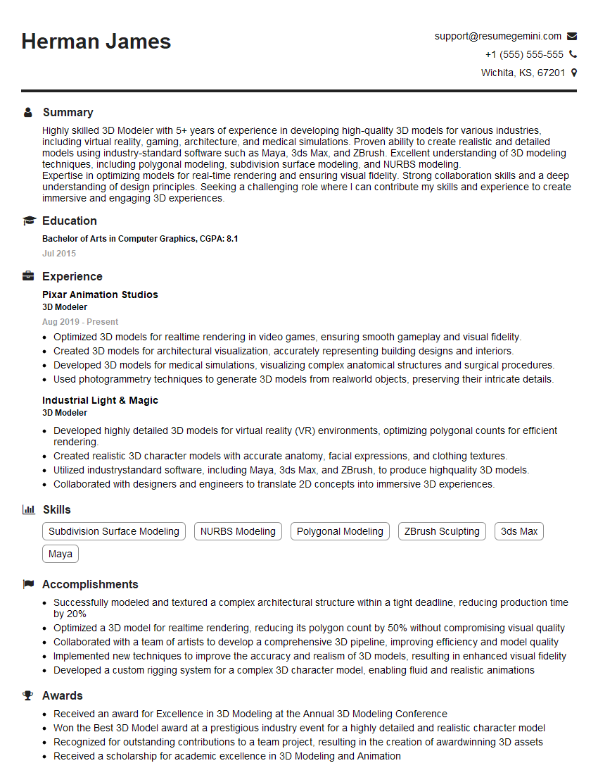
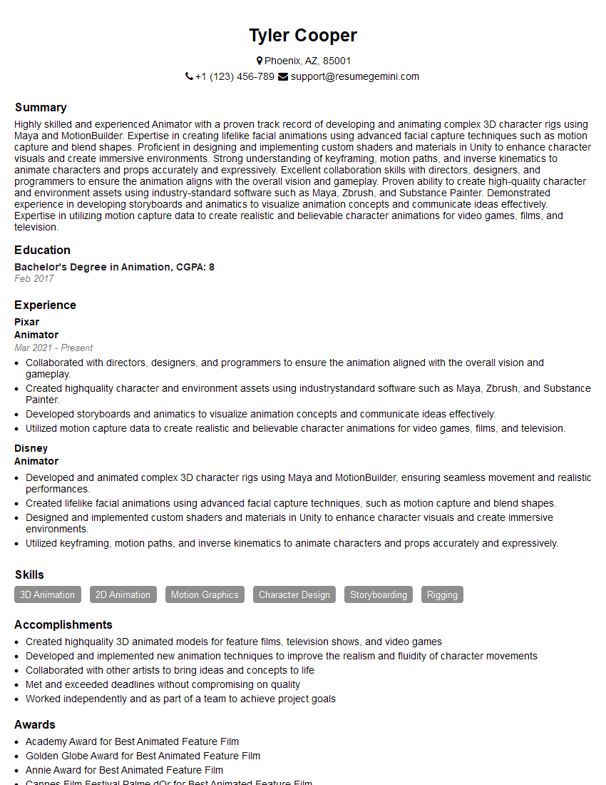
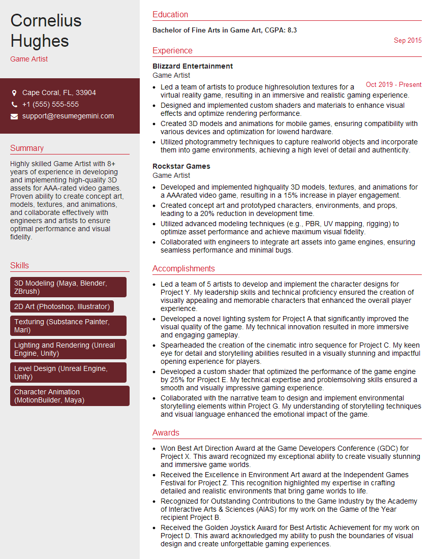
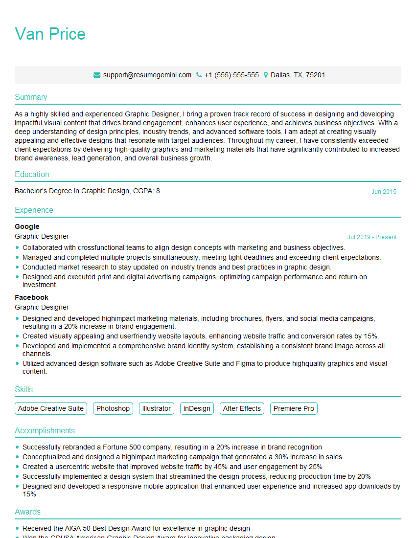
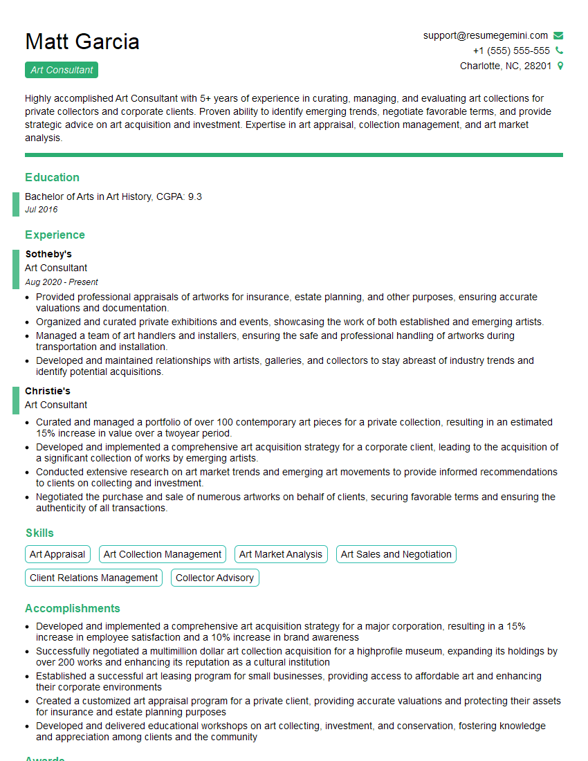
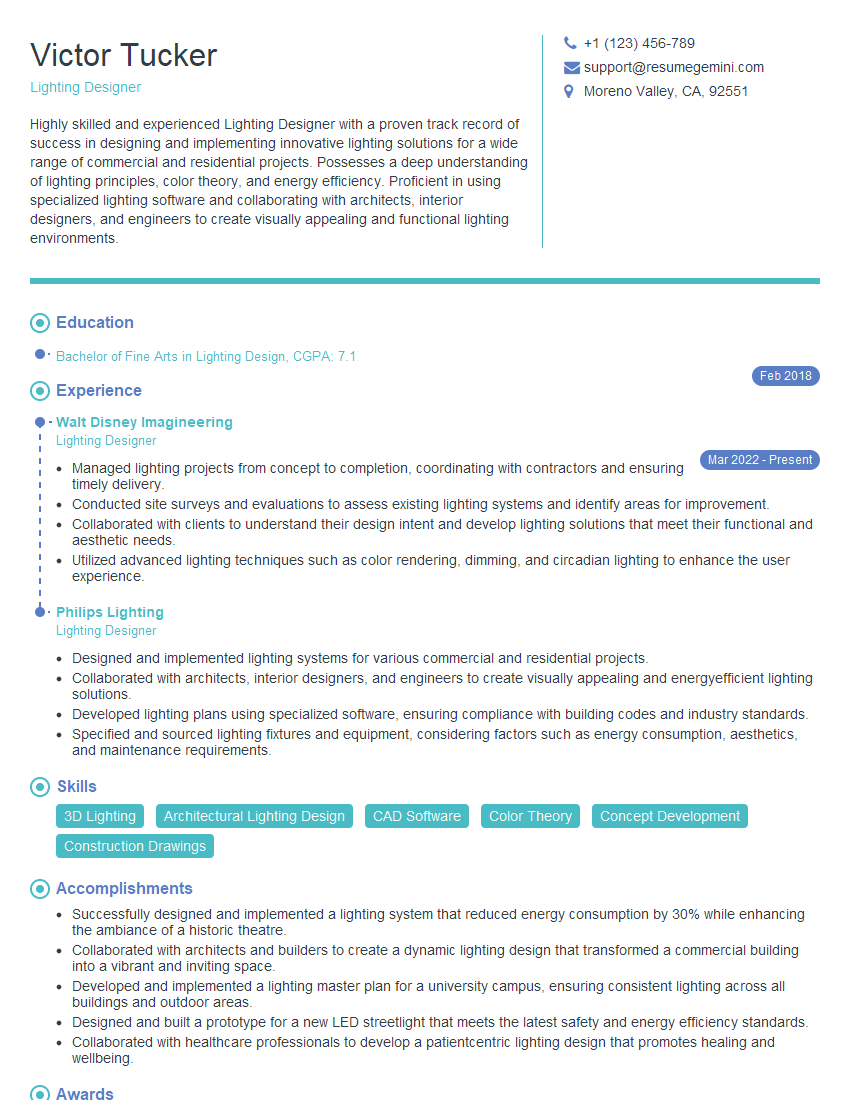
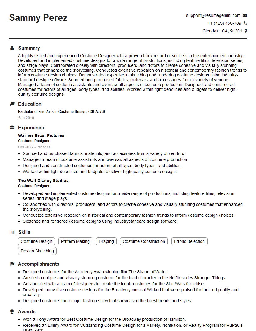
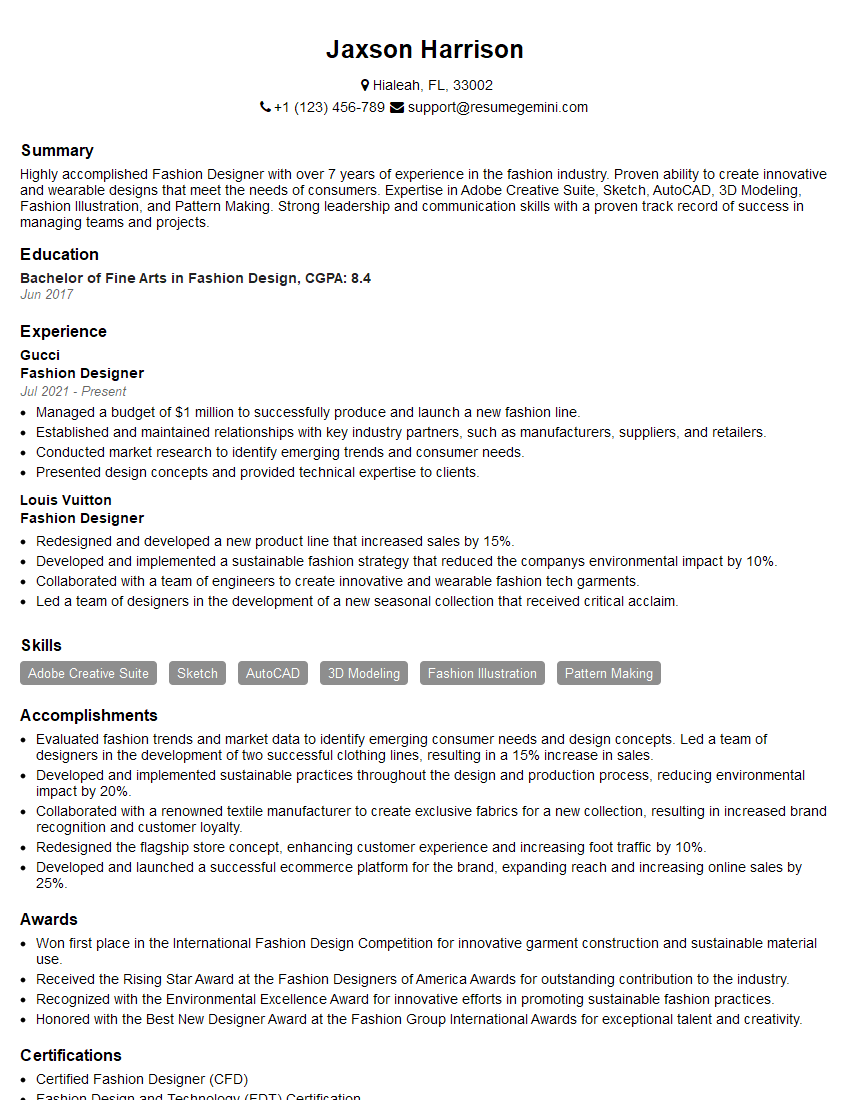
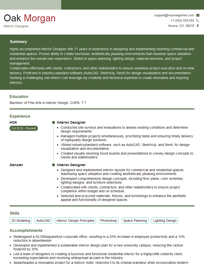
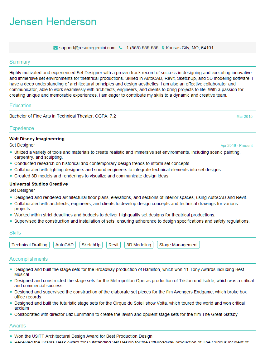
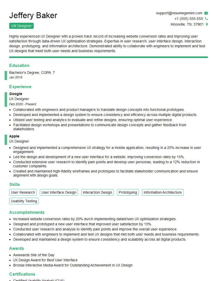
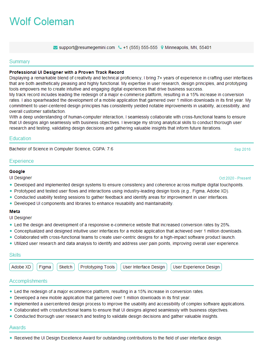
Mastering Artistic Eye principles is crucial for career advancement in the creative industry. A strong grasp of visual communication, design thinking, and technical skills opens doors to exciting opportunities and allows you to stand out from the competition. To maximize your job prospects, create an ATS-friendly resume that highlights your relevant skills and experience. ResumeGemini is a trusted resource for building a professional and impactful resume that will help you make a strong impression on potential employers. Examples of resumes tailored to Artistic Eye are available to help you get started.
Explore more articles
Users Rating of Our Blogs
Share Your Experience
We value your feedback! Please rate our content and share your thoughts (optional).
What Readers Say About Our Blog
Hi, I’m Jay, we have a few potential clients that are interested in your services, thought you might be a good fit. I’d love to talk about the details, when do you have time to talk?
Best,
Jay
Founder | CEO
