Interviews are more than just a Q&A session—they’re a chance to prove your worth. This blog dives into essential Experience with data analysis and visualization tools interview questions and expert tips to help you align your answers with what hiring managers are looking for. Start preparing to shine!
Questions Asked in Experience with data analysis and visualization tools Interview
Q 1. Explain the difference between bar charts and histograms.
Bar charts and histograms, while both used to display the frequency of data, differ significantly in their application and the type of data they handle.
Bar charts represent categorical data. Each bar represents a distinct category, and the height of the bar corresponds to the frequency or value associated with that category. Think of a bar chart showing the number of sales for each product type (e.g., shirts, pants, shoes). The categories are distinct and independent.
Histograms, on the other hand, depict numerical data. They display the distribution of continuous data by dividing it into intervals or bins. The height of each bar represents the frequency of data points falling within that particular bin. Imagine a histogram showing the distribution of customer ages. The data is continuous (age can take on many values), and the histogram groups it into ranges (e.g., 20-30, 30-40).
Key Difference: Bar charts show the frequency of distinct categories, while histograms show the frequency distribution of continuous data grouped into bins.
Q 2. When is a pie chart appropriate, and when is it not?
Pie charts are excellent for showcasing the proportion of parts to a whole, particularly when you have a small number of categories (generally no more than 5-7). They’re visually intuitive and immediately show the relative contribution of each segment.
When appropriate: Use a pie chart when you want to quickly communicate the relative sizes of different categories within a whole. For example, a pie chart might effectively show the market share of different competing brands or the percentage of budget allocated to different departments.
When not appropriate: Pie charts become difficult to interpret when you have many categories, or when the differences between categories are subtle. In such cases, other visualizations like bar charts or treemaps are more effective. Also, avoid pie charts when your categories don’t add up to a meaningful whole (e.g., showing the number of cars of different colors in different cities – this is not a whole).
In short: use pie charts sparingly and only when the visual clarity outweighs the potential for misinterpretation due to a high number of categories or small differences.
Q 3. Describe your experience with Tableau or Power BI.
I have extensive experience with both Tableau and Power BI, using them for diverse projects ranging from interactive dashboards for executive reporting to exploratory data analysis for identifying trends and insights.
In Tableau, I’m proficient in creating interactive dashboards, using calculated fields for advanced data manipulation, and leveraging its strong visualization capabilities to communicate complex data effectively. I’ve worked extensively with its data connectors to integrate with various databases and data sources, and I’m comfortable with data blending and creating custom map visualizations.
My Power BI experience includes creating reports and dashboards using DAX (Data Analysis Expressions) for advanced calculations and data modeling. I’ve utilized its strong integration with Microsoft products and its robust data connectivity features to build comprehensive and dynamic reports. I’m also familiar with Power Query for data cleaning and transformation.
In both tools, I’m comfortable with version control, collaboration, and publishing reports for stakeholders. I consistently prioritize creating user-friendly visualizations that effectively communicate insights and facilitate decision-making.
Q 4. How would you handle missing data in a dataset?
Handling missing data is crucial for maintaining data integrity and avoiding biased results. The approach depends on the nature of the data, the extent of missingness, and the goals of the analysis.
My strategy usually involves a multi-step process:
- Identify and understand the missingness: Is it missing completely at random (MCAR), missing at random (MAR), or missing not at random (MNAR)? This determines the appropriate imputation technique.
- Visualize missing data patterns: Heatmaps or missingness plots can reveal patterns in missing data, offering clues about potential causes.
- Imputation techniques: For MCAR or MAR data, I might use methods like:
- Mean/Median/Mode imputation: Simple, but can distort the distribution, especially with skewed data.
- Regression imputation: Predicts missing values based on other variables, improving accuracy but requiring careful model selection.
- K-Nearest Neighbors (KNN) imputation: Finds similar data points and uses their values to impute the missing values. Works well for complex datasets but can be computationally intensive.
- Listwise deletion: Removing rows with missing data is simple but can lead to significant data loss and bias if the missingness is not random.
- Multiple imputation: Creates multiple plausible imputed datasets, analyzes each, and then combines the results to obtain a more robust estimate.
- Model-based approaches: Depending on the type of analysis, the model itself might implicitly handle missing data, for example in Maximum Likelihood Estimation.
The choice of method depends on the context. I always document my chosen method, rationale, and potential limitations to ensure transparency and reproducibility.
Q 5. What are some common data visualization best practices?
Effective data visualization is essential for clear communication of insights. Here are some key best practices:
- Know your audience: Tailor the visualization to their level of understanding and needs.
- Choose the right chart type: Select the visualization that best represents the data and answers the question at hand.
- Prioritize clarity and simplicity: Avoid clutter, use clear labels, and concise titles.
- Use color effectively: Choose colors that are consistent, accessible, and enhance readability. Avoid overusing colors.
- Maintain data integrity: Ensure the visualization accurately represents the data without manipulation or misrepresentation.
- Provide context: Include relevant information such as data sources, dates, and limitations.
- Tell a story: Organize the visualizations to guide the viewer through a narrative that highlights key insights.
- Iterate and refine: Test visualizations with stakeholders and make adjustments based on feedback.
- Accessibility: Design visualizations that are accessible to people with disabilities (e.g., using sufficient color contrast, appropriate font sizes, and alt text for images).
By adhering to these best practices, data visualizations become powerful tools for driving informed decision-making.
Q 6. Explain the concept of data normalization.
Data normalization is a process used in database management to organize data efficiently and to reduce redundancy. It involves structuring the database in such a way that it minimizes data anomalies and ensures data integrity.
This is achieved through several techniques, including:
- 1NF (First Normal Form): Eliminates repeating groups of data within a table. Each column should contain atomic values (indivisible units of information).
- 2NF (Second Normal Form): Builds upon 1NF and eliminates redundant data that depends on only part of the primary key (in tables with composite keys). This involves breaking down tables to reduce redundancy.
- 3NF (Third Normal Form): Builds on 2NF and removes transitive dependencies. This means that no non-key attribute should depend on another non-key attribute. It ensures that data is only stored once, reducing redundancy and improving data consistency.
Example: Imagine a table with customer information that includes multiple phone numbers in a single column. This violates 1NF. Normalizing it would involve creating a separate table for phone numbers, linked to the customer table via a customer ID.
The benefits of normalization include:
- Reduced data redundancy
- Improved data integrity
- Simplified data modification
- Enhanced query performance
However, excessive normalization can sometimes lead to performance issues due to the need for joining multiple tables. The level of normalization required depends on the specific application and trade-offs between data redundancy and query performance.
Q 7. How do you choose the right chart type for a specific dataset?
Choosing the right chart type is crucial for effective data visualization. It depends on the type of data, the message you want to convey, and your audience.
Here’s a step-by-step process:
- Understand your data: Is it categorical or numerical? Continuous or discrete? What is the distribution like?
- Define your objective: What insights are you trying to communicate? Are you comparing values, showing trends, or highlighting proportions?
- Consider your audience: What is their level of understanding? What type of visualization will resonate best with them?
- Select the appropriate chart type: Based on the above, choose a visualization that effectively communicates the desired insights. Here’s a quick guide:
- Comparison: Bar chart, column chart
- Trends over time: Line chart
- Proportions: Pie chart (use sparingly), treemap
- Distribution: Histogram, box plot
- Geographic data: Map
- Relationships between variables: Scatter plot
- Hierarchical data: Tree diagram
It’s sometimes helpful to explore multiple chart types before making a final decision. Interactive dashboards allow for this exploration, letting viewers choose the representation most suitable for them.
Q 8. Describe your experience with SQL and its use in data analysis.
SQL, or Structured Query Language, is the backbone of relational database management. My experience with SQL spans several years and encompasses everything from basic data retrieval to complex query optimization. I’ve used it extensively to extract, clean, and transform data for analysis. For example, I recently used SQL to join multiple tables containing customer data, transaction history, and product information to create a comprehensive dataset for a customer segmentation project. This involved using JOIN clauses, WHERE conditions, and aggregate functions like SUM and AVG to calculate key metrics. Another project utilized window functions like RANK() and LAG() to analyze trends and identify top performing products over time. I’m proficient in writing efficient queries, optimizing their performance, and troubleshooting any issues that arise.
Beyond basic querying, I’m familiar with creating stored procedures, views, and functions to streamline data access and enhance code reusability. I also have experience working with various database systems, including MySQL, PostgreSQL, and SQL Server, adapting my SQL skills to the specific nuances of each platform.
Q 9. How do you identify and address outliers in your data?
Identifying and addressing outliers is crucial for accurate data analysis. Outliers are data points significantly different from other observations. I typically use a combination of visual and statistical methods to detect them. Visual methods include box plots and scatter plots, which allow me to quickly identify data points falling outside the expected range. For example, a box plot clearly shows the interquartile range (IQR) and any data points beyond 1.5 times the IQR from the quartiles, indicating potential outliers.
Statistically, I might use the Z-score method. The Z-score measures how many standard deviations a data point is from the mean. Data points with a Z-score exceeding a certain threshold (often 2 or 3) are flagged as potential outliers. Another approach is to use the modified Z-score, which is less sensitive to extreme values. Once identified, handling outliers depends on the context and the cause. If the outlier is due to a data entry error, I’ll correct it. If it represents a genuine extreme value, I may choose to either keep it, remove it, or transform it (e.g., using logarithmic transformation). The decision is always documented and justified.
Q 10. What is the difference between correlation and causation?
Correlation and causation are often confused but represent distinct concepts. Correlation describes a relationship between two or more variables, indicating how changes in one variable are associated with changes in another. For instance, a positive correlation between ice cream sales and crime rates doesn’t mean that ice cream causes crime. Both are linked to a third variable: hot weather. This is a classic example of correlation without causation.
Causation, on the other hand, implies a cause-and-effect relationship. A causal relationship exists if a change in one variable directly leads to a change in another. Establishing causation requires more rigorous methods than simply observing correlation. Techniques like randomized controlled trials (RCTs) are often used to demonstrate causality. It’s vital to avoid making causal claims based solely on correlation. Always consider potential confounding variables and use appropriate statistical methods to infer causal relationships.
Q 11. Explain your understanding of different data aggregation techniques.
Data aggregation involves combining multiple data points into summary statistics to get a higher-level overview. Several techniques exist, each serving different purposes. SUM calculates the total, AVG computes the average, COUNT counts the number of observations, MIN and MAX identify the minimum and maximum values, respectively. These are basic aggregations often used together in SQL queries, for example: SELECT SUM(sales), AVG(sales), COUNT(*) FROM sales_table WHERE region = 'North'; This query summarizes sales data for the Northern region.
More advanced techniques include grouping data using GROUP BY clauses to calculate aggregate statistics for different subgroups. For example, grouping sales data by product category allows for comparing sales performance across different categories. Other aggregations involve calculations such as weighted averages, percentiles, and running totals, each providing unique insights into the data.
Q 12. How would you present complex data to a non-technical audience?
Presenting complex data to a non-technical audience requires simplifying it without sacrificing accuracy. My approach involves focusing on the story the data tells, using visuals that are easily understood, and avoiding jargon. I generally start with a high-level summary, focusing on key findings and implications. Instead of using tables and graphs filled with numbers, I employ clear and concise charts, such as bar charts, line charts, or pie charts, to visually represent the main points. I also rely heavily on storytelling, using analogies and real-world examples to make the data relatable. For instance, if dealing with large numbers, I might compare them to familiar quantities like the population of a city. Keeping the presentation concise and interactive helps maintain audience engagement and comprehension.
Q 13. Describe a time you had to explain a technical concept to a non-technical stakeholder.
In a previous project, I had to explain the concept of A/B testing to a group of marketing executives who weren’t familiar with statistical analysis. Instead of diving into statistical significance and p-values, I used a simple analogy. I explained it like a taste test: We’re presenting two versions of an advertisement to different groups of people and seeing which one performs better in terms of clicks or conversions. This approach helped them understand the core idea without getting bogged down in the technical details. I then used a visual representation of the results, a simple bar chart comparing the performance of the two versions, which further reinforced their understanding.
Q 14. What are some common challenges in data visualization, and how have you overcome them?
Common challenges in data visualization include overwhelming the audience with too much information, poor chart choices for the data type, and misinterpretations due to unclear labeling or scaling. Overcoming these requires careful planning and consideration of the audience. I always start by identifying the key message I want to convey and then select the most appropriate chart type to highlight that message. For instance, I wouldn’t use a pie chart for showing trends over time; a line chart would be more effective.
I also ensure clear and concise labeling, consistent scaling, and avoid using too many colors or chart elements. Prioritizing simplicity and clarity ensures the visualization is both effective and easy to interpret. If dealing with large datasets, I might use interactive visualizations to allow the audience to explore the data at their own pace. Finally, testing the visualization with a small group before presenting it to a larger audience can help identify and address potential issues before they become a problem.
Q 15. What are your preferred tools for data cleaning and preprocessing?
My preferred tools for data cleaning and preprocessing depend heavily on the data’s structure and size, but generally revolve around a combination of programming languages and specialized libraries. For smaller datasets, I might use spreadsheet software like Excel for initial cleaning, but for larger, more complex datasets, I rely heavily on Python with libraries like pandas and scikit-learn. pandas provides powerful tools for data manipulation, including handling missing values (using fillna(), for example), identifying and removing duplicates (using drop_duplicates()), and data transformation (using functions like apply()). scikit-learn offers robust preprocessing capabilities, such as standardization (StandardScaler) and feature scaling (MinMaxScaler), crucial for many machine learning algorithms. For data that needs more specific cleaning, regular expressions (re module in Python) are invaluable for pattern matching and text cleaning. For example, I’ve used regular expressions to remove unwanted characters from text data scraped from websites, improving data quality and ensuring consistent analysis.
In addition to Python, I’m also proficient in SQL, particularly useful for cleaning and preparing data directly from relational databases. I frequently use SQL queries to filter, aggregate, and join tables to create a cleaner, more manageable dataset ready for analysis. For example, I might use LEFT JOIN to combine data from two tables while retaining all rows from the left table, handling potential missing values in a consistent way.
Career Expert Tips:
- Ace those interviews! Prepare effectively by reviewing the Top 50 Most Common Interview Questions on ResumeGemini.
- Navigate your job search with confidence! Explore a wide range of Career Tips on ResumeGemini. Learn about common challenges and recommendations to overcome them.
- Craft the perfect resume! Master the Art of Resume Writing with ResumeGemini’s guide. Showcase your unique qualifications and achievements effectively.
- Don’t miss out on holiday savings! Build your dream resume with ResumeGemini’s ATS optimized templates.
Q 16. How familiar are you with different data storytelling techniques?
Data storytelling is all about communicating insights clearly and engagingly, using data as the narrative. My familiarity with different techniques is extensive, drawing from various sources including books, online courses, and practical experience. I’m adept at crafting narratives using multiple visual aids. For instance, I might start with a compelling overview using a summary dashboard with key metrics, then delve into the specifics using charts and graphs. A high-level overview using a map, followed by detailed breakdowns using bar charts, might tell a story about geographical trends in sales data. I use various chart types strategically, choosing the best visual representation for each data point. For example, I would use line charts for showing trends over time, bar charts for comparisons between categories, and scatter plots to identify correlations. I also prioritize a clear and concise narrative to guide the audience through the insights presented. This might involve crafting a compelling title and providing clear axis labels and legends.
Moreover, I believe in interactive dashboards which can help to tailor the story based on the audience’s preferences. Providing users with the ability to drill down into details further enhances their understanding and engagement. I firmly believe that the effectiveness of data storytelling lies not just in the data itself but in the ability to communicate that data effectively.
Q 17. Explain your experience with creating interactive dashboards.
I have extensive experience building interactive dashboards using tools like Tableau and Power BI. My approach starts with understanding the target audience and the key performance indicators (KPIs) they need to monitor. For example, for a marketing team, I might build a dashboard that tracks website traffic, conversion rates, and social media engagement, while for a sales team, I would focus on sales figures, lead generation, and customer acquisition costs. Then, I design the dashboard with a clear visual hierarchy, using color-coding, annotations, and interactive elements to draw attention to critical information. I incorporate interactive features such as filters, drill-downs, and tooltips to allow users to explore the data at different levels of detail. In addition to visual appeal, usability is paramount; I strive for intuitive navigation and easy-to-understand visualizations.
For instance, I recently built a dashboard in Tableau for a client in the e-commerce industry that used interactive maps to show sales performance across different regions. Users could filter the data by product category, time period, and other relevant variables, enabling them to quickly identify top-performing regions and areas needing attention. The dashboard’s design incorporated clear color-coding, and concise labels ensuring easy interpretation of the data.
Q 18. What is your process for identifying and interpreting trends in data?
Identifying and interpreting trends in data is a systematic process. It begins with exploratory data analysis (EDA), using techniques like summary statistics (mean, median, standard deviation), data visualization (histograms, scatter plots, box plots), and correlation analysis. These techniques help me to get a general sense of the data. For instance, I might use a histogram to understand the distribution of a variable or a scatter plot to visualize the relationship between two variables.
Next, I employ more sophisticated methods depending on the type of data and the research question. Time series analysis might be employed if the data is collected over time. Regression analysis can identify relationships between variables. Clustering techniques might help group data points based on similarity. For instance, I recently used time series analysis to forecast future sales based on historical data for a client in the retail sector. The identified trends helped optimize inventory management and pricing strategies.
The interpretation of these trends involves considering the context of the data, potential confounding factors, and making inferences based on statistical significance. I always ensure to communicate my findings clearly and concisely, avoiding over-interpretation or misrepresentation of the data.
Q 19. How do you ensure the accuracy and reliability of your data analysis?
Ensuring the accuracy and reliability of data analysis is paramount. My approach involves a multi-step process starting with data validation. This includes checking for data consistency, completeness, and accuracy, often involving verifying data against external sources or using data profiling techniques. For instance, I might check for inconsistencies in date formats or unexpected values in numerical fields.
Next, I implement robust data cleaning procedures as discussed earlier, addressing missing values and outliers. I also meticulously document my data cleaning and preprocessing steps to ensure transparency and reproducibility of my analysis. I often use version control systems like Git to track changes to my code and data. Finally, I rigorously test my analysis, using techniques such as cross-validation and sensitivity analysis to ensure the results are not overly sensitive to small changes in the data or methodology.
Throughout this process, maintaining a skeptical mindset is critical. I always challenge my assumptions and explore alternative explanations for my findings. This is how I ensure the reliability of my results and make sure the analysis has integrity.
Q 20. Describe your experience with A/B testing and data interpretation related to it.
I have significant experience with A/B testing and interpreting the related data. A/B testing, also known as split testing, involves comparing two versions of a webpage, advertisement, or other element to determine which performs better. My process typically begins with defining a clear hypothesis, establishing key metrics for success (e.g., click-through rates, conversion rates), and then carefully selecting a sample size appropriate for detecting a statistically significant difference. For example, I might conduct an A/B test on a website to compare the effectiveness of two different call-to-action buttons.
Data interpretation focuses on determining whether the observed difference between the A and B versions is statistically significant. This involves using statistical tests like t-tests or chi-squared tests, depending on the type of data. I always consider the p-value and confidence interval to assess the strength of evidence. I avoid making decisions based on small differences or statistically insignificant results. I also carefully consider potential confounding factors, like seasonality or changes in marketing campaigns, that could affect the outcome.
Finally, I meticulously document the A/B test methodology, including the hypothesis, metrics, sample size, and statistical results. This transparency is essential for ensuring the credibility and reproducibility of the findings.
Q 21. How familiar are you with different statistical tests and their applications?
I am proficient in various statistical tests and their applications. My understanding covers parametric tests (like t-tests, ANOVA, regression) and non-parametric tests (like Mann-Whitney U test, Kruskal-Wallis test, chi-squared test). The choice of test depends heavily on the data type (continuous, categorical), data distribution (normal, non-normal), and the research question. For example, a t-test would be appropriate for comparing the means of two groups with normally distributed data, while a Mann-Whitney U test would be used for non-normally distributed data.
I also understand the importance of selecting the right statistical test to avoid making incorrect inferences. I always assess the assumptions of each test before applying it and consider alternative tests if assumptions are violated. For example, if the data violates the assumption of normality, I would opt for a non-parametric alternative. I also have experience interpreting the results of statistical tests correctly, including understanding p-values, confidence intervals, and effect sizes. I know that a statistically significant result doesn’t always imply practical significance, and always contextualize results within the specific business problem.
Q 22. Explain your understanding of regression analysis.
Regression analysis is a powerful statistical method used to model the relationship between a dependent variable and one or more independent variables. Think of it like this: you’re trying to find a line (or a more complex surface in multiple dimensions) that best fits a scatter plot of your data. The goal is to predict the value of the dependent variable based on the values of the independent variables.
For example, we might use regression to predict house prices (dependent variable) based on factors like size, location, and number of bedrooms (independent variables). Different types of regression exist, such as linear regression (a straight line), polynomial regression (a curve), and logistic regression (predicting probabilities).
In a linear regression, the model takes the form: y = mx + c, where ‘y’ is the dependent variable, ‘x’ is the independent variable, ‘m’ is the slope (representing the relationship’s strength), and ‘c’ is the y-intercept. More complex models involve multiple ‘x’ variables and more sophisticated functions.
I’ve extensively used regression in various projects, including predicting customer churn based on usage patterns and forecasting sales based on marketing spend and seasonality. Understanding the assumptions and limitations of different regression techniques is crucial for accurate and reliable results.
Q 23. How do you validate your data analysis findings?
Validating data analysis findings is paramount to ensure the reliability and trustworthiness of your conclusions. This involves several key steps:
- Data Quality Assessment: Before even starting the analysis, I thoroughly check the data for accuracy, completeness, and consistency. This might involve looking for missing values, outliers, and inconsistencies in data entry.
- Cross-Validation: For models like regression, I often employ techniques like k-fold cross-validation. This involves splitting the data into multiple subsets, training the model on some subsets, and testing its performance on the remaining subsets. This helps to prevent overfitting, where the model performs well on the training data but poorly on unseen data.
- Statistical Significance Testing: I use hypothesis testing to determine whether the observed relationships are statistically significant or due to random chance. p-values and confidence intervals play a key role in this process.
- Residual Analysis: In regression, analyzing the residuals (the differences between the predicted and actual values) helps to assess the model’s assumptions and identify potential problems like non-linearity or heteroscedasticity.
- External Validation: Whenever possible, I compare my findings with external data sources or domain expertise to further validate the results. This provides an independent assessment of the analysis’s accuracy.
A recent project involved predicting customer lifetime value. Through rigorous cross-validation and comparison with actual customer revenue data over time, I was able to build a robust and accurate predictive model.
Q 24. Describe your experience with data mining techniques.
Data mining involves discovering patterns, anomalies, and insights from large datasets. My experience encompasses various techniques, including:
- Association Rule Mining (Apriori Algorithm): This helps identify relationships between items in transactional data. For example, finding out which products are frequently purchased together in a supermarket.
- Clustering (K-means, hierarchical clustering): Used to group similar data points together. This could be used to segment customers based on their purchasing behavior or identify distinct groups of social media users.
- Classification (Decision Trees, Support Vector Machines): Used to build models that predict categorical outcomes. For instance, predicting whether a customer will churn or not based on their demographics and usage patterns.
- Regression (as discussed earlier): Predicting continuous variables, such as sales revenue or customer lifetime value.
I’ve used these techniques extensively in projects ranging from customer segmentation to fraud detection. A key aspect is selecting the appropriate technique based on the type of data and the business problem at hand.
Q 25. What is your experience with big data technologies (e.g., Hadoop, Spark)?
I have experience working with big data technologies like Hadoop and Spark, primarily using them to process and analyze large datasets that wouldn’t fit in the memory of a single machine. Hadoop provides a distributed storage and processing framework, while Spark offers in-memory processing capabilities for faster computation.
Specifically, I’ve used:
- Hadoop Distributed File System (HDFS) for storing and managing massive datasets.
- MapReduce for parallel processing of large data sets within Hadoop.
- Spark SQL and PySpark for data manipulation and analysis within the Spark ecosystem.
In a recent project involving analyzing billions of website logs, I leveraged Spark’s capabilities to perform real-time analysis and generate insightful reports on user behavior significantly faster than traditional methods.
Q 26. How do you handle large datasets for visualization purposes?
Handling large datasets for visualization requires careful consideration and a strategic approach. Directly visualizing billions of data points is computationally expensive and often impractical. Here’s how I typically address this:
- Sampling: I select a representative subset of the data to visualize. This significantly reduces processing time and maintains the overall trends and patterns.
- Aggregation: Instead of visualizing individual data points, I aggregate the data into meaningful summaries, such as averages, counts, or percentiles, per relevant grouping (e.g., by time period, region, or customer segment).
- Data Reduction Techniques: Techniques like dimensionality reduction (PCA) can be used to reduce the number of variables while retaining important information, simplifying visualization.
- Interactive Visualizations: Tools that allow for interactive exploration, filtering, and zooming, like Tableau or D3.js, are crucial for navigating large datasets effectively. Users can drill down into specific areas of interest instead of being overwhelmed by the entire dataset at once.
For example, when visualizing website traffic data, I would aggregate the data by hour of the day or by geographic location instead of plotting each individual page view.
Q 27. Explain your experience with creating data visualizations for different business needs.
I have experience creating a wide range of data visualizations tailored to specific business needs. My approach always starts by understanding the target audience and the key message to be conveyed.
For example:
- For executives: I focus on high-level dashboards showing key performance indicators (KPIs) using charts like bar charts, line charts, and gauges, emphasizing the overall trends and patterns.
- For operational teams: I provide detailed reports using tables, heatmaps, and scatter plots, allowing for in-depth analysis of specific issues and trends.
- For marketing teams: I use visualizations to show customer segmentation, campaign performance, and conversion rates, helping to optimize marketing strategies.
I am proficient in using various tools such as Tableau, Power BI, and D3.js to create effective and engaging visualizations, choosing the right chart type and presentation format to best suit the data and the audience.
Q 28. Describe a challenging data visualization project you worked on and how you approached it.
One challenging project involved visualizing the complex network of relationships between different entities in a large financial dataset. The dataset contained millions of transactions involving various companies, individuals, and accounts. The challenge was to make sense of this intricate web of relationships while highlighting potential fraud or anomalies.
My approach was multi-faceted:
- Data Preprocessing: First, I cleaned and preprocessed the dataset to handle missing values and inconsistencies. I created a simplified representation of the network relationships.
- Network Visualization: I chose a network graph visualization using a tool capable of handling large networks. This allowed me to see the interconnectedness of various entities.
- Node Attributes: I used node attributes such as size and color to represent different characteristics of entities (e.g., transaction volume, risk scores). This allowed me to identify key nodes in the network and highlight potential anomalies.
- Interactive Exploration: I made the visualization interactive so that users could zoom in and out, explore different sub-networks and filter by attributes. This improved understanding.
- Collaboration: I worked closely with the domain experts to interpret the findings and refine the visualization based on their insights.
The resulting interactive visualization effectively showcased the intricate relationships within the dataset, enabling the identification of several potential instances of fraud that were not apparent through traditional methods. This successful visualization significantly improved the team’s understanding of the data and ultimately supported better decision-making.
Key Topics to Learn for Data Analysis and Visualization Tools Interviews
- Data Wrangling & Cleaning: Understanding techniques to handle missing data, outliers, and inconsistencies. Practical application: Describe your experience cleaning and preparing datasets for analysis using tools like Python’s Pandas or R’s dplyr.
- Exploratory Data Analysis (EDA): Mastering techniques to summarize and visualize data to gain insights. Practical application: Explain how you used EDA to identify patterns and trends in a dataset, perhaps using histograms, scatter plots, or box plots.
- Data Visualization Techniques: Proficiency in creating effective visualizations using various tools (Tableau, Power BI, Matplotlib, Seaborn, etc.). Practical application: Describe a project where you used visualizations to communicate complex data findings to a non-technical audience.
- Statistical Analysis: Understanding and applying statistical methods (regression, hypothesis testing, etc.) to draw meaningful conclusions from data. Practical application: Explain a situation where you used statistical methods to test a hypothesis or build a predictive model.
- Database Management Systems (DBMS): Familiarity with SQL and database querying for data extraction and manipulation. Practical application: Describe your experience writing SQL queries to retrieve and analyze data from a relational database.
- Data Storytelling: Ability to translate data insights into compelling narratives that inform decision-making. Practical application: Describe a project where you effectively communicated data findings and their implications to stakeholders.
- Tool-Specific Knowledge: Deep understanding of at least one or two data analysis and visualization tools, including their strengths and limitations. Practical application: Be prepared to discuss specific features and functionalities you’ve utilized in your chosen tools.
Next Steps
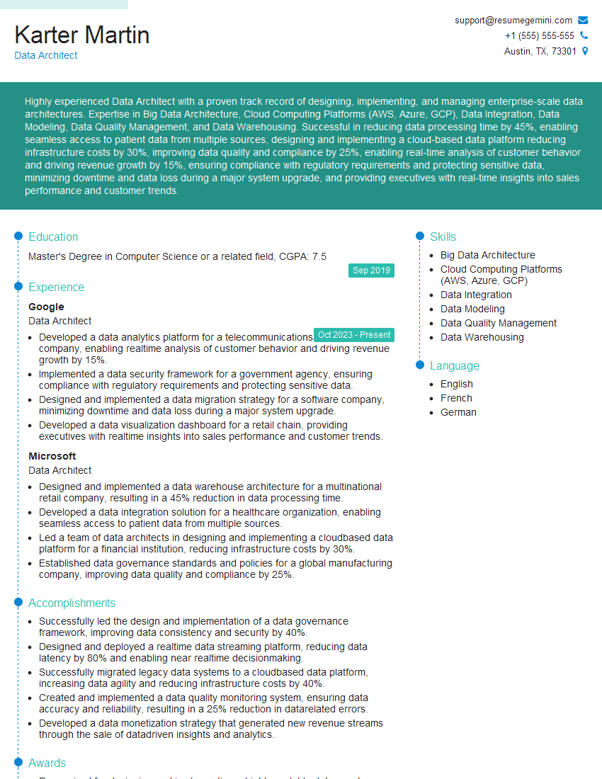
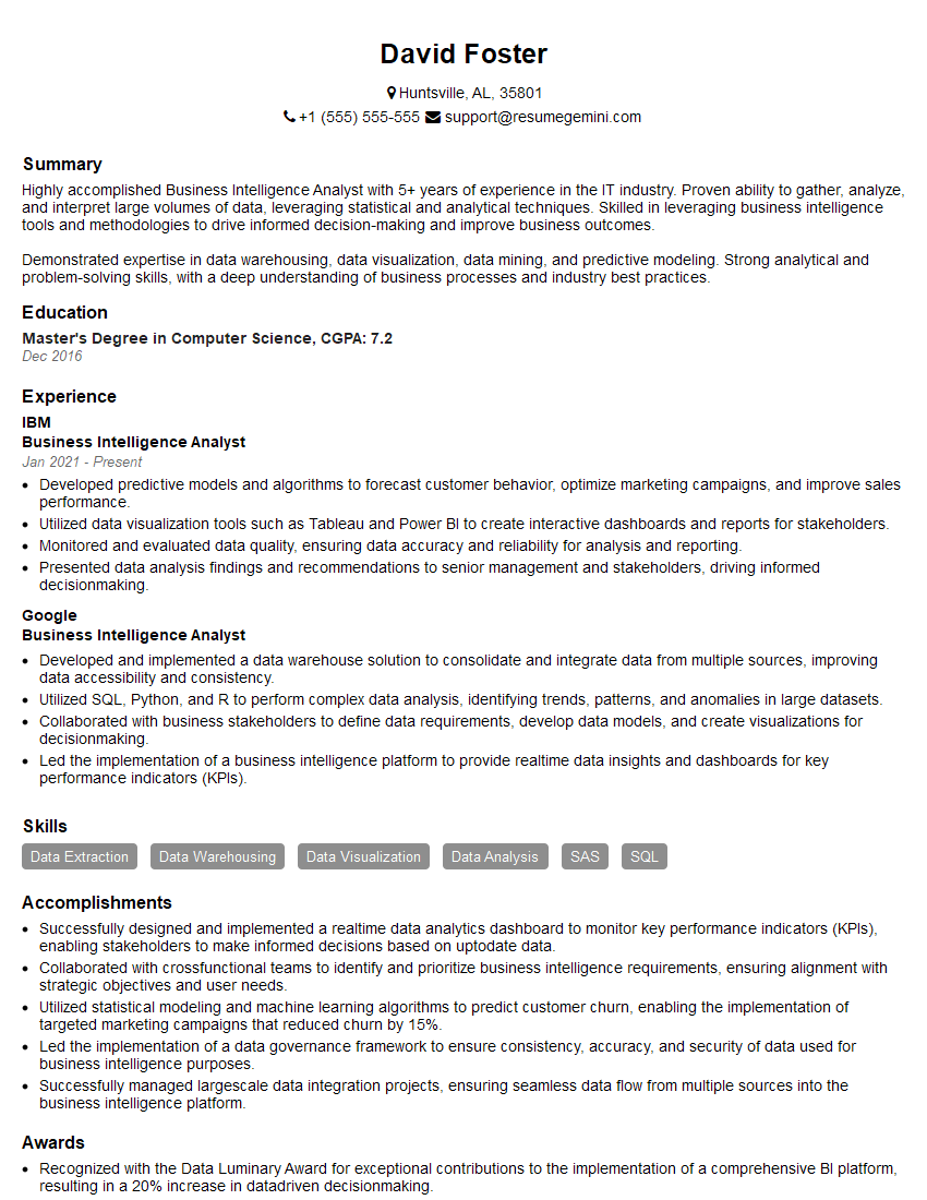
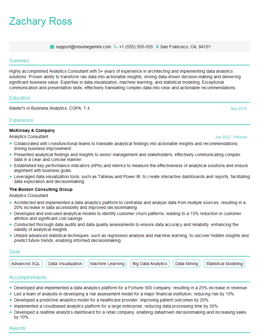
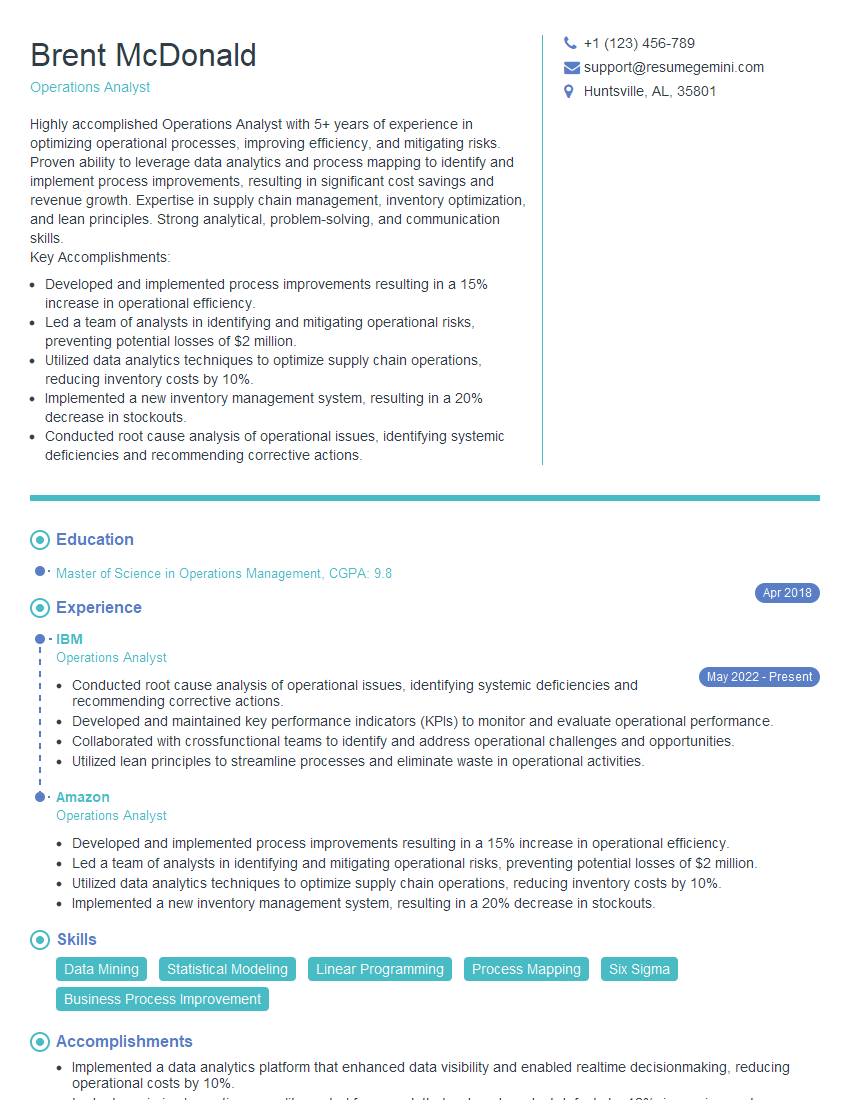
Mastering data analysis and visualization tools is crucial for career advancement in today’s data-driven world. These skills are highly sought after across various industries, opening doors to exciting and rewarding opportunities. To maximize your job prospects, create a compelling and ATS-friendly resume that highlights your achievements and skills. ResumeGemini is a trusted resource to help you build a professional and impactful resume. We provide examples of resumes tailored to data analysis and visualization roles to help you get started. Take the next step towards your dream career – build your best resume today!
Explore more articles
Users Rating of Our Blogs
Share Your Experience
We value your feedback! Please rate our content and share your thoughts (optional).
What Readers Say About Our Blog
Hi, I’m Jay, we have a few potential clients that are interested in your services, thought you might be a good fit. I’d love to talk about the details, when do you have time to talk?
Best,
Jay
Founder | CEO
