Interviews are more than just a Q&A session—they’re a chance to prove your worth. This blog dives into essential Publishing Software (InDesign, Adobe Creative Suite) interview questions and expert tips to help you align your answers with what hiring managers are looking for. Start preparing to shine!
Questions Asked in Publishing Software (InDesign, Adobe Creative Suite) Interview
Q 1. Explain your experience with InDesign’s object styles.
InDesign’s Object Styles are a powerful tool for maintaining consistency and efficiency throughout a project. Think of them as templates for individual elements like paragraphs, characters, frames, and even tables. Instead of manually formatting each element, you create an Object Style once, defining its characteristics (font, size, color, spacing, etc.), and then apply it to multiple elements. This ensures uniformity and simplifies updates; if you need to change the font of a heading, for example, you modify the style once, and it updates everywhere it’s applied.
- Creating an Object Style: You can create them via the Styles panel (Window > Styles) by clicking the ‘New Object Style’ button. You then select the object and define its attributes. A simple example would be creating a style for body text: 10pt Times New Roman, justified alignment, and 12pt leading.
- Applying Object Styles: Once created, you can quickly apply a style by selecting an object and choosing the style from the Styles panel’s dropdown menu.
- Modifying Object Styles: The beauty lies in the ability to modify styles globally. If you update a style, the changes are automatically reflected in every object using that style – saving tremendous time and effort.
- Nested Styles: You can even nest styles, applying one style within another (e.g., a character style within a paragraph style). This is incredibly useful for creating complex text formatting structures.
In a real-world scenario, I recently used object styles to manage a 100-page brochure. Having styles for headings, body text, captions, and callouts not only ensured a consistent brand identity but also allowed me to quickly make global changes as the design evolved.
Q 2. How do you manage linked images in InDesign?
Managing linked images in InDesign is crucial for maintaining file sizes, allowing for easy updates, and ensuring efficient workflow. Instead of embedding images directly, you link them, essentially creating a pointer to the original file. This keeps the InDesign file relatively small and allows for easy updates; changes to the original image will automatically reflect in the InDesign document after updating the links.
- Linking Images: This is done via the Place command (File > Place) when you’re adding the image to the document. Ensure the ‘Link’ option is selected.
- Updating Links: If the original image is changed, InDesign will typically prompt to update the links automatically, but you can manually check and update them via the Links panel (Window > Links).
- Relinking Images: If the original image is moved or renamed, you might need to manually relink it using the Links panel. This panel displays the status of all linked files—missing links will be highlighted.
- Packaging InDesign Files: When you package the InDesign file for print or for sharing with others, all linked files are included, ensuring the project is complete and self-contained.
A common mistake is forgetting to package the linked images. I’ve learned the hard way to always double-check my links and package the complete project; It’s saved me from countless headaches when collaborating or sending files to print.
Q 3. Describe your process for creating and managing master pages.
Master pages are fundamental to ensuring consistency across a multi-page document. They act as templates for your pages; any elements placed on a master page (headers, footers, page numbers, running heads, etc.) will automatically appear on all pages based on that master. This eliminates redundant work and ensures brand consistency across the publication.
- Creating Master Pages: New master pages are created by clicking the ‘New Master Page’ button in the Pages panel (Window > Pages).
- Organizing Master Pages: It’s good practice to create separate master pages for different page layouts (e.g., one for left-hand pages, one for right-hand pages in a book). This allows for different headers and footers on opposite pages.
- Applying Master Pages: New pages are created by selecting the desired master page from the Pages panel. You can apply different master pages to different pages within your document, adapting to the needs of various sections.
- Working with Master Page Items: Items on master pages can be locked to prevent accidental modifications; the ‘Lock’ function in the Layers panel prevents changes.
Imagine designing a magazine—you’d create separate master pages for articles, advertisements, and feature spreads. Each master would have specific design elements, ensuring a unified look and feel while allowing flexibility for different content.
Q 4. What are your preferred methods for ensuring color consistency across a project?
Color consistency is paramount in design. In InDesign, several methods ensure color accuracy throughout a project. The key is to establish a central color palette and maintain consistency across all elements.
- Using Swatches: Defining your colors as swatches (Window > Swatches) is crucial. This allows you to apply the same named color consistently without worrying about minor variations in RGB or CMYK values.
- Spot vs. Process Colors: Understanding the difference between spot (Pantone) and process (CMYK) colors is essential, especially for print. Spot colors are ideal for consistent color matching across various printing presses; process colors are a mix of CMYK inks, which can vary slightly in different print environments.
- Color Management: InDesign offers robust color management features. Ensure your document is set to the correct color profile (usually CMYK for print). Calibration and proofing are vital for ensuring the printed colors match your screen display.
- Using Color Libraries: Adobe offers access to various color libraries (e.g., Pantone libraries) that you can import directly into InDesign.
During one project, we had to maintain consistent branding across different marketing materials. Utilizing named swatches for the company’s signature colors—ensuring that all materials—from brochures to business cards, used the same exact color from the same swatch—guaranteed brand consistency.
Q 5. How do you handle preflighting and trapping in InDesign?
Preflighting and trapping are essential steps in the pre-press process, ensuring your document prints correctly. Preflighting checks your document for potential problems (missing fonts, low-resolution images, color issues, overprints), and trapping prevents gaps between colors during printing.
- Preflighting: InDesign offers built-in preflighting capabilities (Package command). It checks for a variety of potential printing errors. Third-party plugins offer even more thorough checks. A crucial preflight action is checking for missing or low-resolution images and verifying the intended color mode.
- Trapping: Trapping compensates for slight misregistration during printing. It ensures that overlapping colors don’t have gaps. Manual trapping is precise, but automated trapping through InDesign or dedicated pre-press software is common and efficient for most projects. InDesign offers trapping features, and a print shop often has its own preferences.
I once had a project where a low-resolution image slipped through preflight. Preflighting was crucial to catching this; had I not taken this critical step, it would have resulted in a blurry image in the final product, costing a considerable amount of money and time to correct.
Q 6. Explain your experience with creating and using custom palettes.
Custom palettes in InDesign greatly enhance workflow efficiency. Instead of constantly searching for specific colors, fonts, or styles, you can create custom palettes that are tailored to your needs and project requirements. This results in faster work and design consistency.
- Creating Custom Color Palettes: Swatches palettes can be created, saved, and easily accessed. This allows for the creation of branded palettes containing the company’s specific colors.
- Creating Custom Character & Paragraph Style Palettes: The same concept applies to text styles. Creating specific styles for headings, body text, and captions, for example, aids in style consistency and speed.
- Organizing Custom Palettes: Efficient naming and organization are key to avoid confusion. Consistent nomenclature across palettes promotes project efficiency. Creating separate palettes for different aspects of a project (e.g., one for color, one for paragraph styles) can greatly improve efficiency.
- Sharing Custom Palettes: Custom palettes can be saved and shared with other InDesign users, thereby guaranteeing stylistic uniformity across a team.
I often create custom palettes with frequently used colors and styles; for a recent project, I had a dedicated palette for the client’s branding, significantly improving my speed and preventing color inconsistencies.
Q 7. How do you ensure your InDesign files are compatible across different operating systems?
Ensuring compatibility across different operating systems is essential for collaborative projects. Several steps can be taken to guarantee that your InDesign file will open and display correctly on both macOS and Windows.
- Using System Fonts Carefully: Avoid using obscure or lesser-known fonts. Rely on standard system fonts, or embed fonts within the document during packaging. Be mindful of font licensing agreements.
- Using Standard Color Spaces: Always use a standard color space like CMYK for print and sRGB for screen. Avoid using unusual or device-specific color profiles.
- Checking for Missing Links: Check for missing or broken image and font links, and resolve these issues before sharing or sending the file.
- Packaging the Project: Always use the ‘Package’ feature when sending files to others or preparing for printing. Packaging bundles the InDesign file with all linked images and fonts, ensuring it’s complete and self-contained.
- Version Control: Using a version-control system like Git (although not directly within InDesign) can be beneficial for large projects involving multiple people and operating systems.
For instance, I’ve had situations where using a non-standard font caused issues on a client’s machine. Embedding fonts or opting for system fonts, coupled with thorough preflight checks, avoided problems in the future and maintained high-quality output for all stakeholders.
Q 8. Describe your workflow for creating and exporting PDFs for print and digital media.
My workflow for creating and exporting PDFs begins with meticulous pre-flight checks. I ensure all images are high-resolution and color profiles are correctly set (CMYK for print, RGB for screen). For print, I use InDesign’s preflight feature to catch potential issues like missing fonts or linked files. I then export a PDF/X-1a compliant file for optimal print quality, choosing the appropriate settings based on the printer’s requirements. For digital media, I export a PDF/X-4 or a simple PDF, depending on the need for interactivity or accessibility features. For interactive elements, I ensure all links and actions are tested thoroughly. For example, when creating a brochure for print, I’d use PDF/X-1a with bleed and crop marks for professional printing. For an online magazine, I might create a PDF/X-4 file with interactive elements like hyperlinks and animations.
This entire process is guided by the principle of maintaining consistency throughout, from designing in InDesign to the final exported PDF, guaranteeing optimal quality and a smooth workflow.
Q 9. Explain the difference between CMYK and RGB color modes and when to use each.
CMYK (Cyan, Magenta, Yellow, Key/Black) is a subtractive color model used for print. Think of it like mixing paints; you start with a white surface and add colors to subtract light, resulting in the final color. RGB (Red, Green, Blue) is an additive color model used for screens (monitors, projectors). Here, light is added together to create the final color; a combination of all three creates white.
I always use CMYK for print projects to ensure accurate color reproduction on press. RGB is reserved for digital designs intended solely for screen display, such as website banners or social media graphics. Converting between these color modes can lead to color shifts, so careful consideration and color management are crucial to maintain visual consistency across platforms. For example, a vibrant RGB green might appear dull when printed in CMYK. Therefore, designing directly in CMYK for print jobs is the best practice to avoid unexpected color variations.
Q 10. How proficient are you with Adobe Illustrator and Photoshop integration within InDesign?
I’m highly proficient in integrating Adobe Illustrator and Photoshop with InDesign. Illustrator is invaluable for creating crisp vector graphics like logos and illustrations, while Photoshop is ideal for raster-based images like photographs. I often create complex illustrations in Illustrator, placing them as linked files into InDesign to maintain editability. Similarly, I use Photoshop to retouch photos and apply effects before seamlessly placing them into my InDesign layouts. I’m adept at managing linked files, ensuring their proper color profiles and resolution are maintained. For example, a project recently involved creating a corporate report. I used Illustrator for vector logos and icons, and Photoshop for image editing and enhancement before bringing these assets into InDesign for the final layout and text.
Q 11. Describe your experience with creating interactive PDFs in InDesign.
My experience with interactive PDFs in InDesign encompasses creating documents with hyperlinks, buttons, animations, and form fields. I frequently leverage InDesign’s interactive features for projects like ebooks, online brochures, and interactive presentations. I understand the importance of optimizing the user experience and ensuring cross-platform compatibility. For instance, I recently created an interactive e-book, incorporating hyperlinks to various sections, clickable images that expanded to full-screen views, and even a simple quiz at the end using InDesign’s interactive capabilities. This ensures users get an engaging experience that seamlessly integrates navigation and content. Testing across different PDF readers is crucial for ensuring optimal functionality and avoid compatibility issues.
Q 12. What are your strategies for troubleshooting common InDesign errors?
My troubleshooting strategies for InDesign errors begin with identifying the error message. I utilize InDesign’s built-in error reporting system and consult the Adobe help documentation. Common issues I address include font problems (missing fonts, font conflicts), image problems (missing or corrupt linked images), and performance issues (large file sizes, slow processing). I also frequently use InDesign’s preflight and package features to identify and resolve potential problems before exporting the final file. For example, a ‘missing font’ error is resolved by locating and installing the missing font or replacing it with an alternative. Similarly, performance problems are addressed by optimizing image sizes and creating templates to streamline the workflow for complex files.
Q 13. How do you manage large and complex InDesign documents efficiently?
Managing large and complex InDesign documents efficiently involves several key strategies. I use templates to standardize document settings and styles, reducing manual work and inconsistencies. I meticulously organize my files and use layers effectively to keep content structured. I regularly save incremental versions and use InDesign’s package feature to collect all linked files, ensuring easy project transfer or collaboration. Furthermore, I break down large projects into smaller, manageable components, assembling them later. For example, a multi-page catalog is assembled page by page or by section, reducing potential software issues and improving workflow. This ensures the overall project remains organized and easily manageable, greatly reducing the chances of file corruption or loss of work.
Q 14. What are your preferred methods for version control in InDesign?
My preferred methods for version control in InDesign include using InDesign’s built-in ‘Save As’ functionality to create incremental versions. I also incorporate cloud-based solutions like Adobe Creative Cloud Libraries for collaboration and version history. For larger projects or team-based collaboration, dedicated version control systems like Git (often with a plugin like Git-annex) provide more robust tracking. However, for individual projects, the incremental saving approach, combined with the use of descriptive file names (e.g., ‘projectname_v1_final.indd’), offers sufficient version control. This method allows easy retrieval of previous versions if needed, while streamlining the workflow to avoid cluttering the file system.
Q 15. Explain your experience with using InDesign’s scripting capabilities (if any).
While I haven’t extensively used InDesign’s scripting capabilities for large-scale automation, I possess a foundational understanding of its scripting engine, primarily using JavaScript. I’ve utilized simple scripts for tasks like automating the creation of page numbers or applying consistent formatting across multiple pages. For instance, I’ve written scripts to automatically generate chapter headings with consistent styles based on a data source like a spreadsheet. This saved considerable time compared to manual input. More complex automation, like creating dynamic layouts based on variable data, requires more extensive scripting knowledge, which I’m actively developing through online courses and practice.
A simple example would be a script to add page numbers to the bottom center of every page:
// This is a simplified example and may require adjustments depending on your InDesign version.
 app.activeDocument.pages.everyItem().insertPageNumbers();
My future goal is to leverage scripting to build more complex automated workflows, increasing efficiency and reducing manual error in repetitive design tasks.
Career Expert Tips:
- Ace those interviews! Prepare effectively by reviewing the Top 50 Most Common Interview Questions on ResumeGemini.
- Navigate your job search with confidence! Explore a wide range of Career Tips on ResumeGemini. Learn about common challenges and recommendations to overcome them.
- Craft the perfect resume! Master the Art of Resume Writing with ResumeGemini’s guide. Showcase your unique qualifications and achievements effectively.
- Don’t miss out on holiday savings! Build your dream resume with ResumeGemini’s ATS optimized templates.
Q 16. How do you ensure text consistency and accuracy in your InDesign layouts?
Maintaining text consistency and accuracy in InDesign is paramount for professional publishing. My approach involves a multi-pronged strategy. Firstly, I utilize InDesign’s Styles feature extensively. Creating paragraph and character styles ensures consistent font, size, spacing, and indentation across the entire document. This dramatically reduces the risk of inconsistencies, even with multiple people working on the same document.
Secondly, I meticulously check for spelling and grammar errors, typically using both InDesign’s built-in spell checker and a dedicated grammar and style checking tool like Grammarly or ProWritingAid. This process usually happens before and after importing text to ensure no errors are introduced during the layout process.
Thirdly, I leverage InDesign’s find/change functionality to ensure consistent use of terminology and formatting across the entire publication. For example, I might use find/change to locate all instances of ‘colour’ (British English) and change them to ‘color’ (American English), depending on the publication’s style guide.
Finally, I always implement a thorough proofreading and quality assurance check before the final output. Multiple eyes reviewing the document help to catch any remaining inconsistencies.
Q 17. Describe your experience with working with different types of fonts and typography.
My experience with fonts and typography spans several years and encompasses a wide range of typefaces – from classic serif fonts like Garamond and Times New Roman to modern sans-serif fonts like Helvetica and Open Sans, and even more stylized display fonts. I understand the nuances of different font classifications (serif, sans-serif, script, etc.) and their suitability for various purposes. For example, serifs are generally preferred for body text due to their readability, while sans-serif fonts are often used for headlines or display text.
I’m proficient in using font management software such as Adobe Fonts, which allows for efficient font organization and access. I understand the importance of font licensing and ensuring that we use legally licensed fonts in our projects. I also consider kerning (adjusting the space between individual letters) and tracking (adjusting the space between words) to enhance readability and visual appeal. In complex designs, I may utilize OpenType features to access stylistic alternates and ligatures (special combinations of two or more letters). Ultimately, my goal is to ensure the chosen typography contributes positively to the overall design and message.
Q 18. How do you handle image resolution and quality in InDesign?
Maintaining high-resolution images is critical for print design. Before importing images into InDesign, I meticulously check their resolution. For print, images should generally be at least 300 DPI (dots per inch). I often work with high-resolution TIFF or EPS files for optimal print quality. Lower resolution images (e.g., those from the web) can be significantly enlarged, creating a pixelated or blurry effect.
I avoid unnecessarily large files to manage the file size. Instead of placing a giant high-resolution image directly in InDesign, I might optimize the image in Photoshop, reducing its file size without compromising print quality by saving as a JPEG or reducing file size without altering dimensions and then placing it into the InDesign layout. This ensures the InDesign file remains manageable and reduces potential lag in performance.
InDesign offers options to manage image resolution, allowing me to view images at a specific resolution for a preview of print quality before exporting. For situations where images are being delivered from external sources, I thoroughly communicate the necessary image specifications to ensure optimal print results.
Q 19. What is your experience with bleed and margins in print design?
Bleed and margins are fundamental concepts in print design. Bleed refers to extending the background or design elements beyond the final trim size of the printed piece. This is crucial because printers often trim pages slightly during the cutting process. Without bleed, you might end up with unsightly white edges where the background should be. A typical bleed allowance is ⅛ inch (3.175 mm) on all sides.
Margins, on the other hand, define the space between the printed content and the edge of the page. They provide white space, improving readability and the overall aesthetic appeal. I carefully set margins based on the type of publication and content. For instance, a book might have larger margins than a brochure to improve readability.
In my work, I ensure consistent and appropriate bleed and margins are included in every document. Failure to do so can lead to printing errors and unprofessional results. I often use InDesign’s layout guides and rulers to precisely set these values.
Q 20. How familiar are you with different print finishing techniques?
I’m familiar with various print finishing techniques, including:
- Die-cutting: Creating custom shapes and designs by cutting through the paper.
- Embossing/debossing: Creating raised or indented designs on the paper’s surface.
- Foil stamping: Applying metallic or colored foil to create a shiny, professional look.
- Varnishing/laminating: Applying a protective coating to enhance durability and create a glossy or matte finish.
- Folding and binding: Various techniques like saddle-stitch, perfect binding, and wire-o binding.
Understanding these techniques allows me to design documents that are not only visually appealing but also practically feasible for production. I consider these options during the design process to ensure compatibility and avoid any design choices that might be problematic during printing and finishing.
Q 21. Explain your understanding of the print production process.
My understanding of the print production process encompasses the entire workflow, from design to finished product. It begins with the design phase (using InDesign), followed by pre-press preparation, which includes checking resolution, color profiles, and ensuring proper bleed and margins. Then comes the stage of generating print-ready files, typically in PDF/X-1a format. This format ensures color consistency and compatibility across different printing presses.
The next step involves sending the files to a print service provider (PSP). The PSP handles platemaking, printing (offset, digital, etc.), and the finishing processes. After printing, quality control is performed to check for any errors or defects. Finally, the printed materials are delivered to the client.
I’ve worked closely with PSPs throughout my career, understanding their requirements and ensuring smooth collaboration. This includes providing clear instructions, accurate files, and timely communication. A thorough understanding of this process is essential for producing high-quality printed materials that meet client expectations.
Q 22. Describe your experience with collaborating with other designers and stakeholders.
Collaboration is crucial in publishing. I’ve extensively used collaborative platforms like Adobe Creative Cloud Libraries and shared network drives to ensure seamless teamwork. For example, on a recent book project, I worked with a team of three designers, a copyeditor, and the author. We used cloud libraries to share assets (images, fonts, style guides), ensuring everyone worked with the most up-to-date versions. Regular check-ins, both virtual and in-person, were key to maintaining consistent brand messaging and design aesthetic. We also utilized version control within InDesign, regularly saving different versions with clear notes, facilitating easy revisions and rollback if needed. Effective communication—daily updates via email or project management software—was essential to managing feedback and resolving discrepancies promptly.
- Version Control: Utilizing InDesign’s version history and saving different versions with descriptive filenames.
- Cloud Libraries: Sharing design assets, color palettes, and styles across the team.
- Regular Check-ins: Facilitating timely feedback and addressing concerns early.
Q 23. How do you meet tight deadlines and manage multiple projects simultaneously?
Meeting tight deadlines with multiple projects requires meticulous planning and prioritization. I employ a system built around task breakdown, time-blocking, and efficient workflow management. I start by breaking down each project into smaller, manageable tasks, assigning realistic timelines to each. I then utilize a project management tool (like Asana or Trello) to visualize deadlines, track progress, and identify potential bottlenecks. Time-blocking helps me allocate specific time slots to particular tasks, maximizing focus and minimizing context switching. Prioritization is key—I focus on the most urgent and critical tasks first, while keeping the long-term project goals in mind. For example, during a period with three concurrent projects, I used a Kanban board to visually organize tasks across projects and prioritize those with imminent deadlines. This allowed for flexible task management and a clear overview of my workload.
- Task Breakdown: Dividing large projects into smaller, manageable units.
- Time Blocking: Allocating dedicated time slots for specific tasks.
- Project Management Tools: Utilizing software to track progress and prioritize tasks.
Q 24. What is your approach to solving design challenges?
My approach to design challenges is iterative and problem-solving focused. I begin by clearly defining the problem, understanding the client’s needs and constraints. Then, I brainstorm multiple solutions, exploring different design options and considering their feasibility and impact. I create mockups and prototypes to test and refine my ideas, gathering feedback along the way. This iterative process allows me to adapt and improve the design based on testing and feedback. For example, when faced with the challenge of designing a book cover that would appeal to a diverse audience while adhering to stringent space limitations, I generated several mockups with varying typography, imagery, and layouts, conducting A/B testing through surveys to see which version resonated best.
- Define the Problem: Clearly understanding the project requirements and constraints.
- Brainstorm Solutions: Exploring various design options and approaches.
- Prototype and Test: Creating mockups and gathering feedback for refinement.
Q 25. How do you stay updated on the latest design trends and technologies?
Staying updated in the fast-paced design world requires continuous learning. I actively follow design blogs, podcasts, and online communities like Behance and Dribbble. I also attend industry conferences and webinars when possible, participating in online courses offered by platforms such as LinkedIn Learning and Skillshare. Subscription to design magazines and newsletters keeps me informed about the latest software updates and industry trends. Experimentation with new tools and techniques is also vital—I often dedicate time to exploring the newest features of the Creative Suite and testing out new design software to broaden my skillset. Staying current ensures I can provide cutting-edge design solutions and leverage the most efficient workflows.
- Online Communities: Following design blogs, podcasts, and platforms like Behance and Dribbble.
- Conferences and Webinars: Attending industry events for networking and learning.
- Online Courses: Engaging in continuous learning through platforms like LinkedIn Learning and Skillshare.
Q 26. What are your strengths and weaknesses in using Adobe Creative Suite?
My strengths lie in InDesign’s advanced features like creating complex layouts, managing styles, and automating repetitive tasks with scripting (using Javascript or ExtendScript). I’m highly proficient in Illustrator for creating vector graphics and Photoshop for image editing, seamlessly integrating them into InDesign projects. My weakness, if I were to identify one, would be less familiarity with After Effects, though I’m actively working to expand my skills in motion graphics. I consistently find new ways to leverage the power of the Creative Suite to improve efficiency and achieve high-quality results. For example, I utilize InDesign’s scripting capabilities to automate tasks like generating table of contents or creating consistent cross-references, drastically reducing manual work.
- Strengths: InDesign’s advanced features, Illustrator and Photoshop integration.
- Areas for Growth: After Effects motion graphics.
Q 27. Describe a time you had to overcome a technical challenge in InDesign.
During a recent project involving a large-format poster with intricate layered graphics, I encountered a significant performance issue in InDesign. The file size became excessively large, leading to slow rendering times and frequent crashes. My initial approach was to optimize the images, using Photoshop to reduce file size without compromising quality. This helped, but the performance remained problematic. I then investigated the layer structure and discovered several unnecessary layers and groups. By carefully consolidating and flattening certain layers, while preserving the necessary elements, I significantly reduced the file size and complexity. Finally, I employed InDesign’s “package” feature to efficiently create a self-contained file for the print shop, resolving any potential compatibility issues. This experience highlighted the importance of proactive file management and optimization strategies in InDesign for large and complex projects.
- Problem: Excessive file size in InDesign leading to slow rendering and crashes.
- Solution: Image optimization, layer consolidation, and using the “Package” feature.
Key Topics to Learn for Publishing Software (InDesign, Adobe Creative Suite) Interview
- Mastering InDesign’s Interface and Workspace: Understand panels, toolbars, and workspace customization for efficient workflow. Practice navigating and utilizing these tools intuitively.
- Document Setup and Page Management: Learn to create and manage multi-page documents, master page creation and application, and understand different page sizes and orientations. Practice setting up documents for various print and digital outputs.
- Text and Typography: Go beyond basic text formatting. Understand paragraph and character styles, master text wrapping, and explore advanced typography concepts like kerning and tracking. Practice creating visually appealing and readable text layouts.
- Image and Graphics Handling: Learn to import, place, and manipulate images effectively. Understand image resolution, color modes (CMYK vs. RGB), and image optimization techniques. Practice working with various image formats and maintaining high-quality output.
- Working with Color: Understand color models, color palettes, and spot vs. process colors. Practice creating consistent and accurate color schemes throughout your projects. Familiarize yourself with color management principles.
- Creating and Using Styles: Master paragraph and character styles for consistency and efficiency. Understand the power of style sheets and how they maintain brand consistency and simplify editing.
- Tables and Frames: Learn to create and manipulate complex tables and nested frames. Practice precise alignment and formatting. Understand the use of tables for data organization and layout.
- Prepress and Output: Understand the principles of prepress preparation, including color management, trapping, and PDF export settings. Practice exporting files for various output methods (print, web, etc.).
- Advanced InDesign Features: Explore features like interactive documents, hyperlinks, and scripting (if applicable to your target role). Showcase your ability to leverage InDesign’s full capabilities.
- Adobe Creative Suite Integration: Understand how InDesign interacts with other Creative Suite applications (Photoshop, Illustrator) for a seamless workflow. Practice importing and exporting files between applications.
Next Steps
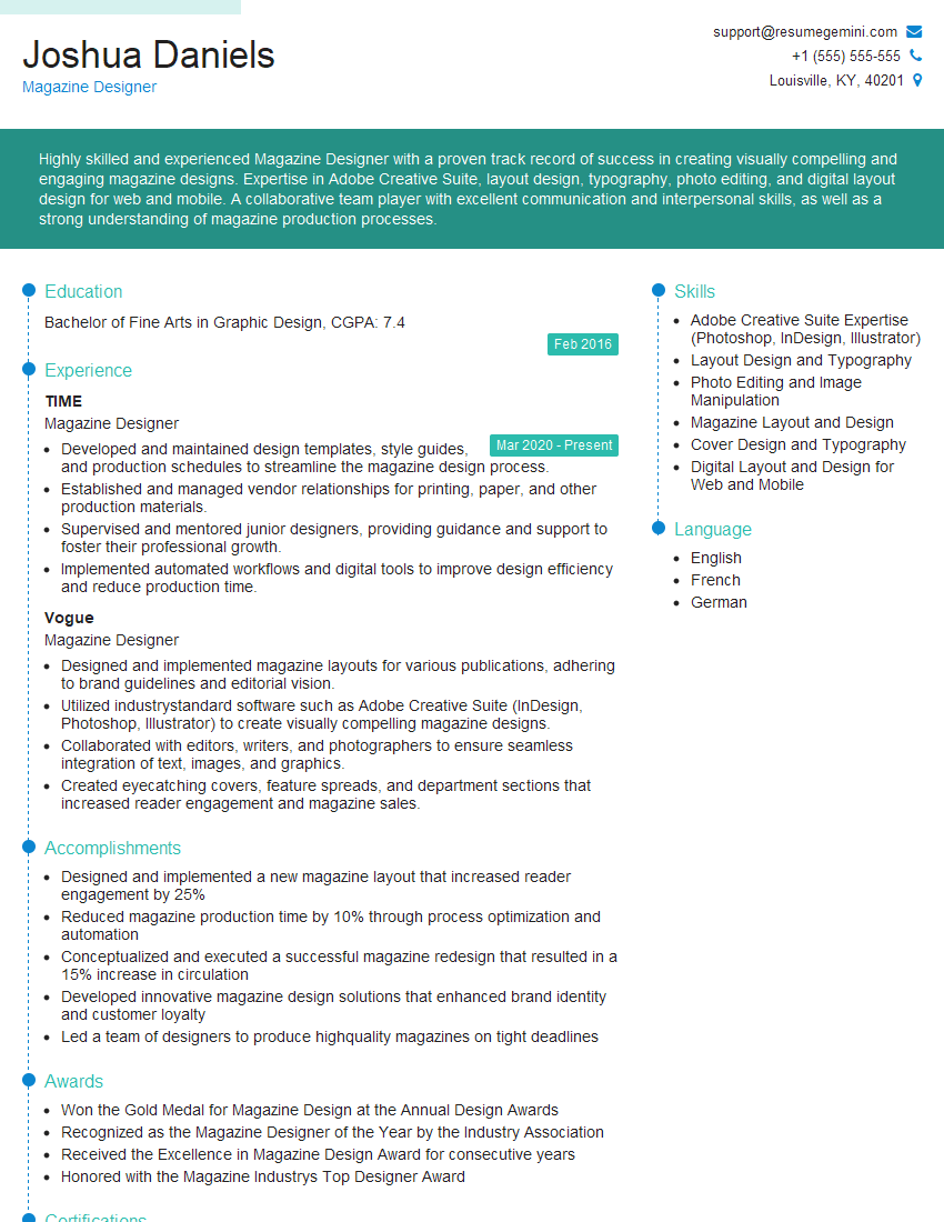
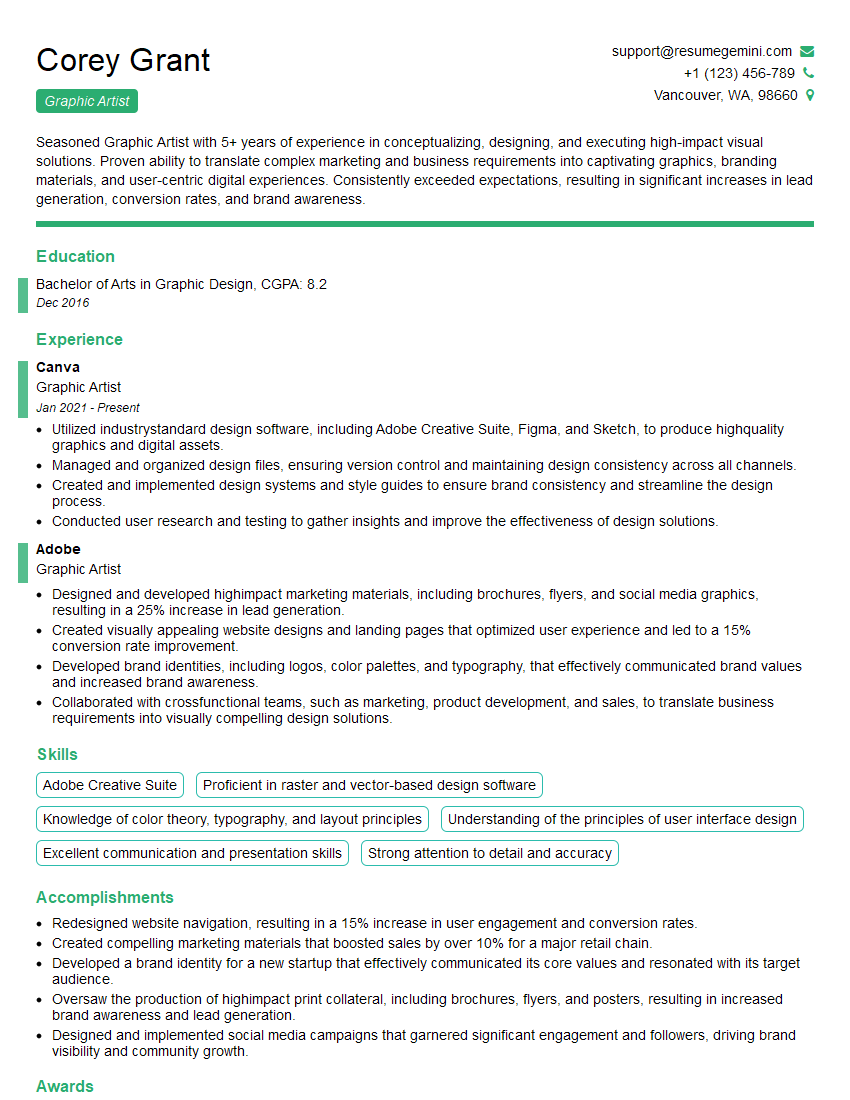
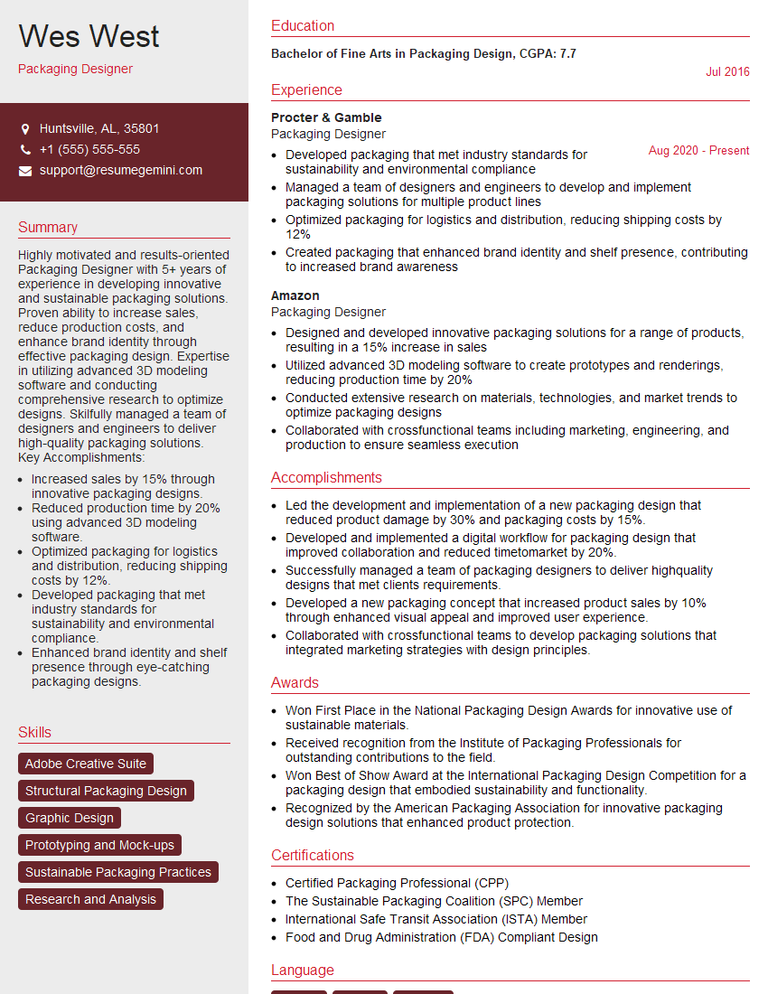
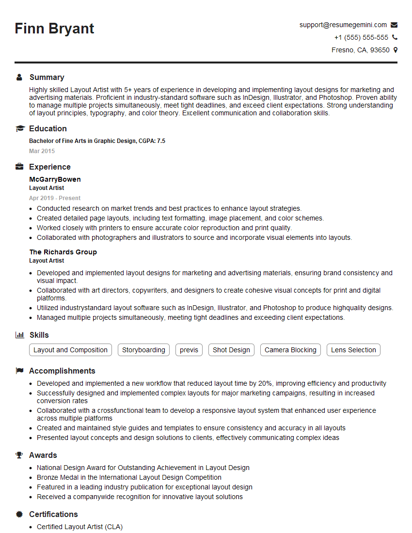
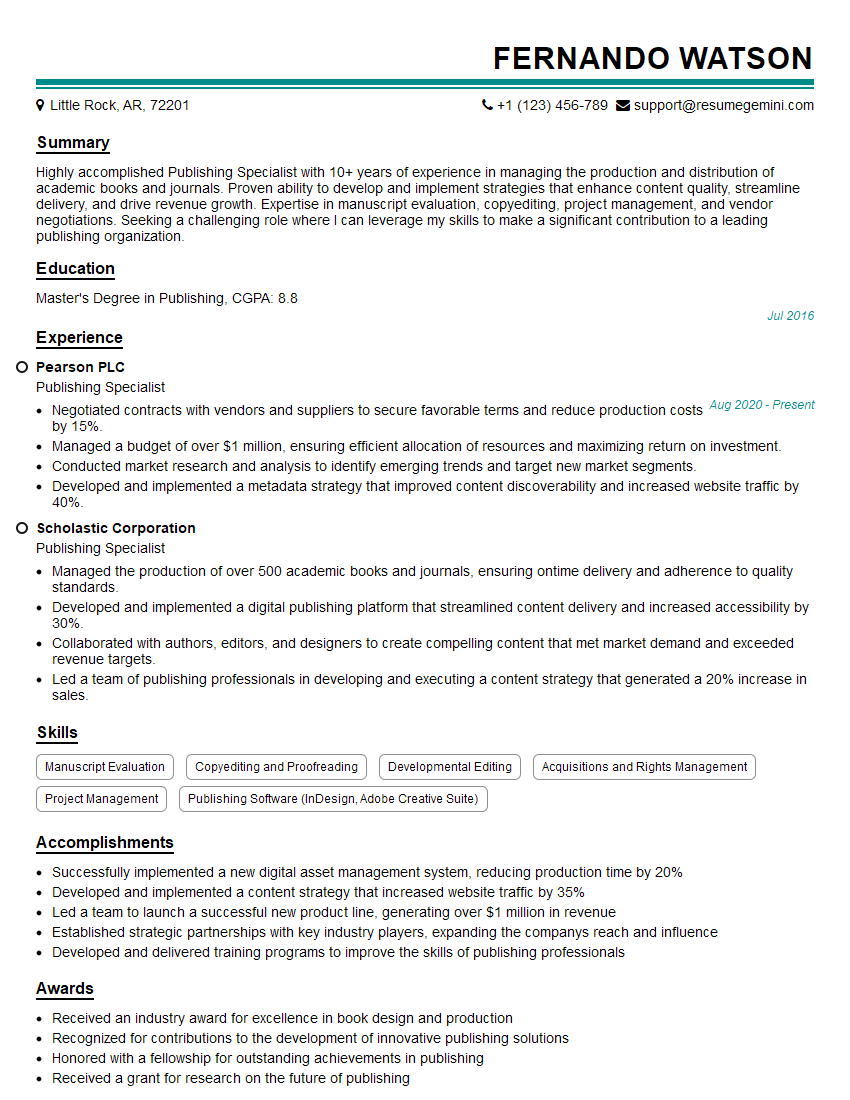
Proficiency in InDesign and the Adobe Creative Suite is highly valued across various publishing and design roles, opening doors to exciting career opportunities and higher earning potential. To maximize your job prospects, crafting a compelling and ATS-friendly resume is crucial. ResumeGemini is a trusted resource to help you build a professional resume that highlights your skills effectively. Examples of resumes tailored to showcasing your InDesign and Adobe Creative Suite expertise are available – utilize these resources to create a resume that stands out and helps you land your dream job.
Explore more articles
Users Rating of Our Blogs
Share Your Experience
We value your feedback! Please rate our content and share your thoughts (optional).
What Readers Say About Our Blog
Hi, I’m Jay, we have a few potential clients that are interested in your services, thought you might be a good fit. I’d love to talk about the details, when do you have time to talk?
Best,
Jay
Founder | CEO
